Advanced Data Visualization
1 Objectives
Give your graphs a custom look using ggplot extension packages.
2 Materials
Slides: this lesson does not slides.
RStudio Project: this lesson does not have an RStudio.Cloud project.
3 Previous lessons
All of the exercises and lessons are available here, but you can also read more about ggplot2 on the tidyverse website, and in the Data Visualisation chapter of R for Data Science.
4 Load the tidyverse
The main packages we’re going to use are dplyr, tidyr, and ggplot2. These are all part of the tidyverse, so we’ll import this package below:
install.packages("tidyverse")
library(tidyverse)
5 ggplot2 extension packages
ggplot2 has an extensive list of user-written packages for just about any data visualization you can think of, and we’re only going to cover a few in this lesson. Check out more here.
library(ggtext)
library(ggfittext)
library(ggdist)
library(ggbeeswarm)
library(plotly)
library(ggthemes)
library(wesanderson)
library(gganimate)
6 Data Sources
We’re going to be using data from the following packages:
library(tidytuesdayR)
library(Lahman)
library(starwarsdb)
library(dplyr)
7 Labeling values
In the previous lesson, we covered how to annotate your graphs with ggplot2::annotate(), and how to label data points with ggrepel. In this section, we’re going to cover additional text options with ggtext.
library(ggtext)We’re going to be visualizing the relationship between height and weight for baseball players in the People dataset from the Lahman package.
7.1 When to label values
Adding labels to values on a graph can highlight important values and focus the audiences’ attention on what information we’re trying to display. Good text annotation,
“places descriptions directly in the context of the data so that a reader doesn’t have to look outside a graph for additional information to fully understand what you show.” - Nathan Yau, Data Points
7.2 Data
The descriptive information on this dataset is presented below:
Description People table - Player names, DOB, and biographical info. This file is to be used to get details about players listed in the Batting, Pitching, and other files where players are identified only by playerID.
nameFirst - Player’s first name
nameLast - Player’s last name
weight - Player’s weight in pounds
height - Player’s height in inches
7.2.1 exercise
Create a BPlayerData dataset with the variables listed above:
BPlayerData <- Lahman::People %>%
  dplyr::select(__________, __________, __________, __________)
BPlayerData
7.2.2 solution
See below:
BPlayerData <- Lahman::People %>%
  dplyr::select(nameFirst, nameLast, height, weight)
BPlayerData
7.3 Labels
Define the graph labels.
7.3.1 exercise
lab_bbp_ht_wt <- labs(title = "Relationship between _______ and ________",
                      subtitle = "Baseball Players from ______ Data Package",
                      x = "_______ in pounds",
                      y = "______ in inches")
7.3.2 solution
lab_bbp_ht_wt <- labs(title = "Relationship between height and weight",
                      subtitle = "Baseball Players from Lahman Data Package",
                      x = "Weight in pounds",
                      y = "Height in inches")
7.4 Scatter plot
Now we can create a scatter-plot
7.4.1 exercise
Use geom_point(). Set the alpha to 1/3.
BPlayerData %>%
  ggplot(aes(x = ______, y = ______)) +
  geom_point(alpha = _/_) +
  lab_bbp_ht_wt
7.4.2 solution
See below:
BPlayerData %>%
  ggplot(aes(x = weight, y = height)) +
  geom_point(alpha = 1/3) +
  lab_bbp_ht_wt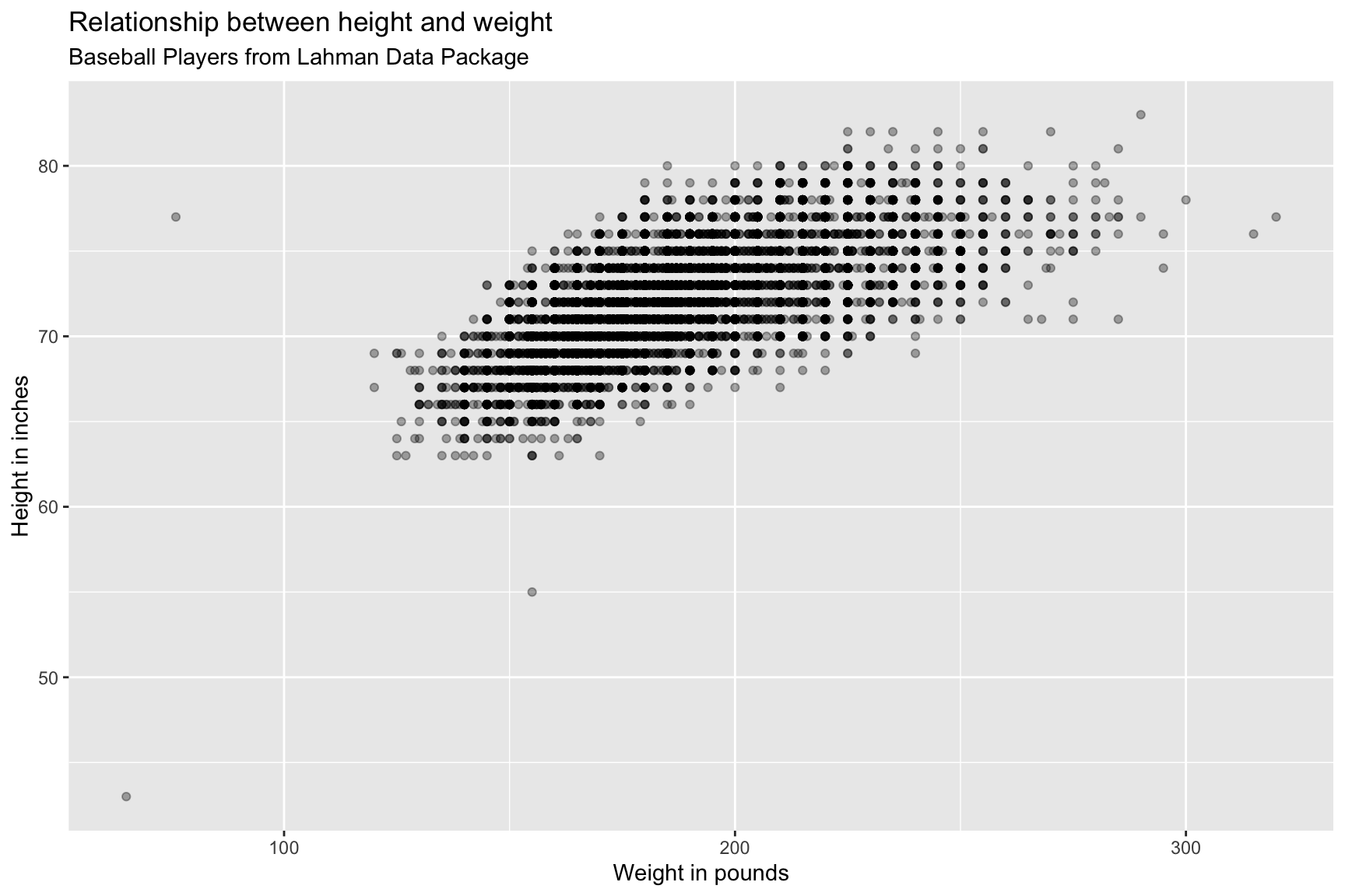
We can see there are some outliers in this graph, let’s label them!
7.5 Identify outliers
First we identify the outliers and determine the names of these players.
7.5.1 exercise
- identify the weight greater than
315asBPHeavy - identify the height greater than
82asBPTall
- identify the height less than
60and height greater than50asBPShort
- identify the weight less than
100and height greater than70asBPLight
- identify the height less than
50and weight less than100asBPTiny
- bind these rows together as
BPlayerLabels
BPlayerData %>% filter(weight > ___) -> BPHeavy
BPlayerData %>% filter(height > 82) -> BPTall
BPlayerData %>% filter(height < __ & height > __) -> BPShort
BPlayerData %>% filter(weight < 100 & height > 70) -> BPLight
BPlayerData %>% filter(height < __ & weight < ___) -> BPTiny
bind_rows(BPHeavy, BPTall, BPShort, BPLight, BPTiny) -> _____________
7.5.2 solution
See below:
BPlayerData %>% filter(weight > 315) -> BPHeavy
BPlayerData %>% filter(height > 82) -> BPTall
BPlayerData %>% filter(height < 60 & height > 50) -> BPShort
BPlayerData %>% filter(weight < 100 & height > 70) -> BPLight
BPlayerData %>% filter(height < 50 & weight < 100) -> BPTiny
bind_rows(BPHeavy, BPTall, BPShort, BPLight, BPTiny) -> BPlayerLabels
BPlayerLabels
7.5.3 exercise
Now we’re going to build some labels for these four players:
- use
paste0()to combine the markdown formatting with thenameFirstandnameLastvariables.
Assign the text to the appropriate player:
"Heaviest"= https://www.baseball-reference.com/players/y/youngwa01.shtml"Tallest"= https://www.baseball-reference.com/players/r/rauchjo01.shtml"Shortest"= https://www.baseball-reference.com/players/h/healeto01.shtml"Lightest"= https://www.baseball-reference.com/players/s/stallja01.shtml"Tiniest"= https://www.baseball-reference.com/players/g/gaedeed01.shtml
Create separate datasets for each group: BPBigSmall, BPShortTall, and BPMaybeLightest
put
"Young"and"Gaedel"inBPBigSmallput
"Rauch"and"Healey"inBPShortTallput
"Stallings"inBPMaybeLightest
BPlayerLabels <- BPlayerLabels %>%
  mutate(outlier_label = case_when(
  nameFirst == "Walter" ~ paste0("**", __________, " ", __________, ":** ",
                                 "*__________...*"),
  nameFirst == "Jon" ~ paste0("**", __________, " ", __________, ":** ",
                                 "*__________...*"),
  nameFirst == "Tom" ~ paste0("**", nameFirst, " ", nameLast, ":** ",
                              "*__________...*"),
  nameFirst == "Jacob" ~ paste0("**", nameFirst, " ", nameLast, ":** ",
                              "*__________..?*"),
  nameFirst == "Eddie" ~ paste0("**", nameFirst, " ", nameLast, ":** ",
                                "*__________...*")))

BPlayerLabels %>%
  filter(nameLast %in% c("______", "_______")) -> BPBigSmall
BPlayerLabels %>%
  filter(nameLast %in% c("______", "_______")) -> BPShortTall
BPlayerLabels %>%
  filter(nameLast == "__________") -> BPMaybeLightest
7.5.4 solution
See below.
BPlayerLabels <- BPlayerLabels %>%
  mutate(outlier_label = case_when(
  nameFirst == "Walter" ~ paste0("**", nameFirst, " ", nameLast, ":** ",
                                 "*Heaviest...*"),
  nameFirst == "Jon" ~ paste0("**", nameFirst, " ", nameLast, ":** ",
                                 "*Tallest...*"),
  nameFirst == "Tom" ~ paste0("**", nameFirst, " ", nameLast, ":** ",
                              "*Shortest...*"),
  nameFirst == "Jacob" ~ paste0("**", nameFirst, " ", nameLast, ":** ",
                              "*Lightest..?*"),
  nameFirst == "Eddie" ~ paste0("**", nameFirst, " ", nameLast, ":** ",
                                "*Tiniest...*")))
BPlayerLabels %>%
  filter(nameLast %in% c("Young", "Gaedel")) -> BPBigSmall
BPlayerLabels %>%
  filter(nameLast %in% c("Rauch", "Healey")) -> BPShortTall
BPlayerLabels %>%
  filter(nameLast == "Stallings") -> BPMaybeLightest
7.6 Placing data labels
7.6.1 Big and small players
BPBigSmall7.6.2 exercise
Now we create the geom_textbox() layer. To accomplish this, we’re going to define the following aesthetics in the ggtext::geom_textbox(aes()): - data = BPBigSmall - label = outlier_label
- orientation = "upright"
- hjust = -0.01
- vjust = -0.01
- fill = "black"
- color = "white"
These aesthetics are defined outside the geom_textbox(aes()) function, but inside the geom_textbox() geom:
size=3
width=unit(0.16, "npc")
Add another geom_point() layer
- map
dataasBPBigSmall - map
x = weightandy = heightinsideaes() - map
sizeto3
- map
colorto"green4"
- map
alphato2/3
In order to get the geom_textbox() to fit on the graph, we need to extend the x and y axes. We can do this with scale_x_continuous():
- set
limitsto0and370
lab_bbp_big_small <- labs(title = "Biggest and smallest MLB players",
                      subtitle = "Baseball Players from Lahman Data Package",
                      x = "Weight in pounds",
                      y = "Height in inches")
BPlayerData %>%
  ggplot(aes(x = weight,
             y = height)) +
  geom_point(alpha = 1/3) +
  ggtext::geom_textbox(data = ____________,
                       aes(label = ___________,
                           orientation = "________",
                           hjust = -____,
                           vjust = -____,
                           fill = "_____",
                           color = "_____"),
                           size = _,
                           width = unit(____, "___")) +
  geom_point(data = ____________,
             aes(x = _______, y = _______),
             size = _,
             color = "_______",
             alpha = ___) +
  scale_discrete_identity(aesthetics = c("color",
                                         "fill",
                                         "orientation")) +
  scale_x_continuous(limits = c(_, ___)) +
  lab_bbp_big_small
7.6.3 solution
See below:
lab_bbp_big_small <- labs(title = "Biggest and smallest MLB players",
                      subtitle = "Baseball Players from Lahman Data Package",
                      x = "Weight in pounds",
                      y = "Height in inches")
BPlayerData %>%
  ggplot(aes(x = weight,
             y = height)) +
  geom_point(alpha = 1/3) +
  ggtext::geom_textbox(data = BPBigSmall,
                       aes(label = outlier_label,
                           orientation = "upright",
                           hjust = -0.01,
                           vjust = -0.01,
                           fill = "black",
                           color = "white"),
                           size = 3,
                           width = unit(0.16, "npc")) +
  geom_point(data = BPBigSmall,
             aes(x = weight, y = height),
             size = 3,
             color = "green4",
             alpha = 2/3) +
  scale_discrete_identity(aesthetics = c("color",
                                         "fill",
                                         "orientation")) +
  scale_x_continuous(limits = c(0, 370)) +
  lab_bbp_big_small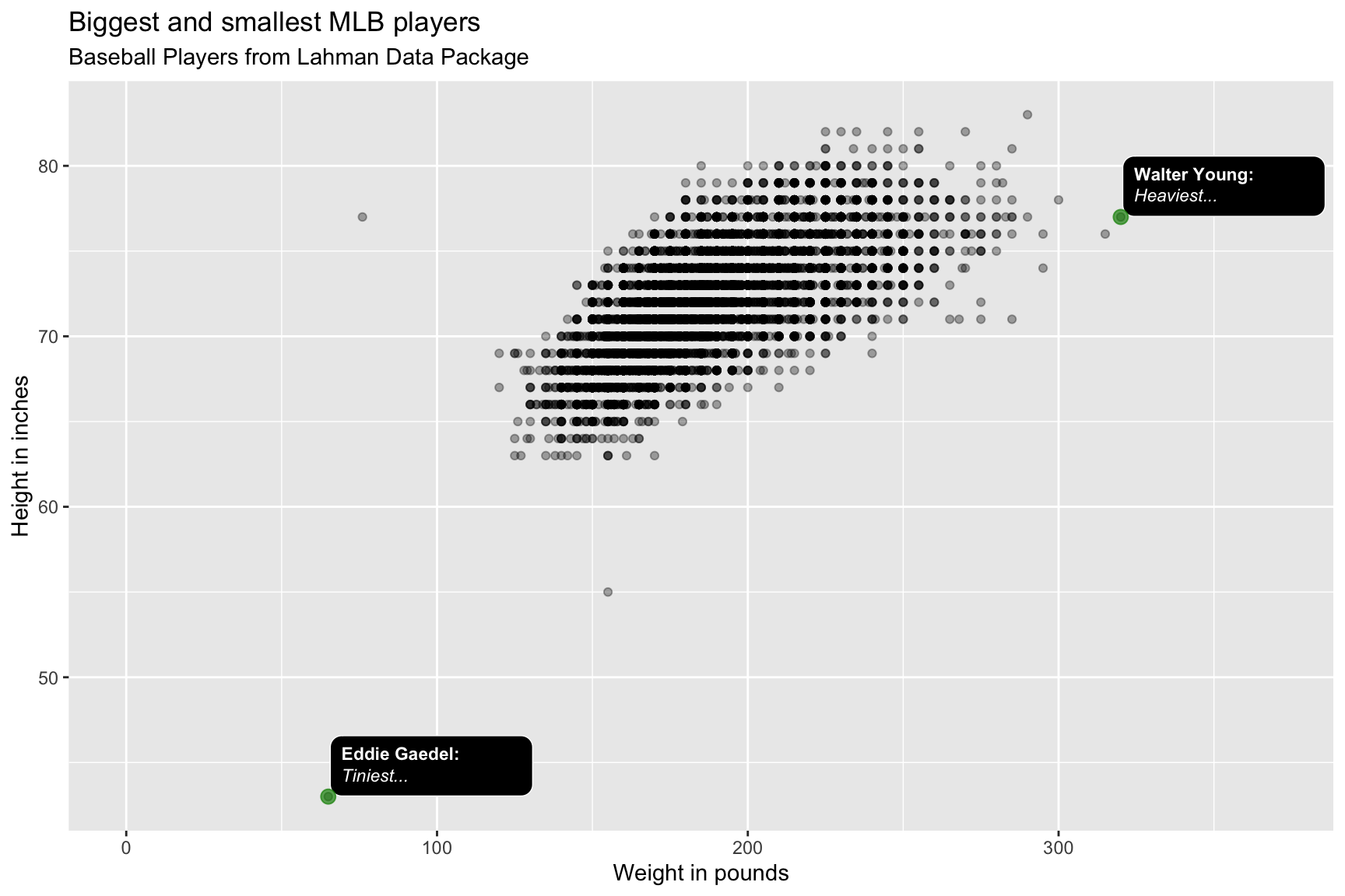
7.6.4 Short and tall players
BPShortTall7.6.5 exercise
Change the geom_textbox() layer by defining the following aesthetics in the ggtext::geom_textbox(aes()):
data=BPShortTall
hjust=-0.04
vjust=0.08
Add another geom_point() layer
- map
colorto"dodgerblue"
We want to ‘zoom in’ on the tallest and shortest players in the dataset, so we’ll adjust the x and y axes with scale_x_continuous() and scale_y_continuous():
set the
scale_x_continuous()limits to50and350set the
scale_y_continuous()limits to30and90
lab_bbp_tall_short <- labs(title = "Tallest and shortest MLB players",
                      subtitle = "Baseball Players from Lahman Data Package",
                      x = "Weight in pounds",
                      y = "Height in inches")
BPlayerData %>%
  ggplot(aes(x = weight,
             y = height)) +
  geom_point(alpha = 1/3) +
  ggtext::geom_textbox(data = ____________,
                       aes(label = outlier_label,
                           orientation = "upright",
                           hjust = ______,
                           vjust = ______,
                           fill = "black",
                           color = "white"),
                           size = 3,
                           width = unit(0.16, "npc")) +
  geom_point(data = ____________,
             aes(x = weight,
                 y = height),
                 size = 3,
                 color = "__________",
                 alpha = 2/3) +
  scale_discrete_identity(aesthetics = c("color",
                                         "fill",
                                         "orientation")) +
  scale_x_continuous(limits = c(__, ___)) +
  scale_y_continuous(limits = c(__, __)) +
  lab_bbp_tall_short
7.6.6 solution
lab_bbp_tall_short <- labs(title = "Tallest and shortest MLB players",
                      subtitle = "Baseball Players from Lahman Data Package",
                      x = "Weight in pounds",
                      y = "Height in inches")
BPlayerData %>%
  ggplot(aes(x = weight,
             y = height)) +
  geom_point(alpha = 1/3) +
  ggtext::geom_textbox(data = BPShortTall,
                       aes(label = outlier_label,
                           orientation = "upright",
                           hjust = -0.04,
                           vjust = 0.08,
                           fill = "black",
                           color = "white"),
                           size = 3,
                           width = unit(0.14, "npc")) +
  geom_point(data = BPShortTall,
             aes(x = weight,
                 y = height),
                 size = 3,
                 color = "dodgerblue",
                 alpha = 2/3) +
  scale_discrete_identity(aesthetics = c("color",
                                         "fill",
                                         "orientation")) +
  scale_x_continuous(limits = c(50, 350)) +
  scale_y_continuous(limits = c(30, 90)) +
  lab_bbp_tall_short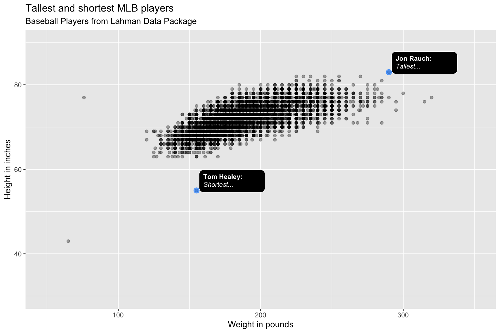
7.6.7 Lightest player?
The Lahman dataset lists Jacob Stallings as weighing 76 lbs, but baseball-reference lists his weight as 220lbs. We will include this label with different colors.
BPMaybeLightest7.6.8 exercise
Change the geom_textbox() layer by defining the following aesthetics in the ggtext::geom_textbox(aes()):
data=BPMaybeLightest
hjust=-0.05
vjust=-0.01
fill="darkred"
color="white"
Add another geom_point() layer
- map
colorto"firebrick"
We don’t need to adjust the axes on this graph.
lab_bbp_maybe_light <- labs(title = "Is Jacob Stallings the lightest player?",
                      subtitle = "Listed as 6-5, 220lb on baseball-reference.com",
                      x = "Weight in pounds",
                      y = "Height in inches",
                      caption = "https://www.baseball-reference.com/players/s/stallja01.shtml")
BPlayerData %>%
  ggplot(aes(x = weight,
             y = height)) +
  geom_point(alpha = 1/3) +
  ggtext::geom_textbox(data = ________________,
                       aes(label = outlier_label,
                           orientation = "upright",
                           hjust = _____,
                           vjust = _____,
                           fill = "________",
                           color = "white"),
                           size = 3,
                           width = unit(0.16, "npc")) +
  geom_point(data = ________________,
             aes(x = weight, y = height),
             size = 3,
             color = "__________",
             alpha = 2/3) +
  scale_discrete_identity(aesthetics = c("color", "fill", "orientation")) +
  lab_bbp_maybe_light
7.6.9 solution
See below:
lab_bbp_maybe_light <- labs(title = "Is Jacob Stallings the lightest player?",
                      subtitle = "Listed as 6-5, 220lb on baseball-reference.com",
                      x = "Weight in pounds",
                      y = "Height in inches",
                      caption = "https://www.baseball-reference.com/players/s/stallja01.shtml")
BPlayerData %>%
  ggplot(aes(x = weight,
             y = height)) +
  geom_point(alpha = 1/3) +
  ggtext::geom_textbox(data = BPMaybeLightest,
                       aes(label = outlier_label,
                           orientation = "upright",
                           hjust = -0.05,
                           vjust = -0.01,
                           fill = "darkred",
                           color = "white"),
                           size = 3,
                           width = unit(0.16, "npc")) +
  geom_point(data = BPMaybeLightest,
             aes(x = weight, y = height),
             size = 3,
             color = "firebrick",
             alpha = 2/3) +
  scale_discrete_identity(aesthetics = c("color", "fill", "orientation")) +
  lab_bbp_maybe_light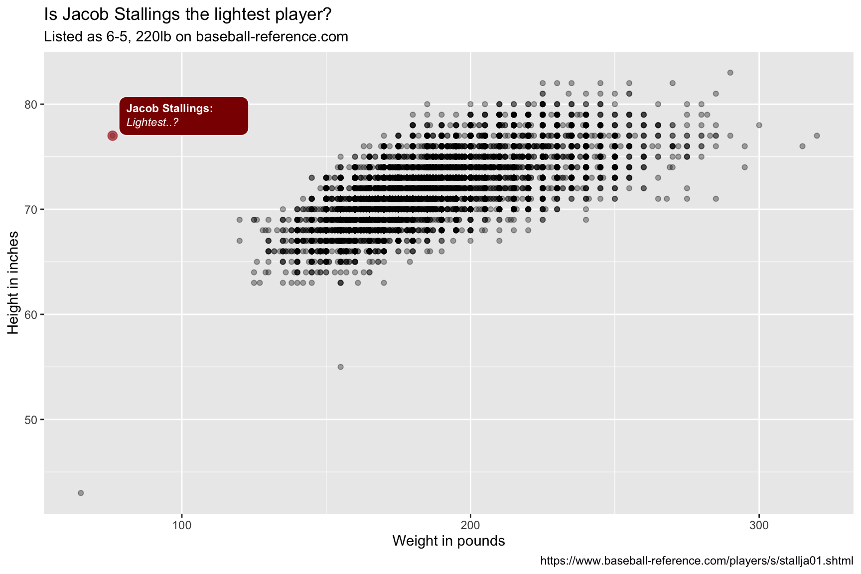
The colored points and textboxes highlight the outliers on the scatter plot.
8 Text placement
We’re going to be using the ggfittext package to add labels onto a bar (or column) graph. This comes in handy if space is limited, or we have
library(ggfittext)8.1 Data
8.1.1 exercise
Calculate the slugging percentage slug_perc from the Lahman::Batting table using the following code:
H - X2B - X3B - HR + 2 * X2B + 3 * X3B + 4 * HR) / AB
Also create the batting_era variable that cut()s the yearID into 7 different levels:
- “19th Century” (1871 to 1900) -> set to 1870 to include 1871
- “Dead Ball” (1901 to 1919)
- “Lively Ball” (1920 to 1941)
- “Integration” (1942 to 1960)
- “Expansion” (1961 to 1976)
- “Free Agency” (1977 to 1993)
- “Long Ball” (1993 to 2019) -> set to 2020 to include 2019
Note that cut() has a breaks argument that will actually take 8 levels.
BattingStats <- Lahman::Batting %>%
  mutate(slug_perc = (_ - ___ - ___ - __ +
                      _ * ___ + _ * ___ + _ * __) / __,
         batting_era = cut(yearID,
                   breaks = c(____, 1900, 1919, 1941,
                              1960, 1976, 1993, ____),
                   labels = c("____________ (1871 - 1900)",
                              "________ (1901 - 1919)",
                              "____________ (1920 - 1941)",
                              "__________ (1942 - 1976)",
                              "________ (1961 - 1976)",
                              "____________ (1977 - 1993)",
                              "__________ (1994 - 2019)")))
BattingStats %>%
  group_by(batting_era) %>%
  summarize(from = min(yearID),
            to = max(yearID))
8.1.2 solution
See below:
BattingStats <- Lahman::Batting %>%
  mutate(slug_perc = (H - X2B - X3B - HR +
                      2 * X2B + 3 * X3B + 4 * HR) / AB,
         batting_era = cut(yearID,
                   breaks = c(1870, 1900, 1919, 1941,
                              1960, 1976, 1993, 2020),
                   labels = c("19th Century (1871 - 1900)",
                              "Dead Ball (1901 - 1919)",
                              "Lively Ball (1920 - 1941)",
                              "Integration (1942 - 1976)",
                              "Expansion (1961 - 1976)",
                              "Free Agency (1977 - 1993)",
                              "Long Ball (1994 - 2019)")))
BattingStats %>%
  group_by(batting_era) %>%
  summarize(from = min(yearID),
            to = max(yearID))
8.1.3 exercise
Group by batting_era and summarize the mean of slug_perc, calling it avg_slug_perc. Remove the missing values with na.rm = TRUE.
SumBattingStats <- BattingStats %>%
  group_by(_________) %>%
  summarize(_________ = mean(_____, na.rm = ____))
SumBattingStats %>% str()
8.1.4 solution
See below:
SumBattingStats <- BattingStats %>%
  group_by(batting_era) %>%
  summarize(avg_slug_perc = mean(slug_perc, na.rm = TRUE))
SumBattingStats %>% str()
## tibble [7 × 2] (S3: tbl_df/tbl/data.frame)
## $ batting_era : Factor w/ 7 levels "19th Century (1871 - 1900)",..: 1 2 3 4 5 6 7
## $ avg_slug_perc: num [1:7] 0.291 0.264 0.304 0.281 0.272 ...8.2 Labels
Define the graph labels.
8.2.1 exercise
Define the graph labels below:
lab_bat_era <- labs(title = "Average slugging percentage by era",
                      subtitle = "Batting Statistics from ______ Data Package",
                      x = "___",
                      y = "Average Slugging Percentage")
8.2.2 solution
See below:
lab_bat_era <- labs(title = "Average slugging percentage by era",
                      subtitle = "Batting Statistics from Lahman Data Package",
                      x = "Era",
                      y = "Average Slugging Percentage")
8.3 Bar text
Now we’re ready for adding the text to the bars. In this case, the levels of batting_era aren’t equal, so we want to include the timeframe inside the bars to show the actual range of years.
8.3.1 exercise
Initiate a graph below by mapping batting_era to the x and the label, and avg_slug_perc to the y. Create a column (or bar) with geom_col(), flip the coordinate using coord_flip().
SumBattingStats %>%
  ggplot(aes(x = __________,
             y = __________,
             label = __________)) +
  geom____() +
  ___________() +
  lab_bat_era
8.3.2 solition
See below:
SumBattingStats %>%
  ggplot(aes(x = batting_era,
             y = avg_slug_perc,
             label = batting_era)) +
  geom_col() +
  coord_flip() +
  lab_bat_era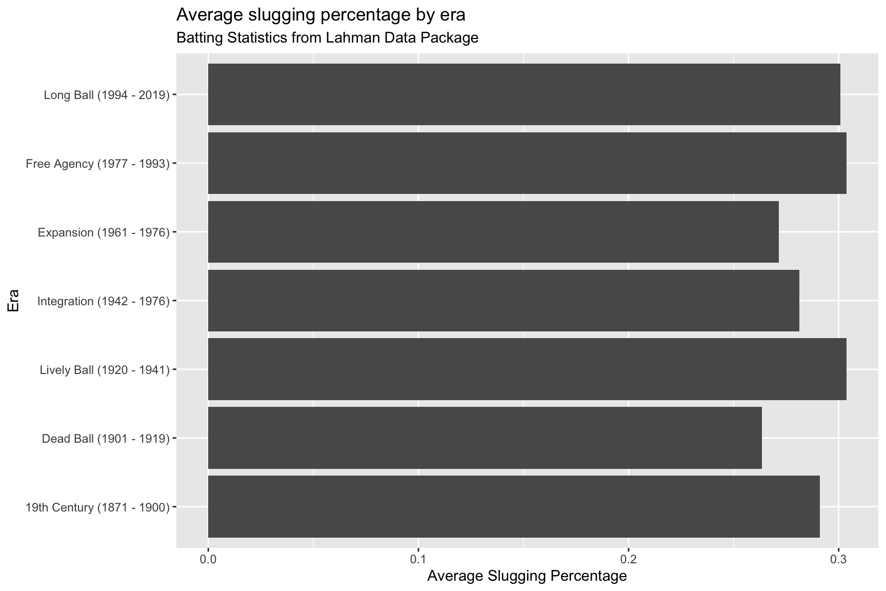
The text on the y axis is taking up a lot of space–we’re going to move this to inside the columns.
8.3.3 exercise
Add the geom_bar_text() to include labels on the columns. Use theme_bw(), but also remove the y axis text and ticks inside an additional theme() layer, using element_blank().
SumBattingStats %>%
  ggplot(aes(x = batting_era,
             y = avg_slug_perc,
             label = batting_era)) +
  geom_col() +
  coord_flip() +
  geom__________() +
  theme_bw() +
  theme(axis.____.y = element_blank(),
        axis._____.y = element_blank()) +
  coord_flip() +
  _____________() +
  lab_bat_era
8.3.4 solution
See below:
SumBattingStats %>%
  ggplot(aes(x = batting_era,
             y = avg_slug_perc,
             label = batting_era)) +
  geom_col() +
  coord_flip() +
  geom_bar_text() +
  theme_minimal() +
  theme(axis.text.y = element_blank(),
        axis.ticks.y = element_blank()) +
  lab_bat_era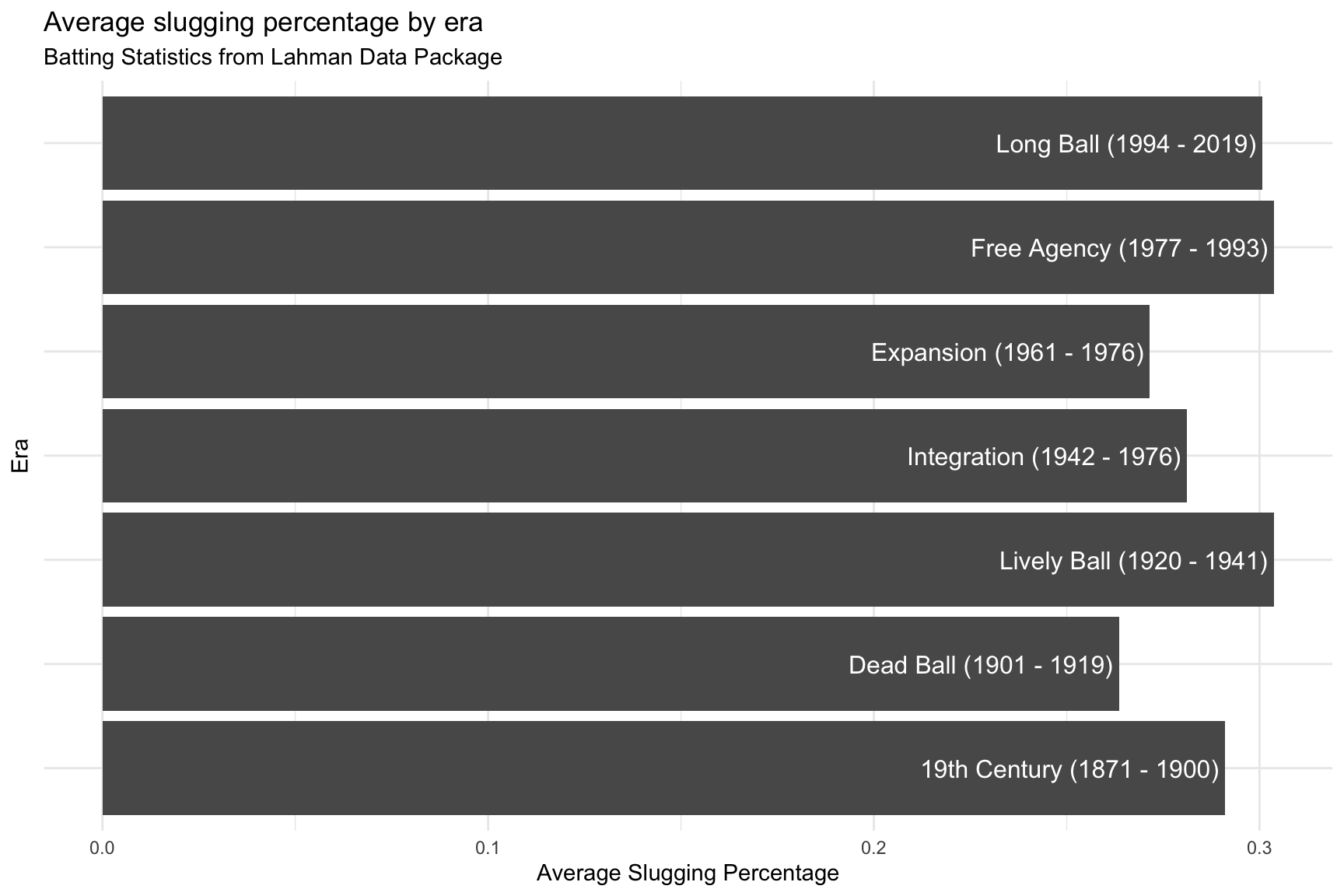
Now we have more ink (data) on the graph. The labels inside the columns also makes sense because these aren’t equal year intervals.
9 Distributions
We previously explored variable distributions using histograms, density and violin plots, and ridgeline plots from the ggridges package.
In this section, we’re going to cover some advanced variable distribution graphs using the ggdist package. We’ll also need some help from the broom and distributional packages. The ggdist package requires a little more underlying knowledge about modeling in R, and I invite you to read the entire vignette for more information.
library(ggdist)
library(broom)
library(distributional)
9.1 Data
We’re going to be using TidyTuesday’s dataset on penguins. We can load these data below:
penguin_data <- tidytuesdayR::tt_load('2020-07-28')##
## Downloading file 1 of 2: `penguins.csv`
## Downloading file 2 of 2: `penguins_raw.csv`Penguins <- penguin_data$penguins9.1.1 Penguins data
We can view the data with skimr::skim()
Penguins %>% skimr::skim()| Name | Piped data |
| Number of rows | 344 |
| Number of columns | 8 |
| _______________________ | |
| Column type frequency: | |
| character | 3 |
| numeric | 5 |
| ________________________ | |
| Group variables | None |
Variable type: character
| skim_variable | n_missing | complete_rate | min | max | empty | n_unique | whitespace |
|---|---|---|---|---|---|---|---|
| species | 0 | 1.00 | 6 | 9 | 0 | 3 | 0 |
| island | 0 | 1.00 | 5 | 9 | 0 | 3 | 0 |
| sex | 11 | 0.97 | 4 | 6 | 0 | 2 | 0 |
Variable type: numeric
| skim_variable | n_missing | complete_rate | mean | sd | p0 | p25 | p50 | p75 | p100 | hist |
|---|---|---|---|---|---|---|---|---|---|---|
| bill_length_mm | 2 | 0.99 | 43.92 | 5.46 | 32.1 | 39.23 | 44.45 | 48.5 | 59.6 | ▃▇▇▆▁ |
| bill_depth_mm | 2 | 0.99 | 17.15 | 1.97 | 13.1 | 15.60 | 17.30 | 18.7 | 21.5 | ▅▅▇▇▂ |
| flipper_length_mm | 2 | 0.99 | 200.92 | 14.06 | 172.0 | 190.00 | 197.00 | 213.0 | 231.0 | ▂▇▃▅▂ |
| body_mass_g | 2 | 0.99 | 4201.75 | 801.95 | 2700.0 | 3550.00 | 4050.00 | 4750.0 | 6300.0 | ▃▇▆▃▂ |
| year | 0 | 1.00 | 2008.03 | 0.82 | 2007.0 | 2007.00 | 2008.00 | 2009.0 | 2009.0 | ▇▁▇▁▇ |
9.1.2 Data dictionary
The description of each variable in Penguins is below.
| variable | class | description |
|---|---|---|
species |
integer | Penguin species (Adelie, Gentoo, Chinstrap) |
island |
integer | Island where recorded (Biscoe, Dream, Torgersen) |
bill_length_mm |
double | Bill length in millimeters (also known as culmen length) |
bill_depth_mm |
double | Bill depth in millimeters (also known as culmen depth) |
flipper_length_mm |
integer | Flipper length in mm |
body_mass_g |
integer | Body mass in grams |
sex |
integer | sex of the animal |
year |
integer | year recorded |
9.2 Scatter plot
We will start by looking at body mass of the three species in the Penguins dataset.
9.2.1 exercise
Build the labels for a scatter plot of body_mass_g on the x axis, and species on the y
lab_peng_scatter <- labs(title = "Relationship between body mass and species",
                     subtitle = "Data from the palmerpenguins package",
                     x = "___________",
                     y = "_______",
                     caption = "https://allisonhorst.github.io/palmerpenguins/")
9.2.2 solution
See below:
lab_peng_scatter <- labs(title = "Relationship between body mass and species",
                     subtitle = "Data from the palmerpenguins package",
                     x = "Body mass (g)",
                     y = "Species",
                     caption = "https://allisonhorst.github.io/palmerpenguins/")
9.2.3 exercise
Create a scatter plot using the labels we built above. Set the alpha to 1/2.
Penguins %>%
  ggplot(aes(x = __________, y = ________)) +
  geom_point(alpha = 1/2) +
  lab_peng_scatter
9.2.4 solution
See below:
Penguins %>%
  ggplot(aes(x = body_mass_g, y = species)) +
  geom_point(alpha = 1/2) +
  lab_peng_scatter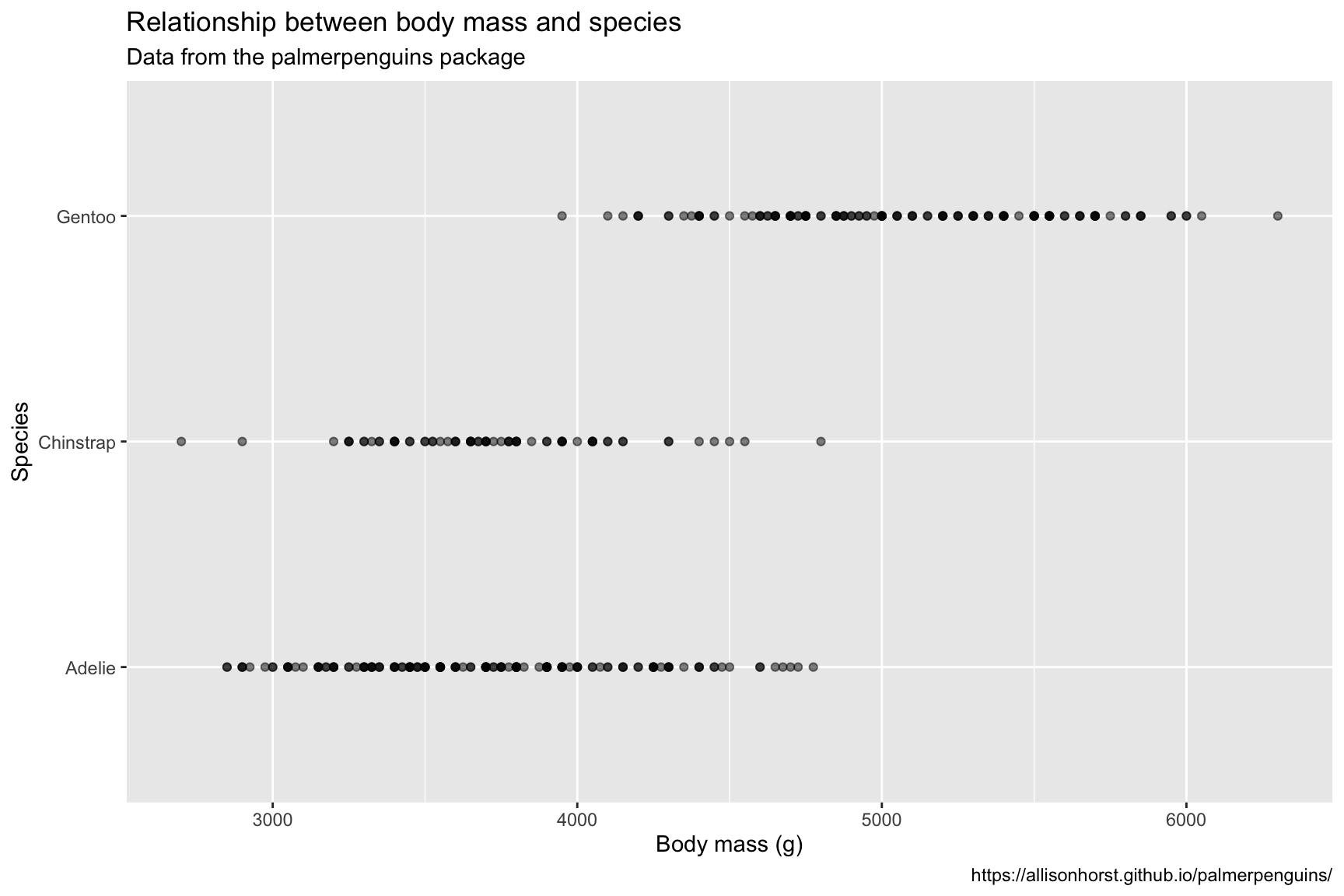
9.3 Create linear model
The graph above doesn’t show much in terms of the probability distributions for body mass across the different levels of species, so we will build a linear model to include additional terms (estimate and std.error) for each level of the distribution on the graph.
9.3.1 exercise
We will use the lm() function to create a linear model predicting body_mass_g with species.
lmmod_penguins <- lm(___________ ~ _______, data = Penguins) 9.3.2 solution
See below:
lmmod_penguins <- lm(body_mass_g ~ species, data = Penguins)
summary(lmmod_penguins)
##
## Call:
## lm(formula = body_mass_g ~ species, data = Penguins)
##
## Residuals:
## Min 1Q Median 3Q Max
## -1126.02 -333.09 -33.09 316.91 1223.98
##
## Coefficients:
## Estimate Std. Error t value Pr(>|t|)
## (Intercept) 3700.66 37.62 98.37 <2e-16 ***
## speciesChinstrap 32.43 67.51 0.48 0.631
## speciesGentoo 1375.35 56.15 24.50 <2e-16 ***
## ---
## Signif. codes:
## 0 '***' 0.001 '**' 0.01 '*' 0.05 '.' 0.1 ' ' 1
##
## Residual standard error: 462.3 on 339 degrees of freedom
## (2 observations deleted due to missingness)
## Multiple R-squared: 0.6697, Adjusted R-squared: 0.6677
## F-statistic: 343.6 on 2 and 339 DF, p-value: < 2.2e-169.4 Tidy model output
The typical output from the summary(lmmod_penguins) is not very helpful from a graphing standpoint, so we will use the broom package to make it easier to manipulate.
9.4.1 exercise
Pass the output of lm() to broom::tidy() to convert the model statistics into a tibble.
______________ %>% broom::tidy()9.4.2 solution
See below:
lmmod_penguins %>% broom::tidy()9.5 Plot probability distribution
We can now use the columns from broom::tidy() to build a graph of the probability distributions.
9.5.1 exercise
Fill in the following labels:
title = "Probability distribution of body mass by species"
x = "Student T distribution"
y = "Model Term"
lab_prob_dist <- labs(title = "_______________________________________________",
                     subtitle = "Data from the palmerpenguins package",
                     x = "________________________",
                     y = "__________________",
                     caption = "https://allisonhorst.github.io/palmerpenguins/")
9.5.2 solution
See below:
lab_prob_dist <- labs(title = "Probability distribution of body mass by species",
                     subtitle = "Data from the palmerpenguins package",
                     x = "Student T distribution",
                     y = "Model Term",
                     caption = "https://allisonhorst.github.io/palmerpenguins/")
9.5.3 exercise
Use the ggdist::stat_dist_halfeye() to map the dist aesthetic with some help from the distributional::dist_student_t() function.
- map
df.residual(lmmod_penguins)todfinside thedist_student_t()function
- map
estimatetomuinside thedist_student_t()function
- map
std.errortosigmainside thedist_student_t()function
We’ve extended the x axis with scale_x_continuous() for clarity.
Penguins %>%
  lm(body_mass_g ~ species, data = .) %>%
  broom::tidy() %>%
  ggplot(aes(y = term)) +
  ggdist::_______________(
    aes(dist = distributional::______________(df = df.residual(___________),
                                              mu = _________,
                                              sigma = ___________))) +
  scale_x_continuous(limits = c(-400, 4400)) +
  lab_prob_dist
9.5.4 solution
See below:
Penguins %>%
  lm(body_mass_g ~ species, data = .) %>%
  broom::tidy() %>%
  ggplot(aes(y = term)) +
  ggdist::stat_dist_halfeye(
    aes(dist = distributional::dist_student_t(df = df.residual(lmmod_penguins),
                                              mu = estimate,
                                              sigma = std.error))) +
  scale_x_continuous(limits = c(-400, 4400)) +
  lab_prob_dist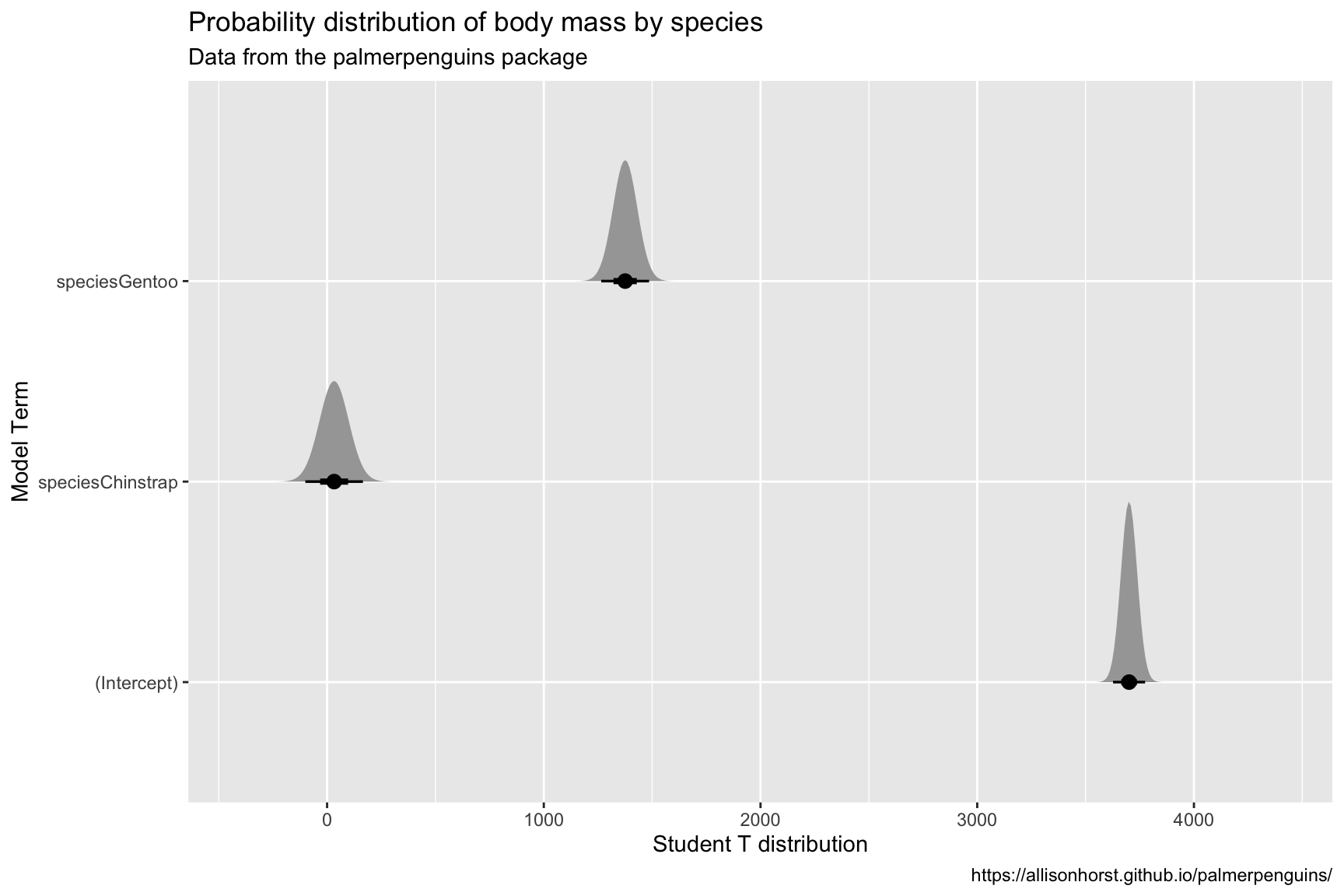
10 Using color
ggplot2 has many options for picking the colors on your graph. We’re going to cover the khroma and wesanderson color packages in this section.
library(wesanderson)
library(khroma)
10.1 Data
We’re going to be graphing the starwarsdb package. Below is a relational model for the tables in the package.
library(dm, warn.conflicts = FALSE)
sw_dm <- starwars_dm()
dm_draw(sw_dm)
We covered joins in a previous lesson. Below we will create a dataset with variables from the people, planets, species, and pilots tables.
10.1.1 exercise
Use an inner_join() to connect people to planets by "homeworld" and "name"
SWPeopPlan <- starwarsdb::people %>%
  ____________(x = ., y = starwarsdb::planets, by = c("_________" = "____"))
SWPeopPlan
10.1.2 solution
See below:
SWPeopPlan <- starwarsdb::people %>%
  inner_join(x = ., y = starwarsdb::planets, by = c("homeworld" = "name"))
SWPeopPlan
10.1.3 exercise
Use
select()to removehomeworldfromspeciesinner_join()to connectspeciestoSWPeopPlanby"name"and"species".Use the
suffixargument to keep track of the variables original location by supplyingc("_species", "_people").rename()thenamevariable asspecies_name.Use another
inner_join()to add thevehiclecolumn frompilots, joiningbythe"name_people" = "pilot".select()only thename_people,height,mass,sex,homeworld,gravity,terrain,population,species_name,average_height,classification,average_lifespan, andvehiclecolumnsFinally, change
populationto anintegervalue withmutate()
starwarsdb::species %>%
  select(-_________) %>%
  _________(x = ., y = SWPeopPlan,
             by = c("name" = "species"),
             suffix = c("_________", "_________")) %>%
  rename(_________ = name) %>%
  inner_join(x = ., y = starwarsdb::pilots,
             by = c("name_people" = "_________")) %>%
  select(_________,
         _________,
         _________,
         _________,
         _________,
         _________,
         _________,
         _________,
         _________,
         _________,
         _________,
         _________,
         _________) %>%
  _________(population = as.integer(population)) -> SWDBData
10.1.4 solution
See below:
starwarsdb::species %>%
  select(-homeworld) %>%
  inner_join(x = ., y = SWPeopPlan,
             by = c("name" = "species"),
             suffix = c("_species", "_people")) %>%
  rename(species_name = name) %>%
  inner_join(x = ., y = starwarsdb::pilots,
             by = c("name_people" = "pilot")) %>%
  select(name_people,
         height,
         mass,
         sex,
         homeworld,
         gravity,
         terrain,
         population,
         species_name,
         average_height,
         classification,
         average_lifespan,
         vehicle) %>%
  mutate(population = as.integer(population),
         average_lifespan = as.integer(average_lifespan)) -> SWDBData
SWDBData
10.2 Viewing color scales
Before we start building a graph, we should take a look at the available colors each package and palette.
10.2.1 wesanderson
Check the names of the palettes in the wesanderson package using names(wes_palettes).
names(wes_palettes)## [1] "BottleRocket1" "BottleRocket2" "Rushmore1"
## [4] "Rushmore" "Royal1" "Royal2"
## [7] "Zissou1" "Darjeeling1" "Darjeeling2"
## [10] "Chevalier1" "FantasticFox1" "Moonrise1"
## [13] "Moonrise2" "Moonrise3" "Cavalcanti1"
## [16] "GrandBudapest1" "GrandBudapest2" "IsleofDogs1"
## [19] "IsleofDogs2"10.2.2 exercise
We can view the colors using wes_palette("name of palette").
View the "IsleofDogs1" palette below:
wes_palette("____________")10.2.3 solution
See below:
wes_palette("IsleofDogs1")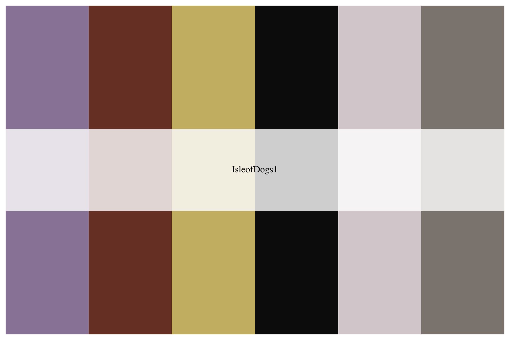
10.2.4 exercise
View the "FantasticFox1" palette below:
wes_palette("_____________")10.2.5 solution
See below:
wes_palette("FantasticFox1")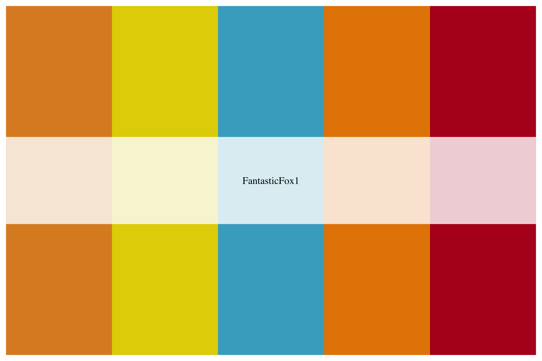
10.2.6 khroma
View the available khroma package using the following syntax:
First we define the
colour()orcolor()with a text string (i.e."vibrant") and store in an output (i.e.vibrant).Then we use the
plot_scheme()function, which takes the output fromcolour()(in this case,vibrant) along with the number of colors we want displayed from that particular scheme in parentheses (each scheme has an upper limit of colors). It looks likevibrant(7).Additional arguments include
coloursandnames(which we set toTRUE) andsize(which we set to0.9).
See the example below for reference.
# set palette
vibrant <- colour("vibrant")
# plot the color scheme
plot_scheme(vibrant(7), colours = TRUE, names = TRUE, size = 0.9)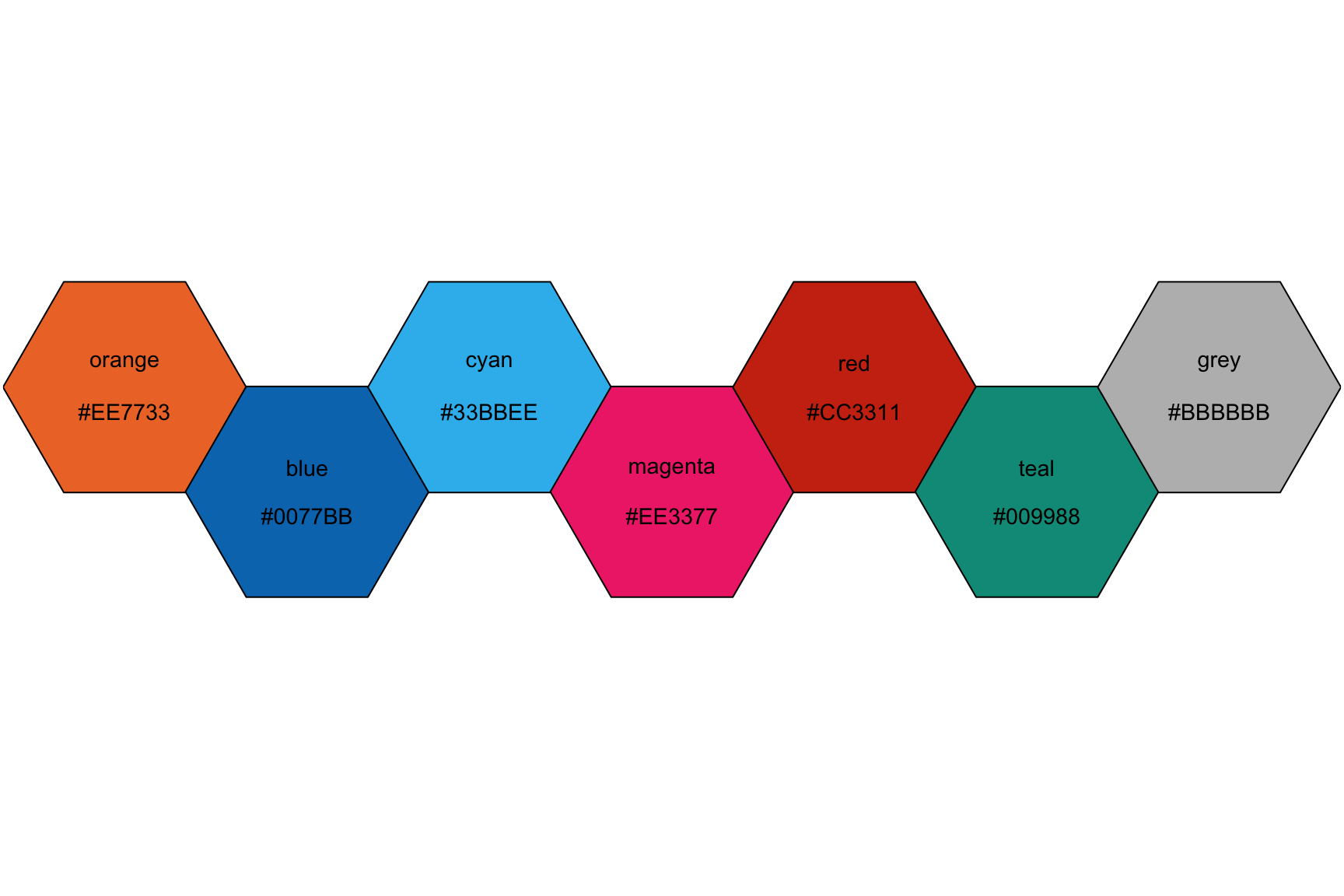
10.2.7 exercise
View the colors in the "bright" scheme, setting the number of different colors to 6.
bright <- colour("______")
plot_scheme(bright(_), colours = TRUE, names = TRUE, size = 0.9)
10.2.8 solution
See below:
bright <- colour("bright")
plot_scheme(bright(6), colours = TRUE, names = TRUE, size = 0.9)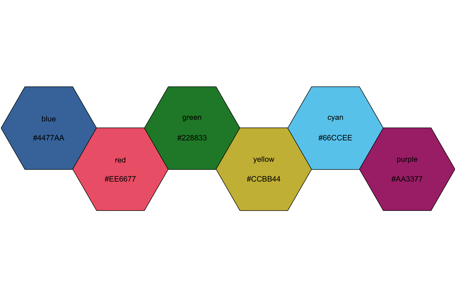
10.3 Coloring bars and columns
Now we’re going to build a few bar and column graphs using the color palettes we’ve outlined above. Bar and column graphs are great for showing amounts (or counts) of data. An important distinction between the geom_bar() and geom_col() is the that the geom_bar() only maps a single x variable, while the geom_col() can map both x and y variables.
10.3.1 exercise
I’ve defined the labels for the graph below. Use them to guide you in building a column graph for the number of species present in the SWDBData pilots data.
Fill the columns by
species_nameAdd the
khroma::scale_fill_light()layer after thegeom_bar()(but before the labels)
lab_species_swdb <- labs(title = "Species of the Pilots in Star Wars",
                         subtitle = "Species for pilot characters",
                         x = "Species",
                         y = "Count",
                         caption = "Data from starwarsdb package",
                         fill = "Species")
SWDBData %>%
  ggplot(aes(x = ___________,
             fill = ___________)) +
    geom_bar(show.legend = FALSE) +
    khroma::____________________() +
    lab_species_swdb
10.3.2 solution
See below. Note that the fill aesthetic is matched with a scale_fill_light() function.
lab_species_swdb <- labs(title = "Species of the Pilots in Star Wars",
                         subtitle = "Species for pilot characters",
                         x = "Species",
                         y = "Count",
                         caption = "Data from starwarsdb package",
                         fill = "Species")
SWDBData %>%
  ggplot(aes(x = species_name,
             fill = species_name)) +
    geom_bar(show.legend = FALSE) +
    khroma::scale_fill_light() +
    lab_species_swdb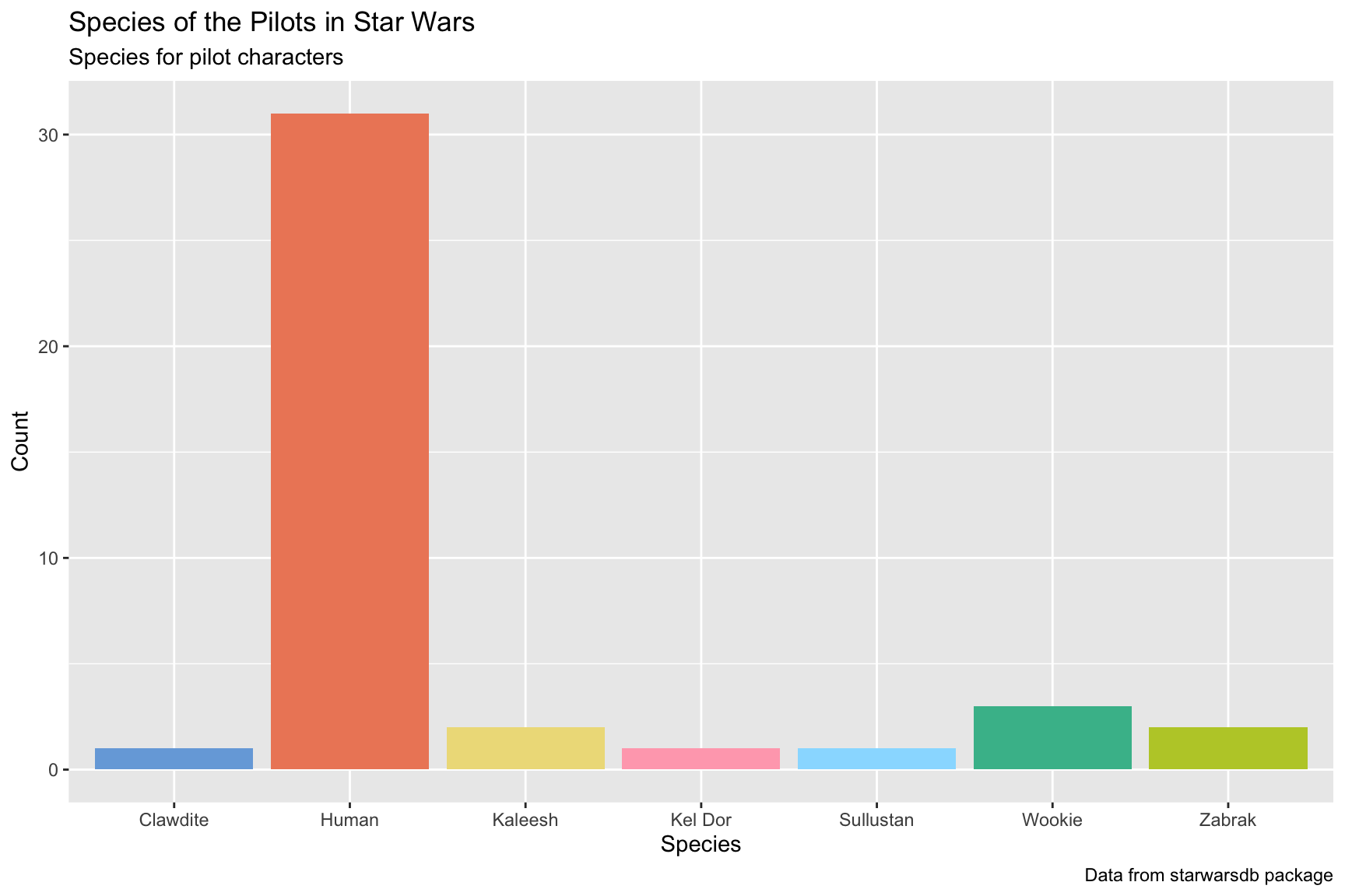
10.3.3 exercise
We are going to reorganize the bars in the previous graph according to the values on the y axis. In order to reorganize our graph, we need a column of counts. Do this with dplyr::count(), sorting the output and naming the new column "counts".
Reordering the
xaxis is accomplished with theforcats::fct_reorder()function, which takes.f(the factor or character variable we’re reordering:species_name) and.x(the numerical variable we want to use to reorder the factor or character variable:counts).We need to switch from using a
geom_bar()to ageom_col(), because we need to map anxandyvariable.Swap the
khroma::scale_fill_light()function forkhroma::scale_fill_bright()
lab_species_swdb <- labs(title = "Species of the Pilots in Star Wars",
                         subtitle = "Species for pilot characters",
                         x = "Species",
                         y = "Count",
                         caption = "Data from starwarsdb package",
                         fill = "Species")
SWDBData %>%
  # here we count species_name and give the new variable name
  dplyr::count(name = "_______", species_name, sort = ____) %>%
  ggplot(aes(x = forcats::fct_reorder(.f = ___________, .x = ______),
             y = counts,
             fill = species_name)) +
    geom____(show.legend = FALSE) +
    khroma::___________________() +
    lab_species_swdb
10.3.4 solution
See below. Note that we’ve organized the x axis according to the values on the y. Which color scheme do you prefer?
lab_species_swdb <- labs(title = "Species of the Pilots in Star Wars",
                         subtitle = "Species for pilot characters",
                         x = "Species",
                         y = "Count",
                         caption = "Data from starwarsdb package",
                         fill = "Species")
SWDBData %>%
  # here we count species_name and give the new variable name
  count(name = "counts", species_name, sort = TRUE) %>%
  ggplot(aes(x = forcats::fct_reorder(.f = species_name, .x = counts),
             y = counts,
             fill = species_name)) +
    geom_col(show.legend = FALSE) +
    khroma::scale_fill_bright() +
    lab_species_swdb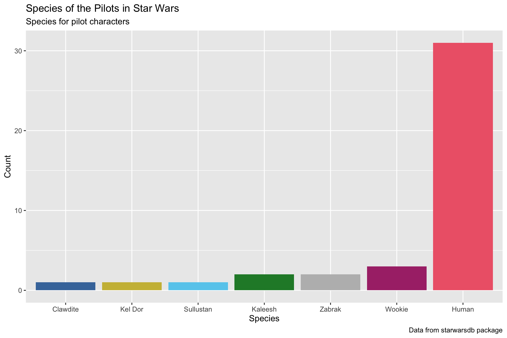
10.3.5 exercise
Now we’re going to use a palette from the wesanderson package.
- Complete the labels with the following arguments:
x = "Species"
y = "Average lifespan"
Wrangle the data:
+ select() the species_name and average_lifespan
+ Remove missing values with tidyr::drop_na()
+ Get only the distinct combinations of species_name and average_lifespan using dplyr::distinct()
Initiate a graph and map the global positions: + reorder species_name on the x axis according to the descending values of average_lifespan
+ y as average_lifespan, and
+ fill as species_name
Add a geom_col() layer and set show.legend to FALSE
Add the scale_fill_manual() layer, and specify the values argument to wes_palette("IsleofDogs2")
lab_spec_lfspn_class <- labs(title = "Average lifespan by species",
                             x = "_______",
                             y = "_________ _________",
                             caption = "Data from starwarsdb package")
SWDBData %>%
  dplyr::select(____________, ________________) %>%
  tidyr::______() %>%
  dplyr::________() %>%
  ggplot(aes(x = forcats::fct_reorder(.f = ____________,
                                      .x = desc(________________)),
             y = ________________,
             fill = ____________)) +
  geom_col(___________ = ____) +
  scale_fill_manual(values = wes_palette("_____________")) +
  lab_spec_lfspn_class
10.3.6 solution
See below. Note the different position of the columns compared to the previous graph.
lab_spec_lfspn_class <- labs(title = "Average lifespan by species",
                             x = "Species",
                             y = "Average lifespan",
                             caption = "Data from starwarsdb package")
SWDBData %>%
  dplyr::select(species_name, average_lifespan) %>%
  tidyr::drop_na() %>%
  dplyr::distinct() %>%
  ggplot(aes(x = forcats::fct_reorder(.f = species_name,
                                      .x = desc(average_lifespan)),
             y = average_lifespan,
             fill = species_name)) +
  geom_col(show.legend = FALSE) +
  scale_fill_manual(values = wes_palette("IsleofDogs2")) +
  lab_spec_lfspn_class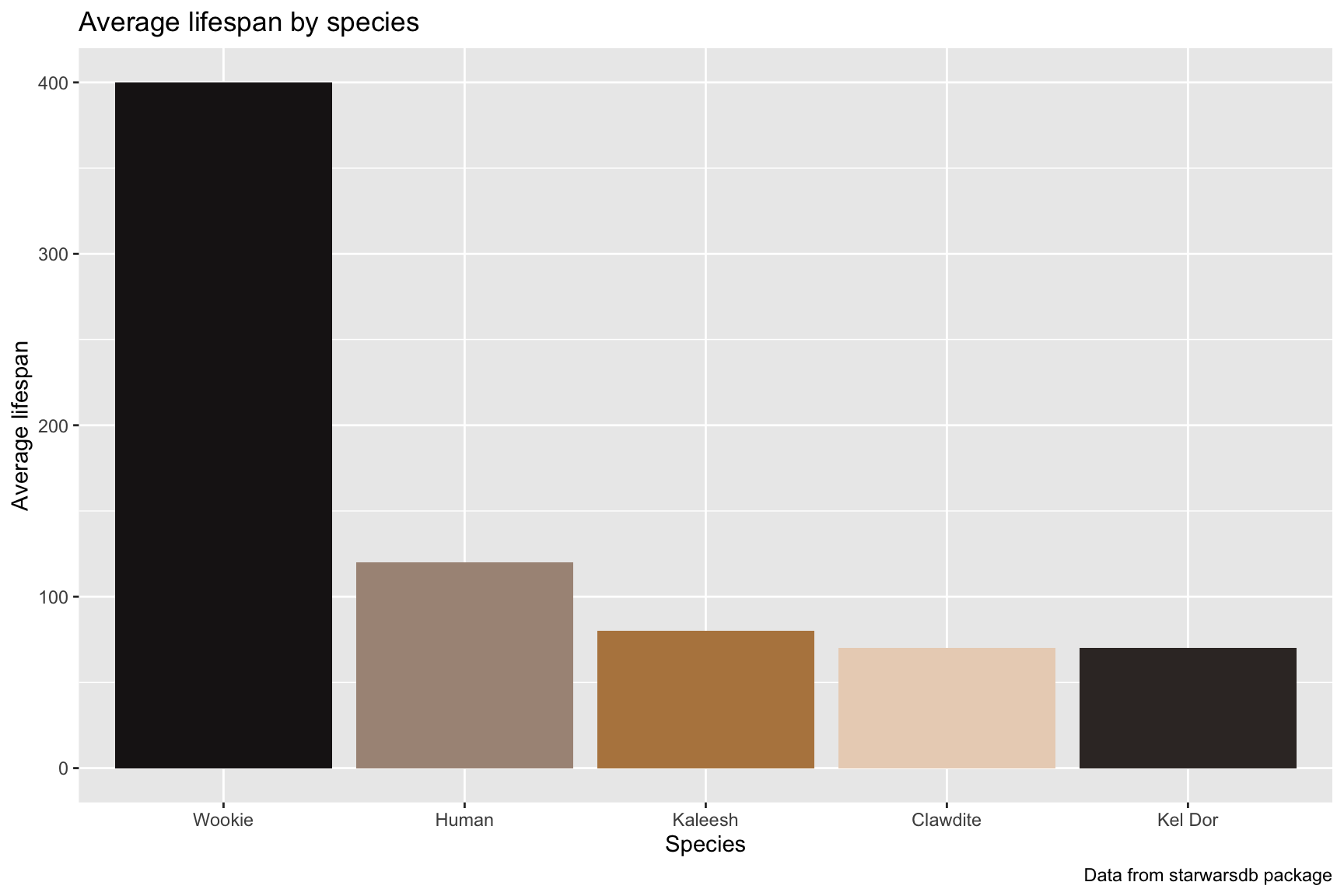
10.4 Position and color
The previous graphs introduced two packages for choosing alternative colors. In this section, we’re going to extend the color selection to other geoms, and include considerations for people with color-vision deficiencies.
10.4.1 May the force be with you…
The code below filters the SWDBData data to only the height and weight for those characters who were “force sensitive” (either Jedi or Sith).
SWDBData %>%
  filter(name_people %in% c("Anakin Skywalker", "Dooku",
                            "Obi-Wan Kenobi", "Plo Koon",
                            "Luke Skywalker", "Leia Organa",
                            "Darth Vader", "Darth Maul")) %>%
  select(name_people, height, mass) %>%
  distinct() -> SWDBForcePilots
SWDBForcePilots
10.4.2 exercise
We’re going to build another column graph, and reorder the x axis by the mass variable.
- map
name_people(reordered bymass)
- map
massto theyvariable
- map
filltoname_people - add a
scale_fill_muted()layer to set the colors
lab_ht_wt_cols <- labs(title = "Force and mass in Star Wars",
                       subtitle = "Mass of force sensitive characters",
                       caption = "source: https://starwars.fandom.com/wiki/",
                       x = "Character",
                       y = "Mass")
SWDBForcePilots %>%
  ggplot(aes(x = fct_reorder(.f = ___________,
                             .x = ____),
             y = ____,
             fill = ___________)) +
  geom_col(show.legend = FALSE) +
  ____________________() +
  lab_ht_wt_cols
10.4.3 solution
See the solution below. Notice how the text along the x axis is difficult to read.
lab_ht_wt_cols <- labs(title = "Force and mass in Star Wars",
                       subtitle = "Mass of force sensitive characters",
                       caption = "source: https://starwars.fandom.com/wiki/",
                       x = "Character",
                       y = "Mass")

SWDBForcePilots %>%
  ggplot(aes(x = fct_reorder(.f = name_people,
                             .x = mass),
             y = mass,
             fill = name_people)) +
  geom_col(show.legend = FALSE) +
  scale_fill_muted() +
  lab_ht_wt_cols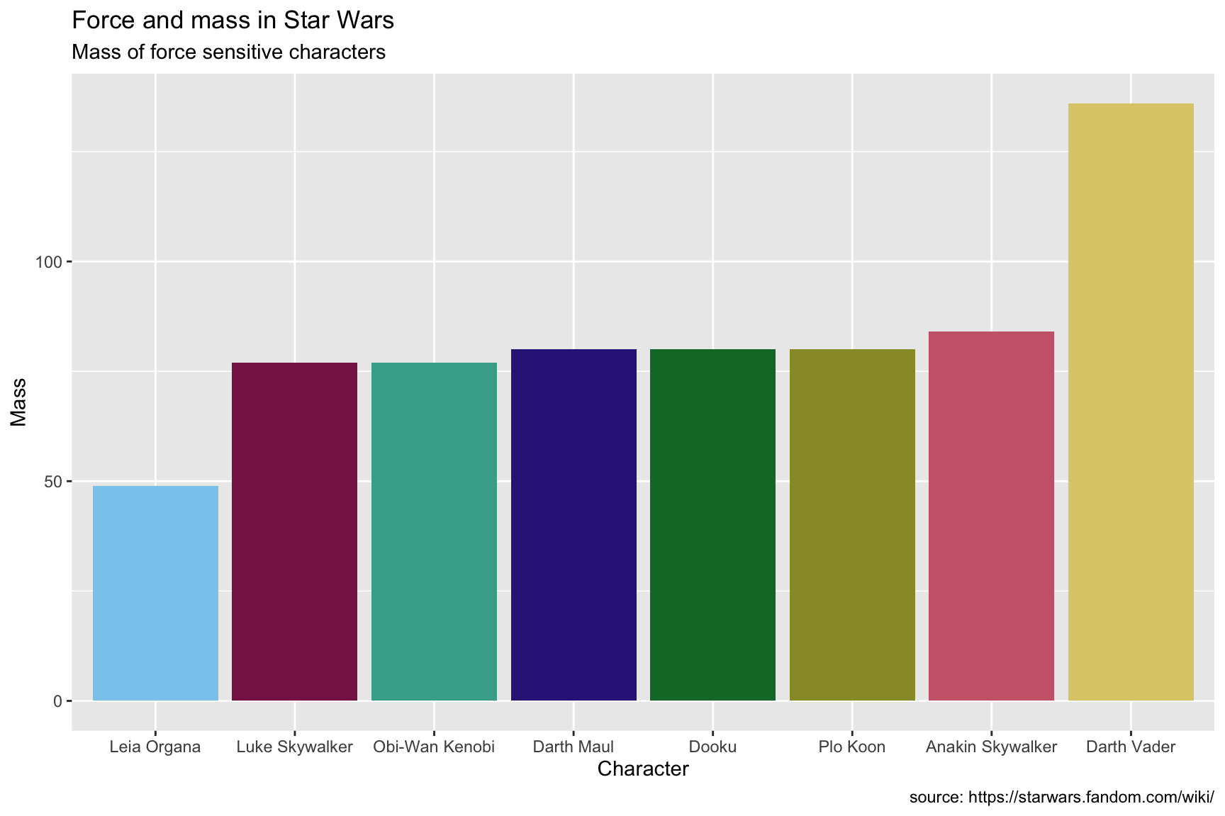
10.4.4 exercise
Use the Okabe Ito scale if you’re presenting graphs to a broad audience, because it’s specifically designed for color-blindness.
add a
coord_flip()layer to deal with thexaxisadd the
scale_fill_okabeito()layer
SWDBForcePilots %>%
  ggplot(aes(x = fct_reorder(.f = name_people,
                             .x = mass),
             y = mass,
             fill = name_people)) +
  geom_col(show.legend = FALSE) +
  __________() +
  ___________________() +
  lab_ht_wt_cols
10.4.5 solution
See below:
SWDBForcePilots %>%
  ggplot(aes(x = fct_reorder(.f = name_people,
                             .x = mass),
             y = mass,
             fill = name_people)) +
  geom_col(show.legend = FALSE) +
  coord_flip() +
  scale_fill_okabeito() +
  lab_ht_wt_cols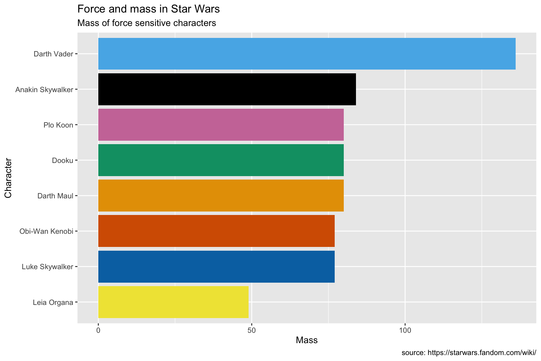
10.4.6 columns vs. points
Sometimes it’s better to pick a different aesthetic when presenting a continuous variable across a categorical variable. Below we replace the columns with shapes, and use color as an additional aesthetic to distinguish the different species of mammals.
We have to manually set the color scales here using the hex codes for the Okabe-Ito scale, but we can make things more exciting by randomly assigning the color values to the shapes in the plot.
okabe_scale <- c("#E69F00", "#56B4E9", "#009E73", "#F0E442",
                 "#0072B2", "#D55E00", "#CC79A7")
sample(x = okabe_scale, size = 4, replace = FALSE)
## [1] "#F0E442" "#D55E00" "#0072B2" "#E69F00"We also add the theme_bw() layer to reduce some of the excess chart elements.
lab_mammal_ht <- labs(title = "Human aren't flightless mammals in Star Wars",
                       subtitle = "Heights of all mammal Star Wars pilots",
                       caption = "source: https://starwars.fandom.com/wiki/",
                       x = "Pilot",
                       y = "Height")

SWDBData %>%
  filter(classification == "mammal") %>%
  ggplot(aes(x = fct_reorder(.f = name_people,
                             .x = height),
             y = height,
             color = species_name,
             fill = species_name,
             shape = species_name)) +
  geom_point(size = 3) +
  coord_flip() +
  scale_shape_manual(name = "Species",
                     values = 21:24) +
  scale_color_manual(name = "Species",
                     values = sample(x = okabe_scale,
                                     size = 4,
                                     replace = FALSE)) +
  scale_fill_manual(name = "Species",
                    values = sample(x = okabe_scale,
                                    size = 4,
                                    replace = FALSE)) +
  theme_bw() +
  lab_mammal_ht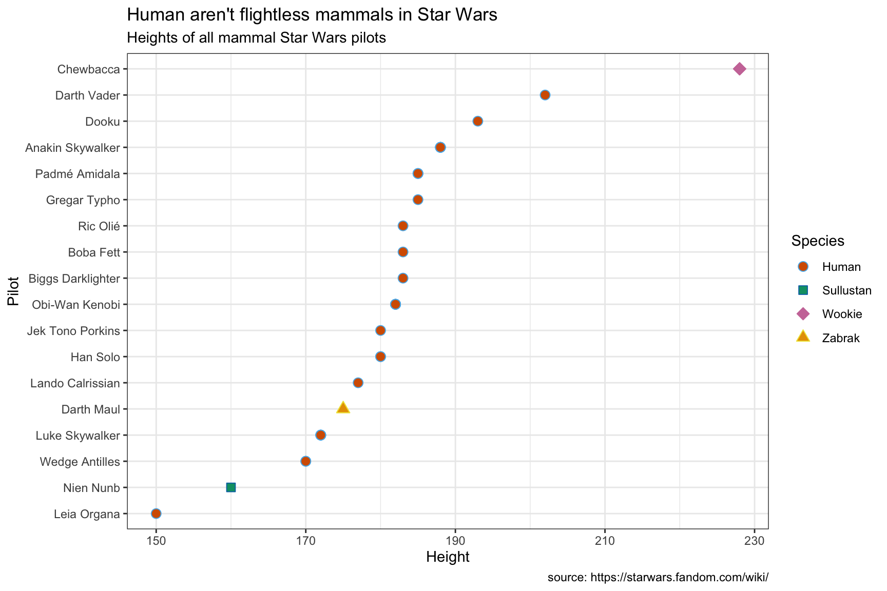
11 Advanced Interactivity
plotly coming soon!!
11.0.1 exercise
plotly coming soon!!
11.0.2 solution
See below:
11.0.3 exercise
plotly coming soon!!
11.0.4 solution
See below:
11.0.5 exercise
plotly coming soon!!
11.0.6 solution
See below:
12 Advanced Animations
gganimate coming soon!!
12.0.1 exercise
gganimate coming soon!!
12.0.2 solution
See below:
12.0.3 exercise
gganimate coming soon!!
12.0.4 solution
See below:
12.0.5 exercise
gganimate coming soon!!
12.0.6 solution
See below: