Data Visualization with ggplot2
ODSC West: https://bit.ly/odscw-ggp2
Exploration requires a Bayesian Mindset (1 of 3)
We all have implicit beliefs, or priors, about the world
What we think we know (i.e.,our expectations)

Exploration requires a Bayesian Mindset (2 of 3)
When we encounter new information or data, our priors get updated
Our expectations + new data (i.e., what we see)

Exploration requires a Bayesian Mindset (3 of 3)
Our updated beliefs, or posteriors, depend on our priors and our perceptions of the new information
What we expect + what we see = what we’ve learned

Graphs can confirm our expectations
What if our expectation was that X is related to Y?
…then we graphed the data…
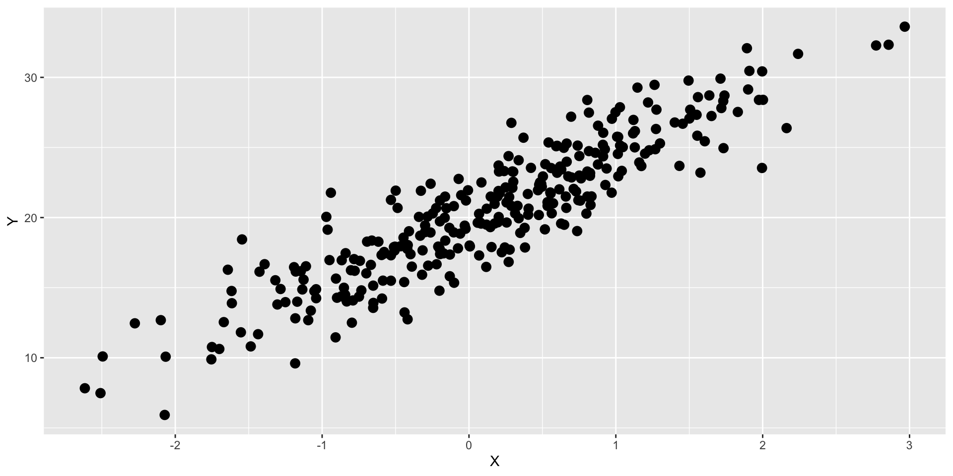
We would say our expectations have been confirmed
Graphs can refute our expectations
What if our expectation was that X is related to Y?
…then we graphed the data…
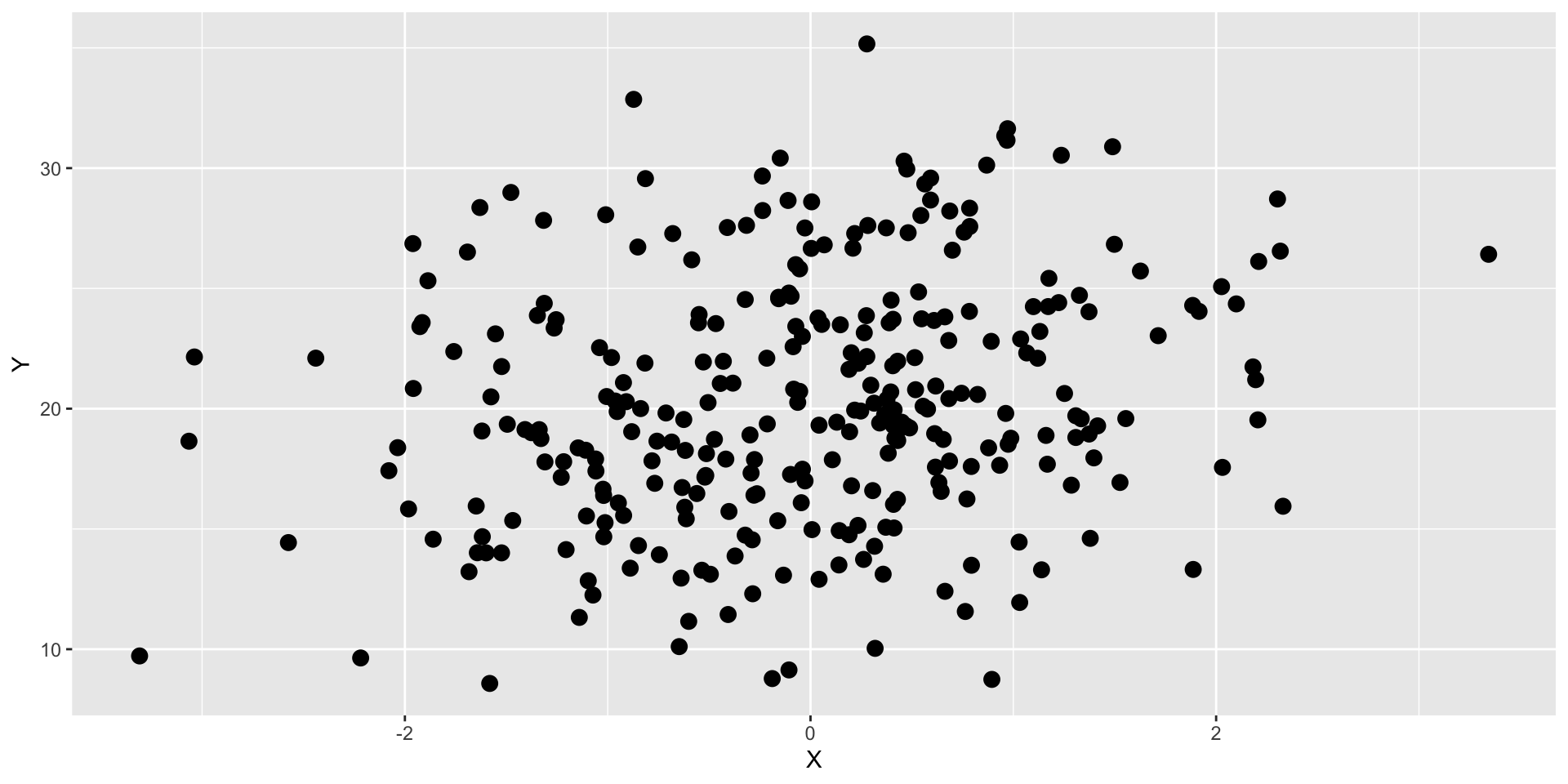
We would say our expectations have been refuted
Syntax
The form, structure and order for constructing statements

[[students][[cook][and][serve grandparents]]]
[[students][[cook and serve][grandparents]]]
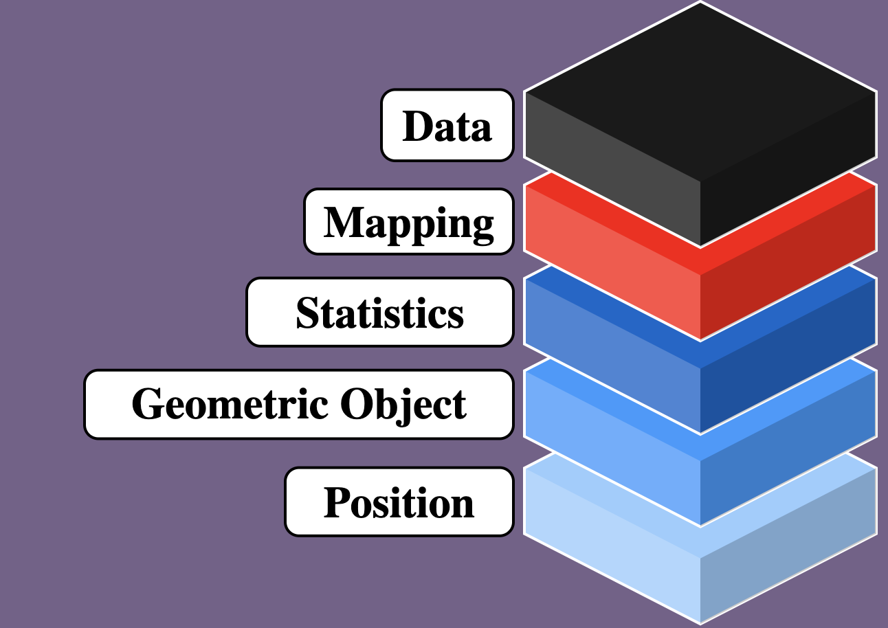
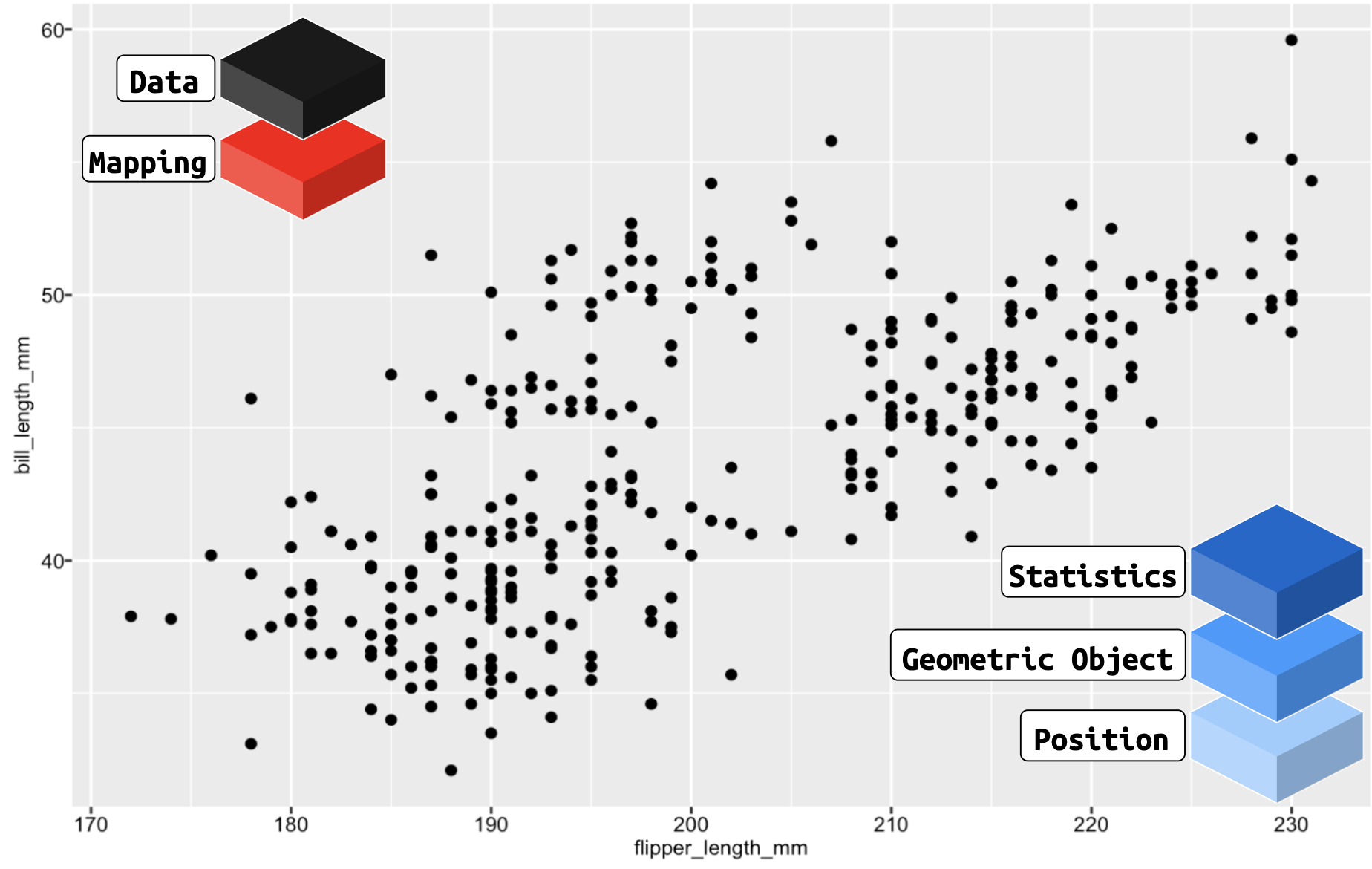
ggplot2: a layered language for graphs
ggplot2 is comprised of layers
- Data
- Mapping
- Statistics
- Geometric objects
- Position adjustments
ggplot2: data

ggplot2: mapping

ggplot2: geoms
ggplot2: layers
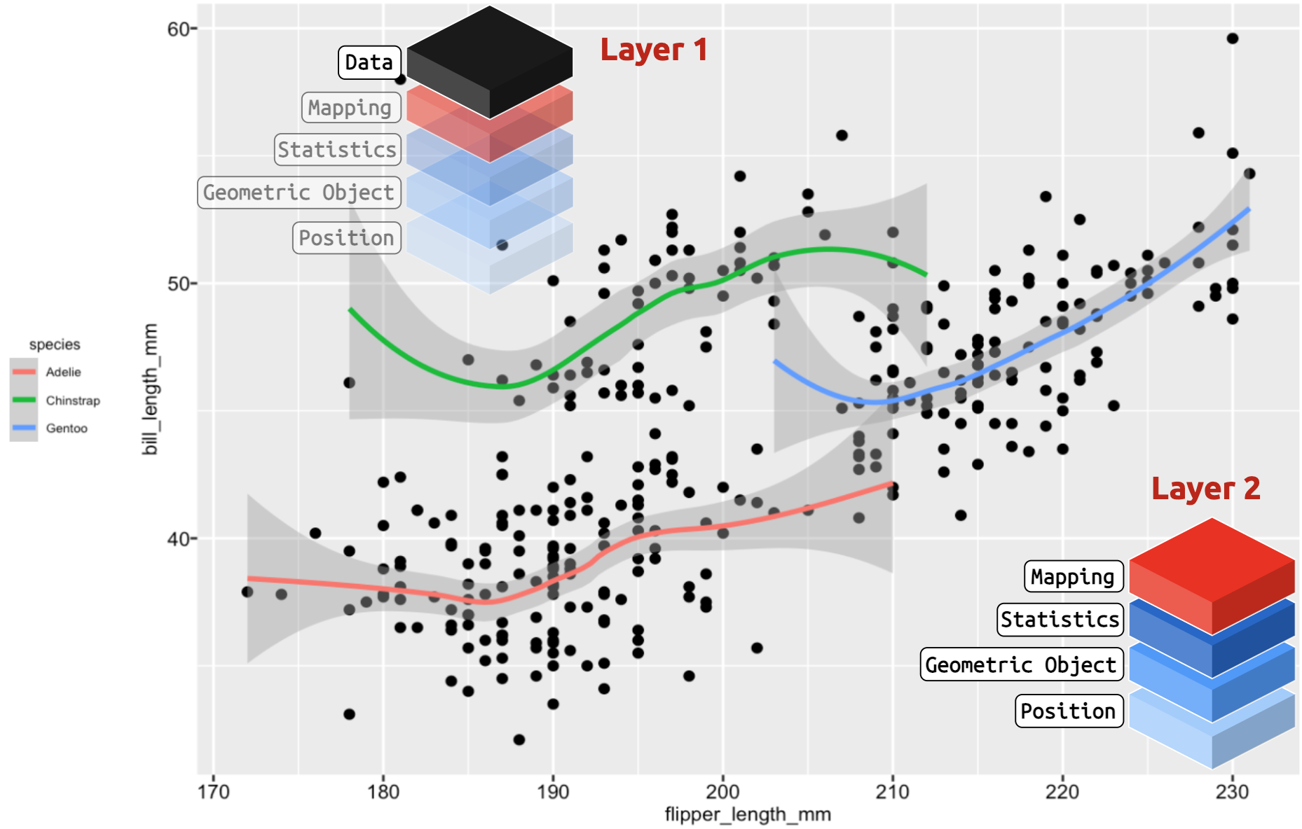
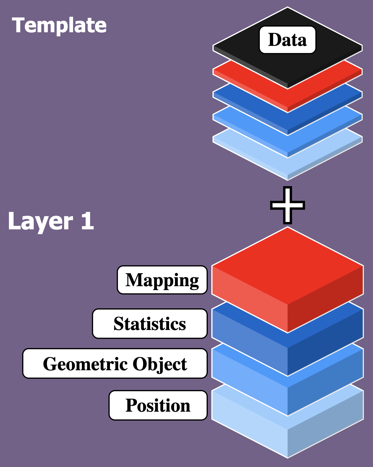
ggplot2: templates
Basic Template: Data, aesthetic mappings, geom

ggplot2: more templates
Template + 1 Layer: more geoms and more aesthetic mappings
ggplot2: even more!
Template + 1 Layer + Facet Layer: template, more aesthetic mappings, and facets!

RStudio.Cloud: Set up (1 of 4)
Head to RStudio.Cloud, you will see the following:

Log in with your GitHub credentials
RStudio.Cloud: Set up (2 of 4)
On the top of the RStudio IDE, you will see the following:

Click on Save a Permanent Copy to add this project to your workspace
RStudio.Cloud: Set up (3 of 4)
In the Files pane, click on the inst.R file to open it

RStudio.Cloud: Set up (4 of 4)
In the Source pane, click on the Source icon to run inst.R

This sends the code in inst.R to the Console
RStudio.Cloud: Exercises
The exercises are in the exercises/ folder

RStudio.Cloud: Solutions
Each exercise has a solution file in solutions/ folder

ggplot2: build graph, check labels
Build labels, build graphs, then check labels!
What’s wrong here?
ggplot2: build graph, check labels, revise
x and y are flipped!

Fixed!
Viewing data (1 of 3)
View() opens the RStudio data viewer

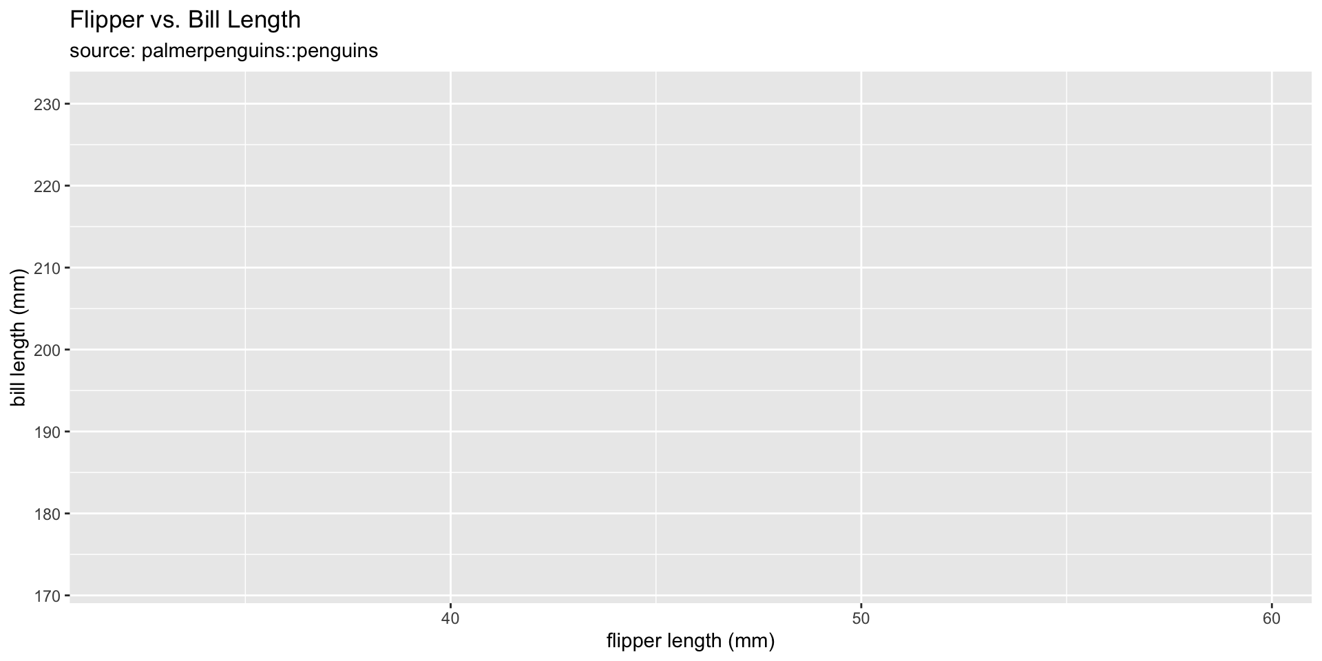
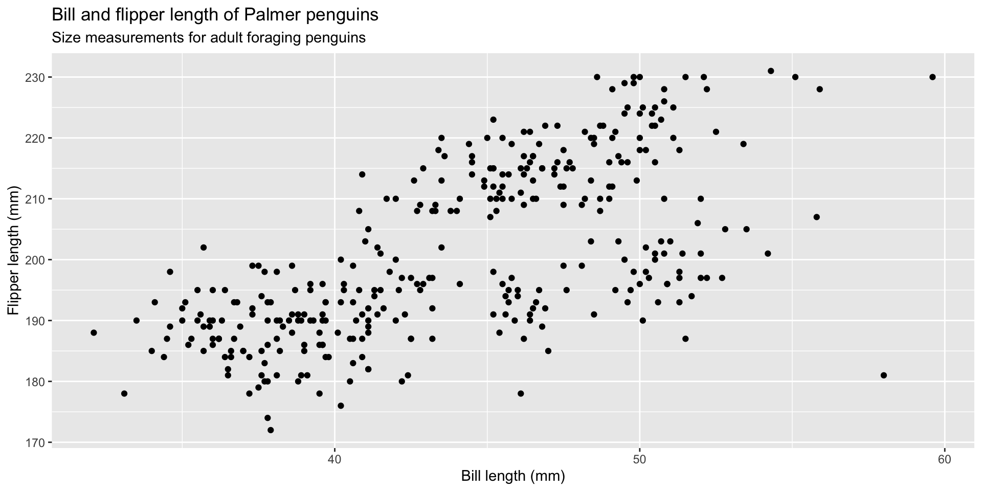
graph 01: Initialize plot with data

graph 02: Map variables to positions

graph 03: Adding geoms

graph 04: Don’t forget the labels!
Global mapping
The previous graphs mapped aesthetics globally

Local mapping
Mapping aesthetics globally and then adding the geom_*() function results in the same graph as when we map aesthetics locally (inside the geom_*() function)


What are visual encodings?
Visual encodings are what we see on the graph
Things like position, size, shape, color, etc.

Ranked by accuracy
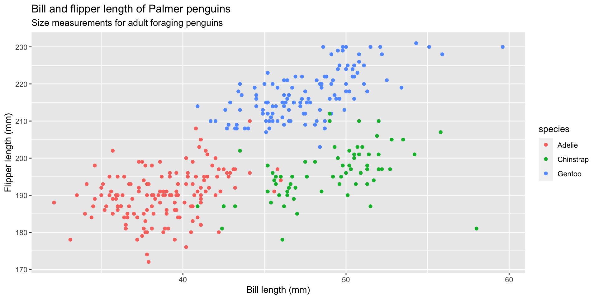
graph 06: Adding color (global)

graph 07: Adding color (local)
Map color to the species variable using local aesthetic mapping
graph 08: Color vs. Fill (2 of 2)

graph 09: Bar position
Stacked bar-graphs make it difficult to do side-by-side comparisons using the y axis

graph 10: Histograms (special bar-graphs)
The geom_histogram() function uses ‘bins’ to represent counts for each value
Create new labels

graph 11: Density plots

Mapping vs. setting (1 of 2)
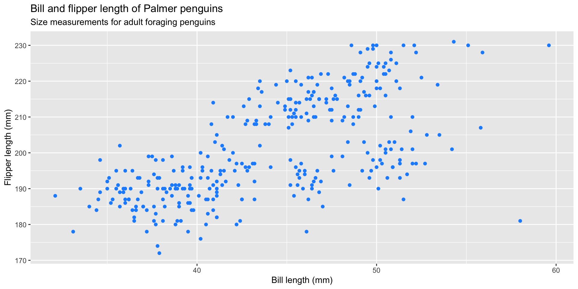
graph 12: Setting graph aesthetics
Change the code below to make the points "firebrick" red
Create labels
What color will the points be on this graph?

TIP: the legend tells us geom_point() is looking for a mapped variable in the penguins dataset named "firebrick"
graph 13: Layer 1
Create layer 1 with penguins_no_miss data and geom_point()
Create labels
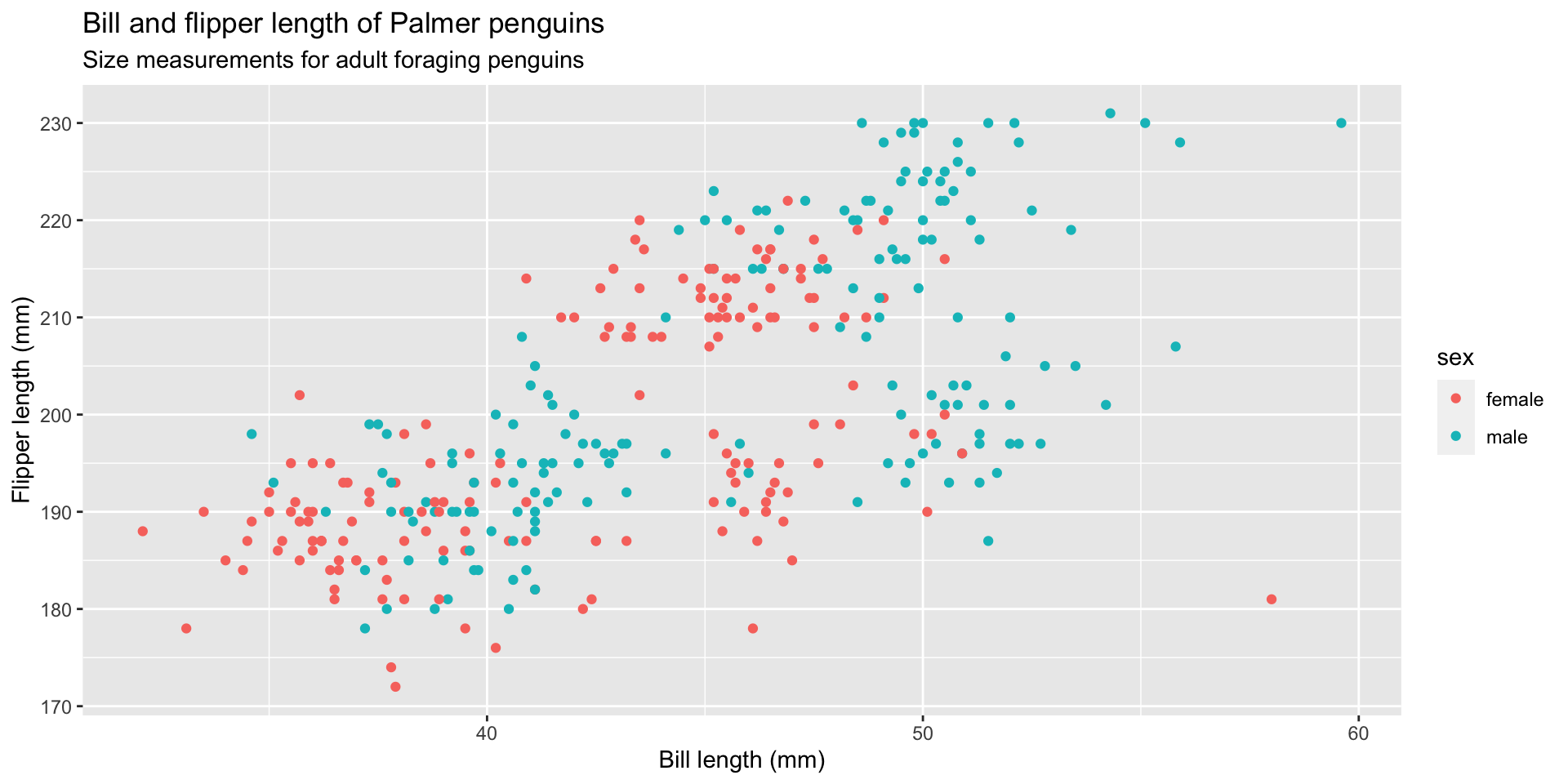
Assign x, y, size, and alpha

graph 14: Layer 2
Create layer 2 with another geom_point() using color and size
Use scale_size() to adjust point scaling

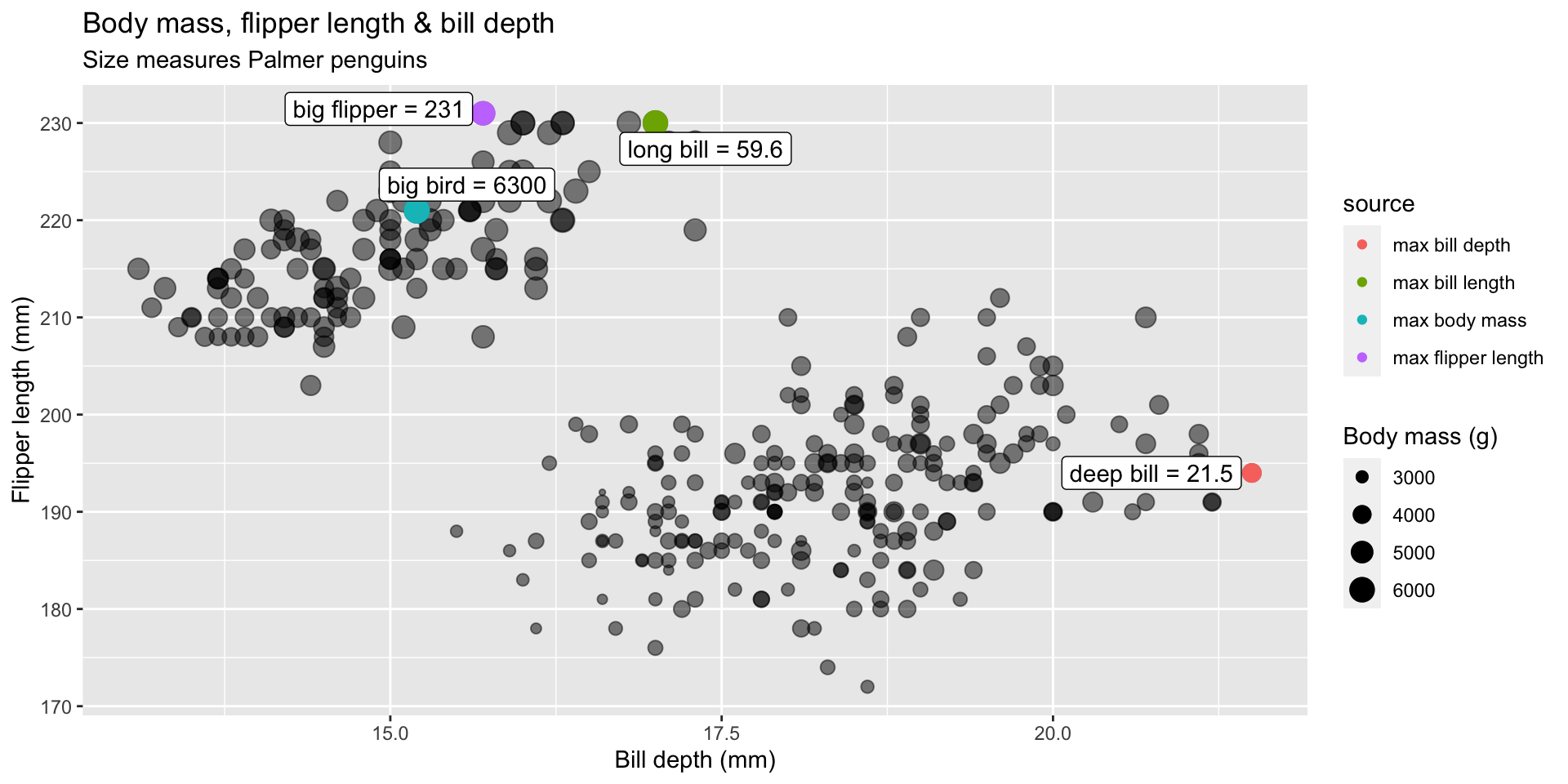
graph 15: Label 3 (max values)
Facets = small multiples
In the previous graph, we used multiple aesthetics (color, size, shape)
Can we explore these relationships by sex or species?
Store graph 15 in ggp_penguin_measures

graph 16: Facet by sex
Use facet_wrap() to view our previous graph by sex

graph 17: Facet by species
Change facet_wrap() to build graphs by species and add theme
Change facet_wrap() to ~ species
Add theme_minimal() and labels
