import pandas as pd
from bokeh.layouts import column, row
from bokeh.models import ColumnDataSource, DataTable, TableColumn, NumberFormatter, Select
from bokeh.plotting import figure, curdoc
from palmerpenguins import load_penguinsI’ve been building quite a few Python applications with VS Code lately and thought I’d write some observations on Bokeh, Streamlit, and Dash. I’ll cover managing dependencies, a few key differences between Python and R, and running the applications in VS Code.
Virtual environments
Python virtual environments are designed to manage project-specific dependencies and ensure that the correct versions of packages are used in a given project. Similar to the renv package in R, Python comes with a a venv command for creating a virtual environment.1 It’s common practice to name the virtual environment something like myenv or .venv.
python -m venv .venvvenv works by creating a directory with a copy of the Python interpreter and the necessary executables to use it. After creating the virtual environment folder, we can activate it using the following command:
source .venv/bin/activate
# windows
# myenv\Scripts\activate
If you’re using VS Code, this activate the following prompt to set your workspace folder:
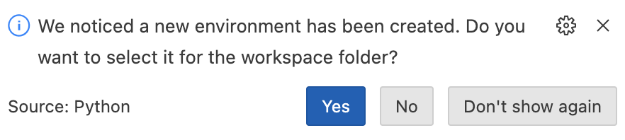
Click Yes, then make sure all the dependencies listed in the requirements.txt file are installed in the virtual environment using pip, the package installer for Python.
pip install -r requirements.txtAs you’re developing, new dependencies can be recorded in requirements.txt using pip freeze:
pip freeze > requirements.txtThe .venv/ directory will store the Python version and packages used in the Python project:
.venv/
  └──lib/
      └── python3.9/
            └── site-packages/
Packages installed into .venv/lib/python3.9/site-packages do not affect the global Python installation or other virtual environments. This isolation helps prevent version conflicts and makes dependency management easier.
Git history
The virtual environment will store all the dependencies for a project, so it’s a good practice to remove it from any Git repositories. You can do this with the following commands in the terminal:
echo ".venv/" >> .gitignore
git add .gitignore
git commit -m "Add .venv to .gitignore"
You can also remove the .venv directory from the latest commit:
git rm -r --cached .venv
git commit -m "Remove .venv directory"Bokeh, Streamlit, and Dash are three popular libraries for creating interactive Python applications, particularly for visualizations and dashboards. Below we’ll explore building an application in each framework using the palmerpenuins data. For uniformity, each app will include a scatter plot comparing the numeric variables and a table output.
Bokeh

Bokeh is a library in Python specifically designed for creating interactive and visually appealing interactive graphs and charts. Bokeh can also create static HTML files without a server, similar to RMarkdown’s HTML output.
Importing Libraries
Create a main.py script and install the following libraries using pip. pandas is for data manipulation, bokeh will be used for the interactive visualizations, and the palmerpenguins package will load the penguins dataset.
in R, we might use dplyr for data manipulation and ggplot2 for visualizations. For interactive visualizations, we might use plotly.
Loading Data
The penguins dataset is loaded into a pandas DataFrame using load_penguins() and the missing data is removed with df.dropna().
df = load_penguins()
df = df.dropna()A ColumnDataSource is created from the DataFrame, which is used by Bokeh for efficient data handling (this intermediate step doesn’t really have an R equivalent).
source = ColumnDataSource(df)A list of numeric columns is defined to use in the scatter plot drop-downs. If we were doing this in R, we could use colnames() or dplyr::select():
numeric_columns = ['bill_length_mm', 'bill_depth_mm', 'flipper_length_mm', 'body_mass_g']App Inputs
Two drop-down Select() widgets can be created for selecting x and y axes variables.
x_select = Select(title="X Axis", value="bill_length_mm", options=numeric_columns)
y_select = Select(title="Y Axis", value="bill_depth_mm", options=numeric_columns)If this was a Shiny app, we would use selectInput().
Scatter Plot
We can initialize a scatter plot with the default axis labels and data:
scatter_plot = figure(title="Scatter Plot",
x_axis_label='Bill Length (mm)',
y_axis_label='Bill Depth (mm)')
scatter_plot.scatter(x='bill_length_mm', y='bill_depth_mm', source=source, size=10)In ggplot2, this would look like:
show/hide ggplot2 equivalent code
ggplot(df,
aes(x = bill_length_mm, y = bill_depth_mm)) +
geom_point()Interactivity
Below we define update_plot(), a function for updating the scatter plot when a new variable is selected for the x or y axis. It changes axis labels and re-renders the plot with new data.
def update_plot(attr, old, new):
x = x_select.value
y = y_select.value
scatter_plot.xaxis.axis_label = x.replace('_', ' ').title()
scatter_plot.yaxis.axis_label = y.replace('_', ' ').title()
scatter_plot.renderers = [] # clear existing renderers
scatter_plot.scatter(x=x, y=y, source=source, size=10)
x_select.on_change("value", update_plot)
y_select.on_change("value", update_plot)In shiny, you would use observeEvent() or reactive() to update plots dynamically.
Table Display
The code below defines columns and their formatters for the data table to be displayed. DataTable() creates data_table, a DataTable widget that displays the data. This is similar to using DT::datatable(df) in R.
columns = [
TableColumn(field="species", title="Species"),
TableColumn(field="island", title="Island"),
TableColumn(field="bill_length_mm", title="Bill Length (mm)", formatter=NumberFormatter(format="0.0")),
TableColumn(field="bill_depth_mm", title="Bill Depth (mm)", formatter=NumberFormatter(format="0.0")),
TableColumn(field="flipper_length_mm", title="Flipper Length (mm)", formatter=NumberFormatter(format="0")),
TableColumn(field="body_mass_g", title="Body Mass (g)", formatter=NumberFormatter(format="0")),
TableColumn(field="sex", title="Sex"),
TableColumn(field="year", title="Year", formatter=NumberFormatter(format="0"))
]
data_table = DataTable(source=source, columns=columns, width=800)Layout
The layout is defined using column and row and added to the current document for rendering. In shiny, you would use fluidPage(), sidebarLayout(), mainPanel(), etc., to arrange UI components.
layout = column(row(x_select, y_select), scatter_plot, data_table)
curdoc().add_root(layout)Run the App
To run this code, save main.py and use the bokeh serve command:
bokeh serve --show main.pyIn R, you would run a shiny app using shinyApp(ui, server) and the runApp() function.
The full code in main.py is available below:
show/hide main.py
import pandas as pd
from bokeh.layouts import column, row
from bokeh.models import ColumnDataSource, DataTable, TableColumn, NumberFormatter, Select
from bokeh.plotting import figure, curdoc
from palmerpenguins import load_penguins
# load the penguins dataset
df = load_penguins()
# drop missing data
df = df.dropna()
# create ColumnDataSource
source = ColumnDataSource(df)
# numeric columns
numeric_columns = ['bill_length_mm', 'bill_depth_mm', 'flipper_length_mm', 'body_mass_g']
# create select widgets for x and y axis
x_select = Select(title="X Axis", value="bill_length_mm", options=numeric_columns)
y_select = Select(title="Y Axis", value="bill_depth_mm", options=numeric_columns)
# scatter plot comparing selected variables
scatter_plot = figure(title="Scatter Plot",
                      x_axis_label='Bill Length (mm)',
                      y_axis_label='Bill Depth (mm)')
scatter_plot.scatter(x='bill_length_mm', y='bill_depth_mm', source=source, size=10)
def update_plot(attr, old, new):
x = x_select.value
y = y_select.value
scatter_plot.xaxis.axis_label = x.replace('_', ' ').title()
scatter_plot.yaxis.axis_label = y.replace('_', ' ').title()
scatter_plot.renderers = [] # Clear existing renderers
scatter_plot.scatter(x=x, y=y, source=source, size=10)
x_select.on_change("value", update_plot)
y_select.on_change("value", update_plot)
# define columns
columns = [
TableColumn(field="species", title="Species"),
TableColumn(field="island", title="Island"),
TableColumn(field="bill_length_mm", title="Bill Length (mm)", formatter=NumberFormatter(format="0.0")),
TableColumn(field="bill_depth_mm", title="Bill Depth (mm)", formatter=NumberFormatter(format="0.0")),
TableColumn(field="flipper_length_mm", title="Flipper Length (mm)", formatter=NumberFormatter(format="0")),
TableColumn(field="body_mass_g", title="Body Mass (g)", formatter=NumberFormatter(format="0")),
TableColumn(field="sex", title="Sex"),
TableColumn(field="year", title="Year", formatter=NumberFormatter(format="0"))
]
# create DataTable
data_table = DataTable(source=source, columns=columns, width=800)
# Layout
layout = column(row(x_select, y_select), scatter_plot, data_table)
# add layout to curdoc
curdoc().add_root(layout)After running the bokeh serve command, the terminal will display the local URL we can use to view our app:
Starting Bokeh server version 3.4.2 (running on Tornado 6.4)
User authentication hooks NOT provided (default user enabled)
Bokeh app running at: http://localhost:5006/main
Starting Bokeh server with process id: 88167
WebSocket connection opened
ServerConnection created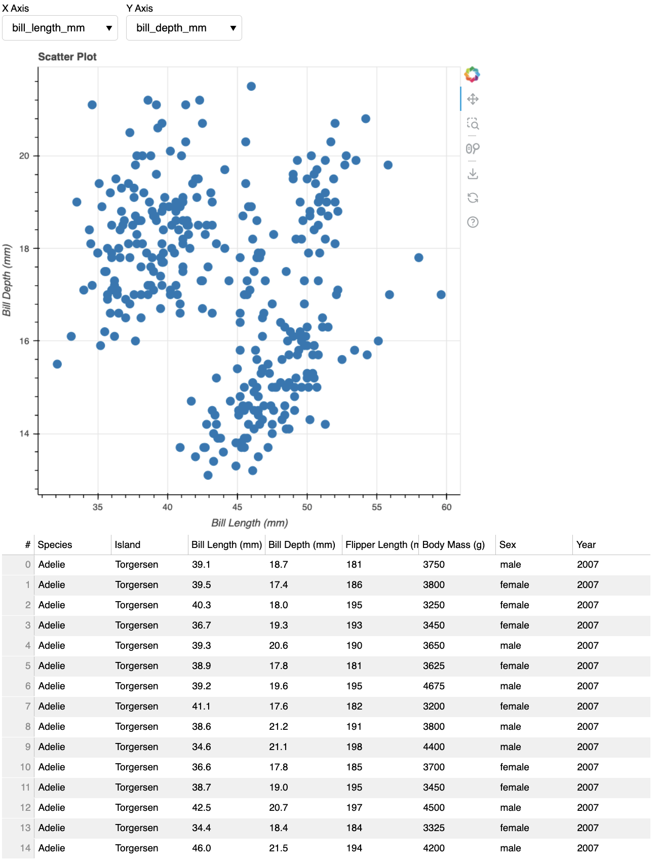
As we can see, the layout is simple, and it gets the job done quickly with a modest amount of code. Bokeh is not really designed for full-fledged applications, but it is capable of creating detailed and interactive plots and tables.
Streamlit

Streamlit is another library for creating web applications for data analysis and visualization. It’s known for its simplicity and generally requires less code to build functional applications.
Importing Libraries
After creating and activating a Python virtual environment with venv, ensure you have streamlit, palmerpenguins, and the other necessary libraries installed using pip. Create an app.py file and import the following libraries:
import streamlit as st
import pandas as pd
import seaborn as sns
import matplotlib.pyplot as plt
from palmerpenguins import load_penguins
Loading Data
Load the penguins data as a pandas DataFrame using the load_penguins() function from the palmerpenguins:
# load the dataset
penguins = load_penguins()
App Inputs
The code below creates a streamlit application that includes a scatter plot with a dropdown menu for selecting the X-axis and Y-axis variables among the numeric columns (minus year). The scatter plot differentiates the species by color.
st.titlesets the title of the app.st.title('Palmer Penguins Dashboard')st.writedisplays text and the datase.t2st.write("### Scatter Plot")st.selectboxcreates dropdown menus for selecting variables for the scatter plot.x_axis = st.selectbox('X-axis variable', numeric_columns)
Scatter Plot
The scatter plot is created using seaborn, a visualization library built on top of matplotlib.
if x_axis and y_axis:
    fig, ax = plt.subplots()
    sns.scatterplot(data=penguins, x=x_axis, y=y_axis, hue='species', ax=ax)
    st.pyplot(fig)
Table Display
The st.dataframe method displays the dataset in a table format within the streamlit app.
st.dataframe(penguins)The full application code is available below:
show/hide app.py
# app title
st.title('Palmer Penguins Dashboard')

# numeric columns for scatter plot
numeric_columns = penguins.select_dtypes(include=['float64', 'int64']).columns
# drop year
numeric_columns = numeric_columns.drop('year')

# scatter plot
st.write("### Scatter Plot")
x_axis = st.selectbox('X-axis variable', numeric_columns)
y_axis = st.selectbox('Y-axis variable', numeric_columns, index=1)

if x_axis and y_axis:
    fig, ax = plt.subplots()
    sns.scatterplot(data=penguins, x=x_axis, y=y_axis, hue='species', ax=ax)
    st.pyplot(fig)

# display the dataframe as a table
st.write("### Dataset")
st.dataframe(penguins)

# footer
st.write("Data Source: [palmerpenguins](https://github.com/allisonhorst/palmerpenguins)")
Run the App
Open your terminal, navigate to the directory containing app.py, and run:
streamlit run app.py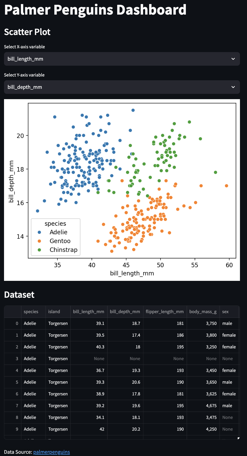
With streamlit we’re able to create an interactive graph and table display with about 1/3 the code we used in Bokeh, which is why they are ideal for quickly building and sharing simpler web apps (similar to flexdashboard in R). However, Streamlit apps have limited customization and may not handle very complex apps or large datasets efficiently.
Dash

Dash is a framework developed by Plotly for building analytical web applications using Python. It’s especially well-suited for interactive visualizations and dashboards.
Importing Libraries
In an app.py file, we’ll start by importing the following necessary libraries. dash and dash.dependencies 3 are used for building web applications (similar to shiny), pandas is imported for data manipulation, plotly.express is used for creating plots (akin to ggplot2), and dash_bootstrap_components allows us to use Bootstrap themes for styling the app.
import dash
from dash import dcc, html, dash_table
from dash.dependencies import Input, Output
import pandas as pd
import plotly.express as px
import dash_bootstrap_components as dbc
Loading Data
Now that we’ve identified and imported the dependencies, we can read the data into the application using pandas. We can assign the URL to the raw .csv file to url, then have pd.read_csv() read the CSV file into a pandas DataFrame.4
url = "https://raw.githubusercontent.com/allisonhorst/palmerpenguins/main/inst/extdata/penguins.csv"
df = pd.read_csv(url)
Utility Function
def format_label(label):
    return label.replace('_', ' ').title()
This function replaces underscores with spaces and capitalizes words. In R, you would define a similar function using gsub() and tools::toTitleCase().
Define Columns
We want to omit the year column from the drop-dowwns, so we’ll define numerical_columns outside of the app so we don’t have to repeat this code later. Type float64 or int64 are numeric columns.
numerical_columns = [col for col in df.select_dtypes(include=['float64', 'int64']).columns if col != 'year']Initialize App
dash.Dash creates a Dash app instance with Bootstrap styling by supplying dbc.themes.BOOTSTRAP to the external_stylesheets argument.5 This is somewhat similar to initializing a Shiny app with shiny::shinyApp().
app = dash.Dash(__name__, external_stylesheets=[dbc.themes.BOOTSTRAP])In the case of initializing a Dash app, __name__ is passed as an argument to the dash.Dash() constructor to specify the name of the application. We’ll encounter this again when we launch the application below.
Layout
The majority of the code is contributed to defining the app layout using Bootstrap components.
dbc.Container,dbc.Row, anddbc.Colarrange components in a grid, similar to layout functions in Shiny likefluidPage(),sidebarLayout(), etc.app.layout = dbc.Container([ dbc.Row([ dbc.Col([ ]) ]) ])html.H1creates a header, liketags$h1()in Shiny.html.H1("Palmer Penguins Dashboard")dcc.Dropdowncreates dropdown menus for user input, similar toselectInput()in Shiny.dcc.Dropdown( id='x-axis', options=[{'label': col, 'value': col} for col in numerical_columns], value='bill_length_mm', clearable=False )dcc.Graphplaces a plot in the app, analogous toplotOutput()in Shiny.dcc.Graph(id='scatter-plot')dash_table.DataTabledisplays data in a table, similar toDT::dataTableOutput()in R.dash_table.DataTable( id='table', columns=[{"name": i, "id": i} for i in df.columns], data=df.to_dict('records'), page_size=10, style_table={'overflowX': 'auto'}, style_cell={ 'height': 'auto', 'minWidth': '140px', 'width': '140px', 'maxWidth': '140px', 'whiteSpace': 'normal' } )
Callback
The callback function updates the scatter plot based on dropdown inputs.
The
@app.callbackdecorator defines reactive behavior, similar toobserveEvent()orreactive()in Shiny.6@app.callback( Output('scatter-plot', 'figure'), [Input('x-axis', 'value'), Input('y-axis', 'value')] )The function
update_scatter_plottakes inputs from dropdowns and updates the plot, usingplotly.expressand ourformat_label()utility function to create the scatter plot, similar to usingggplot2in R.def update_scatter_plot(x_axis, y_axis): fig = px.scatter( df, x=x_axis, y=y_axis, color='species', labels={x_axis: format_label(x_axis), y_axis: format_label(y_axis)}, title=f'Scatter Plot of {format_label(x_axis)} vs {format_label(y_axis)}' ) return fig
The full callback code is below:
show/hide app callback in app.py
@app.callback(
Output('scatter-plot', 'figure'),
[Input('x-axis', 'value'),
Input('y-axis', 'value')]
)
def update_scatter_plot(x_axis, y_axis):
fig = px.scatter(
df, x=x_axis, y=y_axis, color='species',
labels={x_axis: format_label(x_axis), y_axis: format_label(y_axis)},
title=f'Scatter Plot of {format_label(x_axis)} vs {format_label(y_axis)}'
)
return figFor loops
Python often relies on explicit iteration using for loops, which means Python code tends to use for loops more frequently than R code. The reason for this goes beyond the scope of this blog post, but it’s rooted in the distinct practices and strengths of each language.
Coming from R (and purrr or the apply family of functions), writing for loops can take some getting used to, so I’ve broken down the numerical_columns and dcc.Dropdown() examples from our Dash app.
numerical_columns = [col for col in df.select_dtypes(include=['float64', 'int64']).columns if col != 'year'][col for col in ...]is a list comprehension–it iterates over each column name (col) in the filtered list of column names.dfis a DataFrame, andselect_dtypesis a method that filters the DataFrame columns based on their data types. It includes columns with data typesfloat64andint64(similar to numeric types in R)..columnsretrieves the names of the columns that have been filtered byselect_dtypes.if col != 'year'is the condition to ensure that the columnyearis excluded from the resulting list, even if it has a numeric type.
options=[{'label': col, 'value': col} for col in numerical_columns]This for loop iterates over each column name (col) in the numerical_columns list.
For each column name, it creates a dictionary (
{'label': col, 'value': col}).labelis the text displayed in the Dropdown, andvalueis the actual value assigned to this option.
columns=[{"name": i, "id": i} for i in df.columns]This for loop iterates over all columns of the DataFrame df.
For each column, it creates a dictionary with
nameandidboth set to the column name.These dictionaries are used to define the columns of the
dash_table.DataTable().
The entire app layout code is below:
show/hide full Dash app in app.py
import dash
from dash import dcc, html, dash_table
from dash.dependencies import Input, Output
import pandas as pd
import plotly.express as px
import dash_bootstrap_components as dbc
# load the dataset
url = "https://raw.githubusercontent.com/allisonhorst/palmerpenguins/main/inst/extdata/penguins.csv"
df = pd.read_csv(url)
# remove the 'year' column
numerical_columns = [col for col in df.select_dtypes(include=['float64', 'int64']).columns if col != 'year']
# initialize the Dash app
app = dash.Dash(__name__, external_stylesheets=[dbc.themes.BOOTSTRAP])
# function to replace underscores with spaces
def format_label(label):
return label.replace('_', ' ').title()
# app layout
app.layout = dbc.Container([
dbc.Row(
dbc.Col(
html.H1("Palmer Penguins Dashboard"),
width=12)
),
dbc.Row(
html.H3("Inputs")
),
dbc.Row([
dbc.Col(
  dcc.Dropdown(
      id='x-axis',
      options=[{'label': col, 'value': col} for col in numerical_columns],
      value='bill_length_mm',
      clearable=False
), width=3
),
dbc.Col(
dcc.Dropdown(
id='y-axis',
options=[{'label': col, 'value': col} for col in numerical_columns],
value='bill_depth_mm',
clearable=False
), width=3
)
]),
dbc.Row([
dbc.Col([
html.H3("Scatter Plot"),
dcc.Graph(id='scatter-plot')
], width=6),
dbc.Col([
html.H3("Table"),
  dash_table.DataTable(
      id='table',
      columns=[{"name": i, "id": i} for i in df.columns],
      data=df.to_dict('records'),
      page_size=10,
      style_table={'overflowX': 'auto'},
      style_cell={
          'height': 'auto',
          'minWidth': '140px', 'width': '140px', 'maxWidth': '140px',
          'whiteSpace': 'normal'
      }
  )
], width=6)
])
])
# callback to update the scatter plot
  @app.callback(
      Output('scatter-plot', 'figure'),
      [Input('x-axis', 'value'),
       Input('y-axis', 'value')]
  )
  def update_scatter_plot(x_axis, y_axis):
      fig = px.scatter(
          df, x=x_axis, y=y_axis, color='species',
          labels={x_axis: format_label(x_axis), y_axis: format_label(y_axis)},
          title=f'Scatter Plot of {format_label(x_axis)} vs {format_label(y_axis)}'
      )
      return fig
# run the app
if __name__ == '__main__':
    app.run_server(debug=True)
Run the App
The code below runs the application. Note that the __name__ == '__main__' condition corresponds to the dash.Dash(__name__, ...) we used to initialize the application above.
if __name__ == '__main__':
app.run_server(debug=True)Run the application by running the following commands in the terminal:
python app.pyDash is running on http://127.0.0.1:8050/
* Serving Flask app 'app'
* Debug mode: onUse Cmd/Ctrl + click on the URL to open the web browser with our application:
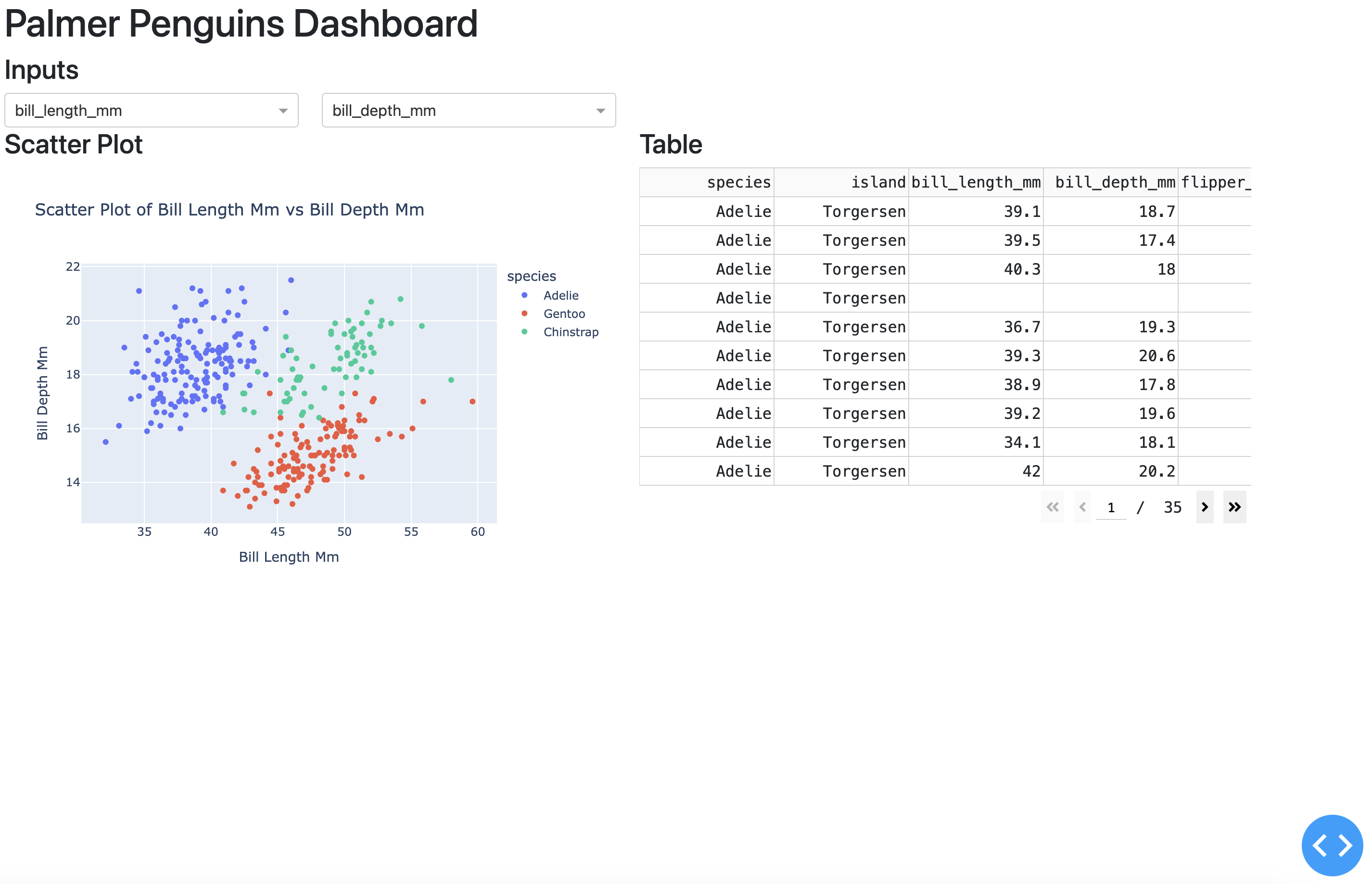
The Dash application has an interactive scatter plot (with hover features) with a side-by-side table display. The layout functions in Dash give us more control over output placement in the UI, and the additional HTML functions give us the ability to build our application up like a standard webpage (or Shiny app).
Recap
In summary, Bokeh is excellent for creating detailed and interactive visualizations, comparable to ggplot2 and plotly for interactive plots, but it’s not focused on developing complete applications. Streamlit is very user-friendly and ideal for quickly building and sharing simpler web apps, but with fewer options for customization. Dash is capable of developing highly customizable and complex web applications (similar to Shiny), but has a steeper learning curve than Streamlit.
You can view the code used to create the apps in this repo.
Footnotes
venvis a module that comes built-in with Python 3.3 and later versions, so we do not need to install it separately.↩︎st.write()is incredibly versatile. We’re passing it Markdown-formatted text in this example, but it can be used to display DataFrames, models, and more.↩︎Watch The Dash Callback - Input, Output, State, and more on the Charming Data YouTube channel.↩︎
pd.read_csvis analogous toread.csvorreadr::read_csvin R.↩︎Read all the arguments for dash.Dash in the documentation.↩︎
Read more about Dash callback definitions in the documentation.↩︎