install.packages("thematic")This post was prompted by a new chapter I’ve been working on for Shiny App-Packages. I’ve recently been building a Shiny application in a Quarto document1, and noticed quite a few deviations from the standard app-package practices that deserve some attention.
I’ll cover various dashboard/html layout options, including modules in a Quarto document, and how to create a standalone function to launch your Quarto + Shiny app from an app-package.
Set up
The Quarto document (index.qmd) is placed inside the inst/ folder with a _quarto.yml project file:
└── inst
     └── quarto
          ├── _quarto.yml
          └── index.qmd
_quarto.yml
_quarto.yml contains metadata on the format, style, and rendering options for the dashboard.
title: "Quarto Movies App"

format:
  html:
    embed-resources: true
This file includes options for the entire Quarto project (i.e., all .qmd files in the folder). In our case it’s simply the dashboard file: index.qmd.
index.qmd
The index.qmd file contains the title of our application and the format of the document in the YAML frontmatter.
---
title: "Movies App"
format: html
server: shiny
---
www/
To include resources (like images or stylesheets), we’ll also add a www/ folder:
└── inst
     └── quarto
          ├── _quarto.yml
          ├── index.qmd
          └── www/
              └── quarto.png
context: setup
The first code chunk in index.qmd should include a context: setup option and load the necessary packages. If we want the dashboard to have access to the resources in www/, we need to include the addResourcePath() function and pass the path with the installed version of our application.
```{r}
#| context: setup
# pkgs -------
library(sap)
library(thematic)
library(ragg)
# resources --------
addResourcePath(
    prefix = 'quarto',
    directoryPath = system.file('www', package = 'sap'))
```
Dashboards
Dashboard layouts are covered extensively in the Quarto documentation2 and elsewhere3, and I’ve included example layouts in the code repo. Key things to remember about Quarto dashboard layouts:
format: dashboard
Dashboard layouts are configured using a combination of YAML fields and markdown headings. By default, the
orientationfield is set torows, but multiple code chunks will add new columns:format: dashboard: orientation: columnsLevel 1 headers create pages (with titles)
# Page 1Level 2 and 3 headers create columns and rows (with height and width options)
## Row {height=20%}

### Column {width=35%}
Tabsets can be created
{.tabset}:### Column {.tabset}Inside the columns and rows, cards provide a flexible, grid-based structure for presenting different types of content. Cards are automatically created with text or a code chunk, and they can be labeled with a
title. Cards can also be included using{.card}inside a div (:::):#| title: Cost per week::: {.card title="Cost per week"} :::To customize the navigation bar in a Quarto dashboard, we can incorporate elements such as a
logoandnav-buttons.format: dashboard: nav-buttons: - text: About href: https://quarto.org/ - icon: github href: https://github.com/mjfrigaard/quarto-dash-r - icon: wikipedia target: _blank href: https://en.wikipedia.org/wiki/RStudio#Reproducible_analyses_with_vignettes
View various layouts in the GitHub repository. for this post.
Below is an example dashboard layout with most of the features mentioned above. Note that the standard code chunk options are also available (i.e., code echo/folding):
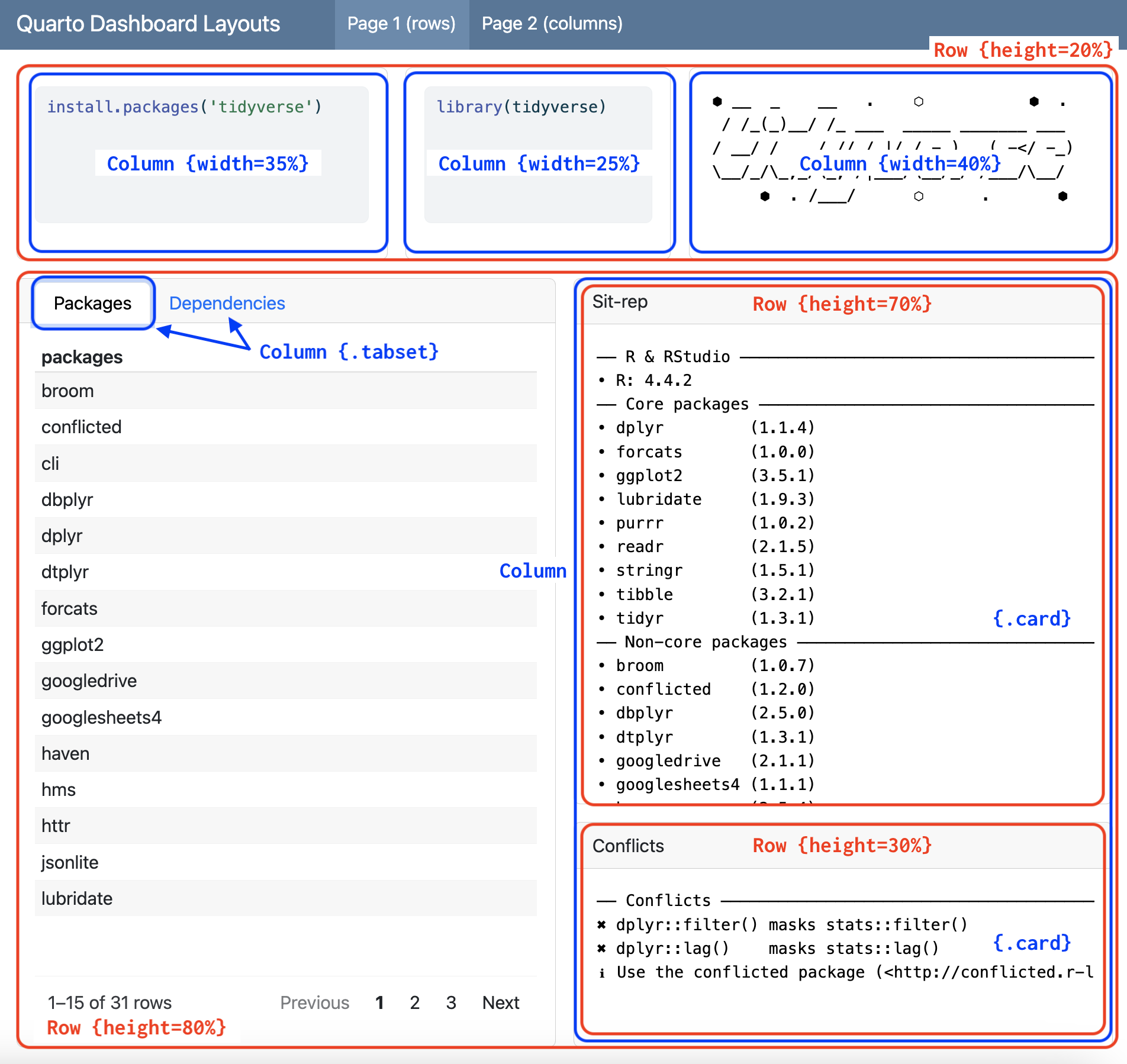
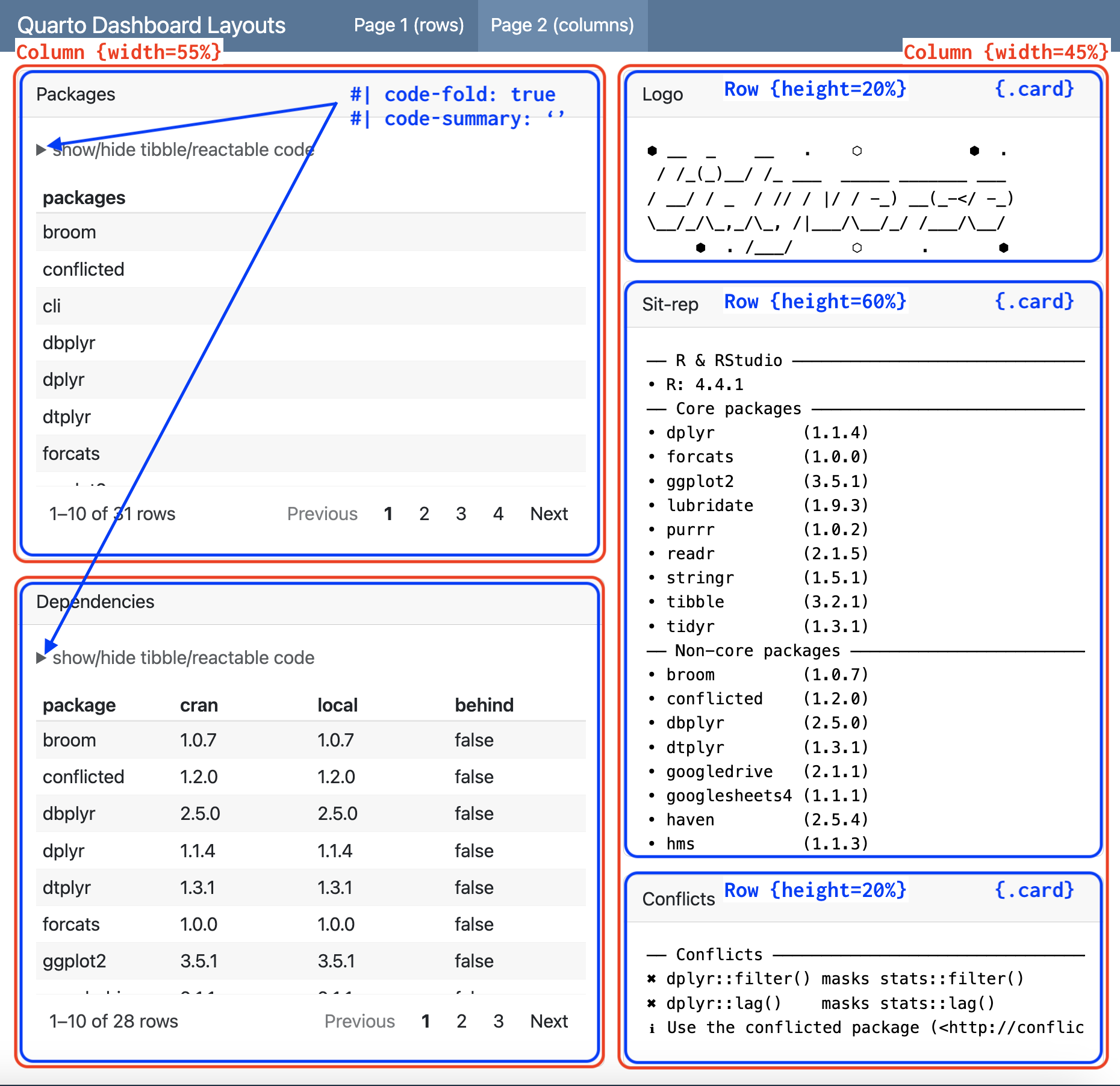
View the code used for the layout above (and others) in the GitHub repository.4
Reactivity
Quarto documents can be converted into Shiny’s apps using the server option in the YAML header. In our index.qmd file, we’ll set server to shiny:
server: shiny
---
title: "Movies App"
format: html
server: shiny
---
```{r}
#| context: server
```Modules
If you’re developing a Quarto + Shiny application using modules (and you should5 be6), the module functions can be placed in the code blocks like regular Shiny code.
The code below is used to implement the UI functions from the mod_var_input.R and mod_scatter_display_ui.R modules:
```{r}
#| panel: input
mod_var_input_ui("vars")
```

```{r}
#| panel: center
mod_scatter_display_ui("plot")
```
The panel: input creates a ‘div with class .panel-input and panel: center will’leave some horizontal margin around its content.’7
We can also include regular shiny code in code chunks:
```{r}
#| panel: fill
tags$br()
tags$em(
  "Built using ",
  tags$a(
    img(
      src = "www/quarto.png",
      height = 25,
      width = 90,
      style = "margin:10px 10px"
    ),
    href = "https://quarto.org/docs/interactive/shiny/"
  ),
  "and data from the ",
  tags$a("Building web applications with Shiny",
    href = "https://rstudio-education.github.io/shiny-course/"),
  "tutorial."
)
```
panel: fill will ‘fill all available space’ in the dashboard.8
context: server
The server: shiny in the YAML frontmatter ensures the document will render the UI inputs (i.e., the contents of mod_var_input_ui()). To differentiate the server (running on the back-end) code from user inputs and outputs, we need to add the module server functions in code blocks with the context: server option:
```{r}
#| context: server

selected_vars <- mod_var_input_server("vars")

mod_scatter_display_server("plot", var_inputs = selected_vars)
```
Styling
SASS (Syntactically Awesome Style Sheets) or CSS (Cascading Style Sheets) can be powerful tools for customizing a Quarto dashboard’s appearance. Unlike standard CSS, SCSS introduces features like variables, nesting, and mixins, which help keep the code organized and modular.
styles.scss
A dedicated .scss file keeps styles organized and separated from content, improving readability and maintainability.
└── inst
     └── quarto
          ├── _quarto.yml
          ├── index.qmd
          └── www
              ├── quarto.png
              └── styles.scss
We will set some colors defaults in www/styles.scss:
/*-- scss:defaults --*/

// colors
$body-bg: #070d35;
$body-color: #FFFFFF;

$link-color: #2ee3a4;
$hover-color: lighten($link-color, 40%);

$code-block-bg-alpha: -.8;

/*-- scss:rules --*/
thematic
For a broader, simplified approach to styling, we can install/use the thematic package:
We can add thematic_set_theme() to the context: setup code chunk in index.qmd:
thematic::thematic_set_theme(
  theme = thematic::thematic_theme(
    bg = "#070d35",
    fg = "#FFFFFF",
    accent = "#2ee3a4"))
This also requires the shiny.useragg option:
options(shiny.useragg = TRUE)Launching
To launch our Quarto dashboard with a standalone app function, we can use quarto_preview() with system.file():
launch_app <- function() {
  quarto::quarto_preview(
    system.file("quarto", "index.qmd", package = "sap" ),
    render = "all")
}launch_app()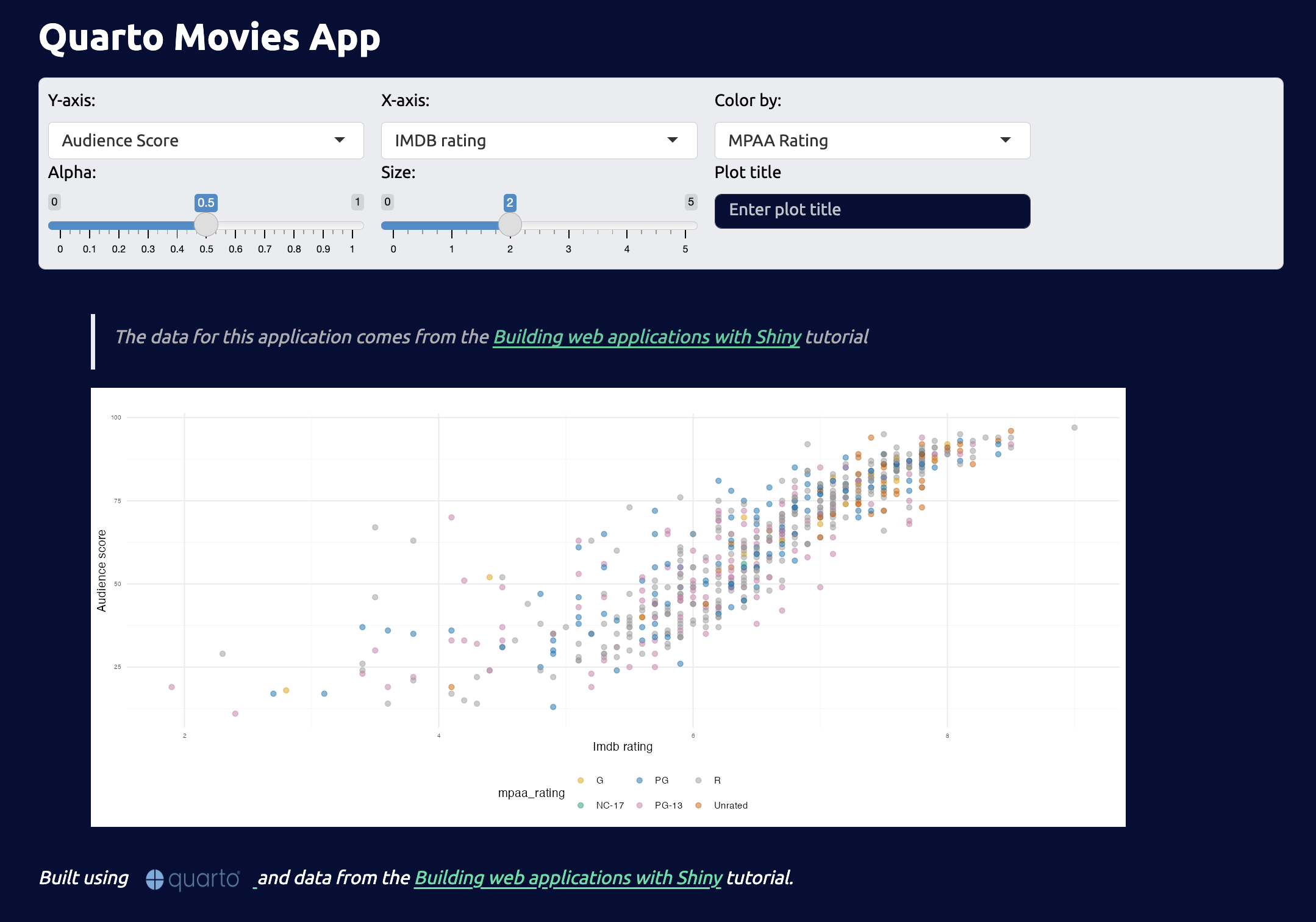
Recap
If you’re interested in learning more, check out the Quarto apps section of Shiny App-Packages and the Quarto documentation. Albert Rapp has a great video on building interactive apps with Quarto & Shiny and Isabella Velásquez also does a fantastic job covering python Quarto dashboards.
Footnotes
Shiny is covered in the Interactivity section of the Quarto documentation.↩︎
Mine Çetinkaya-Rundel has an excellent three part tutorial on Posit’s YouTube channel (part 1, part 2, part 3).↩︎
The
.qmdfiles ending inlayoutare examples of various dashboard layouts.↩︎See the Modularizing Shiny app code in the Shiny documentation.↩︎
See the Shiny modules chapter of Mastering Shiny.↩︎
Read more about Input Panel layouts↩︎
Read more about Sidebar Panel layouts.↩︎