Heatmap
heatmap.RmdMotivating problem/issue
In earlier versions of the application, the heat-map background
wasn’t smoothed like the original Excel application. This file documents
how I changed the SEG graph using a pre-made .png
image.
Data
To create the SEG using ggplot, I need to
load a few data inputs from Github.. I can
do this with the segtools::get_seg_data() function in the
code chunk below:
-
risk_pairs-> this assigns a risk factor value to each BGM measurement -
samp_measured_data-> this is a small sample measurement dataset -
vand_data-> this is a dataset from Vanderbilt used to create some of the initial calculations
segtools::get_seg_data("names")
#>  [1] "VanderbiltComplete"   "AppRiskPairData"      "RiskPairData"
#>  [4] "AppLookUpRiskCat"     "LookUpRiskCat"        "AppTestData"
#>  [7] "AppTestDataSmall"     "AppTestDataMed"       "AppTestDataBig"
#> [10] "FullSampleData"       "ModBAData"            "No_Interference_Dogs"
#> [13] "SEGRiskTable"         "SampMeasData"         "SampleData"
#> [16] "lkpRiskGrade"         "lkpSEGRiskCat4"
risk_pairs <- segtools::get_seg_data("AppRiskPairData")
samp_measured_data <- segtools::get_seg_data("FullSampleData")
vand_data <- segtools::get_seg_data("VanderbiltComplete")
mmolConvFactor <- segtools::mmolConvFactor
mmolConvFactor
#> [1] 18.01806
risk_factor_colors <- segtools::risk_factor_colors
base_data <- segtools::base_data
base_data
#>   x_coordinate y_coordinate color_gradient
#> 1            0            0              0
#> 2            0            0              1
#> 3            0            0              2
#> 4            0            0              3
#> 5            0            0              4
risk_pairs has columns and risk pairs for both
REF and BGM, and the RiskFactor
variable for each pair of REF and BGM data.
Below you can see a sample of the REF, BGM,
RiskFactor, and abs_risk variables.
risk_pairs |>
  dplyr::sample_n(size = 10) |>
  dplyr::select(
    REF, BGM, RiskFactor, abs_risk)
#> # A tibble: 10 × 4
#>      REF   BGM RiskFactor abs_risk
#>    <dbl> <dbl>      <dbl>    <dbl>
#>  1   396   490     -0.366    0.366
#>  2    79   558     -3.18     3.18
#>  3   594    42      3.12     3.12
#>  4   527   215      1.11     1.11
#>  5   333   570     -0.697    0.697
#>  6   177   539     -2.04     2.04
#>  7   315   378     -0.211    0.211
#>  8   591   434      0.155    0.155
#>  9   203   144      0.919    0.919
#> 10   474   335      0.514    0.514
samp_measured_data mimics a blood glucose monitor, with
only BGM and REF values.
samp_measured_data |>
  dplyr::sample_n(size = 10) |>
  dplyr::select(
    REF, BGM)
#> # A tibble: 10 × 2
#>      REF   BGM
#>    <dbl> <dbl>
#>  1   121   123
#>  2   115   120
#>  3   111   116
#>  4   132   143
#>  5   194   202
#>  6   179   174
#>  7   150   161
#>  8   109   100
#>  9   174   183
#> 10   106   111
vand_data contains blood glucose monitor measurements,
with only BGM and REF values.
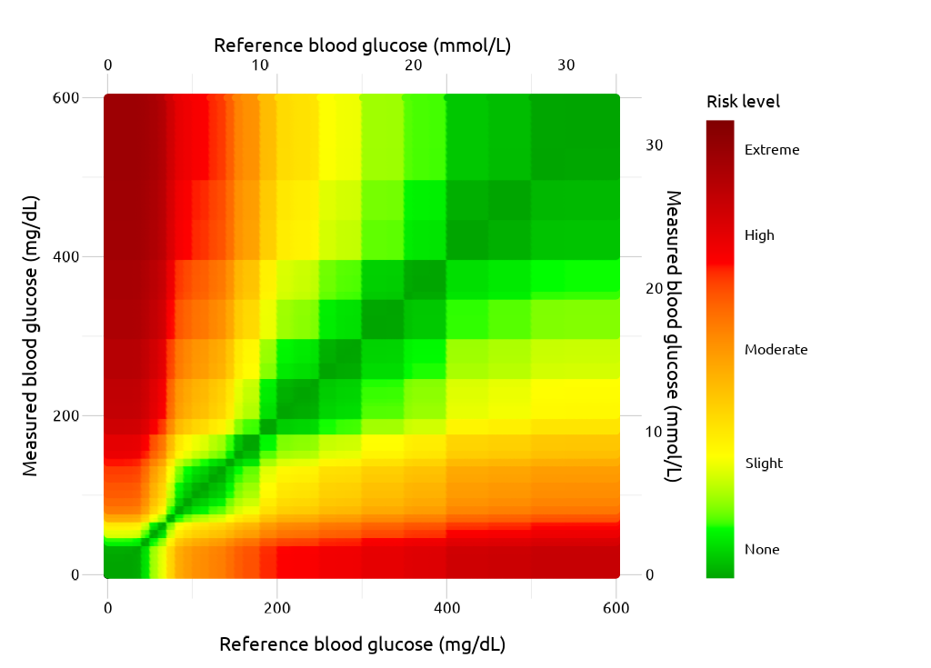
The original (Excel) SEG image
Below is the image from the Excel file:
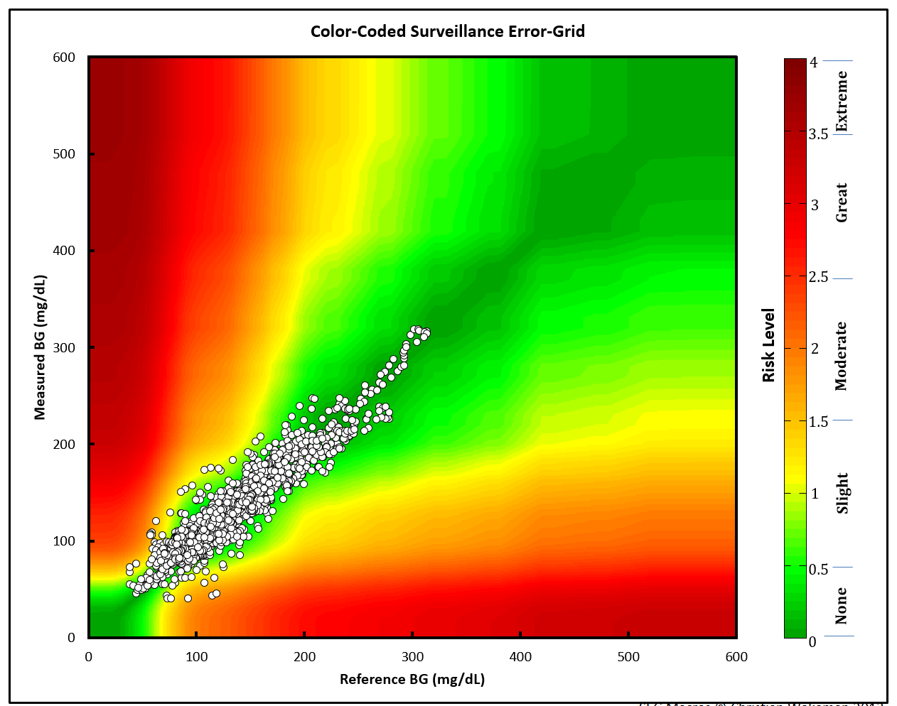
The points are plotted against a Gaussian smoothed background image.
ggplot2 image using risk pairs
The steps/code to create the current ggplot2 image are
below
Base layer
ggp_base <- ggplot() +
  geom_point(data = base_data,
    aes(x = x_coordinate,
      y = y_coordinate,
      fill = color_gradient))
ggp_base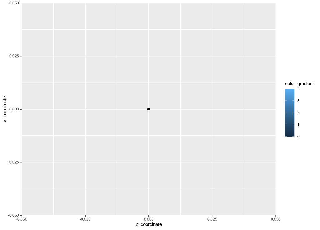
Risk color gradient
The risk layer adds the risk_pairs data and creates the
color gradient.
ggp_risk_color_gradient <- ggp_base +
  geom_point(data = risk_pairs,
    aes(x = REF,
        y = BGM,
        color = abs_risk), show.legend = FALSE)  +
  ggplot2::scale_color_gradientn(
    colors = risk_factor_colors,
    guide = "none",
    limits = c(0, 4),
    values = scales::rescale(c(
      0, # darkgreen
      0.4375, # green
      1.0625, # yellow
      2.7500, # red
      4.0000)))
ggp_risk_color_gradient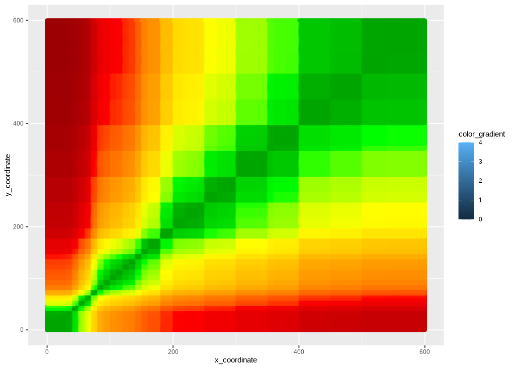
Risk fill gradient
The guide is added with ggplot2::scale_fill_gradientn()
and ggplot2::guide_colorbar().
ggp2_risk_fill_gradient <- ggp_risk_color_gradient +
  ggplot2::scale_fill_gradientn(values = scales::rescale(c(
      0, # darkgreen
      0.4375, # green
      1.0625, # yellow
      2.75, # red
      4.0 # brown
    )),
    limits = c(0, 4),
    colors = risk_factor_colors,
    guide = ggplot2::guide_colorbar(ticks = FALSE,
                           barheight = unit(100, "mm")),
                           breaks = c(0.25, 1, 2, 3, 3.75),
                           labels = c("None", "Slight",
                                      "Moderate", "High", "Extreme"),
                           name = "Risk level")
ggp2_risk_fill_gradient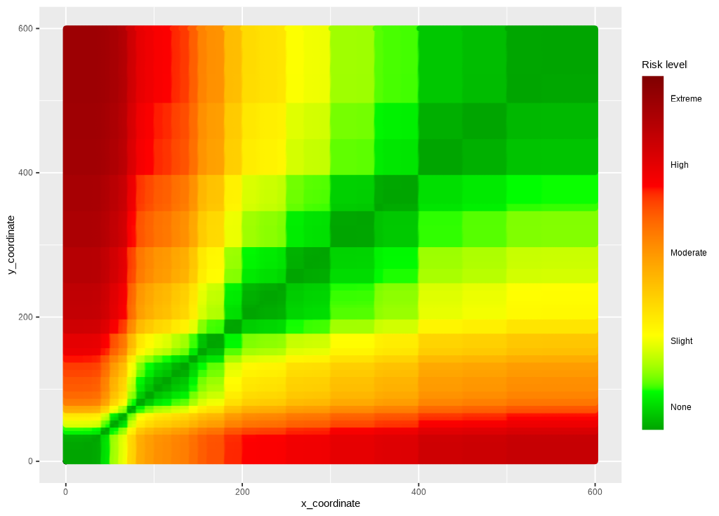
Scales
The x and y scales are set manually using
ggplot2::scale_y_continuous() and
ggplot2::scale_x_continuous().
ggp_scales <- ggp2_risk_fill_gradient +
  ggplot2::scale_y_continuous(
    limits = c(0, 600),
    sec.axis =
      sec_axis(~. / mmolConvFactor,
        name = "Measured blood glucose (mmol/L)"
      ),
    name = "Measured blood glucose (mg/dL)"
  ) +
  ggplot2::scale_x_continuous(
    limits = c(0, 600),
    sec.axis =
      sec_axis(~. / mmolConvFactor,
        name = "Reference blood glucose (mmol/L)"
      ),
    name = "Reference blood glucose (mg/dL)"
  )
ggp_scales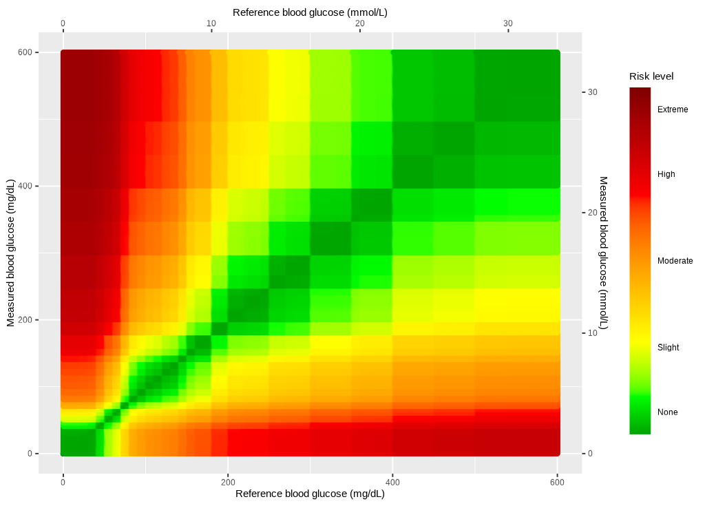
Theme
Finally, the theme is added to polish the output.
ggp_seg <- ggp_scales +
  segtools::theme_seg(base_size = 20)
ggp_seg