# install.packages('pak')
pak::pak('mjfrigaard/shinypak')19 CSS
Cascading Style Sheets (CSS) is a stylesheet language that serves as the backbone of web design, providing the tools to make Shiny applications functional and visually engaging. This chapter extends the Using custom CSS in your app article for including CSS in your Shiny app-package. We’ll also cover a brief introduction to CSS fundamentals and illustrate how it can enhance the aesthetics of a Shiny app.
What is CSS?
CSS is used to define the presentation of an HTML or XML web document. CSS describes how elements should be rendered on screen, paper, speech, or other media, which is particularly relevant to Shiny apps, as Shiny utilizes HTML to render UI elements.
CSS syntax is typically a series of statements comprised of selectors and declarations. The selectors tell the HTML what to style and include names similar to HTML tags (h1, h2) but can also include more complex classes (i.e., custom-sidebar). The declaration includes properties and values: properties are style attributes like color, text-align, or margin, and the values are the settings for each property.
With CSS, you can control your Shiny app’s layout, color, font, and overall visual appearance, making it an indispensable tool for developers looking to customize their applications.
Why use CSS in app-packages?
As we’ve seen, app-packages essentially bundle various application components, including the code for the UI elements, server logic, and any data. Adding CSS to this list of components serves several purposes:
Customization: CSS allows you to go beyond the default styles provided by Shiny, offering the freedom to personalize your app’s look and feel.
Consistency: Using CSS, you can maintain visual consistency across different parts of your app or multiple apps within the same package.
Efficiency: CSS can help reduce the complexity of your app’s UI code by separating content (HTML) from presentation (CSS). This separation makes your code cleaner and easier to maintain.
Incorporating CSS
There are three ways to include CSS in your Shiny apps:
Inline: inline CSS can be used directly within the HTML elements using the
styleattribute and is suitable for quick, small-scale styling.Internal: This method uses the
tags$style()function within the app’s UI definition and is ideal for app-specific styles that won’t be reused.External Files: This approach references external CSS files stored within the R package. A CSS file is best for extensive styling that applies to multiple apps or for sharing styles across different projects.
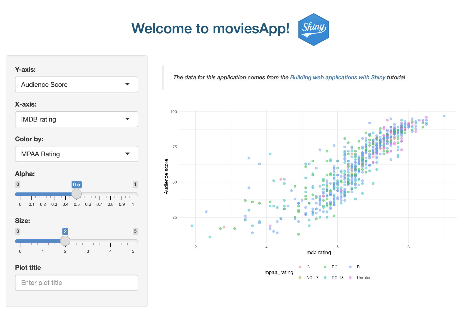
We’ll demonstrate each of these methods in the application launched with the launch_app() function.
19.1 Inline CSS
Lets start at the top of the UI and work our way down. The shiny package exports a collection of HTML tags in the shiny::tags list:
Launch app with the shinypak package:
launch('18.1_css-inline')show/hide HTML tags
names(shiny::tags)
##   [1] "a"                   "abbr"
##   [3] "address"             "animate"
##   [5] "animateMotion"       "animateTransform"
##   [7] "area"                "article"
##   [9] "aside"               "audio"
##  [11] "b"                   "base"
##  [13] "bdi"                 "bdo"
##  [15] "blockquote"          "body"
##  [17] "br"                  "button"
##  [19] "canvas"              "caption"
##  [21] "circle"              "cite"
##  [23] "clipPath"            "code"
##  [25] "col"                 "colgroup"
##  [27] "color-profile"       "command"
##  [29] "data"                "datalist"
##  [31] "dd"                  "defs"
##  [33] "del"                 "desc"
##  [35] "details"             "dfn"
##  [37] "dialog"              "discard"
##  [39] "div"                 "dl"
##  [41] "dt"                  "ellipse"
##  [43] "em"                  "embed"
##  [45] "eventsource"         "feBlend"
##  [47] "feColorMatrix"       "feComponentTransfer"
##  [49] "feComposite"         "feConvolveMatrix"
##  [51] "feDiffuseLighting"   "feDisplacementMap"
##  [53] "feDistantLight"      "feDropShadow"
##  [55] "feFlood"             "feFuncA"
##  [57] "feFuncB"             "feFuncG"
##  [59] "feFuncR"             "feGaussianBlur"
##  [61] "feImage"             "feMerge"
##  [63] "feMergeNode"         "feMorphology"
##  [65] "feOffset"            "fePointLight"
##  [67] "feSpecularLighting"  "feSpotLight"
##  [69] "feTile"              "feTurbulence"
##  [71] "fieldset"            "figcaption"
##  [73] "figure"              "filter"
##  [75] "footer"              "foreignObject"
##  [77] "form"                "g"
##  [79] "h1"                  "h2"
##  [81] "h3"                  "h4"
##  [83] "h5"                  "h6"
##  [85] "hatch"               "hatchpath"
##  [87] "head"                "header"
##  [89] "hgroup"              "hr"
##  [91] "html"                "i"
##  [93] "iframe"              "image"
##  [95] "img"                 "input"
##  [97] "ins"                 "kbd"
##  [99] "keygen"              "label"
## [101] "legend"              "li"
## [103] "line"                "linearGradient"
## [105] "link"                "main"
## [107] "map"                 "mark"
## [109] "marker"              "mask"
## [111] "menu"                "meta"
## [113] "metadata"            "meter"
## [115] "mpath"               "nav"
## [117] "noscript"            "object"
## [119] "ol"                  "optgroup"
## [121] "option"              "output"
## [123] "p"                   "param"
## [125] "path"                "pattern"
## [127] "picture"             "polygon"
## [129] "polyline"            "pre"
## [131] "progress"            "q"
## [133] "radialGradient"      "rb"
## [135] "rect"                "rp"
## [137] "rt"                  "rtc"
## [139] "ruby"                "s"
## [141] "samp"                "script"
## [143] "section"             "select"
## [145] "set"                 "slot"
## [147] "small"               "solidcolor"
## [149] "source"              "span"
## [151] "stop"                "strong"
## [153] "style"               "sub"
## [155] "summary"             "sup"
## [157] "svg"                 "switch"
## [159] "symbol"              "table"
## [161] "tbody"               "td"
## [163] "template"            "text"
## [165] "textarea"            "textPath"
## [167] "tfoot"               "th"
## [169] "thead"               "time"
## [171] "title"               "tr"
## [173] "track"               "tspan"
## [175] "u"                   "ul"
## [177] "use"                 "var"
## [179] "video"               "view"
## [181] "wbr"
All of the objects in the shiny::tags list are functions that generate HTML:
shiny::tags$div()<div></div>We’ll use tags$h2() inside our app’s titlePanel() to add the following CSS directly to the style argument:
tags$h2(
style = "color: #02577A; text-align: center;",
"Welcome to shinyrPkgs!")- 1
-
h2selector defined withshiny::tags
- 2
-
CSS styling with
styleargument
- 3
- Text to be styled
In this example, the h2 text elements within the call to tags$h2() will have their color set to #02577A and be center-aligned. If we pass this function to the Console, we see the following HTML:
<h2 style="color: #02577A; text-align: center;"Welcome to shinyrPkgs!</h2>The CSS statement above consists of a single selector and declaration with two properties and accompanying values:1
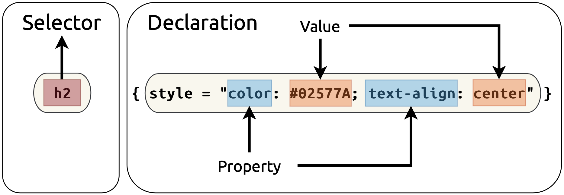
As we can see, the <h2> HTML tag includes the style argument with the declaration properties and values. The updated text in our UI title panel is below:
tags$h2()19.2 Internal CSS
If we’d like to include more complicated styling, we can add this syntax internally using tags$style(). Anything you define within tags$style() will be applied as CSS styling rules to the HTML elements of your app.
Launch app with the shinypak package:
launch('18.2_css-internal')We’ll define a custom style for a few elements in a new custom-sidebar class selector. Class selectors are used to apply the same styling rules to any HTML element that includes the specified class name in its class attribute.
We’ll define and set the background color to a light blue, gray text, and add a comfortable amount of space around the content in custom-sidebar below:
.custom-sidebar: The period (.) before the name indicates that it is a class selector in CSS.
tags$style("
    .custom-sidebar
  ")
{ ... }: Inside the style block, we define a CSS rule for elements that have a class attribute ofcustom-sidebar.
tags$style("
    .custom-sidebar {
      ...
    }")
background-color: #ecfafd;: This CSS property sets the background color of the.custom-sidebarelements using a hexadecimal code (#ecfafd), which is a light blue in this case.2
tags$style("
    .custom-sidebar {
      background-color: #ecfafd;
    }")
color: #696969;: This property sets thecolorof the text inside the.custom-sidebarelements to a shade of gray.
tags$style("
    .custom-sidebar {
      background-color: #ecfafd;
      color: #696969;
    }")
padding: 10px;: Padding is the breathing room between the content of the.custom-sidebarelement and its border (10 pixels on all sides).
tags$style("
    .custom-sidebar {
      background-color: #ecfafd;
      color: #696969;
      padding: 10px;
    }")
When we want to use the .custom-sidebar styling, we can specify it’s name in the class argument of the UI function (like sidebarPanel() below):
sidebarLayout(
sidebarPanel(
class = "custom-sidebar",
mod_var_input_ui("vars")
),
mainPanel(
mod_scatter_display_ui("plot")
)
)- 1
-
Use the CSS styling from
tags$style()
After loading our package and launching our app, we see the updated sidebar in the UI:
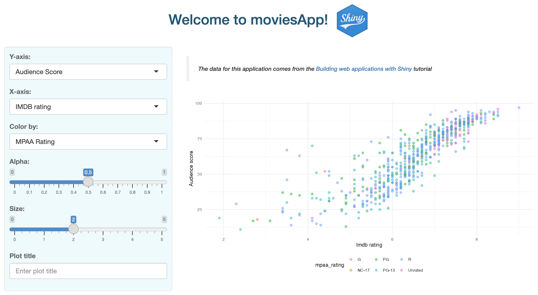
tags$style()19.3 External CSS files
In app-packages, it’s generally better to use external CSS files for reproducibility and ease of maintenance.
19.3.1 Font Awesome
19.3.2 Local CSS files
We’ll create a file named my_styles.css to hold all the custom styles we want to apply to our app and store in the inst/www folder (along with any images and external resources).
Launch app with the shinypak package:
launch('18.3_css-file')shinyrPkgs/
inst/
└── www
├── bootstrap.png
├── my_styles.css
└── shiny.pngThe contents of my_styles.css are described below:
19.3.2.1 Header
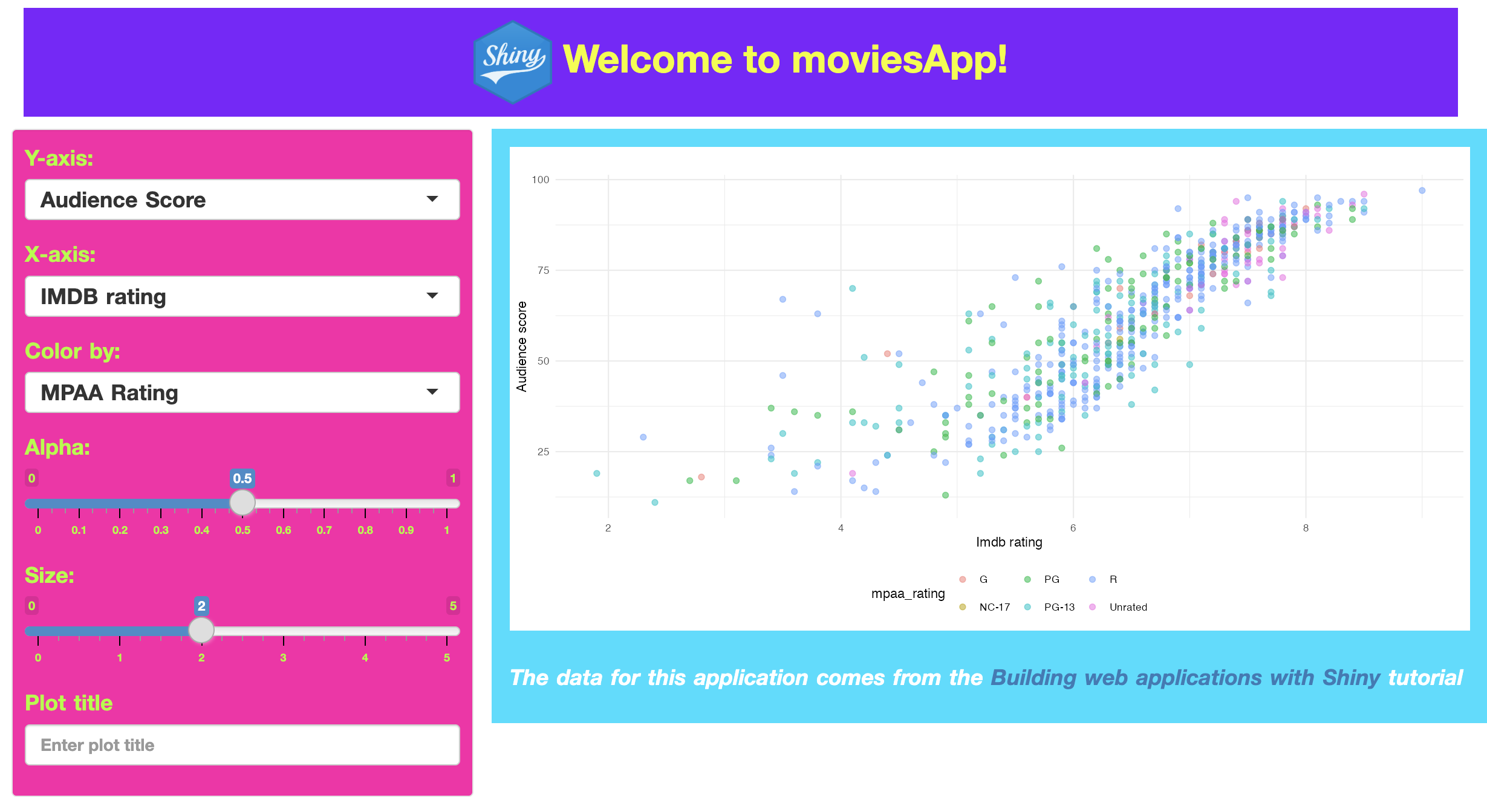
In the previous section, the image tag had CSS styling for the margin3 property inside the titlePanel(). We can move this into the .custom-header selector class and set the margins (along with other properties like font-size and font-weight).
.custom-header {
    background-color: #8000ff;
    color: #f0ff07;
    padding: 10px;
    text-align: center;
    font-size: 32px;
    font-weight: bold;
    margin: 10px 10px;
}div(class = "custom-header",
img(
src = "www/shiny.png",
height = 70,
width = 65,
align = "center"
),
"Welcome to shinyrPkgs!"
)Creating a custom-header class selectors removes the need to use the titlePanel()–we can replace it with a div(). Inside img(), we can still position and size attributes.

19.3.2.2 Text
If we have HTML elements that we’d like to style with more than one class selector, we can provide multiple items to the class argument. For example, suppose custom-text has properties and values we’d like to use in future class selectors.
.custom-text {
    font-size: 18px;
    word-spacing: 1.5px;
    font-weight: bold;
}
19.3.2.3 Sidebar
In the sidebar, we’ll change the background and text color, but also provide the styling from both custom-sidebar and custom-text:
.custom-sidebar {
    background-color: #ff00a9;
    color: #a5ff0b;
    padding: 10px;
}sidebarLayout(
sidebarPanel(
class = c("custom-sidebar",
"custom-text"),
mod_var_input_ui("vars")
)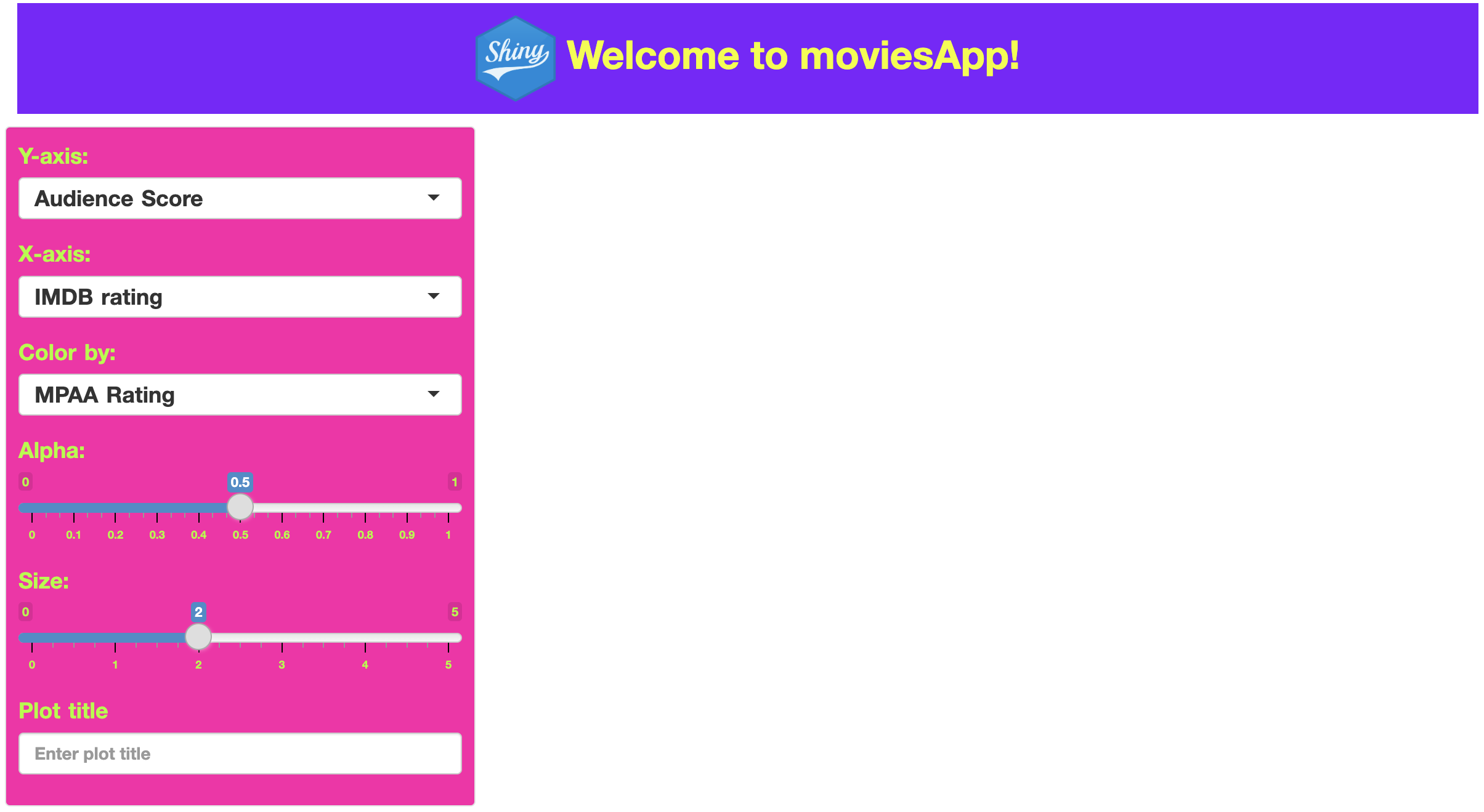
19.3.2.4 Main
The main panel will also have custom colors, but we can provide additional text properties (along with custom-text).
.custom-main {
    background-color: #00ddff;
    color: #ffffff;
    font-style: italic;
    padding: 15px;
}mainPanel(
class = c("custom-main",
"custom-text"),
mod_scatter_display_ui("plot")
)
19.4 Referencing CSS files
In your Shiny application’s UI definition, reference the CSS file using the addResourcePath() and tags$link() functions.4
In movies_ui(), this looks like:
movies_ui <- function(bslib = FALSE) {
addResourcePath(
    prefix = "www",
    directoryPath = system.file("www", package = "shinyrPkgs")
# The rest of the UI app function goes heretagList(
fluidPage(
tags$link(
rel = "stylesheet",
type = "text/css",
href = "www/my_styles.css"
)
# The rest of the UI app function goes hereSince the app is inside an R package, the system.file() function will build a path to the installed version of your package when the application is run/deployed.
Recap
Integrating CSS into your app-package opens a world of possibilities for customization and enhancement. Understanding the basics of CSS gives you the ability to significantly improve the visual appeal and user experience of your Shiny app. Remember, the goal is not just to make your apps work well but also to make them look great and provide an engaging experience for the end-user.
I’ve also included the Shiny icon using
img(),addResourcePath(), andsystem.file()we covered back in Section 9.1.3.↩︎Hex codes are a way of specifying colors in web design and can represent millions of colors by combining different levels of red, green, and blue.↩︎
margin: 10px 10px;if two values are listed formargin, this translates to ‘top/bottom margins are10px, right/left margins are10px.’↩︎We covered using the
inst/folder withsystem.file()in the Section 9.1 chapter.↩︎