# install.packages('pak')
pak::pak('mjfrigaard/shinypak')27 Design
In this section, we’ll briefly introduce a few packages that can be used to customize the look and feel of your Shiny app. Specifically, we’ll cover using bslib’s layout functions, building interactive graphs with plotly, adding colors and themes with thematic, and conditionally displaying the contents in a reactable table.
27.1 Pages, Panels, and Cards
bslib leverages Bootstrap, a popular front-end framework, which allows developers to easily create application and R markdown themes and styles without deep knowledge of CSS or HTML. bslib is tightly integrated into the Shiny ecosystem.1
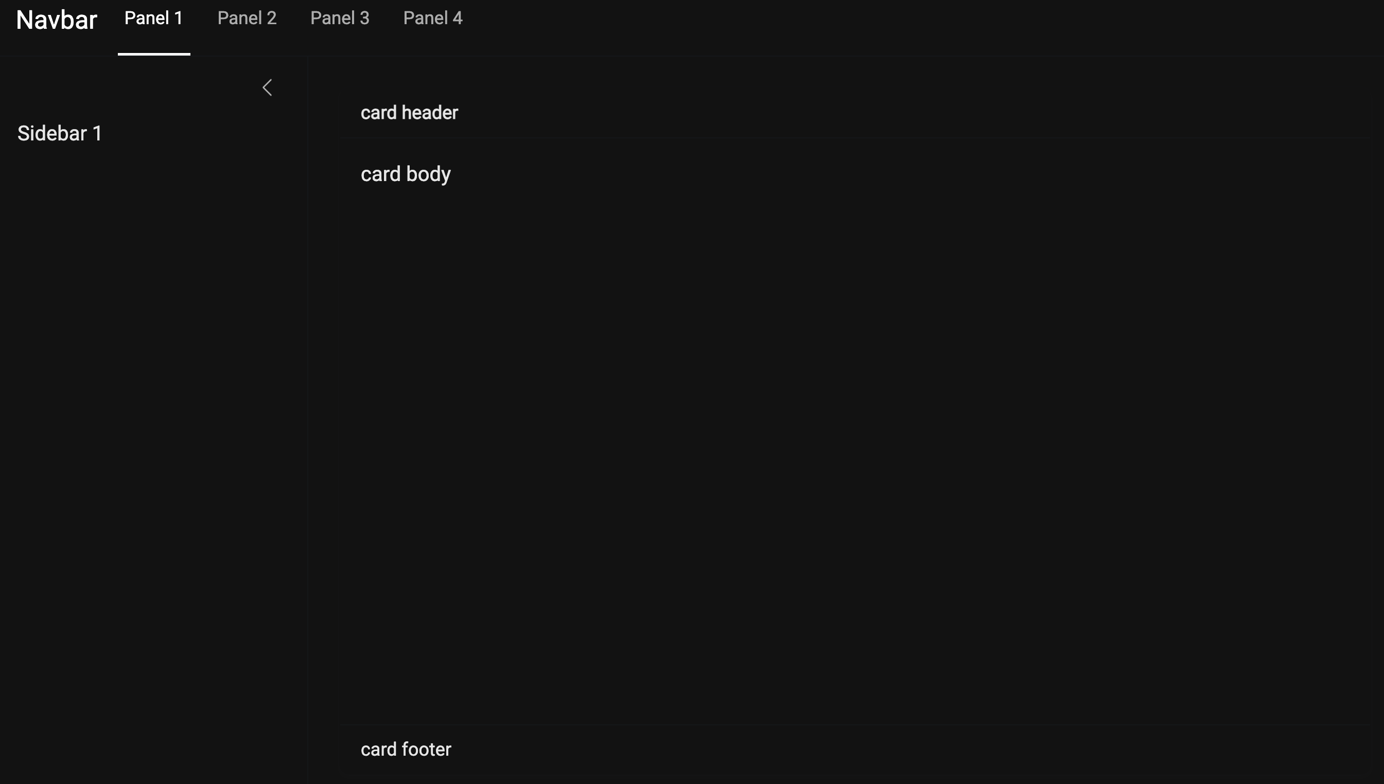
The application layout in this branch has been upgraded to the page_navbar(), allowing us to have multiple pages and sidebars:
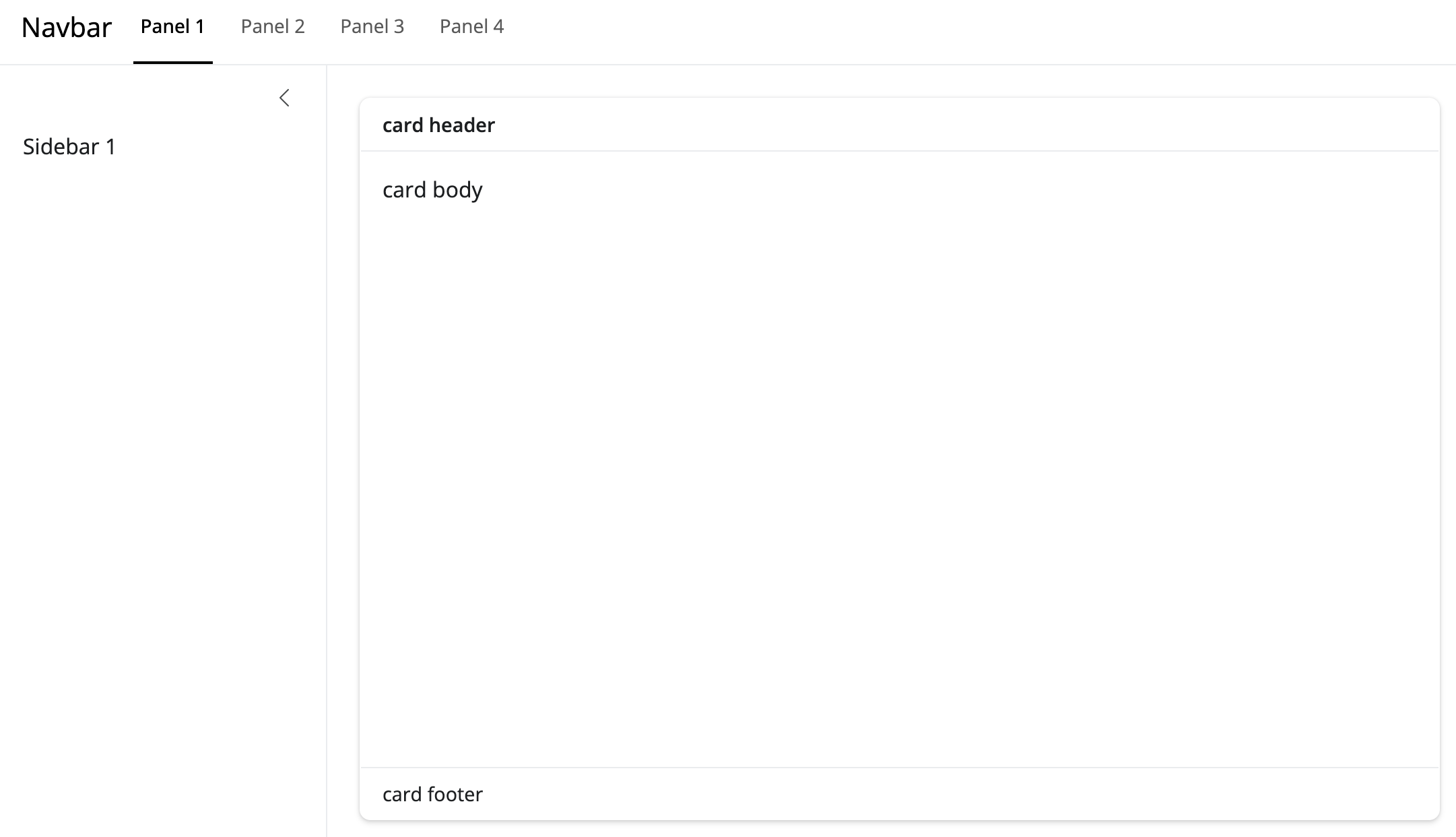
layout_sidebar() inside nav_panel()
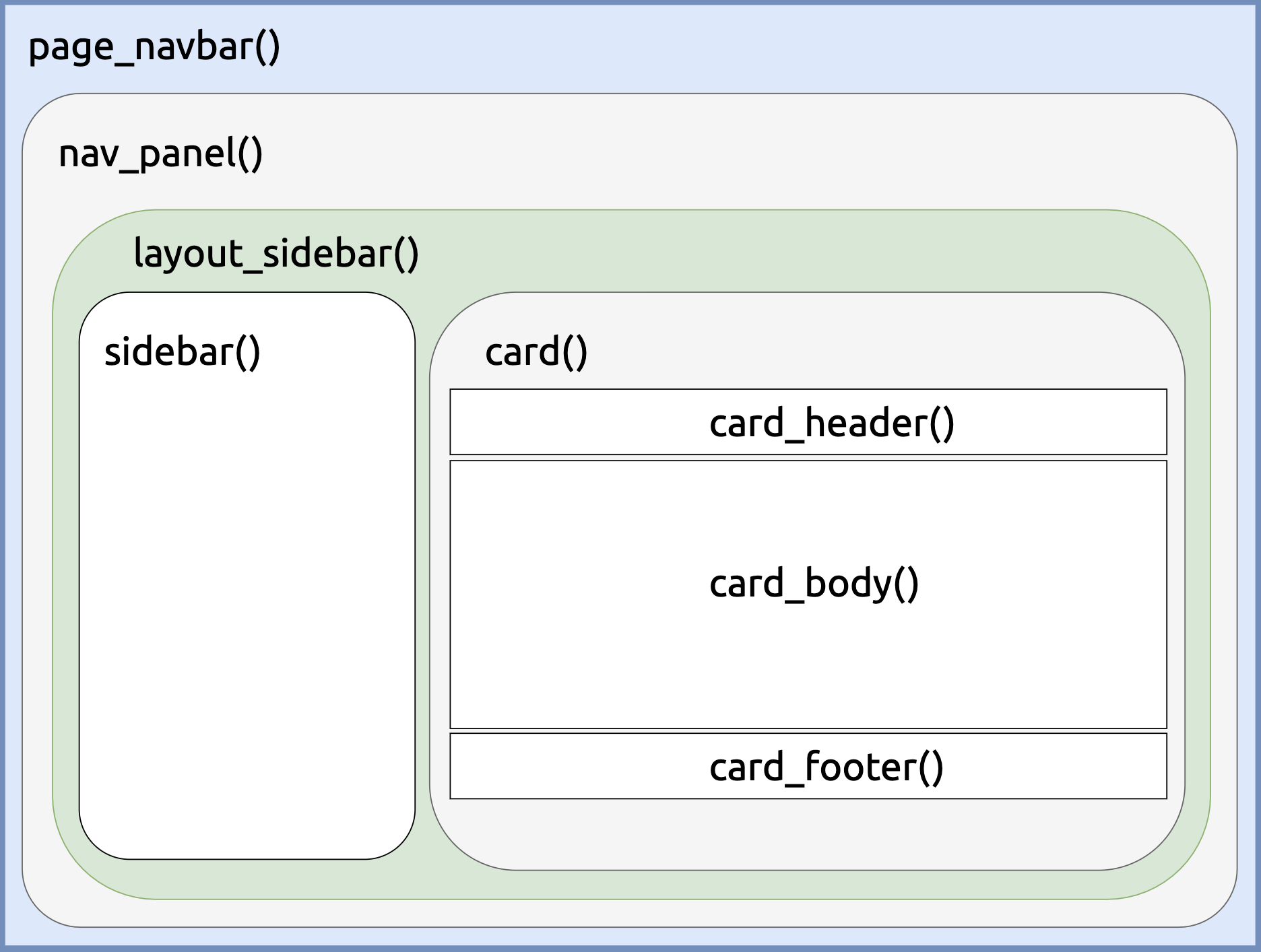
The page_navbar() displays the pages as Panel 1, Panel 2, Panel 3, and Panel 4. The landing page uses nav_panel() to arrange the sidebar() and card() contents.
The subsequent pages display the sidebar and cards with the navset_card_tab() and a second nav_panel():
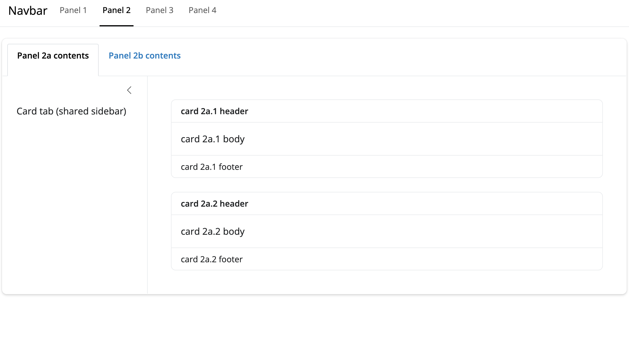
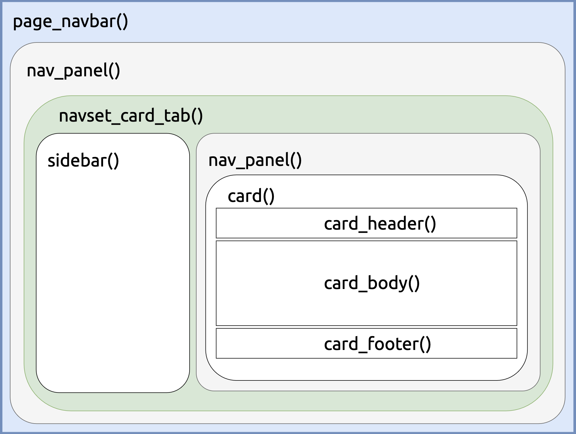
navset_card_tab() inside nav_panel()
You can view a demo of this layout with the demo_app_navbar() function.
27.2 Colors and Fonts
We can choose custom colors and fonts with bslib by passing the bs_theme() function to the themeargument of page_navbar():
theme = bslib::bs_theme(
version = 5,
bg = "#000000",
fg = "#ffffff",
body_bg = "#121212",
primary = "#2979ff",
secondary = "#bdbdbd",
base_font = sass::font_google("Roboto")
)- 1
- Pure black background for maximum contrast
- 2
- White text color for sharp contrast
- 3
- Dark gray for the main content background
- 4
- Bright blue primary color
- 5
- Light gray for secondary elements
- 6
- Base font from Google
bs_theme() can be used to define the colors in our, and the sass::font_google() function also gives us control over the fonts. 2
You can view the dark theme using demo_app_navbar(theme = "dark"):
page_navbar()27.3 Graphs
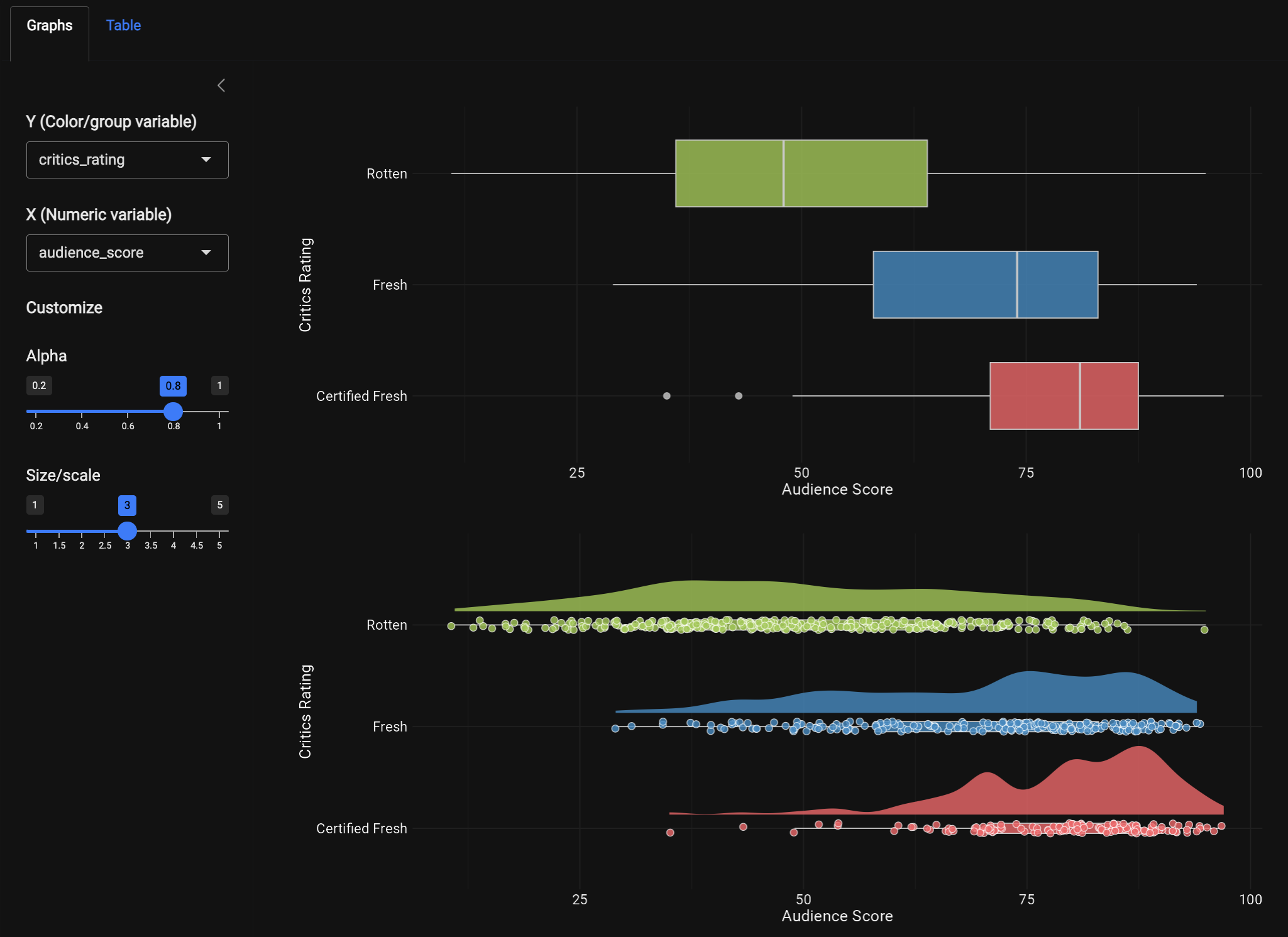
After launching the application with launch_app(), we can see the landing page displays our scatter-plot, which has been rebuilt using plotly to add some interactivity to the application.
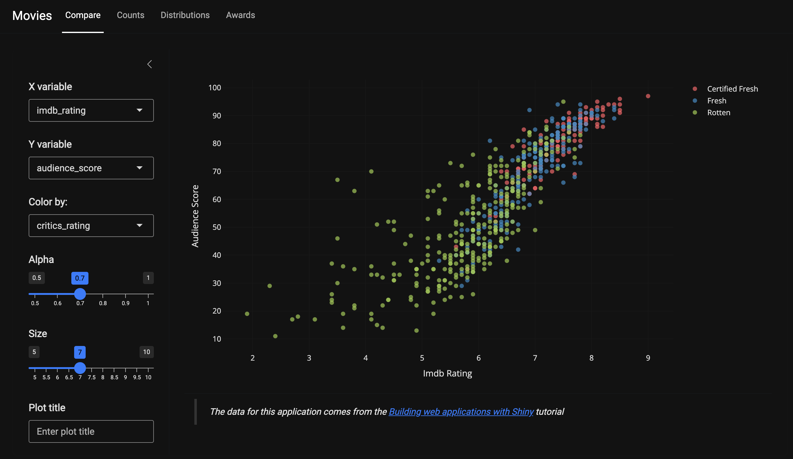
The scatter plot is rendered using plotly::renderPlotly(). The major differences between the ggplot2 syntax and plotly are:
The plot is initialized by
plot_ly(), andmoviesis linked to the x, y, and color axes.base::get()is used to dynamically select the column names stored in our reactive values (vals()).By setting the
textargument to~title, the scatter-plot will display thetitleof the film when the cursor hovers over a specific point.markerspecifies the size (vals()$size) and opacity (vals()$alpha) of the points. Thetype = 'scatter'andmode = 'markers'arguments specify this is a scatter plot with points.
show/hide plotly render code
req(vals())
plotly::plot_ly(
data = movies,
x = ~get(vals()$x),
y = ~get(vals()$y),
color = ~get(vals()$color),
text = ~title,
type = 'scatter',
mode = 'markers',
colors = clr_pal3,
marker = list(
size = vals()$size,
opacity = vals()$alpha
)
)- 1
-
Reactive user variable inputs
- 2
-
Hover value for points
- 3
- The scatter type with markers (similar to aesthetics)
- 4
- Color palette
- 5
- Point size and opacity
The code to create the clr_pal3 vector is created in data-raw/clr_pal3.R and contains three colors for the levels in critics_rating:
clr_pal3 <- c("#FC5C64FF", "#2F8AC4FF", "#99C945FF")

usethis::use_data(clr_pal3, overwrite = TRUE)
The UI navbar (stored in R/navbar_ui.R) now includes panels for Counts, Distributions, and Awards, with Graphs and Table sub-panels. We will cover these graphs in the section below.
27.3.1 Plot Internals
The remaining graphs in the application are built using ggplot2, but instead of writing utility functions (as we did in previous branches), these visualizations use rlang’s injection operator (!!) for the plot inputs. This method makes it possible to include the ggplot2 functions inside each plotting module. See the example from R/mod_boxplot.R below:
ggplot2::ggplot(d_bp,
ggplot2::aes(x = !!vals()$num_var,
y = !!vals()$chr_var,
fill = !!vals()$chr_var)
) - 1
-
Injection operator for our reactive
vals()
The modules in this branch follow a similar naming convention to the previous branches. For example, In the UI, the Compare panel collects the inputs in the sidebar and passes them to the point module in the card_body():
█─layout_sidebar
├─█─sidebar
│ └─█─mod_compare_vars_ui
└─█─card_body
  └─█─mod_compare_point_ui
In the Counts panel, the sidebar collects the inputs inside the navset_card_tab(), then passes them to the two nav_panel()s:
█─navset_card_tab
├─█─sidebar
│ └─█─mod_counts_vars_ui
├─█─nav_panel
│ ├─█─mod_counts_vbox_ui
│ ├─█─mod_counts_bar_ui
│ └─█─mod_counts_waffle_ui
└─█─nav_panel
  └─█─mod_counts_tbl_ui
A consistent naming convention is a life-saver here because it helps differentiate the inputs (_vars) from the outputs (_bar, _point, _tbl, etc.).
27.3.2 thematic
We can match the colors and fonts to the bslib package using thematic::thematic_shiny(), which is placed inside our updated launch_app() function.3
launch_app <- function(options = list(), run = "p", ...) {
if (interactive()) {
display_type(run = run)
}
options(shiny.useragg = TRUE)
ggplot2::theme_set(ggplot2::theme_minimal())
thematic::thematic_shiny(
bg = "#121212",
fg = "#ffffff",
accent = "#bdbdbd",
font = "Roboto")
shinyApp(
ui = navbar_ui(...),
server = navbar_server,
options = options
)
}- 1
-
Set
raggoption - 2
-
Set
ggplot2theme globally - 3
-
Set
thematictheme
This significantly reduces the amount of code required to produce ggplot2 visualizations that match our bslib theme. For example, to reproduce the graph we see in the application, we can use the following code using thematic:
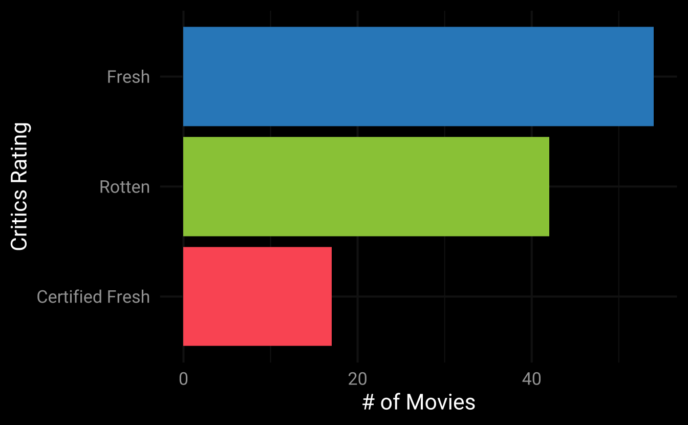
show/hide bar graph code
x_lab <- name_case("critics_rating")
d <- subset(movies,
thtr_rel_year >= 1980 &
thtr_rel_year <= 1990)
ggplot2::theme_set(ggplot2::theme_minimal(base_size = 16))
thematic::thematic_on(bg = "#000000", fg = "#ffffff",
accent = "#bdbdbd", font = "Roboto")
ggplot2::ggplot(d,
ggplot2::aes(x = forcats::fct_rev(
forcats::fct_infreq(
critics_rating)
)
)
) +
ggplot2::geom_bar(
ggplot2::aes(fill = critics_rating),
show.legend = FALSE
) +
ggplot2::coord_flip() +
ggplot2::scale_fill_manual(values = clr_pal12) +
ggplot2::labs(
x = x_lab, y = "# of Movies",
fill = x_lab)- 1
-
Build x label
- 2
-
Subset data
- 3
-
Set theme (globally)
- 4
- $et thematic theme
- 5
- Set aesthetics
- 6
-
Reorganize labels
- 7
-
Build bar graph
- 8
-
Flip x and y
- 9
-
Use color scale
- 10
- Assign labels
However, if we want the same result using ggplot2 functions, the theme() layer would looks something like this:
show/hide bar graph theme args
ggplot2::theme(
      legend.position = "none",
      plot.background = ggplot2::element_rect(fill = "#121212", color = NA),
      panel.background = ggplot2::element_rect(fill = "#121212", color = NA),
      panel.grid.major = ggplot2::element_line(color = "#ffffff"),
      panel.grid.minor = ggplot2::element_line(color = "#ffffff"),
      axis.title = ggplot2::element_text(color = "#ffffff"),
      axis.ticks = ggplot2::element_line(color = "#ffffff"),
      title = ggplot2::element_text(color = "#ffffff"),
      text = ggplot2::element_text(color = "#ffffff"),
      axis.text = ggplot2::element_text(color = "#ffffff", size = 14),
      axis.title = ggplot2::element_text(color = "#ffffff", size = 16)
    )
As we can see, thematic_on() reduces the amount of theme() adjustments we need to specify the colors and fonts for our ggplot2 graphs.
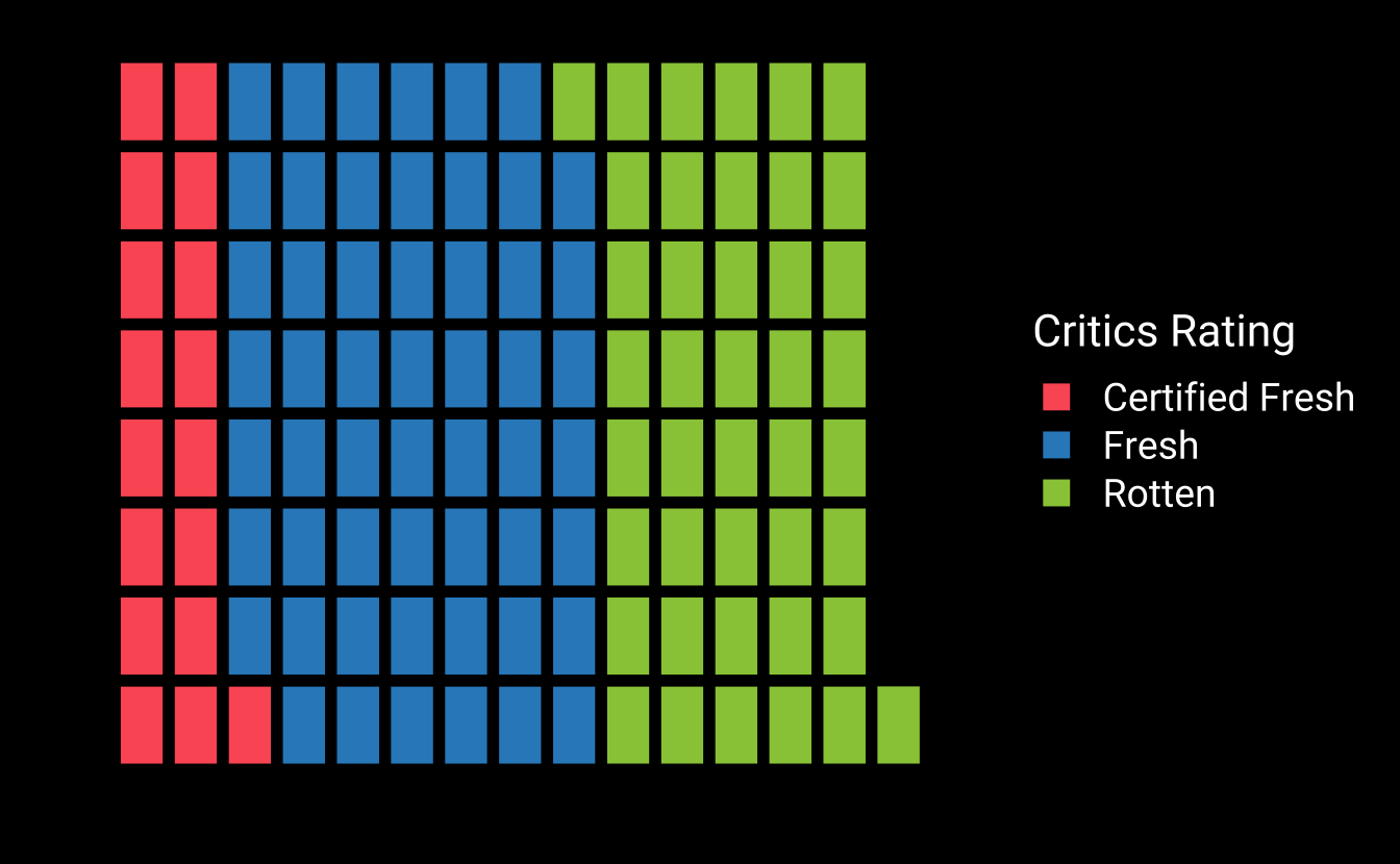
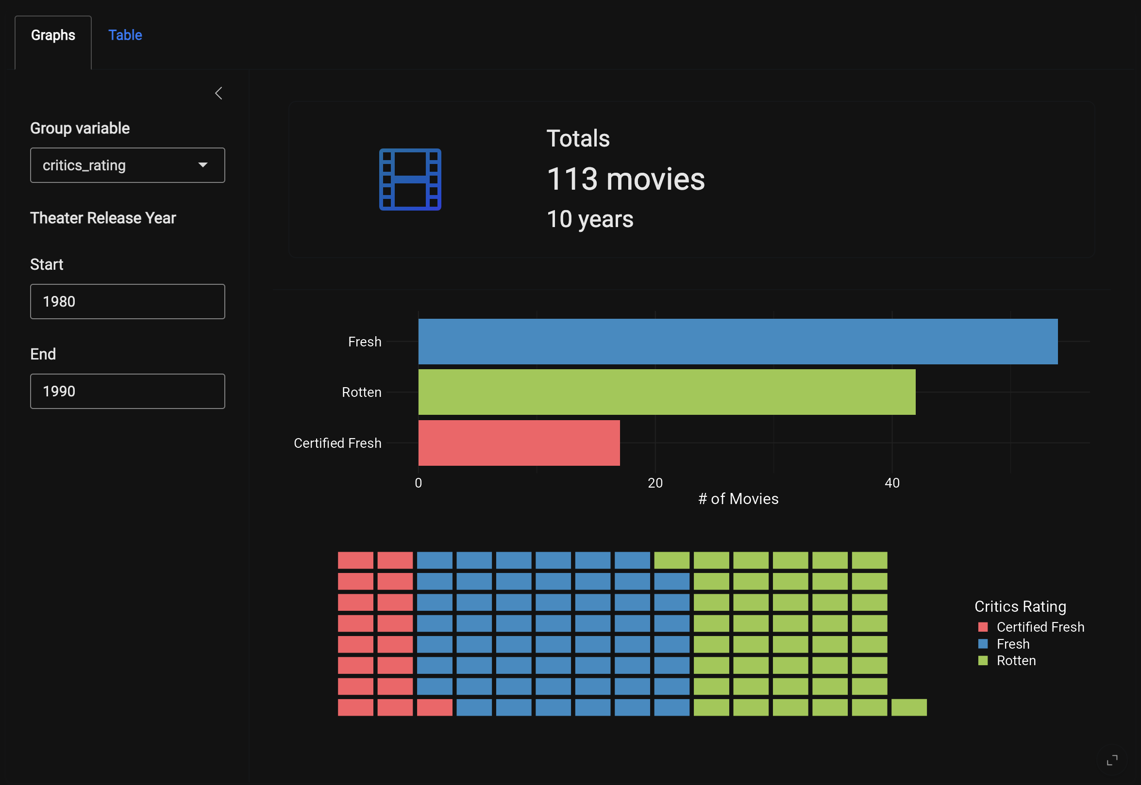
The waffle graph is slightly more challenging because this geom comes with it’s own theme (ggwaffle::theme_waffle()):
show/hide ggwaffle code
library(ggwaffle)
x_lab <- name_case(as.character("critics_rating"))
# convert to character
movies$chr_var <- as.character(movies[["critics_rating"]])
# subset
d <- subset(movies,
        thtr_rel_year >= 1980L &
        thtr_rel_year <= 1990L)
# waffle iron
d_iron <- ggwaffle::waffle_iron(d,
                      ggwaffle::aes_d(group = chr_var))
# plot
ggplot2::ggplot(data = d_iron,
       ggplot2::aes(x = x,
           y = y,
           fill = group)) +
  ggwaffle::geom_waffle() +
  ggplot2::scale_fill_manual(values = clr_pal12) +
  ggplot2::labs(
    x = "", y = "",
    fill = x_lab
  ) +
  ggwaffle::theme_waffle() +
  ggplot2::theme(
      legend.text = ggplot2::element_text(color = "#ffffff", size = 14),
      legend.title = ggplot2::element_text(color = "#ffffff", size = 16)
) 
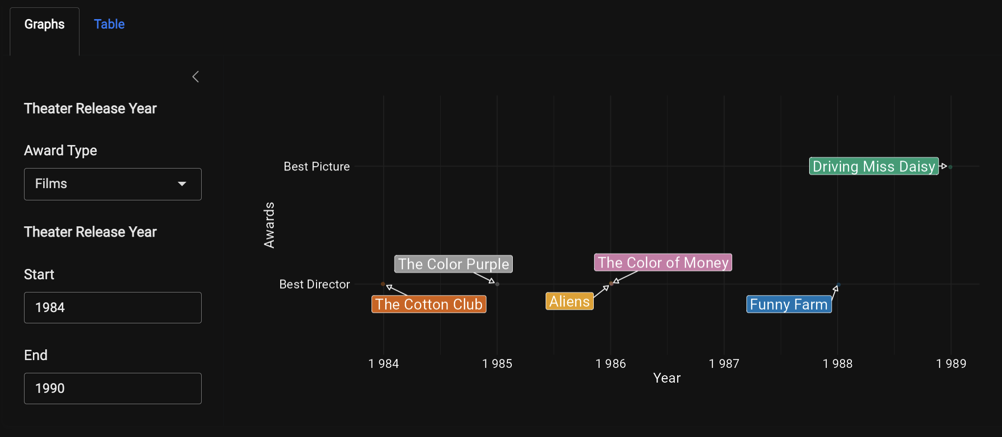
By placing the thematic_shiny() function in our standalone app function, we’re can focus on building graphs without worrying about their colors and fonts matching our bslib theme. The graphs from the Distributions and Awards sub-panels are below:
A new label utility function (R/name_case.R) also makes it easier to convert the variable inputs into title case for the graphs and tables:
show/hide name_case() function
name_case <- function(x, case = "title") {
if (!is.character(x)) {
stop("Input must be a character vector")
}
change_case <- function(name, case) {
sep_words <- strsplit(name, "_|[^[:alnum:]]+")[[1]]
case_words <- switch(case,
title = paste0(
toupper(substring(sep_words, 1, 1)),
substring(sep_words, 2)),
lower = tolower(sep_words),
stop("Unsupported case"))
return(paste(case_words, collapse = " "))
}
named_vector <- sapply(x, change_case, case)
return(unname(named_vector))
}- 1
-
Check if input is a character vector
- 2
-
Change the case of a single name
- 3
-
split the string by underscores or other non-alphanumeric characters
- 4
-
Change case of each word
- 5
-
Combine the words
- 6
-
Apply
change_caseto all elements
Read more about building the graphs with thematic and bslib in the Graphs vignette.
27.4 Value Boxes
The Counts sub-panel include a value box for the time-span and total number of movies released the two year inputs. The value_box() uses a combination of shiny and bsicons functions to format the text:
mod_counts_vbox_ui <- function(id) {
  ns <- NS(id)
  tagList(
    bslib::value_box(
      full_screen = FALSE,
      fill = FALSE,
      title = markdown("#### Totals"),
      value = textOutput(ns("counts_text")),
      showcase = bsicons::bs_icon("film"),
      h4(textOutput(ns("years_text")))
      )
    )
}
The rendered output is placed in the bslib::card_header() above the graphs:
27.5 Tables
We can match the reactable tables with the UI bslib theme using the reactableTheme() function. We also use some conditional formatting to match the colors in the graphs:
bslibis a dependency of the Shiny package, so it’s automatically loaded with@import shiny. However, I recommend listing it in theImportsfield of theDESCRIPTIONand referencing its use explicitly to distinguish it from other layout functions↩︎primaryandsecondarycontrol the text colors, and thebg,fg, andbody_bgarguments control the background, foreground, and body-background↩︎We’ve also set the
raggoption and globalggplot2theme before callingthematic_shiny()↩︎