The contents for section are under development. Thank you for your patience.
In this chapter, we explore how to enhance our app UI by integrating custom HyperText Markup Language (HTML) in our app-package. Web content is made of HTML elements (headings, paragraphs, links, images, and multimedia elements). HTML elements are represented as tags1, which are nested within each other to build a complete document (or web application). As you can imagine, even a basic understanding of HTML can be valuable for designing the user interface of a Shiny applications.
28.1 Shiny and HTML
While Shiny provides a high-level interface for building web applications using R, incorporating raw HTML allows for finer control and customization of the app’s appearance and layout. Knowing a little HTML gives us the ability to create polished and professional UIs. Some basic HTML skills also enables us to include additional content types and structures–beyond what is natively supported by Shiny’s UI functions–allowing for greater flexibility and creativity in our app design.
28.2htmltools
The htmltools package facilitates the creation of HTML elements and documents within R. htmltools provides functions to create tags, manage dependencies, and render HTML documents. htmltools is imported when we install and load shiny,2, so the tags object is automatically available.
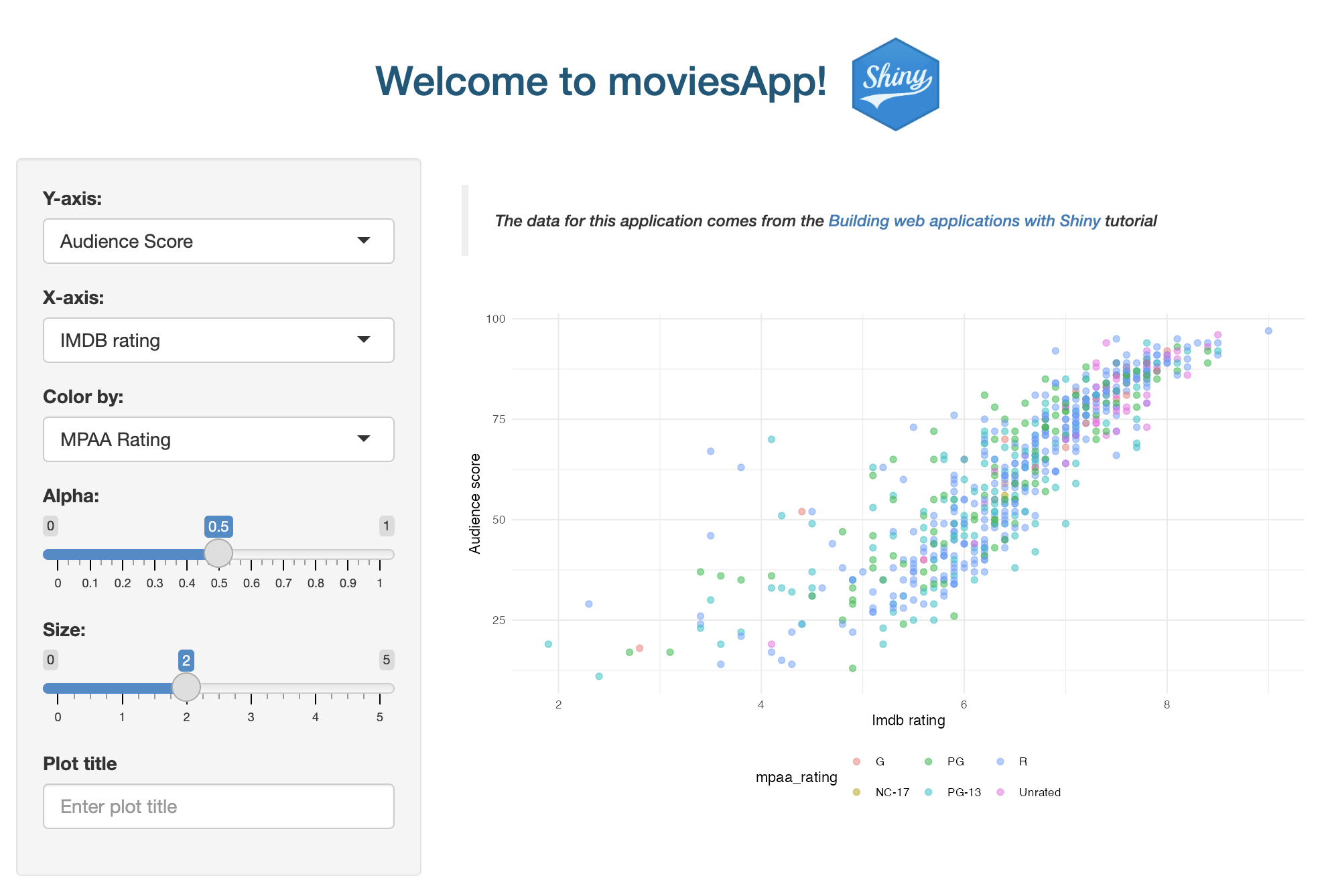
We’re already using HTML tags in our movies_ui() function to reference the original source of the movies data and application:
show/hide
tags$blockquote( tags$em( tags$p("The data for this application comes from the ", tags$a("Building web applications with Shiny",href ="https://rstudio-education.github.io/shiny-course/" ),"tutorial" ) ))
HTML tags are the building blocks of HTML documents. They are enclosed in angle brackets (<tag>) and define the structure and content of the web page. htmltools is particularly useful in Shiny app-packages because it allows you to build complex HTML structures programmatically. If we view the output from the block quote above, we see the raw HTML:
<blockquote><em><p> The data for this application comes from the<a href="https://rstudio-education.github.io/shiny-course/">Building web applications with Shiny</a> tutorial</p></em></blockquote>
htmltools$tags() allows us to create HTML elements directly within our R code. The sections below cover some of the common HTML tags used by htmltools::tags in Shiny applications.
28.2.1 Headings
Headings are used to define the hierarchy and structure of content on a web page. They range from <h1> (the most important heading) to <h6> (the least important heading):
tags$h1("Level 1")
<h1>Level 1</h1>
Level 1
tags$h2("Level 2")
<h2>Level 2</h2>
Level 2
tags$h3("Level 3")
<h3>Level 3</h3>
Level 3
28.2.5 Paragraphs
Paragraphs are used to define blocks of text. They are enclosed within <p> tags.
tags$p("Block of text.")
<p>Block of text.</p>
Block of text.
28.2.6 Divisions and Spans
<div> and <span> are generic containers used to group and style content. <div> is a block-level element used to group larger sections of content:
tags$div( tags$p("Paragraph in a div."))
<div><p>Paragraph in a div.</p></div>
Paragraph in a div.
<span> is an inline element used to style smaller parts of the text:
<p> Some <span style="color: red;">red</span> words.</p>
Some
red
words.
28.2.7 Text Styling
HTML tags can be used to create many of the same styles we use in markdown. For example, we can format text as code using the <code> and <pre> tags.
<code> is better for highlighting a small piece of code within a paragraph of text.
tags$code("library(shiny)")
<code>library(shiny)</code>
library(shiny)
<pre> is better for multiline code because it preserves both spaces and line breaks:
tags$pre("for(i in 1:5) {
    print(paste0('#', i))
  }")
<pre>for(i in 1:5) {
    print(paste0('#', i))
  }</pre>
for(i in 1:5) {
    print(paste0('#', i))
  }
We can also combine <pre> and <code>:
tags$pre(
  tags$code("
    for(i in 1:5) {
      print(paste0('#', i))
    }")
  )
<pre><code>for(i in 1:5) { print(paste0('#', i)) }</code></pre>
for(i in 1:5) { print(paste0('#', i))}
We can also specify bold (<strong>) and italic (<em>).
tags$strong("bold")
<strong>bold</strong>
bold
tags$em("italic")
<em>italic</em>
italic
28.2.8 Links
Links, or anchor tags, are used to create hyperlinks that navigate to other web pages or resources. The href attribute specifies the URL of the link’s destination.
The <img> tag is used to embed images in an HTML document. The src attribute specifies the path to the image file, and the alt attribute provides alternative text for the image:
tags$img(src ="logo.png")
<img src="logo.png"/>
align, width, and height control the size and position of the image.
28.3 Custom inputs
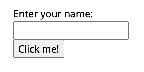
The HTML output generated by htmltools plays well with Shiny, so we could use it to custom inputs.3 For example, in this branch we have a simple buttonApp() application that collects a name text input and displays a greeting.
As we can see, mod_cust_button_ui() uses the tags$form() from htmltools to create a custom text input area and submit button in the sidebar. The mod_cust_button_server() module function returns the text input as a reactive (txt).
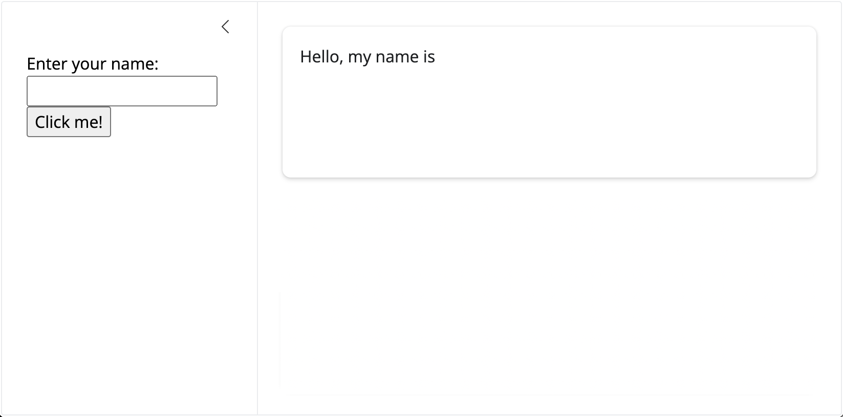
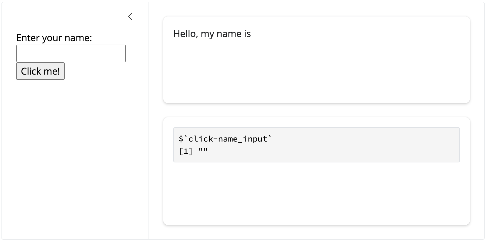
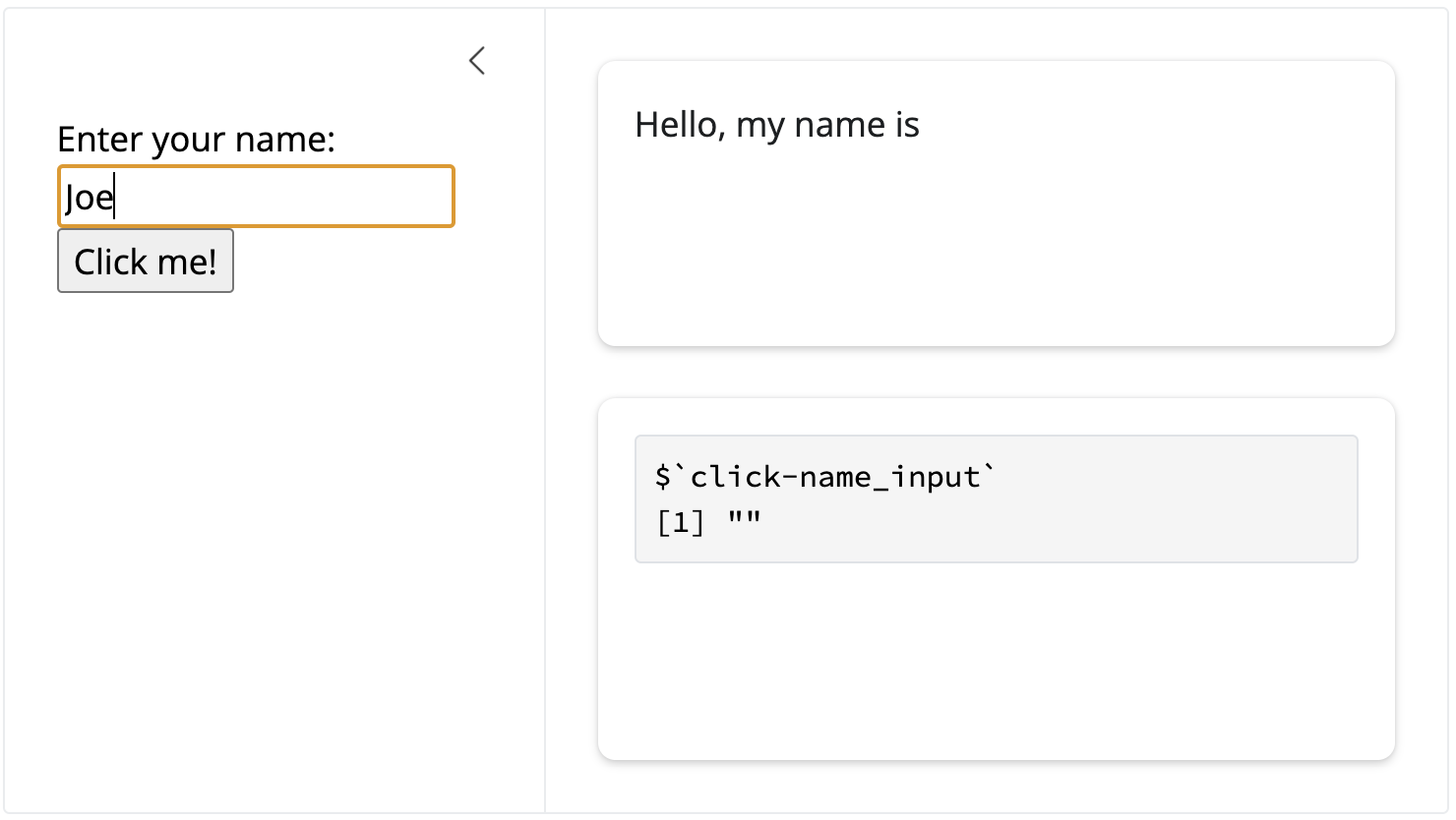
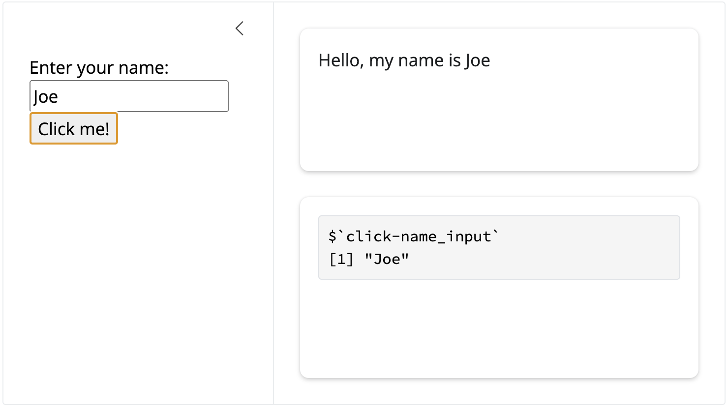
To aid us in understanding how the cutom text input works with submit button inside the modules, we’ll also add a card with verbatimTextOutput() and set it to display the output of reactiveValuesToList():
Now buttonApp() will display the value of txt() input as $`click-name_input`.
buttonApp with reactiveValuesToList()
When we enter a value in the text area, we see nothing is printed in the output from reactiveValuesToList() or textOutput() until we click the submit button, then the reactive values update with the value and the name is printed in the card:
(a) buttonApp + name input
(b) buttonApp + name input + submit
Figure 28.1: Text updates in buttonApp()
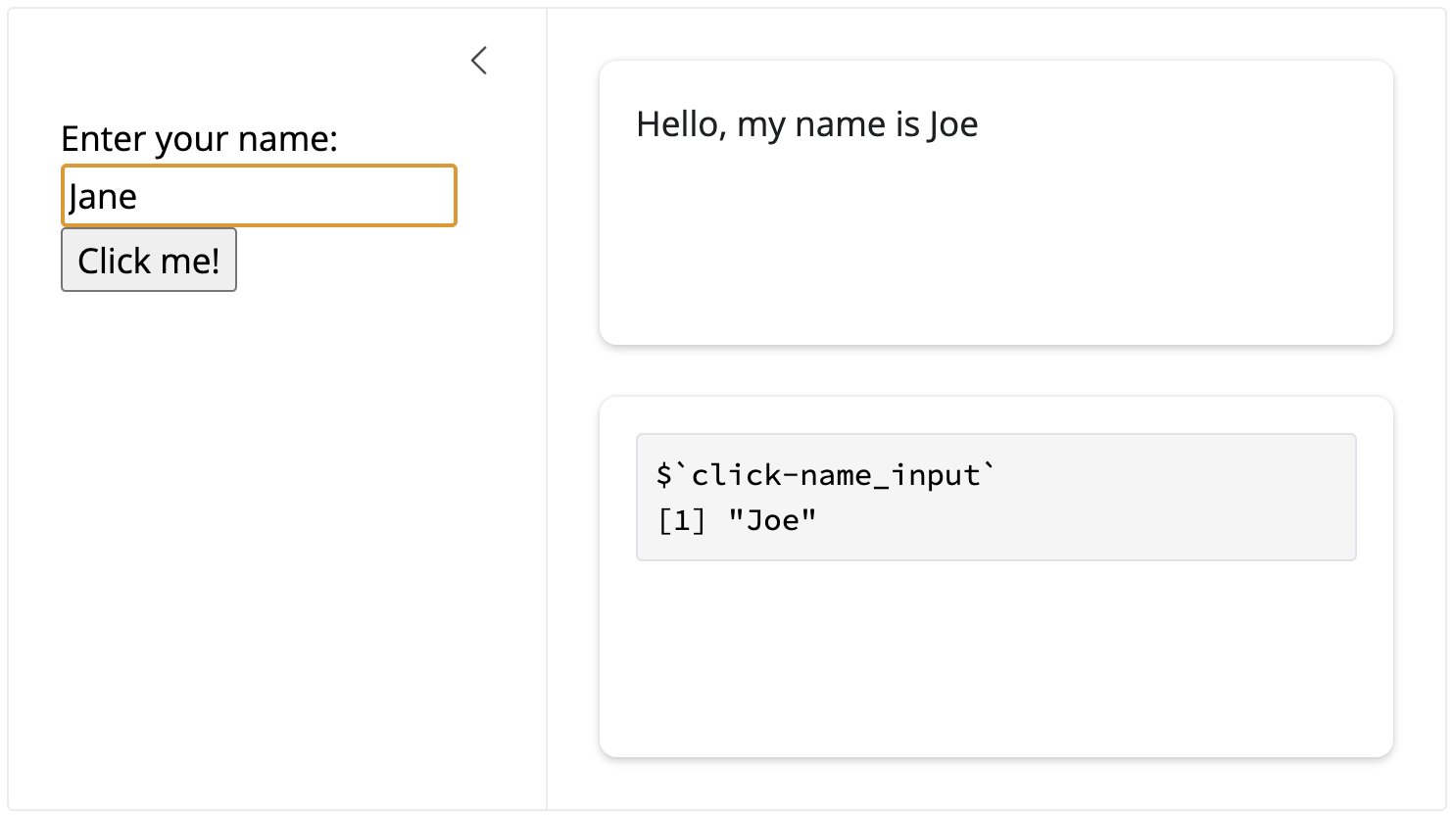
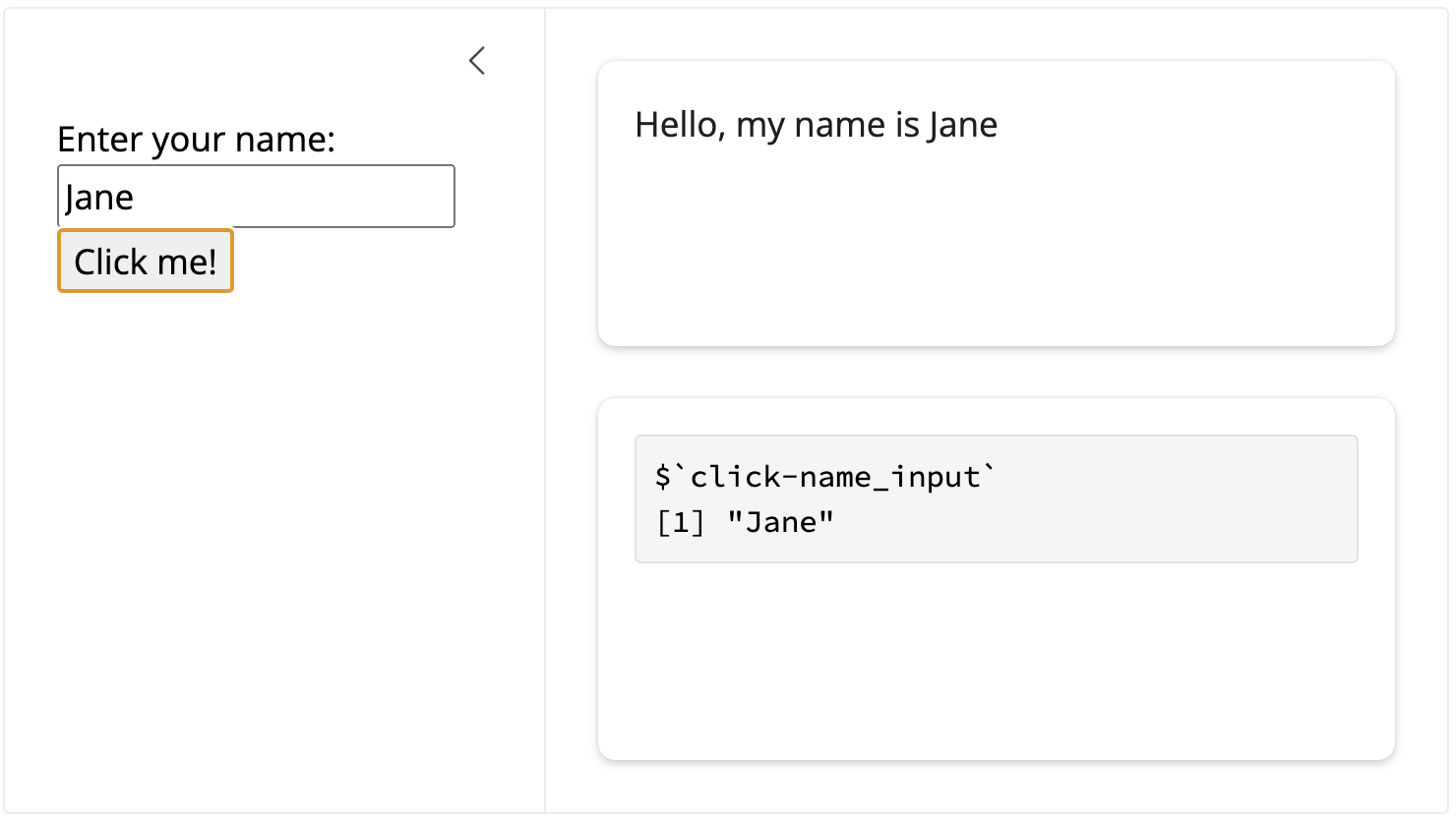
When we change the value to a different name, the UI doesn’t change until we click the submit button again:
(a) New name input
(b) New name input + submit
Figure 28.2: Text updates in buttonApp()
28.4htmlwidgets
The htmlwidgets package is another powerful tool that allows you to create interactive JavaScript data visualizations and embed them in your Shiny applications and R Markdown documents. htmlwidgets provides a framework for binding R to JavaScript libraries, enabling you to create interactive plots, maps, and other data visualizations that can be embedded in your Shiny apps.
Key features of htmlwidgets include:
Interactivity: Create interactive visualizations that respond to user inputs.
Embeddability: Embed widgets in Shiny applications, R Markdown documents, and static HTML pages.
Customizability: Customize the appearance and behavior of widgets using both R and JavaScript.
What is CSS?
CSS is used to define the presentation of an HTML or XML web document. CSS describes how elements should be rendered on screen, paper, speech, or other media, which is particularly relevant to Shiny apps, as Shiny utilizes HTML to render UI elements.
The problem CSS solved
Originally, HTML was designed solely to describe web content, not to format pages. However, the introduction of formatting tags and attributes in HTML 3.2 complicated web development, making the creation of large websites costly and time-consuming. To address this, the W3C introduced CSS to separate style from HTML content.
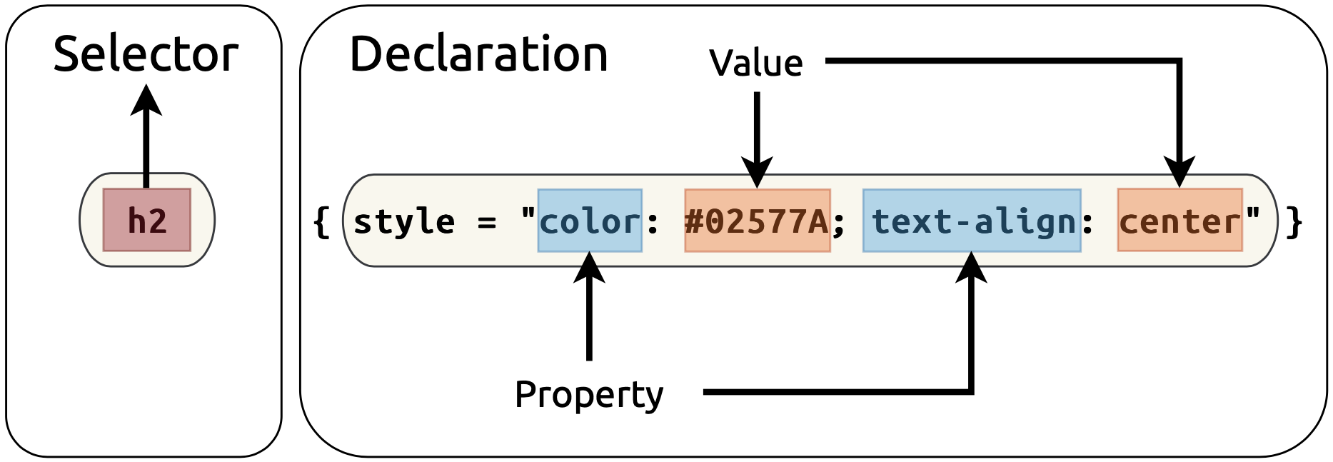
CSS syntax is typically a series of statements comprised of selectors and declarations. The selectors tell the HTML what to style and include names similar to HTML tags (h1, h2) but can also include more complex classes (i.e., custom-sidebar). The declaration includes properties and values: properties are style attributes like color, text-align, or margin, and the values are the settings for each property.
With CSS, you can control your Shiny app’s layout, color, font, and overall visual appearance, making it an indispensable tool for developers looking to customize their applications.
Why use CSS in app-packages?
As we’ve seen, app-packages essentially bundle various application components, including the code for the UI elements, server logic, and any data. Adding CSS to this list of components serves several purposes:
Customization: CSS allows you to go beyond the default styles provided by Shiny, offering the freedom to personalize your app’s look and feel.
Consistency: Using CSS, you can maintain visual consistency across different parts of your app or multiple apps within the same package.
Efficiency: CSS can help reduce the complexity of your app’s UI code by separating content (HTML) from presentation (CSS). This separation makes your code cleaner and easier to maintain.
Incorporating CSS
There are three ways to include CSS in your Shiny apps:
Inline: inline CSS can be used directly within the HTML elements using the style attribute and is suitable for quick, small-scale styling.
Internal: This method uses the tags$style() function within the app’s UI definition and is ideal for app-specific styles that won’t be reused.
External Files: This approach references external CSS files stored within the R package. A CSS file is best for extensive styling that applies to multiple apps or for sharing styles across different projects.
We’ll demonstrate each of these methods in the application launched with the launch_app() function.
28.5 Inline CSS
Lets start at the top of the UI and work our way down. The shiny package exports a collection of HTML tags in the shiny::tags list:
All of the objects in the shiny::tags list are functions that generate HTML:
shiny::tags$div()
<div></div>
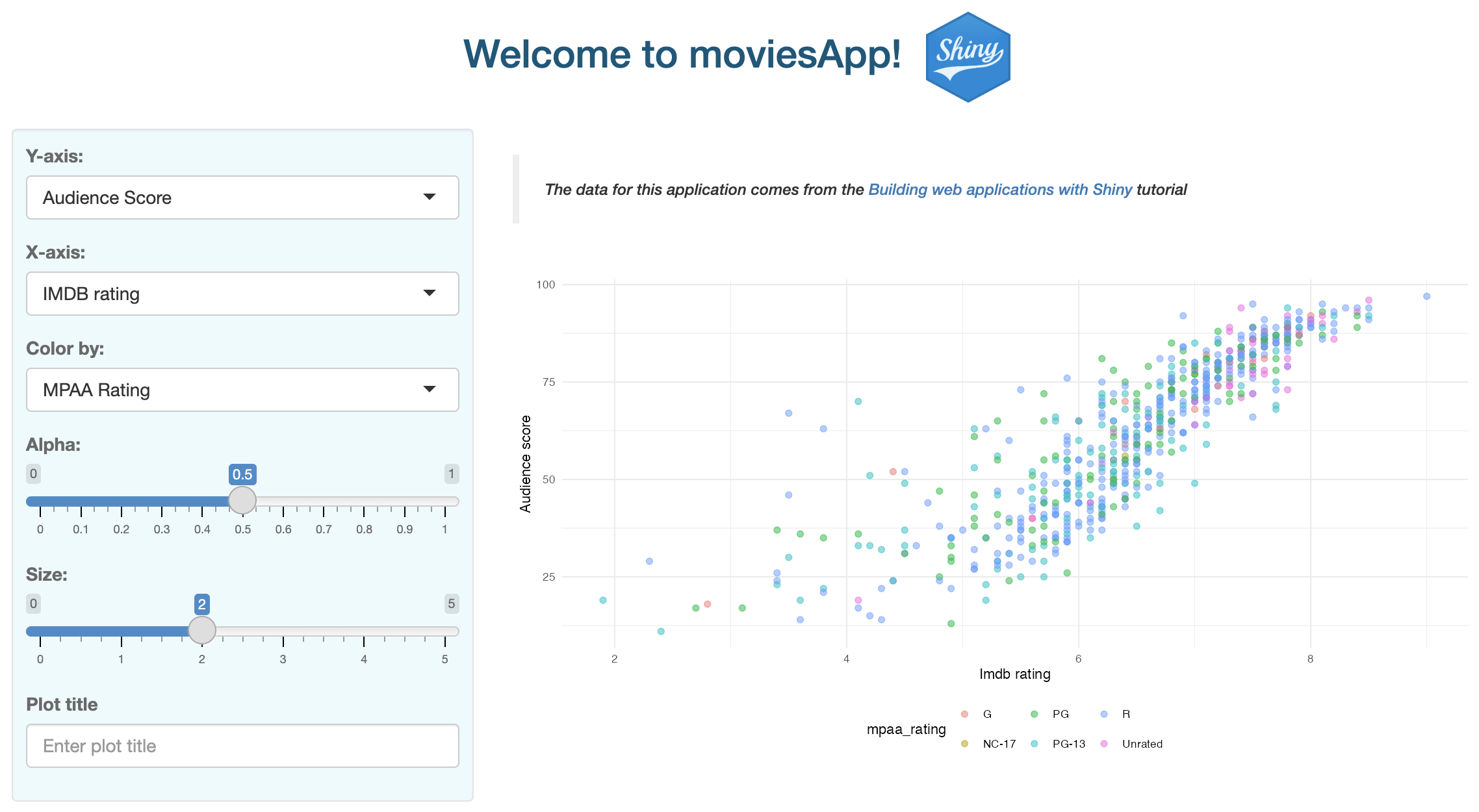
We’ll use tags$h2() inside our app’s titlePanel() to add the following CSS directly to the style argument:
tags$h2(style ="color: #02577A; text-align: center;","Welcome to sap!")
1
h2 selector defined with shiny::tags
2
CSS styling with style argument
3
Text to be styled
In this example, the h2 text elements within the call to tags$h2() will have their color set to #02577A and be center-aligned. If we pass this function to the Console, we see the following HTML:
<h2 style="color: #02577A; text-align: center;"Welcome to sap!</h2>
The CSS statement above consists of a single selector and declaration with two properties and accompanying values:4
CSS Syntax
As we can see, the <h2> HTML tag includes the style argument with the declaration properties and values. The updated text in our UI title panel is below:
Rendered inline CSS for tags$h2()
28.6 Internal CSS
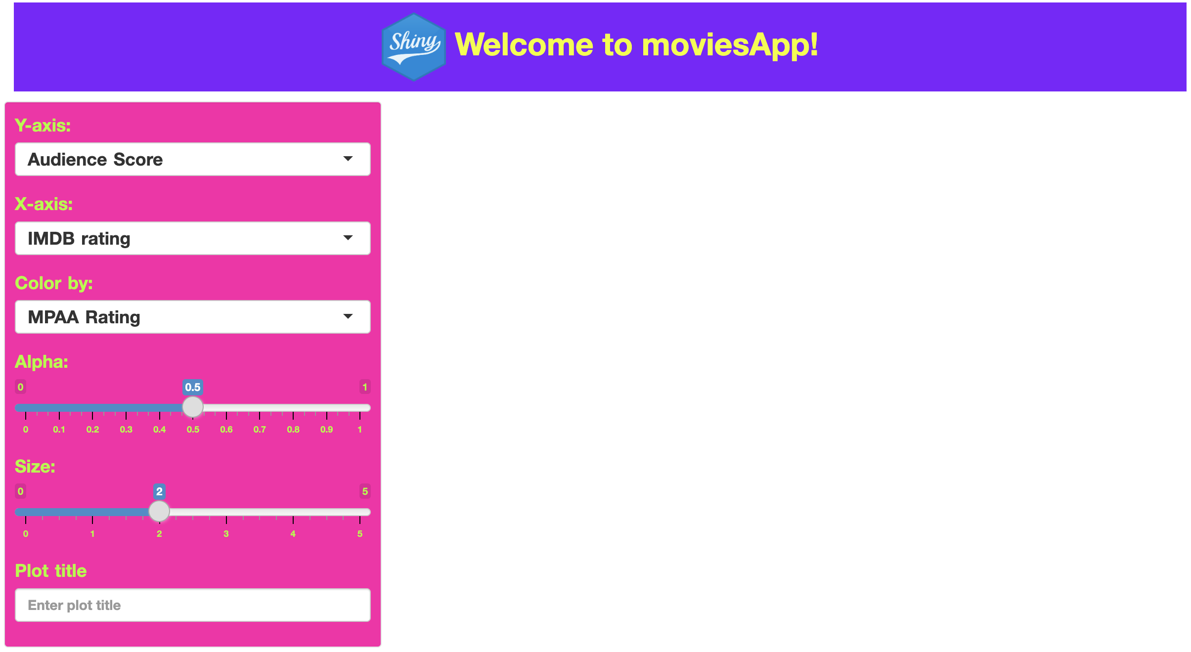
If we’d like to include more complicated styling, we can add this syntax internally using tags$style(). Anything you define within tags$style() will be applied as CSS styling rules to the HTML elements of your app.
We’ll define a custom style for a few elements in a new custom-sidebar class selector. Class selectors are used to apply the same styling rules to any HTML element that includes the specified class name in its class attribute.
We’ll define and set the background color to a light blue, gray text, and add a comfortable amount of space around the content in custom-sidebar below:
.custom-sidebar: The period (.) before the name indicates that it is a class selector in CSS.
tags$style("
    .custom-sidebar
  ")
{ ... }: Inside the style block, we define a CSS rule for elements that have a class attribute of custom-sidebar.
tags$style("
    .custom-sidebar {
      ...
    }")
background-color: #ecfafd;: This CSS property sets the background color of the .custom-sidebar elements using a hexadecimal code (#ecfafd), which is a light blue in this case.5
We’ll create a file named my_styles.css to hold all the custom styles we want to apply to our app and store in the inst/www folder (along with any images and external resources).
The contents of my_styles.css are described below:
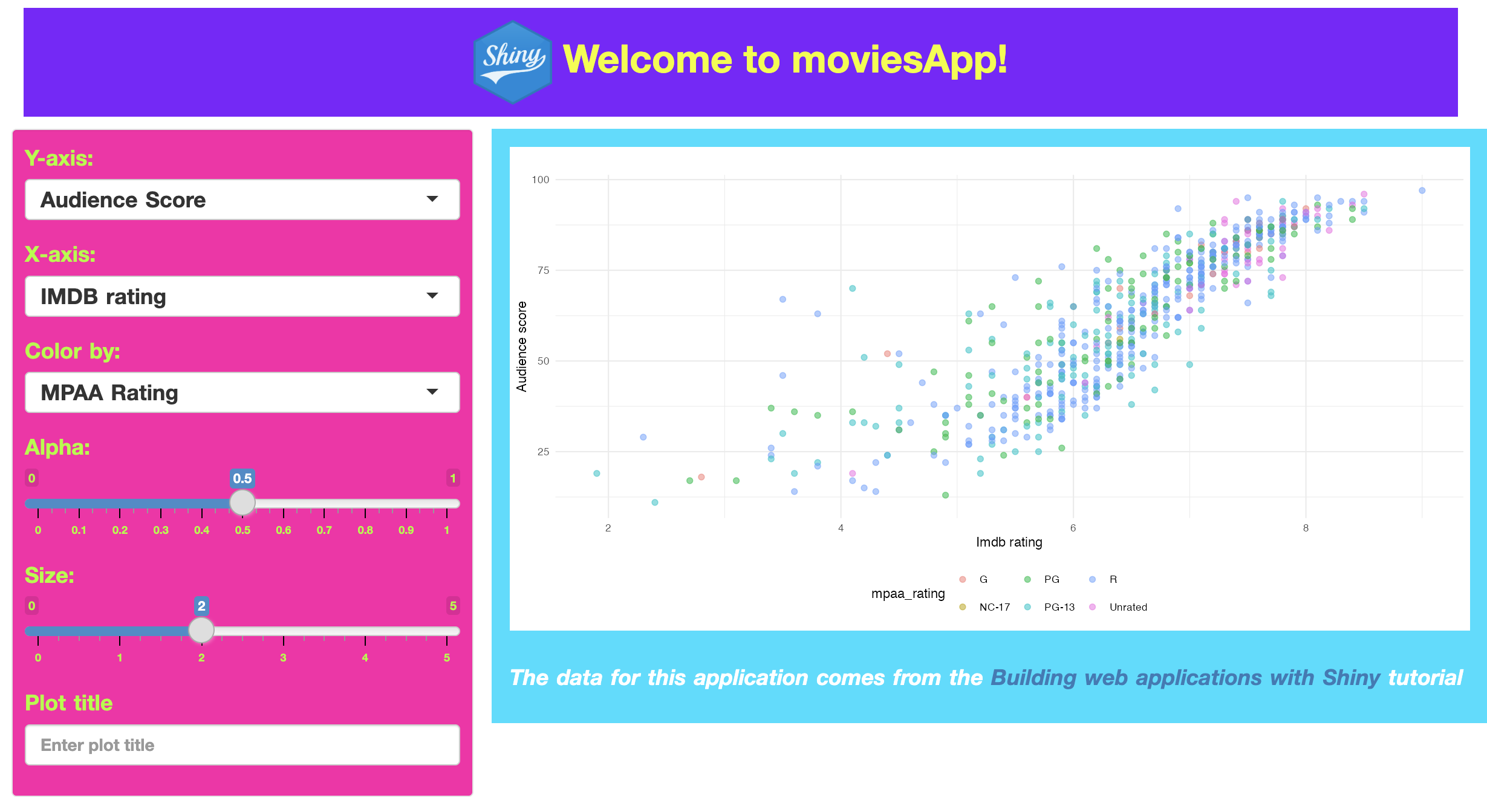
28.7.2.1 Header
In the previous section, the image tag had CSS styling for the margin6 property inside the titlePanel(). We can move this into the .custom-header selector class and set the margins (along with other properties like font-size and font-weight).
div(class ="custom-header",img(src ="www/shiny.png",height =70,width =65,align ="center" ),"Welcome to sap!")
Creating a custom-header class selectors removes the need to use the titlePanel()–we can replace it with a div(). Inside img(), we can still position and size attributes.
CSS custom header
28.7.2.2 Text
If we have HTML elements that we’d like to style with more than one class selector, we can provide multiple items to the class argument. For example, suppose custom-text has properties and values we’d like to use in future class selectors.
In your Shiny application’s UI definition, reference the CSS file using the addResourcePath() and tags$link() functions.7
In movies_ui(), this looks like:
movies_ui <-function(bslib =FALSE) {addResourcePath(prefix ="www",directoryPath =system.file("www", package ="sap")# The rest of the UI app function goes here
tagList(fluidPage( tags$link(rel ="stylesheet", type ="text/css", href ="www/my_styles.css" )# The rest of the UI app function goes here
Since the app is inside an R package, the system.file() function will build a path to the installed version of your package when the application is run/deployed.
Recap
Integrating CSS into your app-package opens a world of possibilities for customization and enhancement. Understanding the basics of CSS gives you the ability to significantly improve the visual appeal and user experience of your Shiny app. Remember, the goal is not just to make your apps work well but also to make them look great and provide an engaging experience for the end-user.
Tips when using CSS in your Shiny apps
Keep it organized: Whether you’re using inline, internal, or external CSS, keeping your styles organized is crucial for maintenance and future updates.
Use meaningful names: When naming CSS classes or IDs, use names that reflect the purpose or content of the elements they style.
Optimize for readability: Ensure your CSS is easily read using comments, consistent indentation, and spacing.
Test across browsers: Different web browsers can render CSS differently. Test your Shiny app across multiple browsers to ensure a consistent appearance.
w3schools has a great (free) intro to HTML course.↩︎
htmltools is listed under the Imports field of Shiny’s DESCRIPTION file.↩︎