Bar graphs
Description
A bar graph (or bar chart) is typically used to display counts for the discrete levels of a categorical variable, like political affiliation, hair color, or race/ethnicity (or species of penguin!).
Bar graphs can be arranged vertically or horizontally, but the length of the bar represents the ‘count’ for each category value.
In ggplot2, bar graphs can be built using geom_bar() (see also: geom_col()).
Getting set up
PACKAGES:
Install packages.
Code
install.packages("palmerpenguins")
library(palmerpenguins)
library(ggplot2)
DATA:

Filter the missing values from species in the palmerpenguins::penguins data and store it in penguins_bar.
Code
penguins_bar <- palmerpenguins::penguins |>
    dplyr::filter(!is.na(species))
glimpse(penguins_bar)
Rows: 344
Columns: 8
$ species <fct> Adelie, Adelie, Adelie, Adelie, Adelie, Adelie, Adel…
$ island <fct> Torgersen, Torgersen, Torgersen, Torgersen, Torgerse…
$ bill_length_mm <dbl> 39.1, 39.5, 40.3, NA, 36.7, 39.3, 38.9, 39.2, 34.1, …
$ bill_depth_mm <dbl> 18.7, 17.4, 18.0, NA, 19.3, 20.6, 17.8, 19.6, 18.1, …
$ flipper_length_mm <int> 181, 186, 195, NA, 193, 190, 181, 195, 193, 190, 186…
$ body_mass_g <int> 3750, 3800, 3250, NA, 3450, 3650, 3625, 4675, 3475, …
$ sex <fct> male, female, female, NA, female, male, female, male…
$ year <int> 2007, 2007, 2007, 2007, 2007, 2007, 2007, 2007, 2007…The grammar
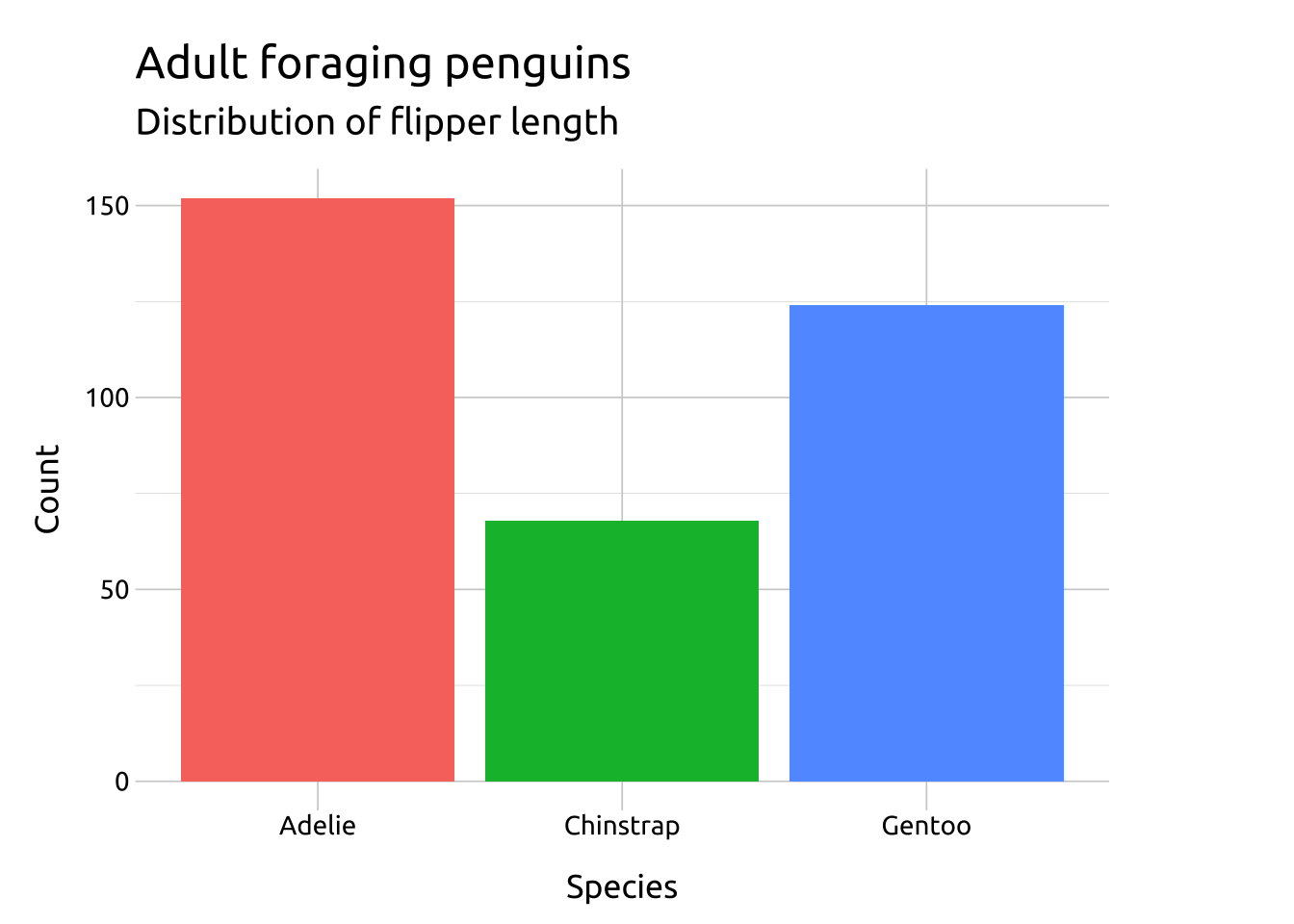
CODE:
Create labels with labs()
Initialize the graph with ggplot() and provide data
Map species to the x axis
Map species to the fill aesthetic inside the aes() of geom_bar()
Remove the legend with show.legend = FALSE
Code
labs_bar <- labs(
  title = "Adult foraging penguins",
  subtitle = "Distribution of flipper length",
  x = "Species", y = "Count",
  fill = "Species")
ggp2_bar <- ggplot(data = penguins_bar,
       aes(x = species)) +
    geom_bar(aes(fill = species),
        show.legend = FALSE)
ggp2_bar +
  labs_bar
GRAPH:

More info
- The connection between statistical transformations and geoms is an important principle for building graphs (and mastering the grammar) with
ggplot2- Below we cover why
geom_bar(stat = "count")produces the same result asstat_count(geom = "bar")
- Below we cover why
“every geom has a default stat, and every stat a default geom.” - ggplot2 book
- Bar graphs can also be created with
geom_col()
stat_count():
The default stat argument in geom_bar() is set to "count", which ‘counts the number of cases at each x position’, so it’s ideal for categorical variables (or factors).
The stat_count() function can also be used to create bar graphs using the geom argument.
The link between geom_geom_name(stat = "stat_name") and stat_stat_name(geom = "geom_name") is shown below:
Code
ggp2_geom_bar <- ggplot(data = penguins_bar,
       aes(x = species)) +
    geom_bar(aes(fill = species),
        stat = "count") +
    labs(title = "geom_bar(stat = 'count')")
ggp2_geom_bar
ggp2_stat_count <- ggplot(data = penguins_bar,
       aes(x = species)) +
    stat_count(aes(fill = species),
        geom = "bar") +
    labs(title = "stat_count(geom = 'bar')")
ggp2_stat_count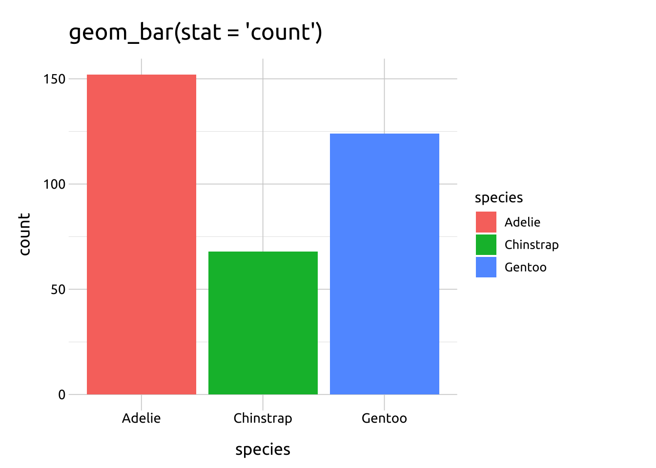

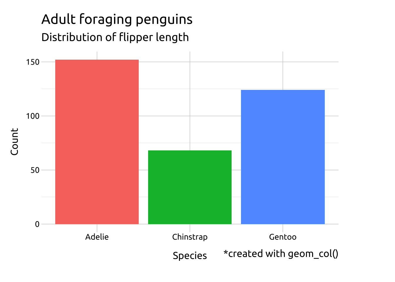
geom_col:
To create a bar graph with geom_col(), the count variable needs to be computed before being mapped into the graph y aesthetic.
Code
penguins_bar |>
    # create column of counts
    dplyr::count(species, name = "count") |>
    # map into x and y
    ggplot(mapping = aes(x = species, y = count)) +
    geom_col(aes(fill = species),
        show.legend = FALSE) +
    labs_bar +
    labs(caption = "*created with geom_col()")
# compare to geom_bar()
ggp2_bar +
  labs_bar