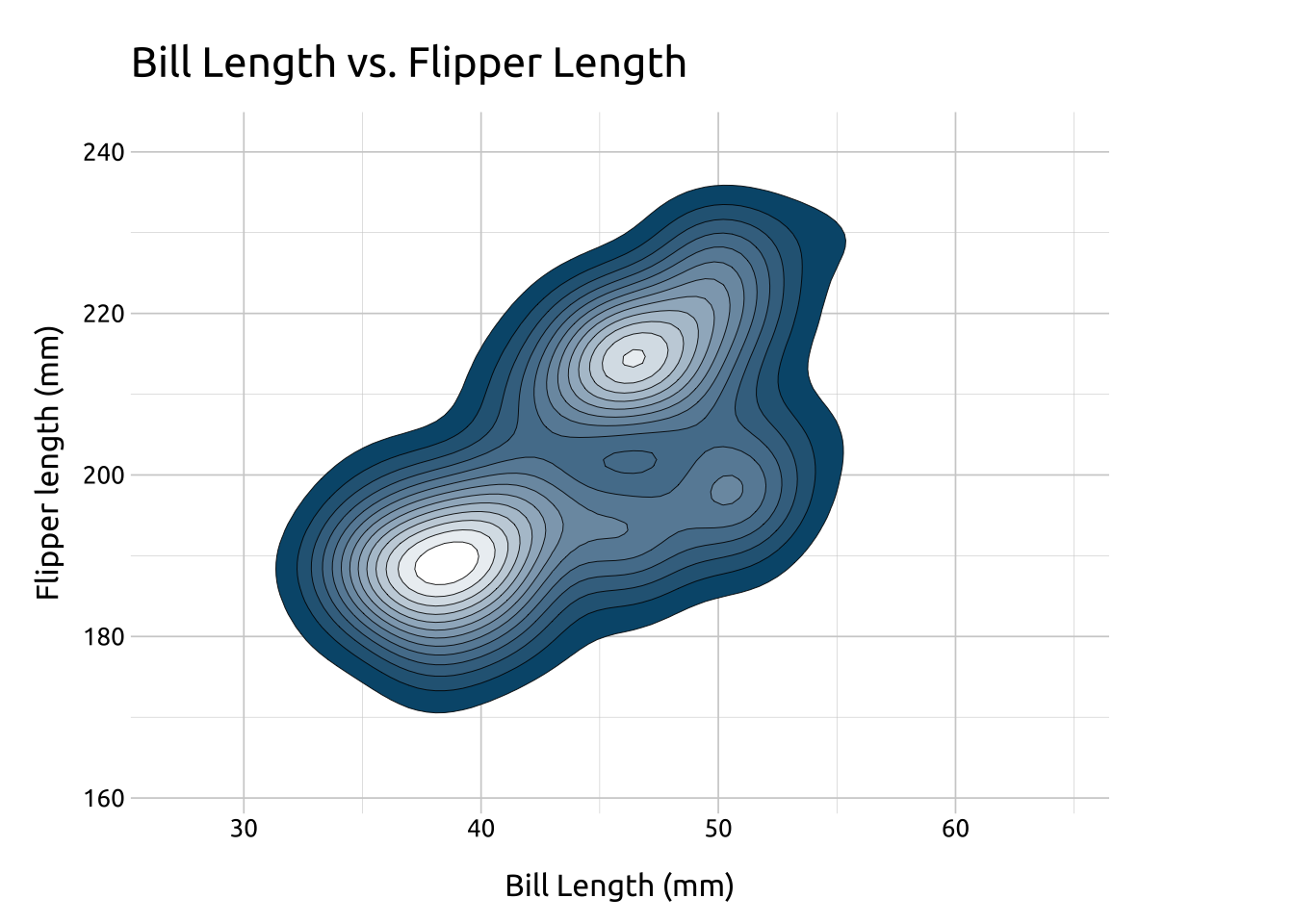
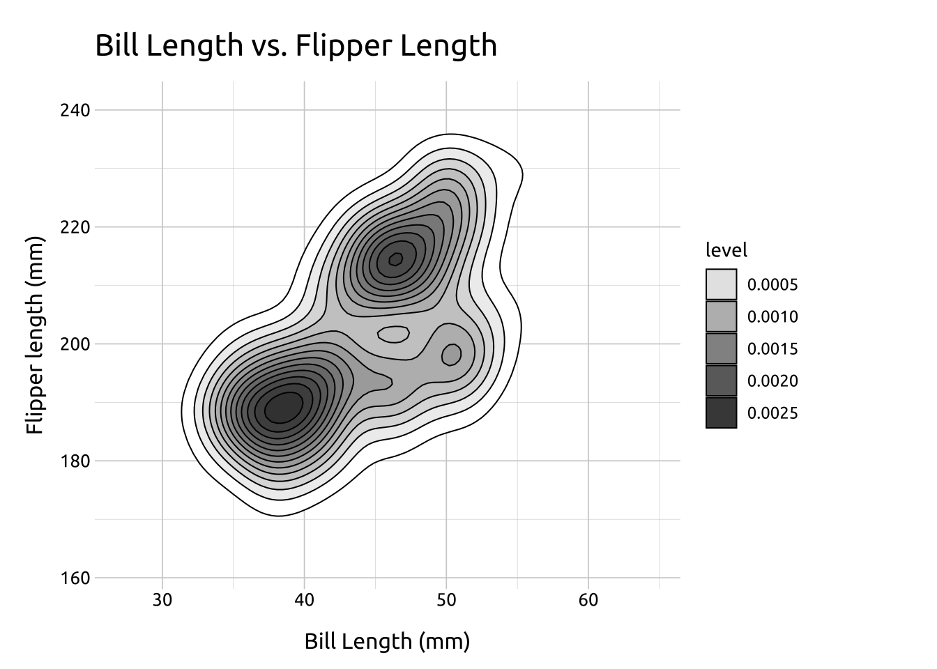
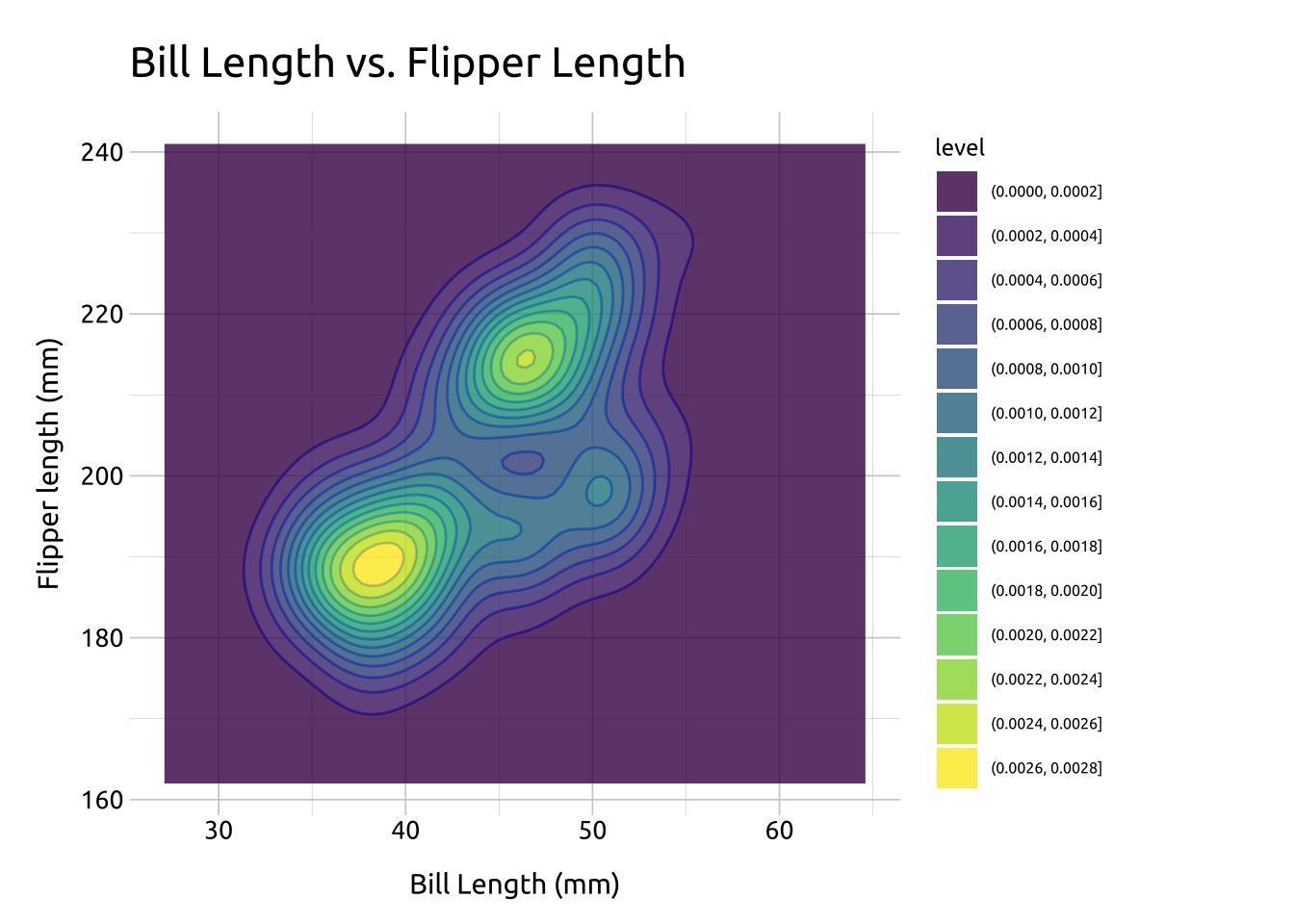
Density contours (or 2-D density plots) are helpful for displaying differences in values between two numeric (continuous) variables.
In topographical maps, contour lines are drawn around areas of equal elevation above sea-level. In density contours, the contour lines are drawn around the areas our data occupy (essentially replacing sea-level as ‘an area without any x or y values.’)
Specifically, the contour lines outline areas on the graph with differing point densities, and semi-transparent colors (gradient) can be added to further highlight the separate regions.
We’re going to break down how to create the density contour layer-by-layer using the stat_density_2d() function (which allows us to access some of the inner-workings of geom_density_2d())
Insideaes(), use after_stat() to map level to fill (from Help, “Evaluation after stat transformation will have access to the variables calculated by the stat, not the original mapped values.”)
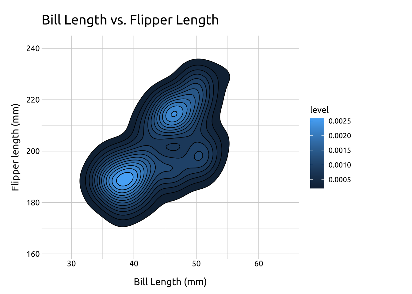
You probably noticed the stat_density_2d() produced a legend with level, and a series of values for the color gradient. These numbers are difficult to interpret directly, but you can think of them as ‘elevation changes’ in point density. Read more here on SO.
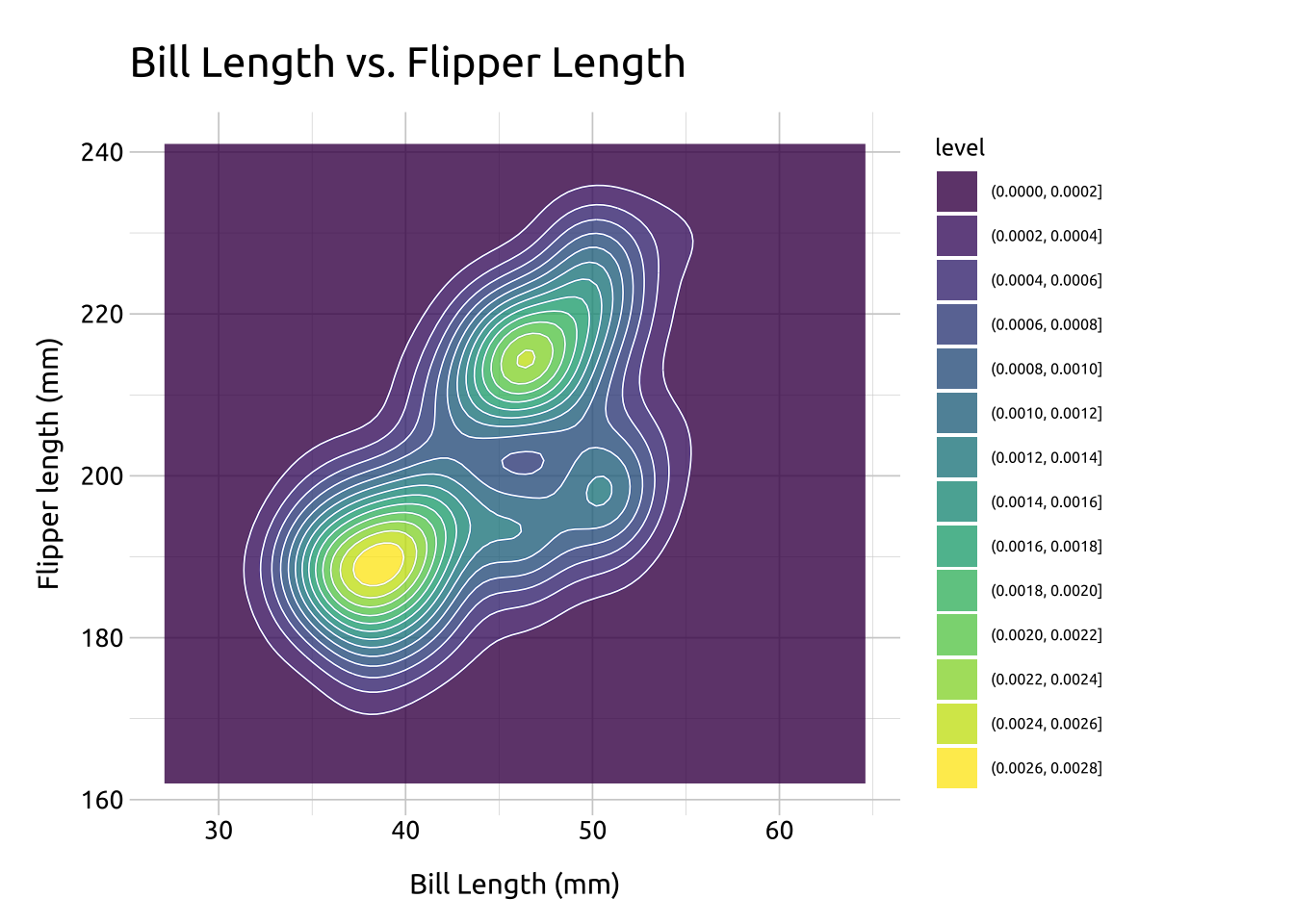
Now that we have a color gradient for our contour lines, we can adjust it’s the range of colors using scale_fill_gradient()
low is the color for the low values of level
high is the color for the high values of level
guide let’s us control the legend
We’ll set these to white ("#ffffff") and dark gray ("#404040")
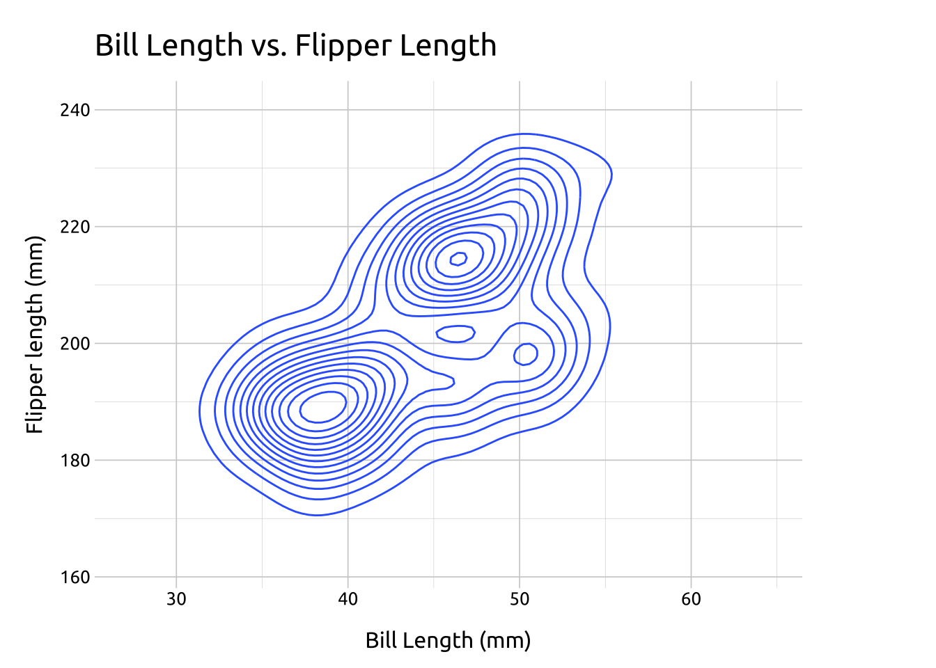
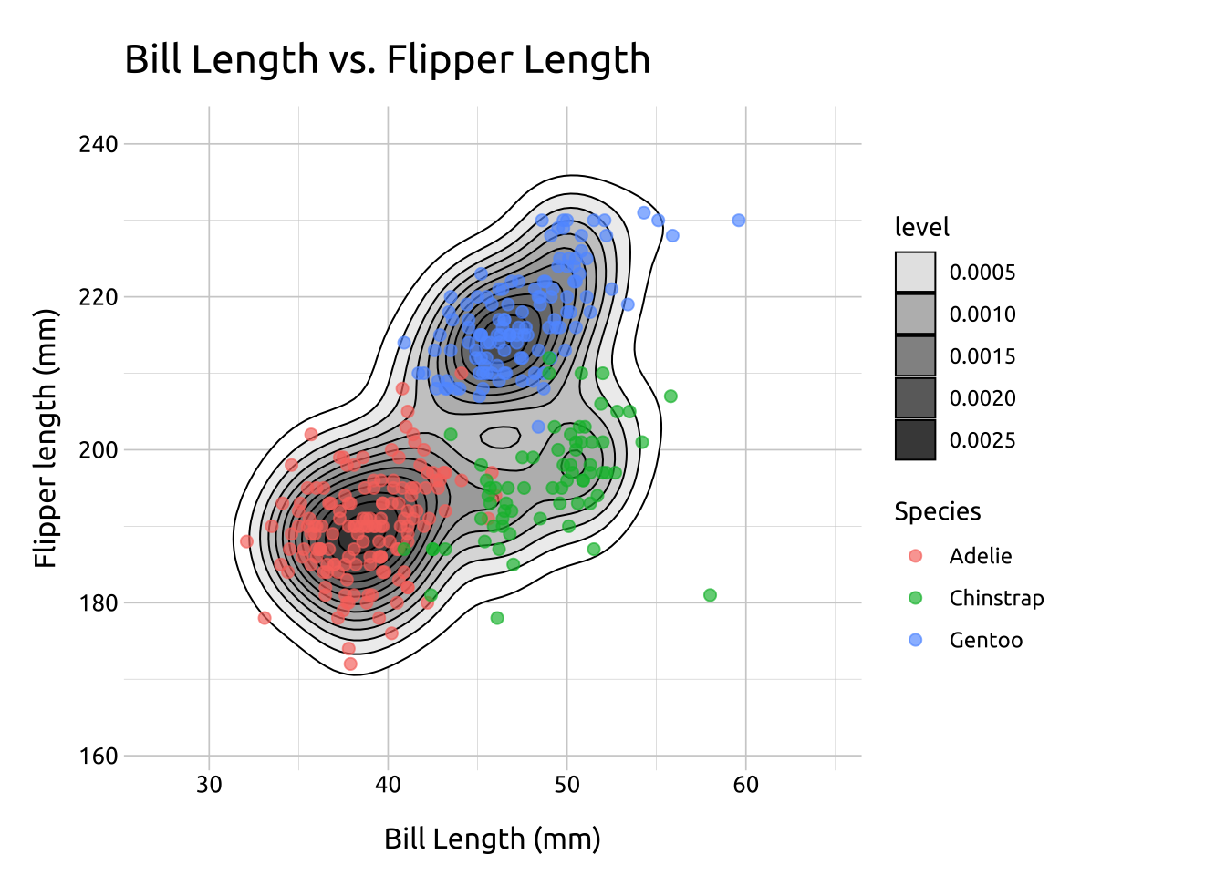
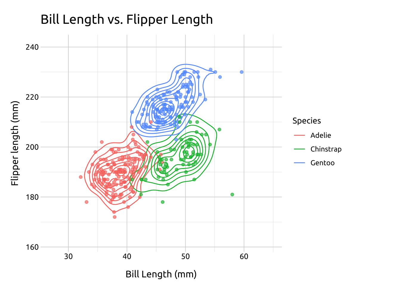
In the previous plot, we used the species variable in the geom_point() layer to identify the points using color. In the section below, we’ll show more methods of displaying groups with density contour lines.
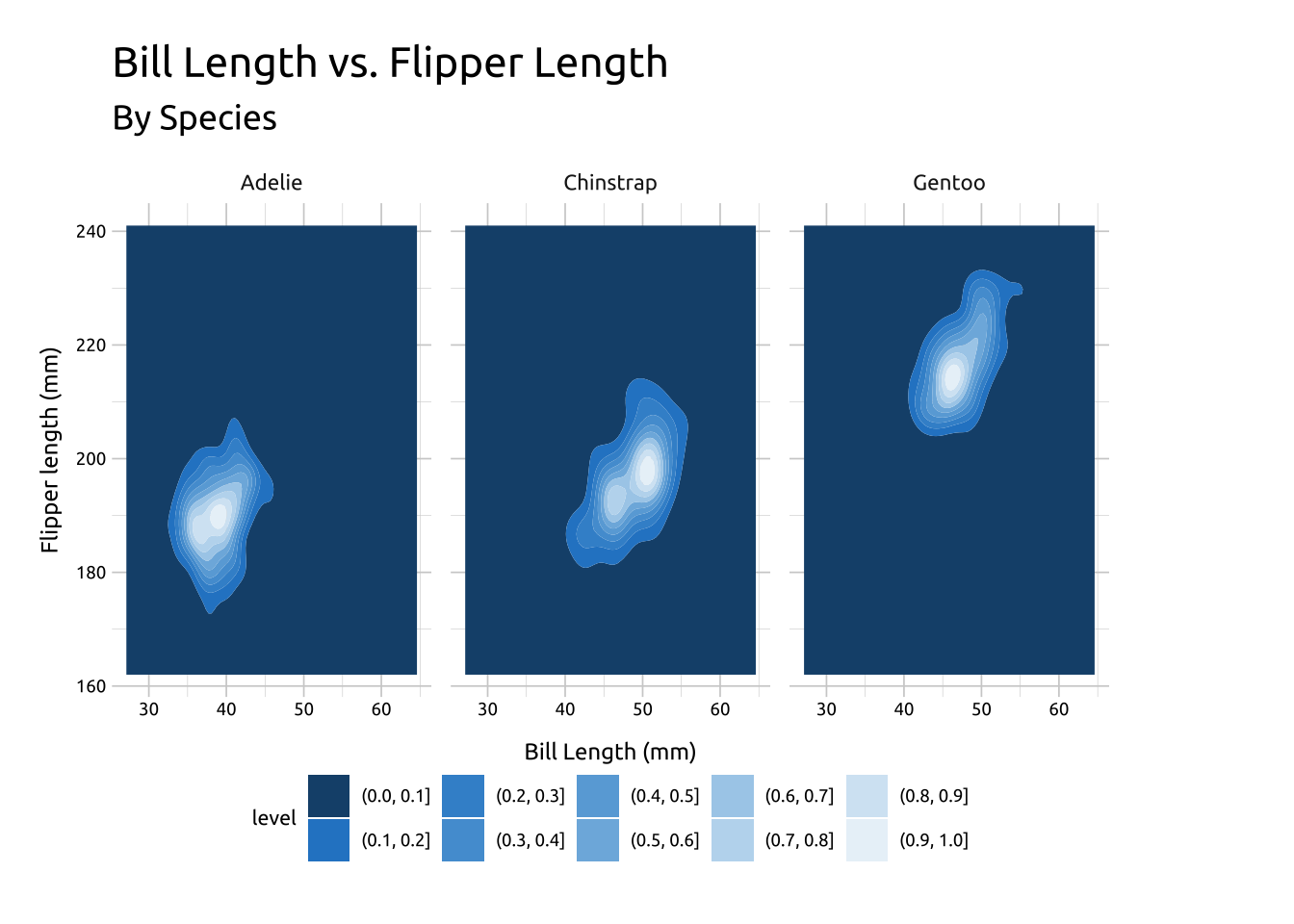
In the previous section, we defined the color values used in geom_density_2d_filled() with scale_discrete_manual(). Below we give an example using the default colors:
---title: "Density contours"format: html: toc: true toc-location: right toc-title: Contents code-fold: true out-height: '100%' out-width: '100%'execute: warning: false message: false---```{r}#| label: setup#| message: false#| warning: false#| include: falselibrary(tidyverse)library(lubridate)library(scales)library(knitr)library(kableExtra)library(colorblindr)library(downlit)library(patchwork)library(cowplot)# options ----options(repos ="https://cloud.r-project.org",dplyr.print_min =6,dplyr.print_max =6,scipen =9999)# fonts ----library(extrafont)library(sysfonts)# import fontextrafont::font_import(paths ="assets/Ubuntu/",prompt =FALSE)# add fontsysfonts::font_add(family ="Ubuntu", regular ="assets/Ubuntu/Ubuntu-Regular.ttf")# use fontshowtext::showtext_auto()# add themesource("R/theme_ggp2g.R")# set themeggplot2::theme_set(theme_ggp2g(base_size =15))install.packages("palmerpenguins")```:::: {.callout-note collapse="false" icon=false}## Graph info::: {style="font-size: 1.25em; color: #02577A;"}**Should I use this graph?**:::<br>```{r}#| label: full_code_display#| eval: true#| echo: false#| warning: false#| message: false#| out-height: '60%'#| out-width: '60%'#| fig-align: rightlibrary(palmerpenguins)library(ggplot2)peng_dnsty_2d <- palmerpenguins::penguins |>filter(!is.na(bill_length_mm) &!is.na(flipper_length_mm) &!is.na(species)) |>mutate(species =factor(species))# x limitsx_min <-min(peng_dnsty_2d$bill_length_mm) -5x_max <-max(peng_dnsty_2d$bill_length_mm) +5# y limitsy_min <-min(peng_dnsty_2d$flipper_length_mm) -10y_max <-max(peng_dnsty_2d$flipper_length_mm) +10labs_dnsty_2d <-labs(title ="Bill Length vs. Flipper Length",x ="Bill Length (mm)",y ="Flipper length (mm)")ggp2_dnsty_2d_fill <-ggplot(data = peng_dnsty_2d,mapping =aes(x = bill_length_mm,fill =after_stat(level),y = flipper_length_mm )) +# expand limitsexpand_limits(x =c(x_min, x_max),y =c(y_min, y_max) ) +# stat polygonstat_density_2d(geom ="polygon",color ="#000000",linewidth =0.15 ) +# gradientscale_fill_gradient(low ="#02577A",high ="#ffffff",guide ="none" )ggp2_dnsty_2d_fill + labs_dnsty_2d```::: {style="font-size: 1.10em; color: #02577A;"}**This graph requires:**:::::: {style="font-size: 0.90em; color: #043b67;"}`r emo::ji("check")` a categorical variable :::::: {style="font-size: 0.90em; color: #043b67;"}`r emo::ji("check")` two numeric (continuous) variables:::<!--This technique works well when the point density changes slowlyacross both the x and the y dimensions.-->::::## DescriptionDensity contours (or 2-D density plots) are helpful for displaying differences in values between two numeric (continuous) variables. In [topographical maps](https://en.wikipedia.org/wiki/Topography), contour lines are drawn around areas of equal elevation above sea-level. In density contours, the contour lines are drawn around the areas our data occupy (essentially replacing sea-level as '*an area without any x or y values.*')Specifically, the contour lines outline areas on the graph with differing point densities, and semi-transparent colors (gradient) can be added to further highlight the separate regions.## Getting set up:::: {.panel-tabset}### Packages::: {style="font-size: 1.15em; color: #1e83c8;"}**PACKAGES:**:::::: {style="font-size: 0.85em;"}Install packages.:::::: {style="font-size: 0.75em;"}```{r}#| label: pkg_code_geom_density_2d#| code-fold: show#| eval: true#| echo: true#| warning: false#| message: false#| results: hideinstall.packages("palmerpenguins")library(palmerpenguins)library(ggplot2)```:::### Data::: {style="font-size: 1.15em; color: #1e83c8;"}**DATA:**:::::: {.column-margin}{fig-align="right" width="100%" height="100%"}:::::: {style="font-size: 0.85em;"}We'll use the `penguins` data from the `palmerpenguins` package, but remove the missing values from `bill_length_mm`, `flipper_length_mm`, and `species`.:::::: {style="font-size: 0.75em;"}```{r}#| label: data_code_geom_density_2d#| eval: true#| echo: truepeng_dnsty_2d <- palmerpenguins::penguins |> dplyr::filter(!is.na(bill_length_mm) &!is.na(flipper_length_mm) &!is.na(species)) |> dplyr::mutate(species =factor(species))glimpse(peng_dnsty_2d)```:::::::## The grammar:::: {.panel-tabset}### Code::: {style="font-size: 1.15em; color: #1e83c8;"}**CODE:**:::::: {style="font-size: 0.85em;"}Create labels with `labs()`Initialize the graph with `ggplot()` and provide `data`Create two values for extending the range of the `x` and `y` axis (`x_min`/`x_max` and `y_min`/`y_max`) Map `bill_length_mm` to `x` and `flipper_length_mm` to `y`Add the `expand_limits()` function, assigning our stored values to `x` and `y`Add the `geom_density_2d()`:::::: {style="font-size: 0.75em;"}```{r}#| label: code_graph_geom_density_2d#| code-fold: show#| eval: false#| echo: true#| warning: false#| message: false#| out-height: '100%'#| out-width: '100%'#| column: page-inset-right#| layout-nrow: 1# labelslabs_dnsty_2d <-labs(title ="Bill Length vs. Flipper Length",x ="Bill Length (mm)",y ="Flipper length (mm)")# x limitsx_min <-min(peng_dnsty_2d$bill_length_mm) -5x_max <-max(peng_dnsty_2d$bill_length_mm) +5# y limitsy_min <-min(peng_dnsty_2d$flipper_length_mm) -10y_max <-max(peng_dnsty_2d$flipper_length_mm) +10ggp2_dnsty_2d <-ggplot(data = peng_dnsty_2d,mapping =aes(x = bill_length_mm,y = flipper_length_mm )) +# use our stored valuesexpand_limits(x =c(x_min, x_max),y =c(y_min, y_max) ) +geom_density_2d()# plotggp2_dnsty_2d + labs_dnsty_2d```:::### Graph::: {style="font-size: 1.15em; color: #1e83c8;"}**GRAPH:**:::```{r}#| label: create_graph_geom_density_2d#| eval: true#| echo: false#| warning: false#| message: false#| out-height: '100%'#| out-width: '100%'#| column: page-inset-right#| layout-nrow: 1# x limitsx_min <-min(peng_dnsty_2d$bill_length_mm) -5x_max <-max(peng_dnsty_2d$bill_length_mm) +5# y limitsy_min <-min(peng_dnsty_2d$flipper_length_mm) -10y_max <-max(peng_dnsty_2d$flipper_length_mm) +10# labelslabs_dnsty_2d <-labs(title ="Bill Length vs. Flipper Length",x ="Bill Length (mm)",y ="Flipper length (mm)")ggp2_dnsty_2d <-ggplot(data = peng_dnsty_2d,mapping =aes(x = bill_length_mm,y = flipper_length_mm )) +# use our stored valuesexpand_limits(x =c(x_min, x_max),y =c(y_min, y_max) ) +geom_density_2d()# plotggp2_dnsty_2d + labs_dnsty_2d```::::## More infoWe're going to break down how to create the density contour layer-by-layer using the `stat_density_2d()` function (which allows us to access some of the inner-workings of `geom_density_2d()`):::: {.panel-tabset}### Base::: {style="font-size: 1.15em; color: #1e83c8;"}**BASE:**:::::: {style="font-size: 0.85em;"}Create a new set of labelsInitialize the graph with `ggplot()` and provide `data`Build a base layer: - Map `bill_length_mm` to `x` and `flipper_length_mm` to `y`- Expand the `x` and `y` values with `expand_limits()` (using the values we created above):::::: {style="font-size: 0.75em;"}```{r}#| label: code_graph_base_layer#| eval: true#| echo: true#| warning: false#| message: false#| out-height: '100%'#| out-width: '100%'#| column: page-inset-right#| layout-nrow: 1labs_sdens_2d <-labs(title ="Bill Length vs. Flipper Length",x ="Bill Length (mm)",y ="Flipper length (mm)",color ="Species")# basebase_sdens_2d <-ggplot(data = peng_dnsty_2d,mapping =aes(x = bill_length_mm,y = flipper_length_mm )) +expand_limits(x =c(x_min, x_max),y =c(y_min, y_max) )base_sdens_2d + labs_sdens_2d```:::### Stat::: {style="font-size: 1.15em; color: #1e83c8;"}**STAT:**:::::: {style="font-size: 0.85em;"}Add the `stat_density_2d()` layer:- *Inside* `aes()`, use [`after_stat()`](https://ggplot2.tidyverse.org/reference/aes_eval.html) to map `level` to `fill` (from Help, "*Evaluation after stat transformation will have access to the variables calculated by the stat, not the original mapped values.*")- Set the `geom` to `"polygon"`- Change the `color` to black (`#000000`)- adjust the `linewidth` to `0.35`:::::: {style="font-size: 0.75em;"}```{r}#| label: code_graph_stat_layer#| eval: true#| echo: true#| warning: false#| message: false#| out-height: '100%'#| out-width: '100%'#| column: page-inset-right#| layout-nrow: 1stat_sdens_2d <- base_sdens_2d +stat_density_2d(aes(fill =after_stat(level)),geom ="polygon",color ="#000000",linewidth =0.35 )stat_sdens_2d + labs_sdens_2d``````{r}#| label: code_graph_stat_layer_pw#| eval: true#| echo: false#| warning: false#| message: false#| out-height: '100%'#| out-width: '100%'#| column: page-inset-right#| layout-nrow: 1ggp1 <- stat_sdens_2d +labs(x ="Bill Length (mm)",y ="Flipper length (mm)" ) +theme(axis.title =element_text(size =8),axis.text =element_text(size =6),legend.text =element_text(size =7),legend.title =element_text(size =9, face ="bold") )```:::### Fill::: {style="font-size: 1.15em; color: #1e83c8;"}**FILL:**:::::: {style="font-size: 0.85em; color: #9d40f5;"}***Where did levels come from?****You probably noticed the `stat_density_2d()` produced a legend with `level`, and a series of values for the color gradient. These numbers are difficult to interpret directly, but you can think of them as 'elevation changes' in point density. Read more [here on SO.](https://stackoverflow.com/questions/53172200/stat-density2d-what-does-the-legend-mean)*:::::: {style="font-size: 0.85em;"}Now that we have a color gradient for our contour lines, we can adjust it's the range of colors using `scale_fill_gradient()`- `low` is the color for the low values of `level`- `high` is the color for the high values of `level`- `guide` let's us control the `legend`We'll set these to white (`"#ffffff"`) and dark gray (`"#404040"`):::::: {style="font-size: 0.75em;"}```{r}#| label: code_graph_fill_layer#| eval: false#| echo: true#| warning: false#| message: false#| out-height: '100%'#| out-width: '100%'#| column: page-inset-right#| layout-nrow: 1fill_sdens_2d <- stat_sdens_2d +scale_fill_gradient(low ="#ffffff",high ="#404040",guide ="legend" )fill_sdens_2d + labs_sdens_2d``````{r}#| label: code_graph_fill_layer_pw#| eval: true#| echo: false#| warning: false#| message: false#| out-height: '100%'#| out-width: '100%'#| column: page-inset-right#| layout-nrow: 1fill_sdens_2d <- stat_sdens_2d +scale_fill_gradient(low ="#ffffff",high ="#404040",guide ="legend" )fill_sdens_2d + labs_sdens_2d```:::### Points::: {style="font-size: 1.15em; color: #1e83c8;"}**POINTS:**:::::: {style="font-size: 0.85em;"}The dark areas in the contour lines are the areas with higher value density, but why don't we test that by adding some data points? Add a `geom_point()` layer- *Inside* `aes()`, map `species` to `color` (this will tell us if the three dark areas represent differences in the three species in the dataset)- set `size` to `2`- Change the `alpha` to `2/3`:::::: {style="font-size: 0.75em;"}```{r}#| label: code_graph_points_layer#| eval: false#| echo: true#| warning: false#| message: false#| out-height: '100%'#| out-width: '100%'#| column: page-inset-right#| layout-nrow: 1# geom_point()pnts_sdens_2d <- fill_sdens_2d +geom_point(aes(color = species),size =2,alpha =2/3 )# finalpnts_sdens_2d + labs_sdens_2d```:::::: {style="font-size: 0.75em;"}```{r}#| label: code_graph_points_layer_pw#| eval: true#| echo: false#| warning: false#| message: false#| out-height: '100%'#| out-width: '100%'#| column: page-inset-right#| layout-nrow: 1pnts_sdens_2d <- fill_sdens_2d +geom_point(aes(color = species),size =2,alpha =2/3)pnts_sdens_2d + labs_sdens_2d```:::::::## Adding groupsIn the previous plot, we used the `species` variable in the `geom_point()` layer to identify the points using color. In the section below, we'll show more methods of displaying groups with density contour lines. :::: {.panel-tabset}### Groups::: {style="font-size: 1.15em; color: #1e83c8;"}**GROUPS:**:::::: {style="font-size: 0.85em;"}Re-create the labels Initialize the graph with `ggplot()` and provide `data`Build a `geom_density_2d()` layer: - Map `bill_length_mm` to `x` and `flipper_length_mm` to `y` - Expand the limits using our adjusted min/max `x` and `y` values - Add the `geom_density_2d()`, mapping `species` to `color`Build the `geom_point()` layer: - Map `species` to `color` - set the `alpha` and remove the `legend`:::::: {style="font-size: 0.75em;"}```{r}#| label: code_graph_points#| eval: true#| echo: true#| warning: false#| message: false#| out-height: '100%'#| out-width: '100%'#| column: page-inset-right#| layout-nrow: 1labs_dnsty_2d_grp <-labs(title ="Bill Length vs. Flipper Length",x ="Bill Length (mm)",y ="Flipper length (mm)",color ="Species")ggp2_dnsty_2d_grp <-ggplot(data = peng_dnsty_2d,mapping =aes(x = bill_length_mm,y = flipper_length_mm )) +expand_limits(x =c(x_min, x_max),y =c(y_min, y_max) ) +geom_density_2d(aes(color = species))ggp2_dnsty_2d_pnts <- ggp2_dnsty_2d_grp +geom_point(aes(color = species),alpha =2/3,show.legend =FALSE )ggp2_dnsty_2d_pnts + labs_dnsty_2d_grp```:::### Facets::: {style="font-size: 1.15em; color: #1e83c8;"}**FACETING:**:::::: {style="font-size: 0.85em;"}Re-create the labelsInitialize the graph with `ggplot()` and provide `data`Build the base/limits: - Map `bill_length_mm` to `x` and `flipper_length_mm` to `y` - Expand the limits using our adjusted min/max `x` and `y` values Build the `geom_density_2d_filled()` layer: - Add the `geom_density_2d_filled()`, setting `linewidth` to `0.30` and `contour_var` to `"ndensity"`Add the `scale_discrete_manual()`: - set `aesthetics` to `"fill"` - Provide a set of color `values` (this plot needed 10 values, and I grabbed them all from [color-hex](https://www.color-hex.com/).Facet: - Add `facet_wrap()`, and place `species` in the [`vars()`](https://ggplot2.tidyverse.org/reference/vars.html):::::: {style="font-size: 0.75em;"}```{r}#| label: code_graph_facets#| eval: false#| echo: true#| warning: false#| message: false#| out-height: '100%'#| out-width: '100%'#| column: page-inset-right#| layout-nrow: 1labs_dnsty_2d_facet <-labs(title ="Bill Length vs. Flipper Length",subtitle ="By Species",x ="Bill Length (mm)",y ="Flipper length (mm)")ggp2_dnsty_2d_facet <-ggplot(data = peng_dnsty_2d,mapping =aes(x = bill_length_mm,y = flipper_length_mm )) +expand_limits(x =c(x_min, x_max),y =c(y_min, y_max) ) +geom_density_2d_filled(linewidth =0.30,contour_var ="ndensity" ) +scale_discrete_manual(aesthetics ="fill",values =c("#18507a", "#2986cc", "#3e92d1", "#539ed6", "#69aadb","#7eb6e0", "#a9ceea", "#bedaef", "#d4e6f4", "#e9f2f9" ) ) +facet_wrap(vars(species))ggp2_dnsty_2d_facet + labs_dnsty_2d_facet``````{r}#| label: code_graph_facets_run#| eval: true#| echo: false#| warning: false#| message: false#| out-height: '100%'#| out-width: '100%'#| column: page-inset-right#| layout-nrow: 1labs_dnsty_2d_facet <-labs(title ="Bill Length vs. Flipper Length",subtitle ="By Species",x ="Bill Length (mm)",y ="Flipper length (mm)")ggp2_dnsty_2d_facet <-ggplot(data = peng_dnsty_2d,mapping =aes(x = bill_length_mm,y = flipper_length_mm )) +expand_limits(x =c(x_min, x_max),y =c(y_min, y_max) ) +geom_density_2d_filled(linewidth =0.30,contour_var ="ndensity" ) +scale_discrete_manual(aesthetics ="fill",values =c("#18507a", "#2986cc", "#3e92d1", "#539ed6", "#69aadb","#7eb6e0", "#a9ceea", "#bedaef", "#d4e6f4", "#e9f2f9" ) ) +facet_wrap(vars(species))ggp2_dnsty_2d_facet + labs_dnsty_2d_facet +theme(axis.title =element_text(size =9),axis.text =element_text(size =7),legend.position ="bottom",legend.text =element_text(size =7),legend.title =element_text(size =8,face ="bold" ) )```:::::::## Using fill and line color In the previous section, we defined the color values used in `geom_density_2d_filled()` with `scale_discrete_manual()`. Below we give an example using the default colors: :::: {.panel-tabset}### Fill ::: {style="font-size: 1.15em; color: #1e83c8;"}**Fill:**:::::: {style="font-size: 0.85em;"}Re-create the labelsInitialize the graph with `ggplot()` and provide `data`Build the base/limits: - Map `bill_length_mm` to `x` and `flipper_length_mm` to `y` - Expand the limits using our adjusted min/max `x` and `y` values Add the `geom_density_2d()` layerAdd the `geom_density_2d_filled()`, setting `alpha` to `0.8`:::::: {style="font-size: 0.75em;"}```{r}#| label: code_graph_fill#| eval: false#| echo: true#| warning: false#| message: false#| out-height: '100%'#| out-width: '100%'#| column: page-inset-right#| layout-nrow: 1labs_dnsty_2d <-labs(title ="Bill Length vs. Flipper Length",x ="Bill Length (mm)",y ="Flipper length (mm)")ggp2_dnsty_2d <-ggplot(data = peng_dnsty_2d,mapping =aes(x = bill_length_mm,y = flipper_length_mm )) +# use our stored valuesexpand_limits(x =c(x_min, x_max),y =c(y_min, y_max) ) +geom_density_2d()ggp2_dnsty_2d_fill <- ggp2_dnsty_2d +geom_density_2d_filled(alpha =0.8)ggp2_dnsty_2d_fill + labs_dnsty_2d``````{r}#| label: code_graph_fill_run#| eval: true#| echo: false#| warning: false#| message: false#| out-height: '100%'#| out-width: '100%'#| column: page-inset-right#| layout-nrow: 1labs_dnsty_2d <-labs(title ="Bill Length vs. Flipper Length",x ="Bill Length (mm)",y ="Flipper length (mm)")ggp2_dnsty_2d <-ggplot(data = peng_dnsty_2d,mapping =aes(x = bill_length_mm,y = flipper_length_mm )) +# use our stored valuesexpand_limits(x =c(x_min, x_max),y =c(y_min, y_max) ) +geom_density_2d()ggp2_dnsty_2d_fill <- ggp2_dnsty_2d +geom_density_2d_filled(alpha =0.8)ggp2_dnsty_2d_fill + labs_dnsty_2d +theme(axis.title =element_text(size =11),axis.text =element_text(size =10),legend.text =element_text(size =6),legend.title =element_text(size =9,face ="bold" ) )```:::### Lines::: {style="font-size: 1.15em; color: #1e83c8;"}**LINES:**:::::: {style="font-size: 0.85em;"}We can also outline the contours by adding color to the lines using another `geom_density_2d()` layer: - set `linewidth` to `0.30` - set `color` to `"#ffffff"`:::::: {style="font-size: 0.75em;"}```{r}#| label: code_graph_lines#| eval: false#| echo: true#| warning: false#| message: false#| out-height: '100%'#| out-width: '100%'#| column: page-inset-right#| layout-nrow: 1ggp2_dnsty_2d_fill_lns <- ggp2_dnsty_2d_fill +geom_density_2d(linewidth =0.30,color ="#ffffff" )ggp2_dnsty_2d_fill_lns + labs_dnsty_2d``````{r}#| label: code_graph_lines_run#| eval: true#| echo: false#| warning: false#| message: false#| out-height: '100%'#| out-width: '100%'#| column: page-inset-right#| layout-nrow: 1ggp2_dnsty_2d_fill_lns <- ggp2_dnsty_2d_fill +geom_density_2d(linewidth =0.30,color ="#ffffff" )ggp2_dnsty_2d_fill_lns + labs_dnsty_2d +theme(axis.title =element_text(size =11),axis.text =element_text(size =10),legend.text =element_text(size =6),legend.title =element_text(size =9,face ="bold" ) )```:::::::