
Summary bar graphs
Description
Summary bar graphs display the sum (or total) of a numerical variable across the levels of a second categorical variable. Color is used to make comparisons and distinguish between groups (or levels) of the categorical variable.
In ggplot2, we can create summary bar graphs with geom_bar().
Getting set up
PACKAGES:
Install packages.
Code
install.packages("palmerpenguins")
library(palmerpenguins)
library(ggplot2)
DATA:

Remove the missing values from body_mass_g and island in the palmerpenguins::penguins data and convert body mass in grams to kilograms (body_mass_kg).
We’ll also reduce the number of columns in the penguins data for clarity.
Code
peng_sum_col <- palmerpenguins::penguins |>
    dplyr::select(body_mass_g, island) |>
    tidyr::drop_na() |>
    # divide the mass value by 1000
    dplyr::mutate(
        body_mass_kg = body_mass_g / 1000
    )
dplyr::glimpse(peng_sum_col)
Rows: 342
Columns: 3
$ body_mass_g <int> 3750, 3800, 3250, 3450, 3650, 3625, 4675, 3475, 4250, 330…
$ island <fct> Torgersen, Torgersen, Torgersen, Torgersen, Torgersen, To…
$ body_mass_kg <dbl> 3.750, 3.800, 3.250, 3.450, 3.650, 3.625, 4.675, 3.475, 4…The grammar
CODE:
Create labels with labs()
Initialize the graph with ggplot() and provide data
Map island to x and body_mass_kg to y
Inside the aes() of geom_col(), map island to fill
Outside the aes() of geom_col(), remove the legend with show.legend = FALSE
Code
labs_sum_col <- labs(
    title = "Total Penguin Mass",
    subtitle = "How many kilograms of penguin per Island?",
    x = "Island",
    y = "Total Penguin Body Mass (kg)")
ggp2_sum_col <- ggplot(data = peng_sum_col,
    aes(x = island,
        y = body_mass_kg)) +
    geom_col(aes(fill = island),
        show.legend = FALSE)
ggp2_sum_col +
    labs_sum_col
GRAPH:

More Info
Note that we didn’t have to write any code to calculate the total body_mass_g (displayed on the y axis) by island.
That’s because ggplot2 does this for us!
SUMMARY:
If we pass a categorical variable to the x (like island) and a continuous variable to y (like body_mass_kg), geom_col() will calculate the sum() of y by levels of x
We can see the underlying summary of budget using dplyr’s group_by() and summarise() functions.
Code
palmerpenguins::penguins |>
    dplyr::select(body_mass_g, island) |>
    tidyr::drop_na() |>
    # divide the mass value by 1000
    dplyr::mutate(
        body_mass_kg = body_mass_g / 1000
    ) |>
    dplyr::group_by(island) |>
    dplyr::summarise(
       `Total Penguin Body Mass (kg)` = sum(body_mass_kg)) |>
    dplyr::ungroup() |>
    dplyr::select(`Island` = island,
`Total Penguin Body Mass (kg)`)| Island | Total Penguin Body Mass (kg) |
|---|---|
| Biscoe | 787.575 |
| Dream | 460.400 |
| Torgersen | 189.025 |
STATS:
The geom_bar() geom will also create grouped bar graphs, but we have to switch the stat argument to "identity".
Code
ggplot(data = peng_sum_col,
    aes(x = island,
        y = body_mass_kg)) +
    geom_col(aes(fill = island),
        show.legend = FALSE,
        stat = "identity")  +
    labs_sum_col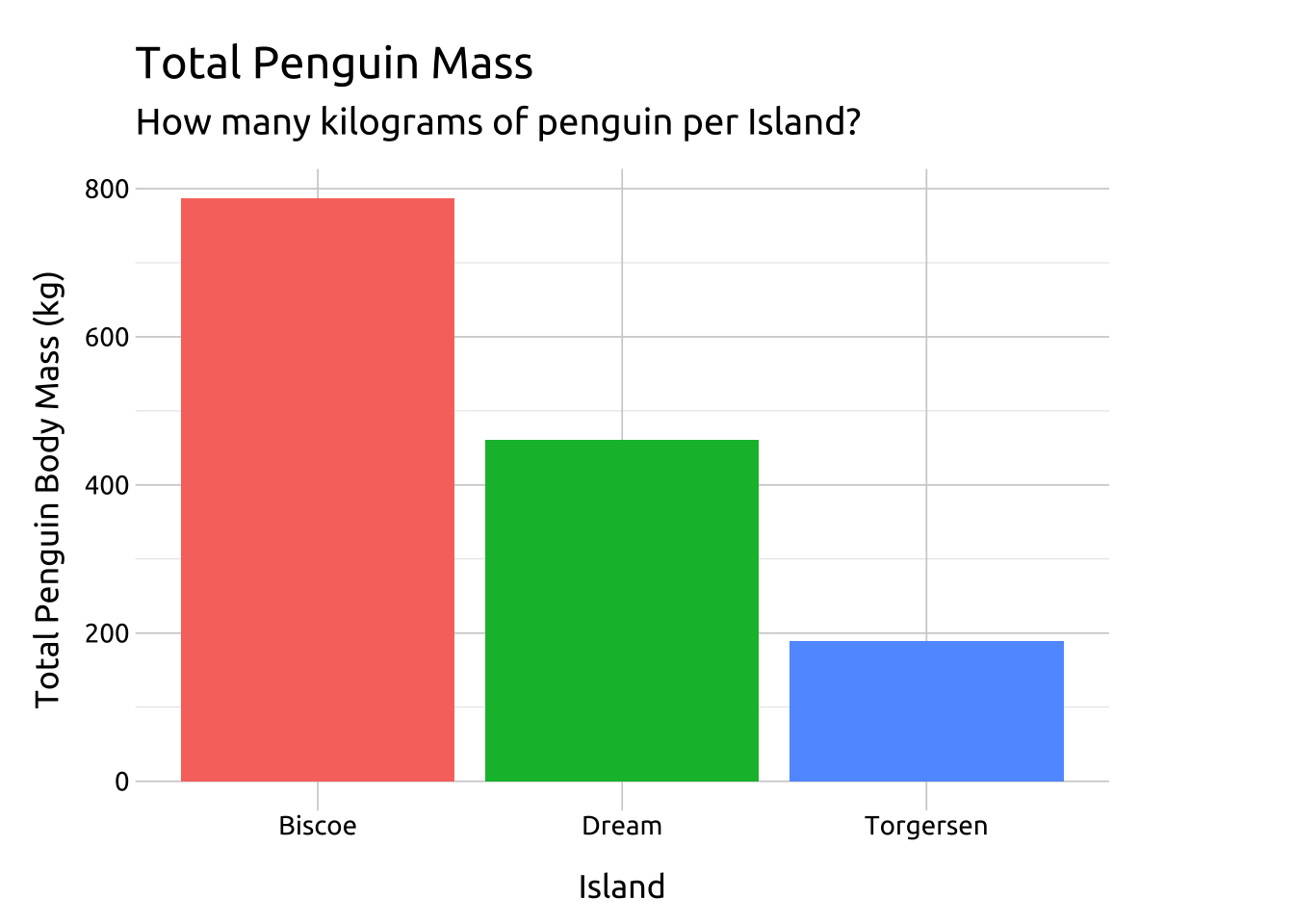
geom_bar() vs. geom_col():
geom_bar() will map a categorical variable to the x or y and display counts for the discrete levels (see stat_count() for more info)
geom_col() will map both x and y aesthetics, and is used when we want to display numerical (quantitative) values across the levels of a categorical variable. geom_col() assumes these values have been created in their own column (see stat_identity() for more info)