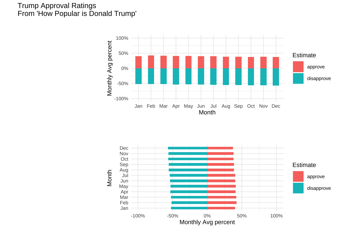
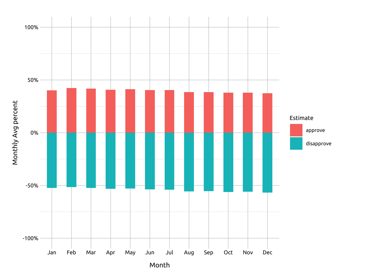
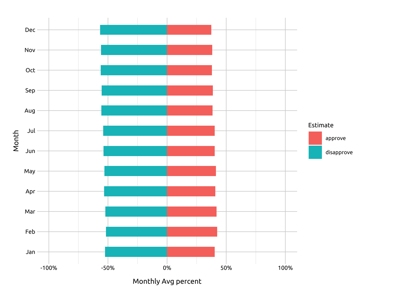
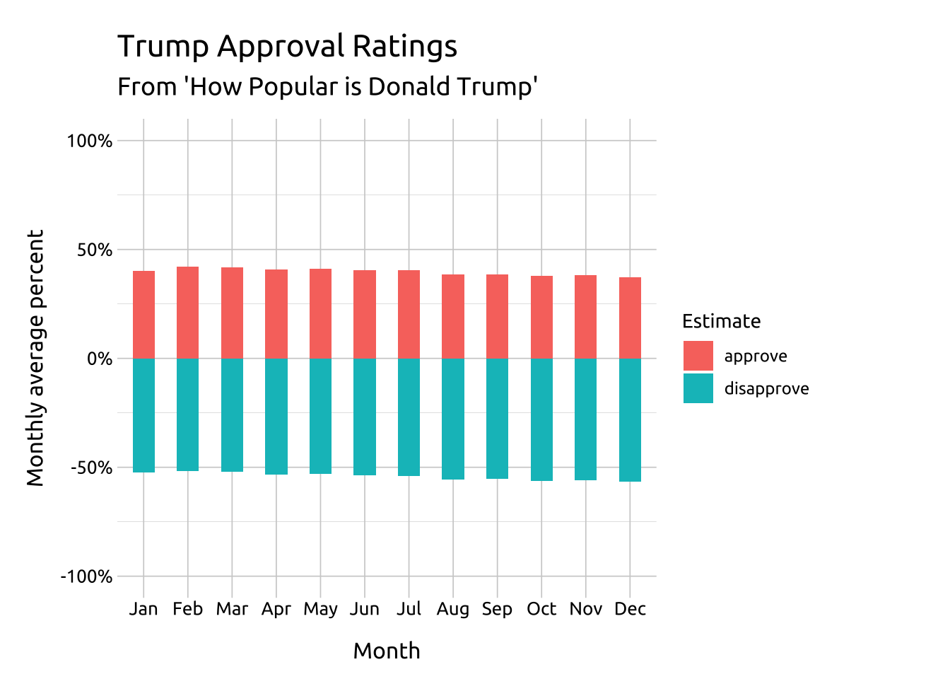
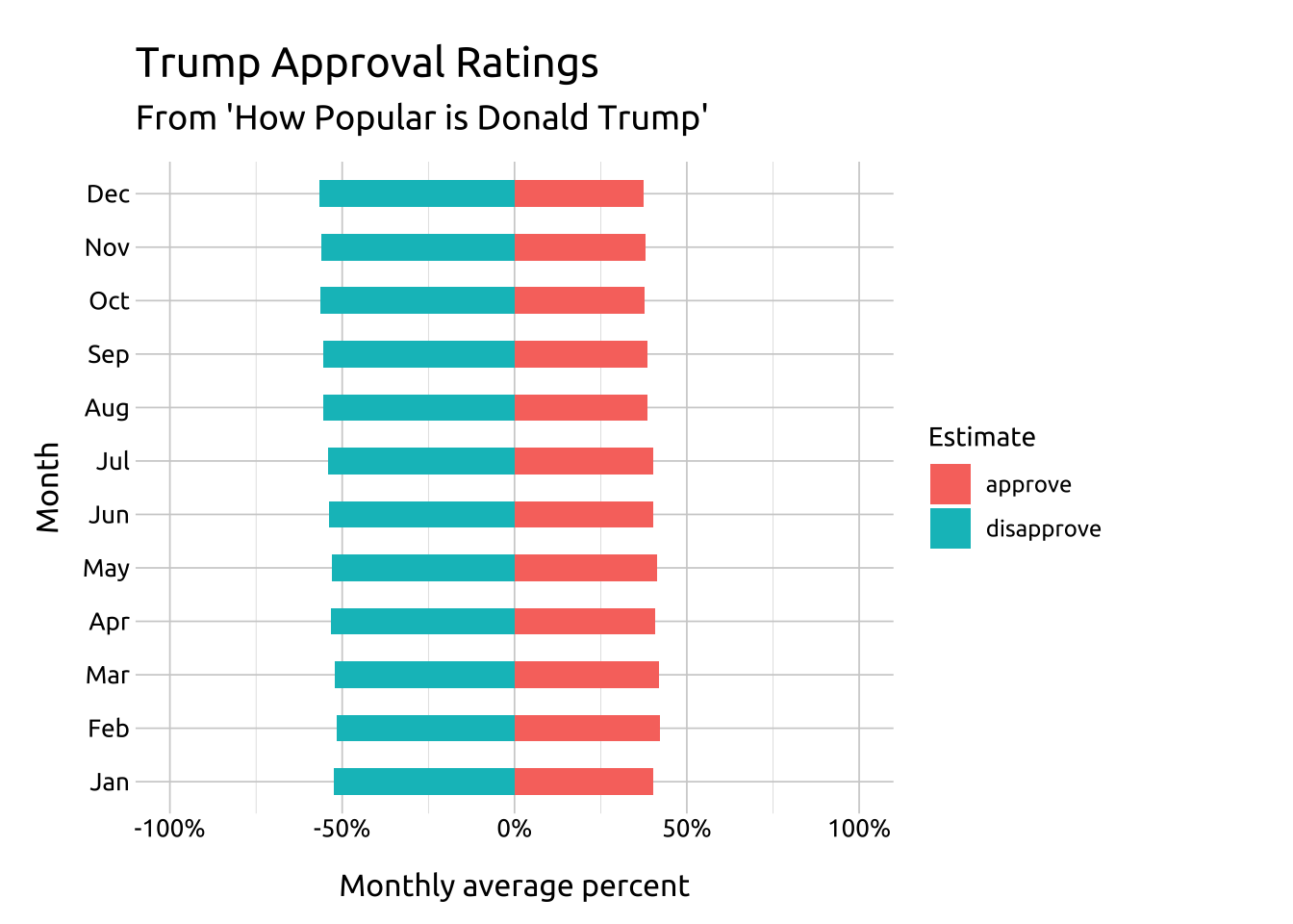
--- title: "Diverging bar graphs" format: html: toc: true toc-location: right toc-title: Contents code-fold: true out-height: '100%' out-width: '100%' execute: warning: false message: false --- ```{r} #| label: setup #| message: false #| warning: false #| include: false library (tidyverse)library (lubridate)library (scales)library (knitr)library (kableExtra)library (colorblindr)library (downlit)# options ---- options (repos = "https://cloud.r-project.org" ,dplyr.print_min = 6 , dplyr.print_max = 6 , scipen = 9999 )# fonts ---- library (extrafont)library (sysfonts)# import font :: font_import (paths = "assets/Ubuntu/" ,prompt = FALSE )# add font :: font_add (family = "Ubuntu" , regular = "assets/Ubuntu/Ubuntu-Regular.ttf" )# use font :: showtext_auto ()# add theme source ("R/theme_ggp2g.R" )# set theme :: theme_set (theme_ggp2g (base_size = 15 ))# install data packages ---- install.packages ("palmerpenguins" )library (palmerpenguins)install.packages ("fivethirtyeight" )library (fivethirtyeight)``` ## Graph info <br> ```{r} #| label: full_code_display #| eval: true #| echo: false #| warning: false #| message: false #| out-height: '80%' #| out-width: '80%' #| fig-align: right library (fivethirtyeight) library (ggplot2)library (patchwork):: trump_approval_trend |> filter (subgroup == "All polls" ) |> mutate (month = lubridate:: month (modeldate,label = TRUE , abbr = TRUE ),approve = approve_estimate* 0.01 ,disapprove = disapprove_estimate* 0.01 ,disapprove = disapprove * - 1 ) |> pivot_longer (cols = c (approve, disapprove), names_to = "poll" , values_to = "values" ) |> group_by (month, poll) |> summarise (month_avg = mean (values, na.rm = TRUE )|> ungroup () -> trump_approval_diverg<- labs (x = "Month" ,y = "Monthly Avg percent" ,fill = "Estimate" )<- ggplot (data = trump_approval_diverg, aes (x = month, y = month_avg)) + geom_bar (aes (fill = poll),stat = "identity" , width = .5 ) + scale_y_continuous (limits = c (- 1 , 1 ), labels = scales:: percent) + theme (legend.position = "bottom" )<- labs (x = "Monthly Avg percent" ,y = "Month" ,fill = "Estimate" )<- ggplot (data = trump_approval_diverg,aes (x = month_avg, y = month)) + geom_bar (aes (fill = poll), stat = "identity" , width = .5 ) + scale_x_continuous (limits = c (- 1 , 1 ), labels = scales:: percent)# diverging bar-charts ---- <- ggp2_bars_diverg + + :: theme_minimal (base_size = 9 )# diverging bar-charts vertical ---- <- ggp2_bar_diverg_vert + + :: theme_minimal (base_size = 9 )# combine ---- plot_spacer () + diverg + plot_spacer () + diverg_vert + :: plot_layout (nrow = 2 , widths = c (1 , 4 )) + plot_annotation (theme = theme_minimal (base_size = 9 ), title = "Trump Approval Ratings \n From 'How Popular is Donald Trump'" )``` `r emo::ji("check")` a categorical variable `r emo::ji("check")` a numeric (continuous) variable## Description `geom_bar()` . ### Vertical bars ```{r} #| label: diverg #| eval: true #| echo: false #| warning: false #| message: false #| out-height: '75%' #| out-width: '75%' #| fig-align: center + + theme_ggp2g (base_size = 11 )``` ### Horizontal bars ```{r} #| label: diverg_vert #| eval: true #| echo: false #| warning: false #| message: false #| out-height: '75%' #| out-width: '75%' #| fig-align: center + + theme_ggp2g (base_size = 11 )``` ## Getting set up ### Packages ```{r} #| label: pkg_code_diverging_bar #| code-fold: show #| eval: true #| echo: true #| warning: false #| message: false #| results: hide install.packages ("fivethirtyeight" )library (fivethirtyeight) library (ggplot2)``` ### Data  {fig-align="right" width="45%" height="45%"}`trump_approval_diverg` from the `trump_approval_trend` dataset in the `fivethirtyeight` package.```{r} #| label: data_code_diverging_bar #| eval: true #| echo: true :: trump_approval_trend |> :: filter (subgroup == "All polls" ) |> :: mutate (month = lubridate:: month (modeldate,label = TRUE , abbr = TRUE ),approve = approve_estimate* 0.01 ,disapprove = disapprove_estimate* 0.01 ,disapprove = disapprove * - 1 ) |> :: pivot_longer (cols = c (approve, disapprove), names_to = "poll" , values_to = "values" ) |> :: group_by (month, poll) |> :: summarise (month_avg = mean (values, na.rm = TRUE )|> :: ungroup () -> trump_approval_divergglimpse (trump_approval_diverg)``` ## The grammar ### Code `labs()` `ggplot()` and provide `data` `month` to the `x` and `month_avg` to the `y` ` geom_bar()` - map `poll` to `fill` - use `stat = "identity"` and `width = .5` `scale_y_continuous()` to manually set the limits and format the axis with `scales::percent` ```{r} #| label: code_graph_diverging_bar #| code-fold: show #| eval: false #| echo: true #| warning: false #| message: false #| out-height: '100%' #| out-width: '100%' #| column: page-inset-right #| layout-nrow: 1 <- labs (title = "Trump Approval Ratings" ,subtitle = "From 'How Popular is Donald Trump'" ,x = "Month" ,y = "Monthly average percent" ,fill = "Estimate" )<- ggplot (data = trump_approval_diverg, aes (x = month, y = month_avg)) + geom_bar (aes (fill = poll),stat = "identity" , width = .5 ) + scale_y_continuous (limits = c (- 1 , 1 ), labels = scales:: percent) + ``` ### Graph ```{r} #| label: create_graph_diverging_bar #| eval: true #| echo: false #| warning: false #| message: false #| out-height: '100%' #| out-width: '100%' #| column: page-inset-right #| layout-nrow: 1 <- labs (title = "Trump Approval Ratings" ,subtitle = "From 'How Popular is Donald Trump'" ,x = "Month" ,y = "Monthly average percent" ,fill = "Estimate" )<- ggplot (data = trump_approval_diverg, aes (x = month, y = month_avg)) + geom_bar (aes (fill = poll),stat = "identity" , width = .5 ) + scale_y_continuous (limits = c (- 1 , 1 ), labels = scales:: percent)+ ``` ## More info `x` and `y` axis variables.### Horizontally arranged bars `labs()` `month_avg` to the `x` and `month` to the `y` `geom_bar()` - map `poll` to `fill` - use `stat = "identity"` and `width = .5` `scale_y_continuous()` to manually set the limits and format the axis with `scales::percent` ```{r} #| label: create_graph_vert_diverg_bars #| eval: true #| echo: true #| warning: false #| message: false #| out-height: '100%' #| out-width: '100%' #| column: page-inset-right #| layout-nrow: 1 <- labs (title = "Trump Approval Ratings" ,subtitle = "From 'How Popular is Donald Trump'" ,x = "Monthly average percent" ,y = "Month" ,fill = "Estimate" )<- ggplot (data = trump_approval_diverg,aes (x = month_avg, y = month)) + geom_bar (aes (fill = poll), stat = "identity" , width = .5 ) + scale_x_continuous (limits = c (- 1 , 1 ), labels = scales:: percent)+ ```