Overlapping density plot
Description
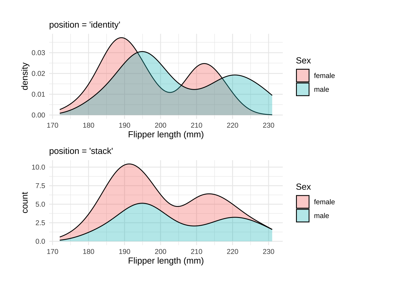
Density plots are smoothed version(s) of histogram(s). They can are great for comparing the distributions of a continuous variable across the levels of a categorical variable.
geom_density() creates a kernel density estimate. The default position argument is "identity", which takes the data as is. However, we can change position to "stack" to display overlapping distributions.
Getting set up
PACKAGES:
Install packages.
Code
install.packages("palmerpenguins")
library(palmerpenguins)
library(ggplot2)
DATA:

Remove missing sex from the penguins data
Code
peng_density <- dplyr::filter(penguins, !is.na(sex))
dplyr::glimpse(peng_density)
Rows: 333
Columns: 8
$ species <fct> Adelie, Adelie, Adelie, Adelie, Adelie, Adelie, Adel…
$ island <fct> Torgersen, Torgersen, Torgersen, Torgersen, Torgerse…
$ bill_length_mm <dbl> 39.1, 39.5, 40.3, 36.7, 39.3, 38.9, 39.2, 41.1, 38.6…
$ bill_depth_mm <dbl> 18.7, 17.4, 18.0, 19.3, 20.6, 17.8, 19.6, 17.6, 21.2…
$ flipper_length_mm <int> 181, 186, 195, 193, 190, 181, 195, 182, 191, 198, 18…
$ body_mass_g <int> 3750, 3800, 3250, 3450, 3650, 3625, 4675, 3200, 3800…
$ sex <fct> male, female, female, female, male, female, male, fe…
$ year <int> 2007, 2007, 2007, 2007, 2007, 2007, 2007, 2007, 2007…The grammar
CODE:
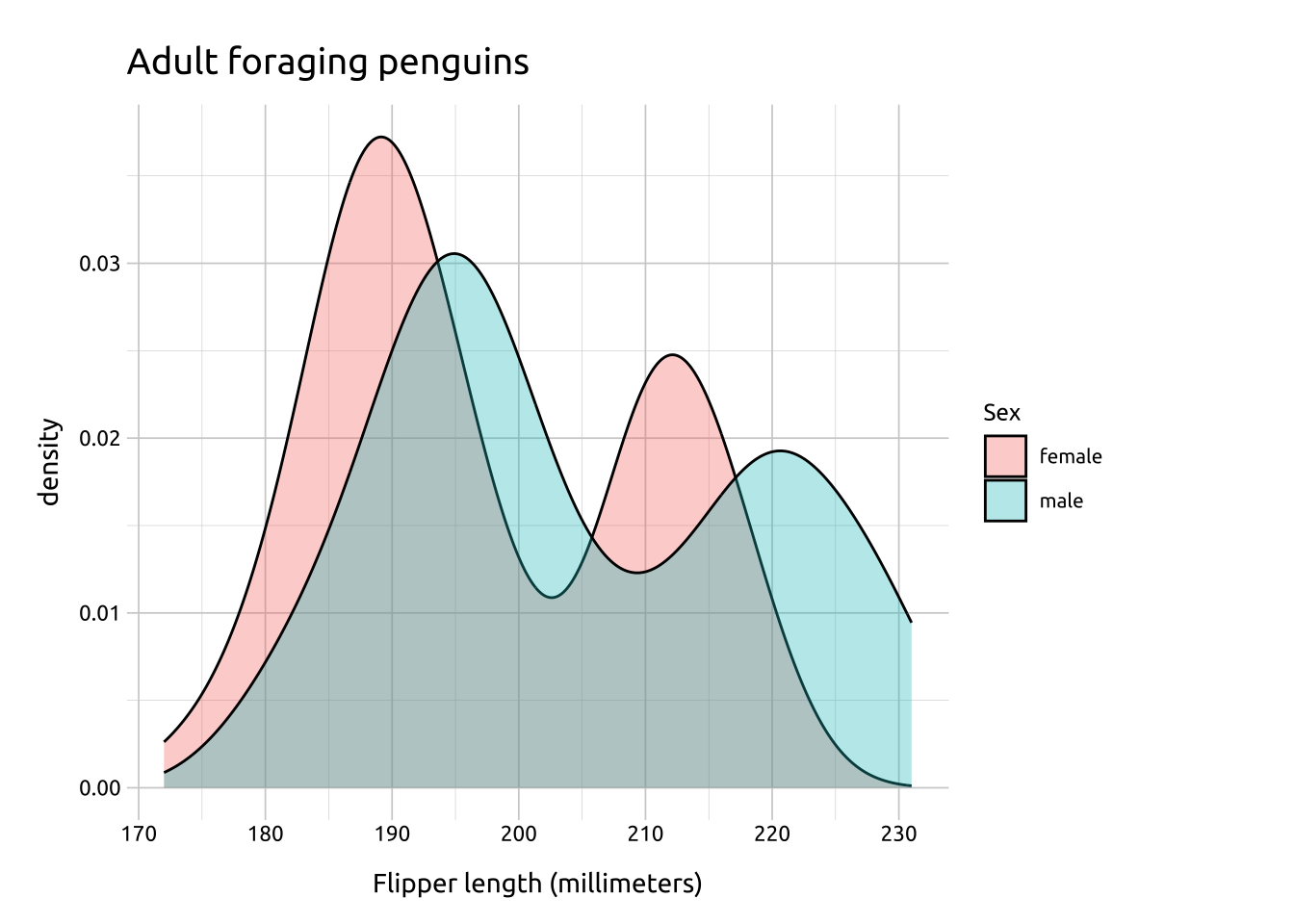
Create labels with labs()
Initialize the graph with ggplot() and provide data
Map the flipper_length_mm to the x and sex to fill
Add the geom_density()
Set the alpha to 1/3 (to handle the overlapping areas)
Code
labs_ovrlp_density <- labs(
  title = "Adult foraging penguins",
  x = "Flipper length (millimeters)",
  fill = "Sex")
ggp2_ovrlp_density <- ggplot(data = peng_density,
       aes(x = flipper_length_mm,
           fill = sex)) +
      geom_density(alpha = 1/3)
ggp2_ovrlp_density +
  labs_ovrlp_density
GRAPH:
A downside of density plots is the lack of interpretability of the y axis
Make density area slightly transparent to handle over-plotting
More info
ggplot2 has multiple options for overlapping density plots, so which one to use will depend on how you’d like to display the relative distributions in your data. We’ll cover three options below:
STACK:
If we change the position to "stack" we can see the smoothed estimates are ‘stacked’ on top each other (and the y axis shifts slightly).
Code
labs_stack_density <- labs(
    title = "Adult foraging penguins",
    x = "Flipper length (millimeters)",
    fill = "Sex")
ggp2_stack_density <- ggplot(data = peng_density,
    mapping = aes(x = flipper_length_mm,
               fill = sex)) +
    geom_density(position = "stack",
                 alpha = 1 / 3)
ggp2_stack_density +
    labs_stack_density
Setting position to 'stack' loses marginal densities
AFTER STAT:
If we include after_stat(count) as one of our mapped aesthetics, the mapping is postponed until after statistical transformation, and uses the density * n instead of the default density.
Code
labs_after_stat_density <- labs(
  title = "Adult foraging penguins",
  x = "Flipper length (millimeters)",
  fill = "Sex")
ggp2_after_stat_density <- ggplot(data = peng_density,
       aes(x = flipper_length_mm,
           after_stat(count),
           fill = sex)) +
      geom_density(position = "stack",
                   alpha = 1/3)
ggp2_after_stat_density +
  labs_after_stat_density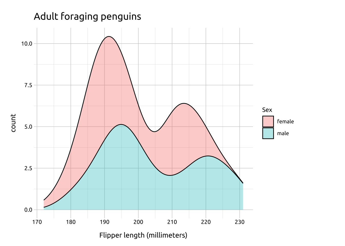
Adding after_stat(count) ‘preserves marginal densities.’, which result in more a interpretable y axis (depending on the audience)
FILL:
Using after_stat(count) with position = "fill" creates in a conditional density estimate.
Code
labs_fill_density <- labs(
  title = "Adult foraging penguins",
  x = "Flipper length (millimeters)",
  fill = "Sex")
ggp2_fill_density <- ggplot(data = peng_density,
       aes(x = flipper_length_mm,
           after_stat(count),
           fill = sex)) +
      geom_density(position = "fill",
                   alpha = 1/3)
ggp2_fill_density +
  labs_fill_density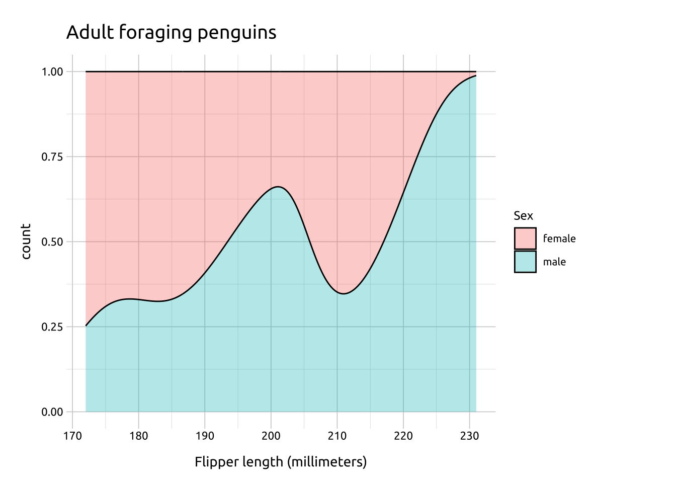
This results in a y axis ranging from 0-1, and the area filled with the relative proportional values.