
Frequency polygons
Description
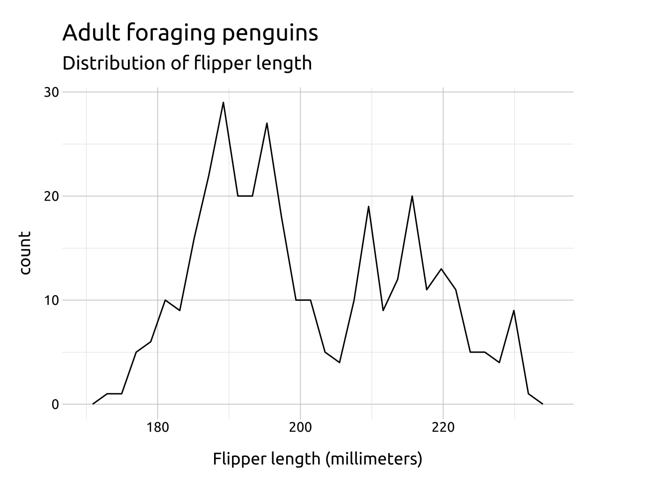
Frequency polygons are similar to histograms, but they use lines instead of bars to represent the variable’s distribution. The height of the line represents the frequency (or count) of the value occurrence.
When viewing frequency polygons, we’re still assessing the shape of the lines for symmetry and skewness..
Getting set up
PACKAGES:
Install packages.
Code
install.packages("palmerpenguins")
library(palmerpenguins)
library(ggplot2)
DATA:

The penguins data
Code
penguins <- palmerpenguins::penguins
glimpse(penguins)
Rows: 344
Columns: 8
$ species <fct> Adelie, Adelie, Adelie, Adelie, Adelie, Adelie, Adel…
$ island <fct> Torgersen, Torgersen, Torgersen, Torgersen, Torgerse…
$ bill_length_mm <dbl> 39.1, 39.5, 40.3, NA, 36.7, 39.3, 38.9, 39.2, 34.1, …
$ bill_depth_mm <dbl> 18.7, 17.4, 18.0, NA, 19.3, 20.6, 17.8, 19.6, 18.1, …
$ flipper_length_mm <int> 181, 186, 195, NA, 193, 190, 181, 195, 193, 190, 186…
$ body_mass_g <int> 3750, 3800, 3250, NA, 3450, 3650, 3625, 4675, 3475, …
$ sex <fct> male, female, female, NA, female, male, female, male…
$ year <int> 2007, 2007, 2007, 2007, 2007, 2007, 2007, 2007, 2007…The grammar
CODE:
Create labels with labs()
Initialize the graph with ggplot() and provide data
Map flipper_length_mm to the x axis
Add the geom_freqpoly() layer
Code
labs_freqpoly <- labs(
  title = "Adult foraging penguins",
  subtitle = "Distribution of flipper length",
  x = "Flipper length (millimeters)")
ggp2_freqpoly <- ggplot(data = penguins,
      aes(x = flipper_length_mm)) +
    geom_freqpoly()
ggp2_freqpoly +
  labs_freqpoly
GRAPH:
Experiment to see how many bins fit your variable’s distribution