
Histograms
Description
Histograms are a special kind of bar graph. The x axis is divided into ‘bins’ that cover the range of a variable’s values, and the height of the bars is the frequency (or count) of the value occurrence (displayed on the y axis).
Unlike a typical bar graph, histograms can be used to visually asses the ‘normality’ (i.e. are the bars symmetrical, with a single peak in the middle of the x axis? Or do the bars form multiple peaks?) or ‘skewness’ (i.e., is there a long ‘tail’ of bars with decreasing length on either end of the x axis?) of a variable’s distribution.
Getting set up
PACKAGES:
Install packages.
Code
install.packages("palmerpenguins")
library(palmerpenguins)
library(ggplot2)
DATA:

The penguins data.
Code
penguins <- palmerpenguins::penguins
glimpse(penguins)
Rows: 344
Columns: 8
$ species <fct> Adelie, Adelie, Adelie, Adelie, Adelie, Adelie, Adel…
$ island <fct> Torgersen, Torgersen, Torgersen, Torgersen, Torgerse…
$ bill_length_mm <dbl> 39.1, 39.5, 40.3, NA, 36.7, 39.3, 38.9, 39.2, 34.1, …
$ bill_depth_mm <dbl> 18.7, 17.4, 18.0, NA, 19.3, 20.6, 17.8, 19.6, 18.1, …
$ flipper_length_mm <int> 181, 186, 195, NA, 193, 190, 181, 195, 193, 190, 186…
$ body_mass_g <int> 3750, 3800, 3250, NA, 3450, 3650, 3625, 4675, 3475, …
$ sex <fct> male, female, female, NA, female, male, female, male…
$ year <int> 2007, 2007, 2007, 2007, 2007, 2007, 2007, 2007, 2007…The grammar
CODE:
Create labels with labs()
Initialize the graph with ggplot() and provide data
Assign flipper_length_mm to the x
Add the geom_histogram()
Adjust the bins accordingly
Code
labs_histogram <- labs(
  title = "Adult foraging penguins",
  subtitle = "Distribution of flipper length",
  x = "Flipper length (millimeters)")

ggp2_hist <- ggplot(data = penguins,
     aes(x = flipper_length_mm)) +
     geom_histogram()

ggp2_hist +
  labs_histogram
GRAPH:
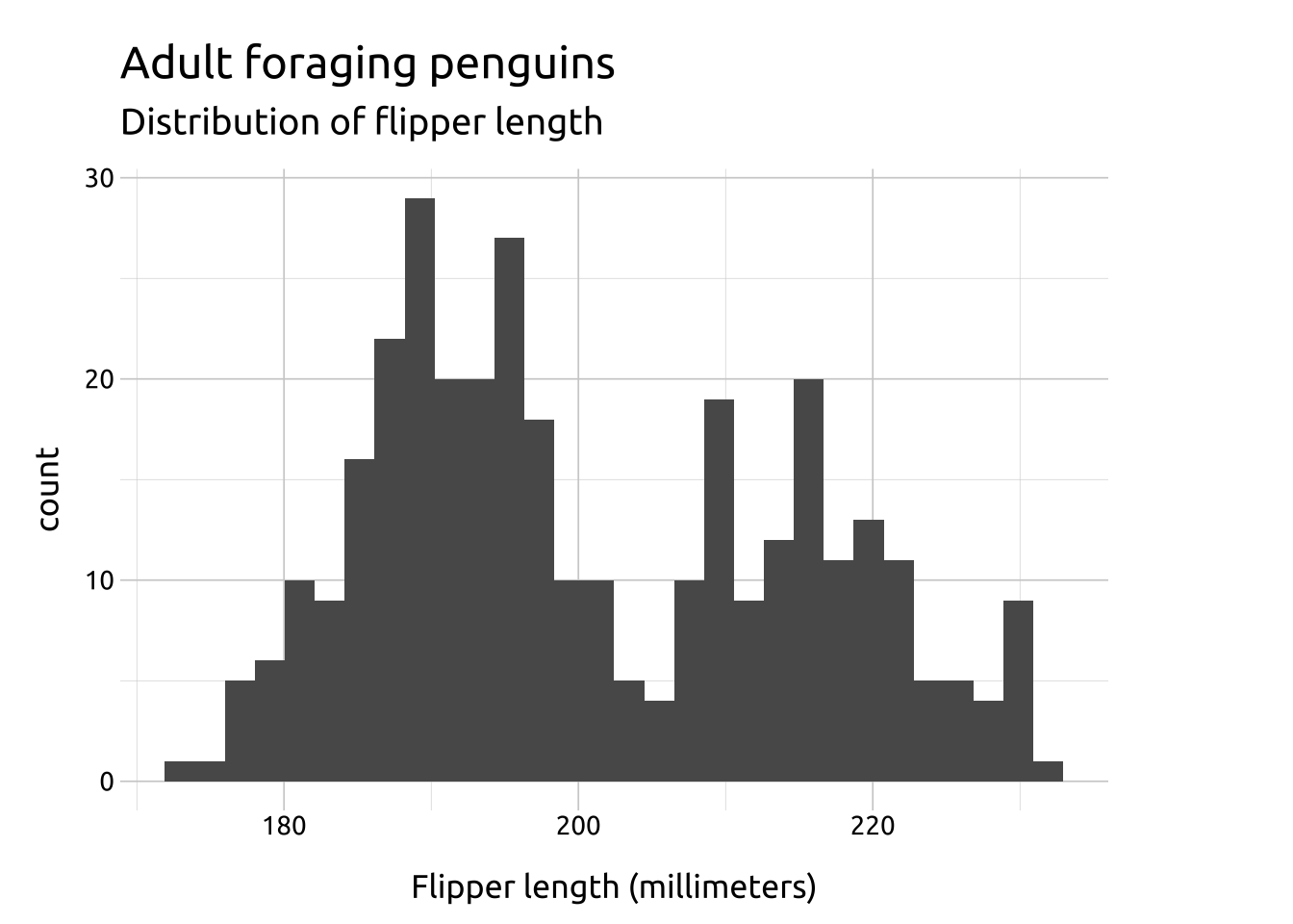
The standard number of bins is 30, but ‘you should always override this value, exploring multiple widths to find the best to illustrate the stories in your data.’