Waffle charts
Description
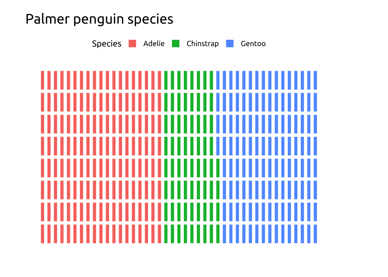
Waffle charts use color to display the levels that make up the values in a categorical variable. The counts for each level are divided into separate colors into a square or grid display.
Waffle chart legends should be positioned on top or bottom and justified horizontally to preserve shape and improve readability.
We’ll build a waffle chart using the ggwaffle package.
Getting set up
PACKAGES:
Install packages.
Code
devtools::install_github("liamgilbey/ggwaffle")
library(ggwaffle)
install.packages("palmerpenguins")
library(palmerpenguins)
library(ggplot2)
DATA:

Waffle charts require a special data transformation with ggwaffle::waffle_iron()
Set the group argument in ggwaffle::aes_d() as the categorical variable you want to see the relative counts for:
Code
penguins <- palmerpenguins::penguins
penguins <- dplyr::mutate(penguins,
              species = as.character(species))
waffle_peng <- ggwaffle::waffle_iron(penguins,
                      aes_d(group = species))

glimpse(waffle_peng)
Rows: 344
Columns: 3
$ y <int> 1, 2, 3, 4, 5, 6, 7, 8, 1, 2, 3, 4, 5, 6, 7, 8, 1, 2, 3, 4, 5, 6…
$ x <int> 1, 1, 1, 1, 1, 1, 1, 1, 2, 2, 2, 2, 2, 2, 2, 2, 3, 3, 3, 3, 3, 3…
$ group <chr> "Adelie", "Adelie", "Adelie", "Adelie", "Adelie", "Adelie", "Ade…The grammar
CODE:
Create labels with labs()
Initialize the graph with ggplot() and provide data
Map the x and y to the x and y axes
Map group to fill
Add ggwaffle::geom_waffle()
Add ggwaffle::theme_waffle()
Move the legend to the top with theme(legend.position = "top")
Code
labs_waffle <- labs(
  title = "Palmer penguin species",
  x = "", y = "", fill = "Species")
ggp2_waffle <- ggplot(data = waffle_peng,
       aes(x = x,
           y = y,
           fill = group)) +
  ggwaffle::geom_waffle() +
  theme(legend.position = "top")
ggp2_waffle +
  labs_waffle +
  ggwaffle::theme_waffle()
GRAPH:
