Grouped scatter plots
Description
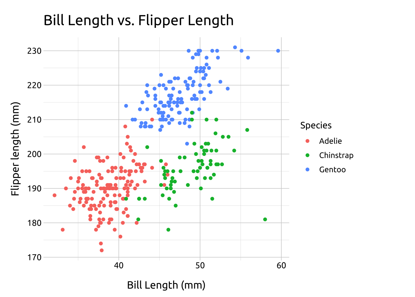
Grouped scatter-plots display the relationships between two continuous variables across a third categorical variable.
The x and y position displays the relationship between the two continuous variables, and color is used to distinguish between the categorical levels.
Getting set up
PACKAGES:
Install packages.
Code
install.packages("palmerpenguins")
library(palmerpenguins)
library(ggplot2)
DATA:

The penguins data
Code
penguins <- palmerpenguins::penguins
glimpse(penguins)
Rows: 344
Columns: 8
$ species <fct> Adelie, Adelie, Adelie, Adelie, Adelie, Adelie, Adel…
$ island <fct> Torgersen, Torgersen, Torgersen, Torgersen, Torgerse…
$ bill_length_mm <dbl> 39.1, 39.5, 40.3, NA, 36.7, 39.3, 38.9, 39.2, 34.1, …
$ bill_depth_mm <dbl> 18.7, 17.4, 18.0, NA, 19.3, 20.6, 17.8, 19.6, 18.1, …
$ flipper_length_mm <int> 181, 186, 195, NA, 193, 190, 181, 195, 193, 190, 186…
$ body_mass_g <int> 3750, 3800, 3250, NA, 3450, 3650, 3625, 4675, 3475, …
$ sex <fct> male, female, female, NA, female, male, female, male…
$ year <int> 2007, 2007, 2007, 2007, 2007, 2007, 2007, 2007, 2007…The grammar
CODE:
Create labels with labs()
Initialize the graph with ggplot() and provide data
Map bill_length_mm to the x axis
Map flipper_length_mm to the y axis
Map species to color inside the geom_point()
Code
labs_grp_scatter <- labs(
  title = "Bill Length vs. Flipper Length",
  x = "Bill Length (mm)",
  y = "Flipper length (mm)",
  color = "Species")

ggp2_grp_scatter <- penguins |>
  ggplot(
    aes(x = bill_length_mm,
        y = flipper_length_mm)) +
  geom_point(aes(color = species))

ggp2_grp_scatter +
  labs_grp_scatter
GRAPH:
Adjust over-plotting with transparency (alpha)
