AMOUNTS
These graphs display counts or simple summary statistics of one or two columns in a dataset.
Grouped bar graphs
Grouped bar graphs help compare multiple variables across the same categories. Each category has a cluster of bars representing different subsets of data. The x-axis labels the categories, and the y-axis shows the measured value. Colors or patterns differentiate the subsets within each category, and a legend is usually shown on the side or top of the graph.
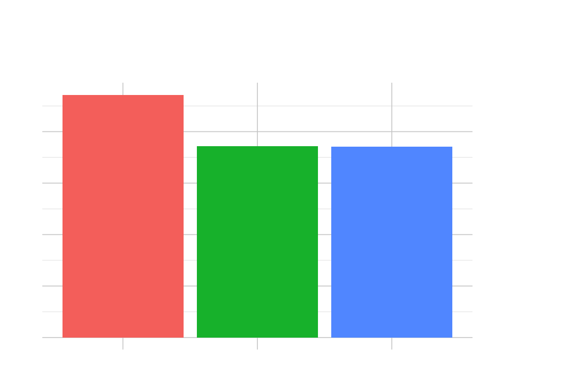
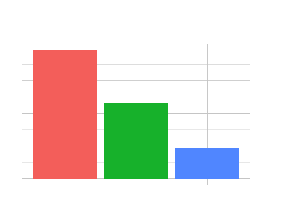
Summary bar graphs
Bar graphs that summarize data show a statistic for each category. Each bar represents a value calculated for a specific group, such as the mean, median, or total. The x-axis lists the categories, and the y-axis shows the statistic values. These graphs are helpful in quickly displaying essential data points for different categories, and they can include error bars to show variation or confidence intervals.
Overlapping bar graphs
When displaying multiple variables on a graph, you can use overlapping bar graphs instead of placing them side by side. This method allows you to compare the values of different groups on the same scale, but it might be harder to read if the bars are entirely opaque. The bars are often made partially transparent to make it easier to see. Legends can help distinguish between the data represented by the different bars.
Heatmaps
A heatmap is a graph that shows data as colors. It uses a matrix to represent values, with the x and y axes showing categories. Each cell in the matrix is colored according to its value. Heatmaps help show how big something is in two dimensions. A color scale (legend) is often next to the graph to explain what the colors mean.
Waffle charts
Waffle charts are a way to show how a whole thing is divided into parts, just like pie charts. Instead of using slices, waffle charts use squares or icons to represent each part and group them into categories that fill a grid. This graph type is appropriate when showing percentages or proportions out of a total. To make it easy to understand, you can add a legend or labels next to each category to explain what it is.
Cleveland dot plots
Cleveland dot plots are a graph that helps compare a few different numbers. The graph lists the categories on the side and shows the data with dots along a line. This graph helps show the differences between groups and is more efficient than traditional bar graphs.