29 Grouped line graphs
29.1 Description
Grouped line graphs use color, line style, and faceting to show group changes over time for a continuous variable across categorical levels.
29.2 Set up
PACKAGES:
Install packages.
show/hide
install.packages("fivethirtyeight")
library(fivethirtyeight)
library(ggplot2)
DATA:

We’ll be using the US_births_1994_2003 and US_births_2000_2014 datasets from the fivethirtyeight package:
Binding these together (they have identical columns)
Create a
day_categoryvariable that distinguishes between weekdays (Weekends) and weekends (Weekday)Use
yearandmonthto createyr_mnthUse
yearandquarterto createyr_qtrSave these changes to
usbirth_1994_2014
show/hide
US_births_2004_2014 <- filter(fivethirtyeight::US_births_2000_2014, year > 2003)
usbirth_1994_2014 <- US_births_2004_2014 |>
    dplyr::bind_rows(fivethirtyeight::US_births_1994_2003) |>
    dplyr::mutate(
        day_category = case_when(
            day_of_week %in% c("Sun", "Sat") ~ "Weekend",
            day_of_week %nin% c("Sun", "Sat") ~ "Weekday",
            TRUE ~ NA_character_
        ),
        month = dplyr::if_else(
            condition = month < 10,
            true = paste0("0", month),
            false = as.character(month)
        ),
        yr_mnth = paste0(year, "-", month),
        yr_mnth = lubridate::ym(yr_mnth),
        yr_qtr = paste0(lubridate::year(date),
                              "/0",
                              quarter(date)),
        yr_qtr = factor(yr_qtr, ordered = TRUE)
    )
dplyr::glimpse(usbirth_1994_2014)
#> Rows: 7,670
#> Columns: 9
#> $ year          <int> 2004, 2004, 2004, 2004, 20…
#> $ month         <chr> "01", "01", "01", "01", "0…
#> $ date_of_month <int> 1, 2, 3, 4, 5, 6, 7, 8, 9,…
#> $ date          <date> 2004-01-01, 2004-01-02, 2…
#> $ day_of_week   <ord> Thurs, Fri, Sat, Sun, Mon,…
#> $ births        <int> 8205, 10586, 8337, 7359, 1…
#> $ day_category  <chr> "Weekday", "Weekday", "Wee…
#> $ yr_mnth       <date> 2004-01-01, 2004-01-01, 2…
#> $ yr_qtr        <ord> 2004/01, 2004/01, 2004/01,…
We’ll use these data in the More info section for more line graphs, but for now:
Group
usbirth_1994_2014onyearandday_categoryCalculate the average
birthsasavg_birthsStore the data in
avg_birth_day_cat_yr.
show/hide
avg_birth_day_cat_yr <- usbirth_1994_2014 |>
    dplyr::group_by(year, day_category) |>
    dplyr::summarise(avg_births = mean(births, na.rm = TRUE)) |>
    dplyr::ungroup()
#> `summarise()` has regrouped the output.
#> ℹ Summaries were computed grouped by year and
#>   day_category.
#> ℹ Output is grouped by year.
#> ℹ Use `summarise(.groups = "drop_last")` to
#>   silence this message.
#> ℹ Use `summarise(.by = c(year, day_category))`
#>   for per-operation grouping (`?dplyr::dplyr_by`)
#>   instead.
dplyr::glimpse(avg_birth_day_cat_yr)
#> Rows: 42
#> Columns: 3
#> $ year         <int> 1994, 1994, 1995, 1995, 199…
#> $ day_category <chr> "Weekday", "Weekend", "Week…
#> $ avg_births   <dbl> 11728.012, 8604.610, 11593.…
29.3 Grammar
CODE:
Create labels with
labs()Map
yr_mnthto thex,avg_birthsto they, andday_categorytogroupAdd the
geom_line()layer and mapday_categoryto color (insideaes())
show/hide
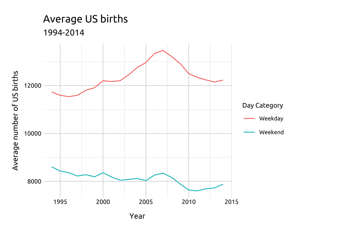
labs_line_graph <- labs(title = "Average US births",
                        subtitle = "1994-2014",
                        y = "Average number of US births",
                        x = "Year",
                        color = "Day Category")

ggp2_line <- ggplot(data = avg_birth_day_cat_yr,
       mapping = aes(x = year,
                     y = avg_births,
                     group = day_category)) +
    geom_line(aes(color = day_category))
ggp2_line +
    labs_line_graph
GRAPH:
29.4 More info
Line graphs are great for displaying relationships across variables with multiple groups (or levels). We can also use facets for multiple comparisons (i.e., small multiples).
29.4.1 Groups
In the previous graph, we can see the number of births begins to decline around 2007 or 2008.
We’ll create another summarized dataset from the
usbirth_2010_2014data, but this time we restrict the observations to only births in between2008and2009Group the data on
yr_qtrandday_of_weekThen calculate the average number of
birthsasavg_births
show/hide
avg_births_dow_qtr <- usbirth_1994_2014 |>
    dplyr::filter(year >= 2008 & year <= 2009) |>
    dplyr::group_by(yr_qtr, day_of_week) |>
    dplyr::summarise(avg_births = mean(births, na.rm = TRUE)) |>
    dplyr::ungroup()
dplyr::glimpse(avg_births_dow_qtr)
#> Rows: 56
#> Columns: 3
#> $ yr_qtr      <ord> 2008/01, 2008/01, 2008/01, 2…
#> $ day_of_week <ord> Sun, Mon, Tues, Wed, Thurs, …
#> $ avg_births  <dbl> 7497.231, 12464.385, 13099.6…
Now when we create our line graph, we will have a categorical variable with seven levels (day_of_week):
Create subtitle using
paste0()to ensure it’s accurate if/when the underlying data is updated.Move the legend to the top of the graph using
theme(legend.position = "top")(to improve readability).
show/hide
# here we create the labels (with the subtitle updating with the data)
labs_line_graph_grp <- labs(title = "Average US births",
                        subtitle = paste0("Between ",
                                    min(avg_births_dow_qtr$yr_qtr),
                                    " and ",
                                    max(avg_births_dow_qtr$yr_qtr)),
                        y = "Average births",
                        x = "Year/Quarter",
                        color = "Day of Week")
show/hide
# Build layer with yr_qtr and day_of_week
ggp2_line_grp <- ggplot(data = avg_births_dow_qtr,
                   mapping = aes(x = yr_qtr,
                                 y = avg_births,
                                 group = day_of_week)) +
        geom_line(aes(color = day_of_week))
# move legend
ggp2_line_grp +
    labs_line_graph_grp +
    theme(legend.position = "top")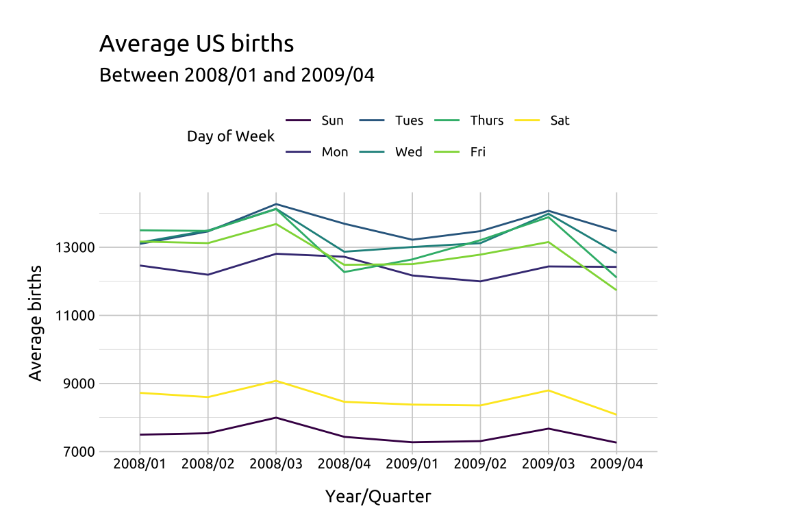
29.4.2 Line Styles
We can make it easier to distinguish between lines in our graph by adjusting the line style (
linetypeandlinewidth), or by changing overall opacity (alpha).We’ll work through some examples below using another subset from
usbirth_1994_2014.
DATA:
show/hide
avg_births_dow_mnth <- usbirth_1994_2014 |>
    dplyr::filter(year >= 2008 & year < 2010) |>
    dplyr::group_by(yr_mnth, day_of_week) |>
    dplyr::summarise(avg_births = mean(births, na.rm = TRUE)) |>
    dplyr::ungroup()
dplyr::glimpse(avg_births_dow_mnth)
#> Rows: 168
#> Columns: 3
#> $ yr_mnth     <date> 2008-01-01, 2008-01-01, 200…
#> $ day_of_week <ord> Sun, Mon, Tues, Wed, Thurs, …
#> $ avg_births  <dbl> 7535.25, 12344.00, 12280.60,…
show/hide
labs_line_styles <- labs(
    title = "Average US births",
    subtitle = paste0(
        "Between ",
        min(avg_births_dow_mnth$yr_mnth),
        " and ",
        max(avg_births_dow_mnth$yr_mnth)
    ),
    y = "Average births",
    x = "Year-Month",
    color = "Day of Week"
)
29.4.3 alpha & linewidth
Color palettes are a excellent too for highlighting or emphasizing certain lines over others.
- We’ll start by creating a line graph layer for Monday (
"Mon"), Thursday ("Thurs"), and Friday ("Fri") adjusting the opacity withalpha.
show/hide
ggp2_line_mon_thur_fri <-
    ggplot(data = dplyr::filter(avg_births_dow_mnth,
        day_of_week %in% c("Mon", "Thurs", "Fri"))) +
    geom_line(
        aes(x = yr_mnth,
            y = avg_births,
            group = day_of_week,
            color = day_of_week),
        alpha = 1 / 4,
        linewidth = 0.85)
# layer 1
ggp2_line_mon_thur_fri +
    labs_line_styles +
    theme(legend.position = "top")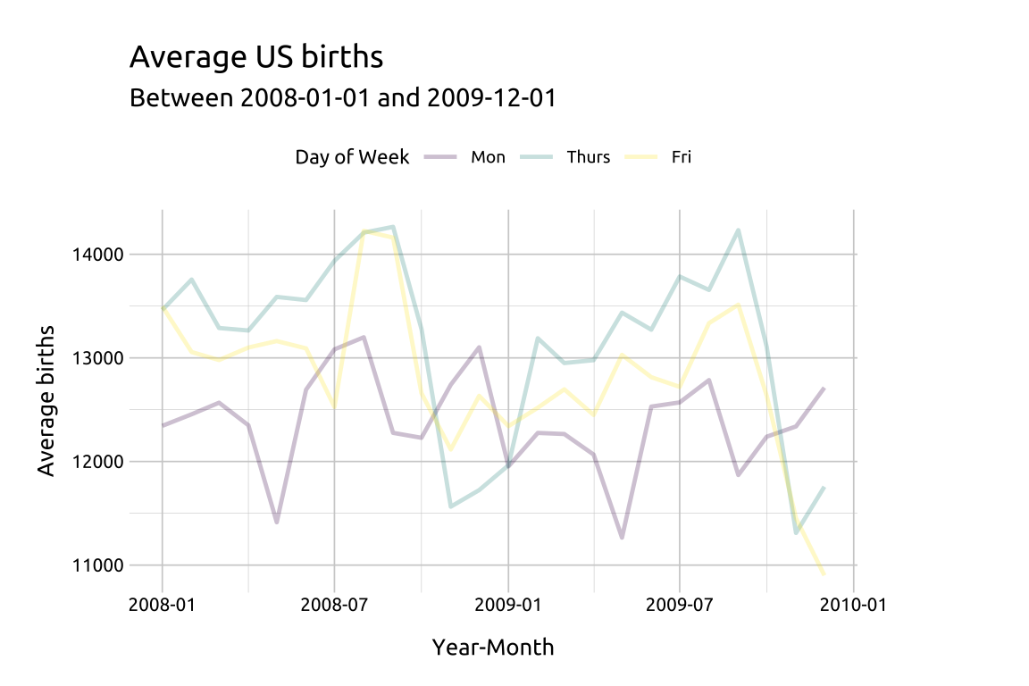
29.4.4 linetype
Then we’ll change the linetype of Saturday and Sunday to "longdash' (and make this somewhat transparent with a slightly higher alpha).
show/hide
ggp2_line_sat_sun <- ggp2_line_mon_thur_fri +
    geom_line(data = dplyr::filter(avg_births_dow_mnth,
            day_of_week %in% c("Sat", "Sun")),
        aes(x = yr_mnth,
            y = avg_births,
            group = day_of_week,
            color = day_of_week),
        alpha = 1 / 2,
        linewidth = 0.75,
        linetype = "longdash")
# layers 1 & 2
ggp2_line_sat_sun +
    labs_line_styles +
    theme(legend.position = "top")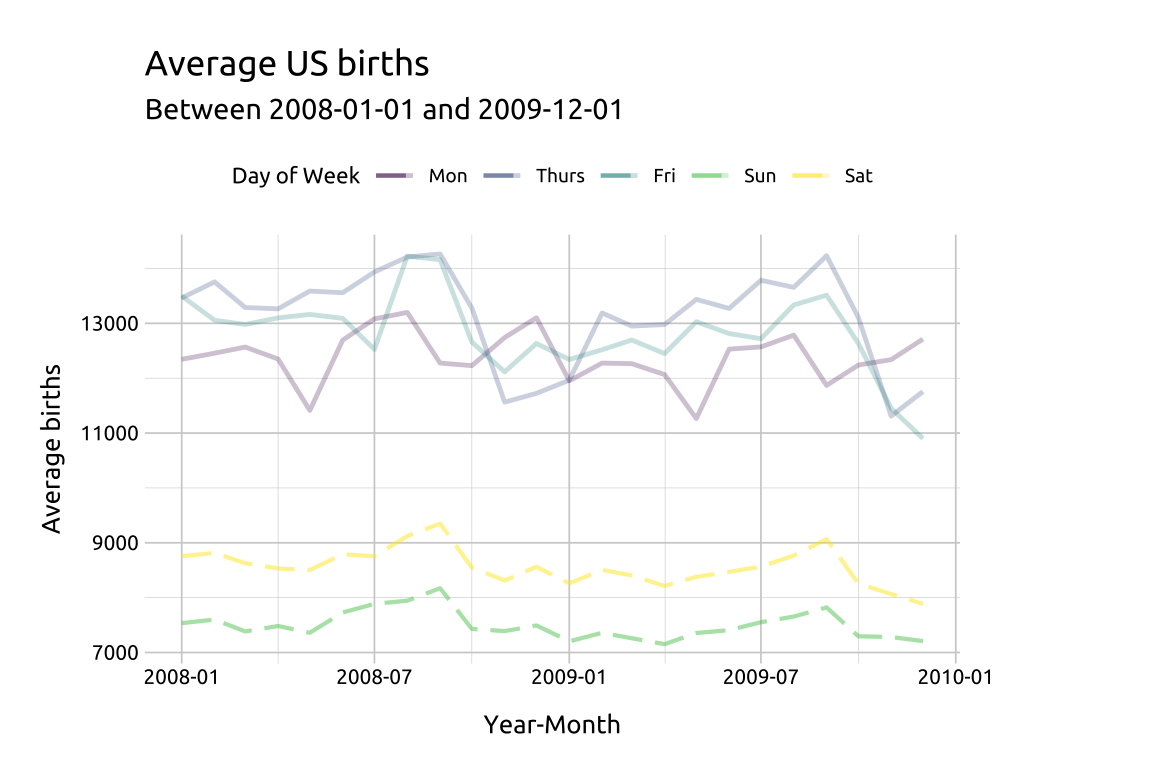
29.4.5 Color palettes
Add
geom_line()for Wednesday and Tuesday, but change the color palette withpaletteerandggthemes.We also manually set the legend order by supplying the original factor levels to the
breaksargument.
show/hide
library(paletteer)
library(ggthemes)
# original factor levels
lev_order <- levels(avg_births_dow_mnth$day_of_week)
# layer 3
ggp2_line_pal_d <- ggp2_line_sat_sun +
    # add line
    geom_line(data = dplyr::filter(avg_births_dow_mnth,
            day_of_week %in% c("Wed", "Tues")),
        aes(x = yr_mnth,
            y = avg_births,
            group = day_of_week,
            color = day_of_week),
        linewidth = 1.25) +
    # add palette
    ggplot2::scale_color_manual(
        breaks = lev_order,
        # original factor levels
        values = paletteer::paletteer_d(palette = "ggthemes::Color_Blind",
            n = 7))
# three layers
ggp2_line_pal_d +
    # labels
    labs_line_styles +
    # legend position
    theme(legend.position = "top")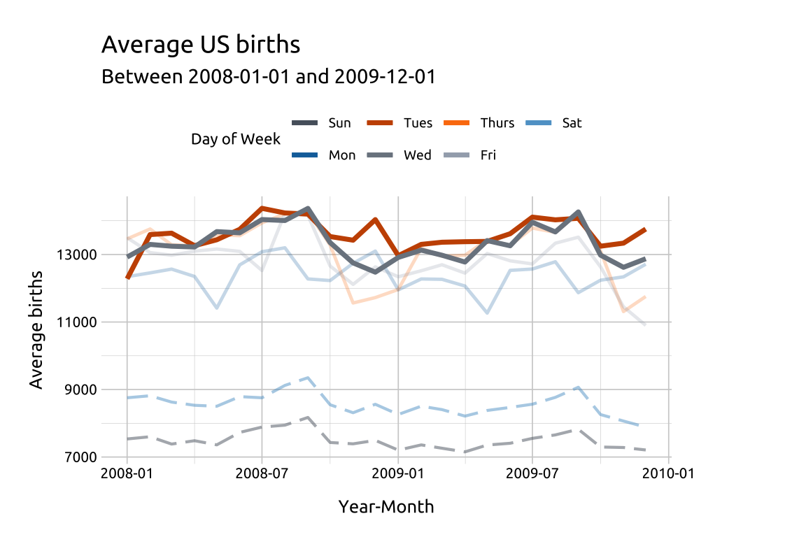
Changing the look of the lines is a great way to highlight or emphasize some lines over others.
29.4.6 Labels
In the previous graph, we can see the number of average births reaches it’s peak in 2008 or 2009, so we’ll use labels to display the max births and max average births.
To accomplish this, we’re going to create two small tables of labels,
label_max_dowandlabel_max_avg_dow, that we’ll use to label the maximum values.They will each have 7 rows (one for each day of the week) and a label variable (
lbl) which we can use withgeom_label().
show/hide
label_max_dow <- usbirth_1994_2014 |>
    dplyr::group_by(day_of_week) |>
    dplyr::summarise(max_births = max(births, na.rm = TRUE)) |>
    dplyr::ungroup() |>
    dplyr::arrange(desc(max_births)) |>
    dplyr::inner_join(y = usbirth_1994_2014,
        by = c("max_births" = "births", "day_of_week")) |>
    dplyr::mutate(lbl = paste0(day_of_week,
        " (",
        date,
        " )",
        ", max births = ",
        max_births)) |>
    dplyr::select(day_of_week, yr_mnth, max_births, lbl)

dplyr::arrange(label_max_dow, desc(max_births)) |>
    dplyr::slice(1:2)
show/hide
label_max_avg_dow <- avg_births_dow_mnth |>
    # group by mon-sun
    dplyr::group_by(day_of_week) |>
    # get max avg
    dplyr::summarise(max_avg_births = max(avg_births, na.rm = TRUE)) |>
    # ungroup
    dplyr::ungroup() |>
    # join back to table
    dplyr::inner_join(y = avg_births_dow_mnth,
        by = "day_of_week") |>
    # check for max
    dplyr::mutate(is_max = case_when(
        avg_births == max_avg_births ~ TRUE,
        avg_births != max_avg_births ~ FALSE,
    )) |>
    # remove non-maxes
    filter(is_max == TRUE) |>
    dplyr::mutate(lbl = paste0(day_of_week,
        ": Max avg births = ",
        max_avg_births)) |>
    # reduce
    select(day_of_week, yr_mnth, max_avg_births, lbl)
dplyr::arrange(label_max_avg_dow, desc(max_avg_births)) |>
    dplyr::slice(1:2)
Now that we have label tables for each metric, we can filter them to the days we want to label.
- We’ll use
filter()to get the maximum values for"Wed"(inlabel_max_wed_dowandlabel_max_avg_wed_dow)
show/hide
# get wed
label_max_wed_dow <- label_max_dow |>
    filter(day_of_week == "Wed")
label_max_wed_dow
label_max_avg_wed_dow <- label_max_avg_dow |>
    filter(day_of_week == "Wed")
label_max_avg_wed_dow
Add geom_point() and geom_label() for Wednesday.
show/hide
# point for max births/day
ggp2_line_wed_max_births_pnts <- geom_point(
    data = label_max_wed_dow,
    aes(x = yr_mnth,
        y = max_births,
        color = day_of_week),
    size = 2.5,
    show.legend = FALSE)

ggp2_line_wed_max_avg_births_pnts <-
    geom_point(
        data = label_max_avg_wed_dow,
        aes(x = yr_mnth,
            y = max_avg_births,
            color = day_of_week),
        size = 2.5,
        alpha = 1/2,
        show.legend = FALSE)

ggp2_line_wed_max_births_lbl <- geom_label(
    data = label_max_wed_dow,
    aes(x = yr_mnth,
        y = max_births,
        label = lbl,
        color = day_of_week),
    fill = "#ffffff",
    nudge_y = -480,
    nudge_x = 25,
    size = 1.3,
    show.legend = FALSE)

ggp2_line_wed_max_avg_births_lbl <-
    geom_label(data = label_max_avg_wed_dow,
        aes(x = yr_mnth,
            y = max_avg_births,
            label = lbl,
            color = day_of_week),
        fill = "#ffffff",
        nudge_y = 145,
        nudge_x = 85,
        size = 1.3,
        show.legend = FALSE)

ggp2_line_pal_d +
    ggp2_line_wed_max_births_pnts +
    ggp2_line_wed_max_avg_births_pnts +
    ggp2_line_wed_max_births_lbl +
    ggp2_line_wed_max_avg_births_lbl +
    # add labels
    labs_line_styles +
    # move legend to top
    theme(legend.position = "top")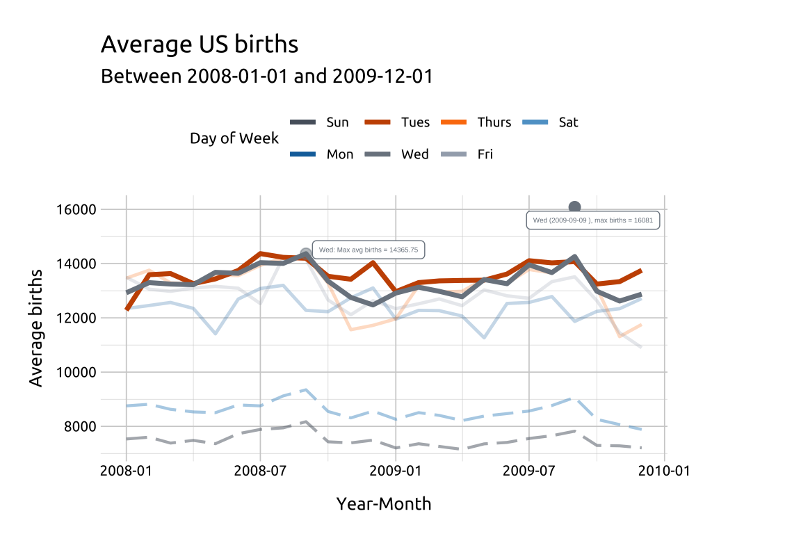
We’ll use filter() to get the maximum values for "Tues" (in label_max_tues_dow and label_max_avg_tues_dow):
show/hide
# point for max births/day
# get tues
label_max_tues_dow <- label_max_dow |>
    filter(day_of_week == "Tues")
label_max_tues_dow
label_max_avg_tues_dow <- label_max_avg_dow |>
    filter(day_of_week == "Tues")
label_max_avg_tues_dow
Add geom_point() and geom_label() for Tuesday
show/hide
# point for max births/day
ggp2_line_tues_max_births_pnts <-
    geom_point(data = label_max_tues_dow,
        aes(x = yr_mnth,
            y = max_births,
            color = day_of_week),
        size = 2.5,
        show.legend = FALSE)

ggp2_line_tues_max_avg_births_pnts <-
    geom_point(
        data = label_max_avg_tues_dow,
        aes(x = yr_mnth,
            y = max_avg_births,
            color = day_of_week),
        size = 2.5,
        alpha = 1/2,
        show.legend = FALSE)

ggp2_line_tues_max_births_lbl <-
    geom_label(data = label_max_tues_dow,
        aes(x = yr_mnth,
            y = max_births,
            label = lbl,
            color = day_of_week),
        fill = "#ffffff",
        nudge_y = -480,
        nudge_x = 50,
        size = 1.3,
        show.legend = FALSE)

ggp2_line_tues_max_avg_births_lbl <-
    geom_label(data = label_max_avg_tues_dow,
        aes(x = yr_mnth,
            y = max_avg_births,
            label = lbl,
            color = day_of_week),
        fill = "#ffffff",
        nudge_y = 300,
        nudge_x = -80,
        size = 1.3,
        show.legend = FALSE)


ggp2_line_pal_d +
    # wednesday layers
    ggp2_line_wed_max_births_pnts +
    ggp2_line_wed_max_avg_births_pnts +
    ggp2_line_wed_max_births_lbl +
    ggp2_line_wed_max_avg_births_lbl +
    # tuesday layers
    ggp2_line_tues_max_births_pnts +
    ggp2_line_tues_max_avg_births_pnts +
    ggp2_line_tues_max_births_lbl +
    ggp2_line_tues_max_avg_births_lbl +
    # add labels
    labs_line_styles +
    # move legend to top
    theme(legend.position = "top")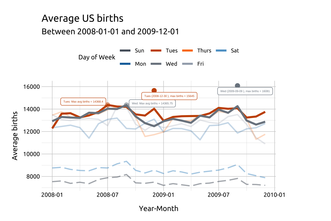
29.4.7 Facets
Finally, we can use facets to view each of the line graphs seperately (or small multiples).
We’ll create a dataset with the dates limited to births between
2008-07-01and2010-01-01Calculate the median births, grouped by
date,day_categoryAnd
day_of_weekand store it asmed_births_dcat_dow_mnth
show/hide
med_births_dcat_dow_mnth <- usbirth_1994_2014 |>
    dplyr::filter(date >= lubridate::as_date("2008-07-01") &
            date < lubridate::as_date("2010-01-01")) |>
    dplyr::group_by(date, day_category, day_of_week) |>
    dplyr::summarise(med_births = median(births, na.rm = TRUE)) |>
    dplyr::ungroup()
dplyr::glimpse(med_births_dcat_dow_mnth)
#> Rows: 549
#> Columns: 4
#> $ date         <date> 2008-07-01, 2008-07-02, 20…
#> $ day_category <chr> "Weekday", "Weekday", "Week…
#> $ day_of_week  <ord> Tues, Wed, Thurs, Fri, Sat,…
#> $ med_births <int> 14350, 14189, 14182, 9449, …- Using
facet_wrap()with a single categorical variable (. ~ var) will create a plot for each discrete level, whilefacet_grid()will create a level-by-level grid (specified asvar ~ var).
show/hide
# labels
labs_line_graph_facet_wrap <- labs(
    title = "Median US births",
    subtitle = paste0(
        "Between ",
        min(med_births_dcat_dow_mnth$date),
        " and ",
        max(med_births_dcat_dow_mnth$date)
    ),
    y = "Median births",
    x = "Date",
    color = "Day of Week"
)
# layer
ggp2_line_facet_wrap <- ggplot(data = med_births_dcat_dow_mnth,
    mapping = aes(x = date,
        y = med_births,
        group = day_of_week)) +
    geom_line(aes(color = day_of_week)) +
    scale_color_manual(values = c(
        "#30123B", "#4485F6", "#1AE4B6",
        "#A1FB3E", "#FABA39", "#E3460B", "#7A0403"
    )) +
    scale_y_continuous(
        breaks = c(4000, 8000, 12000, 16000),
        labels = c('4000', '8000', '12000', '16000')
    ) +
    scale_x_date(date_breaks = "1 year",
        date_labels = "%Y") +
    facet_wrap(day_of_week ~ ., shrink = TRUE)

ggp2_line_facet_wrap +
    labs_line_graph_facet_wrap +
    theme(legend.position = "top")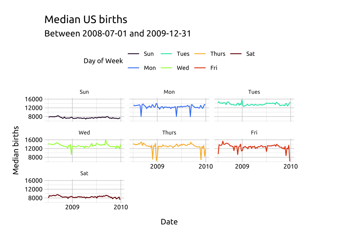
- It’s always a good idea to check the
xandyaxis text when using facets. I’ve adjusted thexandyaxes above usingscale_y_continuous()andscale_x_date()before addingfacet_wrap()
show/hide
# labels
labs_line_graph_facet_grid <- labs(
    title = "Median US births",
    subtitle = paste0(
        "Between ",
        min(med_births_dcat_dow_mnth$date),
        " and ",
        max(med_births_dcat_dow_mnth$date)
    ),
    y = "Median births",
    x = "Date",
    color = "Day of Week"
)
# layer
ggp2_line_facet_grid <- ggplot(data = med_births_dcat_dow_mnth,
    mapping = aes(x = date,
        y = med_births,
        group = day_of_week)) +
    geom_line(aes(color = day_of_week)) +
    scale_color_manual(values = c(
        "#30123B", "#4485F6", "#1AE4B6",
        "#A1FB3E", "#FABA39", "#E3460B", "#7A0403"
    )) +
    scale_y_continuous(
        breaks = c(4000, 8000, 12000, 16000),
        labels = c('4000', '8000', '12000', '16000')
    ) +
    scale_x_date(date_breaks = "1 year",
        date_labels = "%Y") +
    facet_grid(day_of_week ~ day_category,
        shrink = TRUE)

ggp2_line_facet_grid +
    labs_line_graph_facet_grid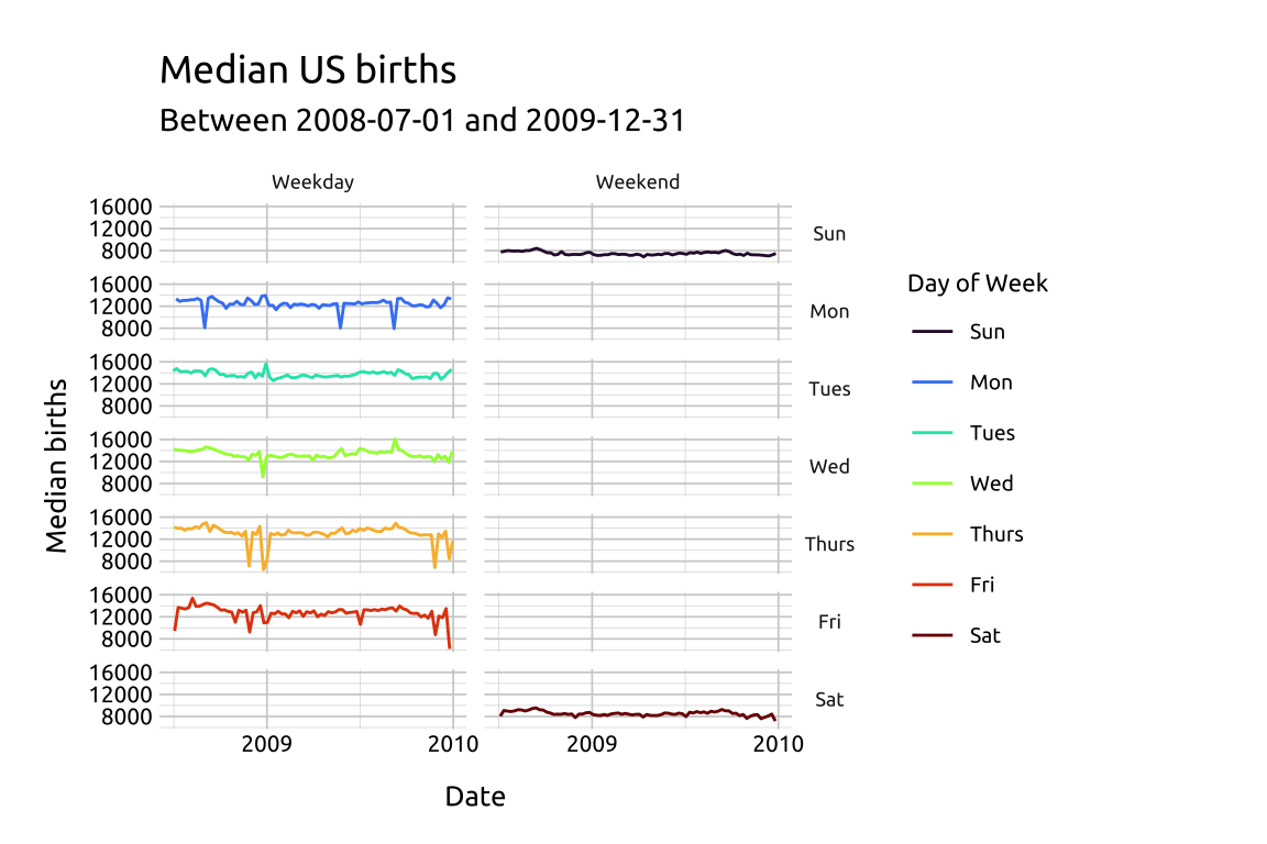
The colors have been manually, using scale_color_manual() and passing seven color hex codes to the values argument.