40 Density contours
40.1 Description
Density contours (or 2-D density plots) are helpful for displaying differences in values between two numeric (continuous) variables.
In topographical maps, contour lines are drawn around areas of equal elevation above sea-level. In density contours, the contour lines are drawn around the areas our data occupy (essentially replacing sea-level as ‘an area without any x or y values.’)
Specifically, the contour lines outline areas on the graph with differing point densities, and semi-transparent colors (gradient) can be added to further highlight the separate regions.
40.2 Set up
PACKAGES:
Install packages.
show/hide
install.packages("palmerpenguins")
library(palmerpenguins)
library(ggplot2)
DATA:

We’ll use the penguins data from the palmerpenguins package, but remove the missing values from bill_length_mm, flipper_length_mm, and species.
show/hide
peng_dnsty_2d <- palmerpenguins::penguins |>
  dplyr::filter(!is.na(bill_length_mm) &
    !is.na(flipper_length_mm) &
    !is.na(species)) |>
  dplyr::mutate(species = factor(species))
glimpse(peng_dnsty_2d)
#> Rows: 342
#> Columns: 8
#> $ species           <fct> Adelie, Adelie, Adelie…
#> $ island            <fct> Torgersen, Torgersen, …
#> $ bill_length_mm    <dbl> 39.1, 39.5, 40.3, 36.7…
#> $ bill_depth_mm     <dbl> 18.7, 17.4, 18.0, 19.3…
#> $ flipper_length_mm <int> 181, 186, 195, 193, 19…
#> $ body_mass_g       <int> 3750, 3800, 3250, 3450…
#> $ sex               <fct> male, female, female, …
#> $ year              <int> 2007, 2007, 2007, 2007…
40.3 Grammar
CODE:
Create labels with
labs()Initialize the graph with
ggplot()and providedataCreate two values for extending the range of the
xandyaxis (x_min/x_maxandy_min/y_max)Map
bill_length_mmtoxandflipper_length_mmtoyAdd the
expand_limits()function, assigning our stored values toxandyAdd the
geom_density_2d()
show/hide
# labels
labs_dnsty_2d <- labs(
  title = "Bill Length vs. Flipper Length",
  x = "Bill Length (mm)",
  y = "Flipper length (mm)"
)

# x limits
x_min <- min(peng_dnsty_2d$bill_length_mm) - 5
x_max <- max(peng_dnsty_2d$bill_length_mm) + 5
# y limits
y_min <- min(peng_dnsty_2d$flipper_length_mm) - 10
y_max <- max(peng_dnsty_2d$flipper_length_mm) + 10

ggp2_dnsty_2d <- ggplot(
  data = peng_dnsty_2d,
  mapping = aes(
    x = bill_length_mm,
    y = flipper_length_mm
  )
) +
  # use our stored values
  expand_limits(
    x = c(x_min, x_max),
    y = c(y_min, y_max)
  ) +
  geom_density_2d()
# plot
ggp2_dnsty_2d +
  labs_dnsty_2d
GRAPH:
40.4 More info
We’re going to break down how to create the density contour layer-by-layer using the stat_density_2d() function (which allows us to access some of the inner-workings of geom_density_2d())
40.4.1 Base
Create a new set of labels
Initialize the graph with
ggplot()and providedataBuild a base layer:
Map
bill_length_mmtoxandflipper_length_mmtoyExpand the
xandyvalues withexpand_limits()(using the values we created above)
show/hide
labs_sdens_2d <- labs(
  title = "Bill Length vs. Flipper Length",
  x = "Bill Length (mm)",
  y = "Flipper length (mm)",
  color = "Species"
)
# base
base_sdens_2d <- ggplot(
  data = peng_dnsty_2d,
  mapping = aes(
    x = bill_length_mm,
    y = flipper_length_mm
  )
) +
  expand_limits(
    x = c(x_min, x_max),
    y = c(y_min, y_max)
  )
base_sdens_2d +
  labs_sdens_2d
40.4.2 Stat
Add the stat_density_2d() layer:
Inside
aes(), useafter_stat()to mapleveltofill(from Help, “Evaluation after stat transformation will have access to the variables calculated by the stat, not the original mapped values.”)Set the
geomto"polygon"Change the
colorto black (#000000)adjust the
linewidthto0.35
show/hide
stat_sdens_2d <- base_sdens_2d +
  stat_density_2d(
    aes(fill = after_stat(level)),
    geom = "polygon",
    color = "#000000",
    linewidth = 0.35
  )
stat_sdens_2d +
  labs_sdens_2d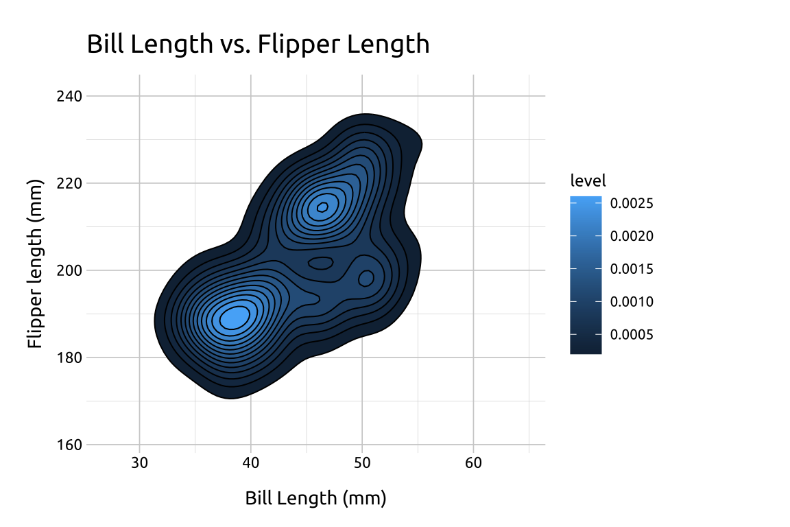
40.4.3 Fill
Where did levels come from?
You probably noticed the stat_density_2d() produced a legend with level, and a series of values for the color gradient. These numbers are difficult to interpret directly, but you can think of them as ‘elevation changes’ in point density. Read more here on SO.
Now that we have a color gradient for our contour lines, we can adjust it’s the range of colors using scale_fill_gradient()
lowis the color for the low values oflevelhighis the color for the high values oflevelguidelet’s us control thelegend
We’ll set these to white ("#ffffff") and dark gray ("#404040")
show/hide
fill_sdens_2d <- stat_sdens_2d +
  scale_fill_gradient(
    low = "#ffffff",
    high = "#404040",
    guide = "legend"
  )
fill_sdens_2d +
  labs_sdens_2d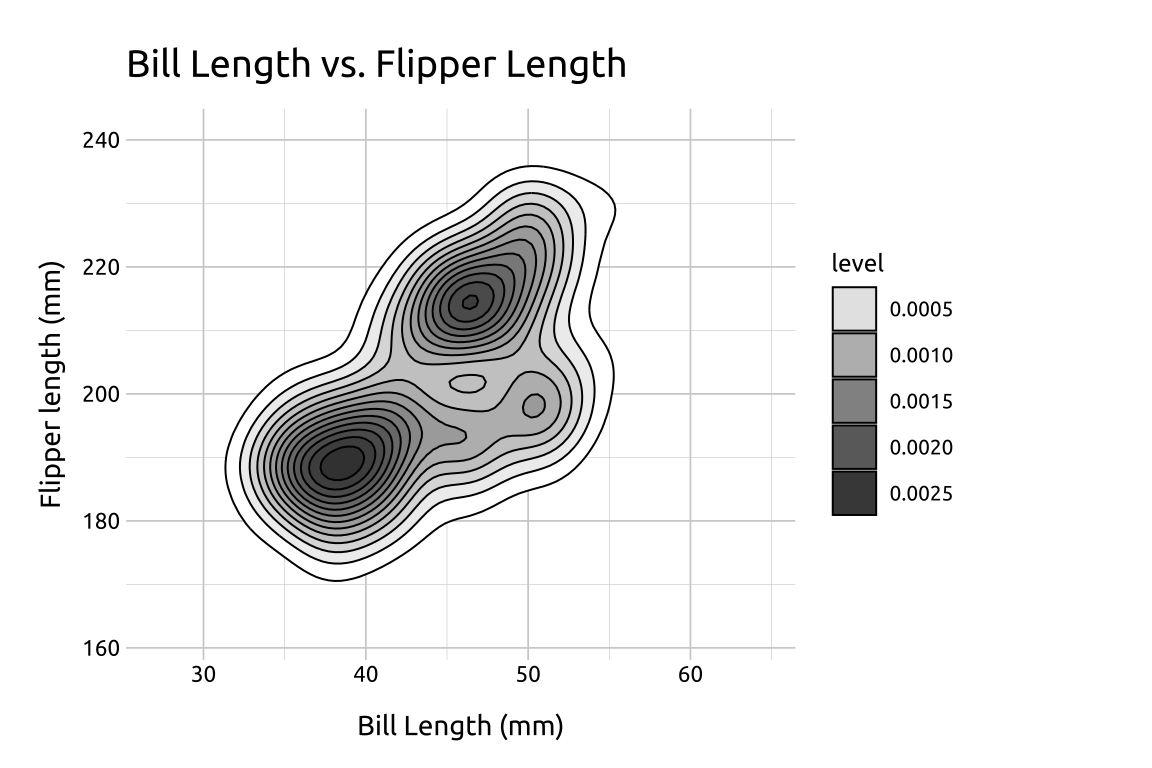
40.4.4 Points
The dark areas in the contour lines are the areas with higher value density, but why don’t we test that by adding some data points?
Add a
geom_point()layerInside
aes(), mapspeciestocolor(this will tell us if the three dark areas represent differences in the three species in the dataset)Set
sizeto2Change the
alphato2/3
show/hide
# geom_point()
pnts_sdens_2d <- fill_sdens_2d +
  geom_point(aes(color = species),
    size = 2,
    alpha = 2 / 3
  )
# final
pnts_sdens_2d +
  labs_sdens_2d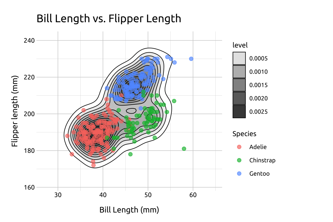
40.5 Even more info
In the previous plot, we used the species variable in the geom_point() layer to identify the points using color. In the section below, we’ll show more methods of displaying groups with density contour lines.
40.5.1 Groups
Re-create the labels
Initialize the graph with ggplot() and provide data
Build a geom_density_2d() layer:
Map
bill_length_mmtoxandflipper_length_mmtoyExpand the limits using our adjusted min/max
xandyvaluesAdd the
geom_density_2d(), mappingspeciestocolor
Build the geom_point() layer:
Map
speciestocolorset the
alphaand remove thelegend
show/hide
labs_dnsty_2d_grp <- labs(
  title = "Bill Length vs. Flipper Length",
  x = "Bill Length (mm)",
  y = "Flipper length (mm)",
  color = "Species"
)

ggp2_dnsty_2d_grp <- ggplot(
  data = peng_dnsty_2d,
  mapping = aes(
    x = bill_length_mm,
    y = flipper_length_mm
  )
) +
  expand_limits(
    x = c(x_min, x_max),
    y = c(y_min, y_max)
  ) +
  geom_density_2d(aes(color = species))


ggp2_dnsty_2d_pnts <- ggp2_dnsty_2d_grp +
  geom_point(aes(color = species),
    alpha = 2 / 3,
    show.legend = FALSE
  )

ggp2_dnsty_2d_pnts +
  labs_dnsty_2d_grp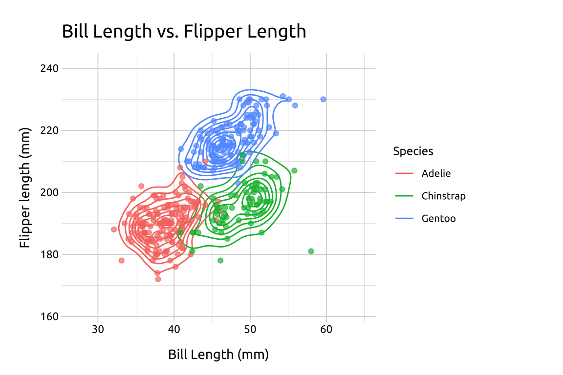
40.5.2 Facets
Re-create the labels
Initialize the graph with
ggplot()and providedataBuild the base/limits:
Map
bill_length_mmtoxandflipper_length_mmtoyExpand the limits using our adjusted min/max
xandyvalues
Build the
geom_density_2d_filled()layer:- Add the
geom_density_2d_filled(), settinglinewidthto0.30andcontour_varto"ndensity"
- Add the
Add the
scale_discrete_manual():Set
aestheticsto"fill"Provide a set of color
values(this plot needed 10 values, and I grabbed them all from color-hex.
Facet:
- Add
facet_wrap(), and placespeciesin thevars()
- Add
show/hide
labs_dnsty_2d_facet <- labs(
  title = "Bill Length vs. Flipper Length",
  subtitle = "By Species",
  x = "Bill Length (mm)",
  y = "Flipper length (mm)"
)
ggp2_dnsty_2d_facet <- ggplot(
  data = peng_dnsty_2d,
  mapping = aes(
    x = bill_length_mm,
    y = flipper_length_mm
  )
) +
  expand_limits(
    x = c(x_min, x_max),
    y = c(y_min, y_max)
  ) +
  geom_density_2d_filled(
    linewidth = 0.30,
    contour_var = "ndensity"
  ) +
  scale_discrete_manual(
    aesthetics = "fill",
    values = c(
      "#18507a", "#2986cc", "#3e92d1", "#539ed6", "#69aadb",
      "#7eb6e0", "#a9ceea", "#bedaef", "#d4e6f4", "#e9f2f9"
    )
  ) +
  facet_wrap(vars(species))

ggp2_dnsty_2d_facet +
  labs_dnsty_2d_facet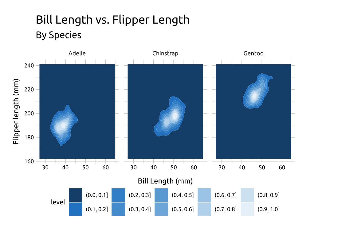
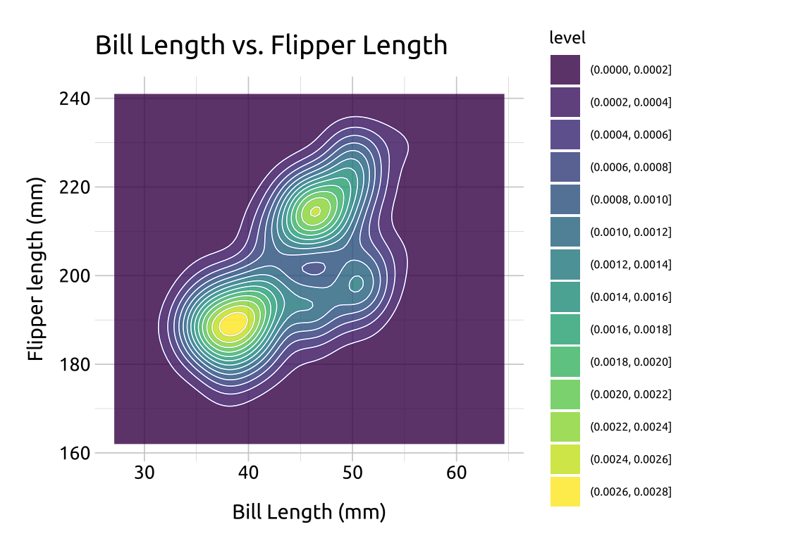
40.5.3 Fill
In the previous section, we defined the color values used in geom_density_2d_filled() with scale_discrete_manual(). Below we give an example using the default colors:
Re-create the labels
Initialize the graph with
ggplot()and providedataBuild the base/limits:
Map
bill_length_mmtoxandflipper_length_mmtoyExpand the limits using our adjusted min/max
xandyvalues
Add the
geom_density_2d()layerAdd the
geom_density_2d_filled(), settingalphato0.8
show/hide
labs_dnsty_2d <- labs(
  title = "Bill Length vs. Flipper Length",
  x = "Bill Length (mm)",
  y = "Flipper length (mm)"
)

ggp2_dnsty_2d <- ggplot(
  data = peng_dnsty_2d,
  mapping = aes(
    x = bill_length_mm,
    y = flipper_length_mm
  )
) +
  # use our stored values
  expand_limits(
    x = c(x_min, x_max),
    y = c(y_min, y_max)
  ) +
  geom_density_2d()

ggp2_dnsty_2d_fill <- ggp2_dnsty_2d +
  geom_density_2d_filled(alpha = 0.8)

ggp2_dnsty_2d_fill +
  labs_dnsty_2d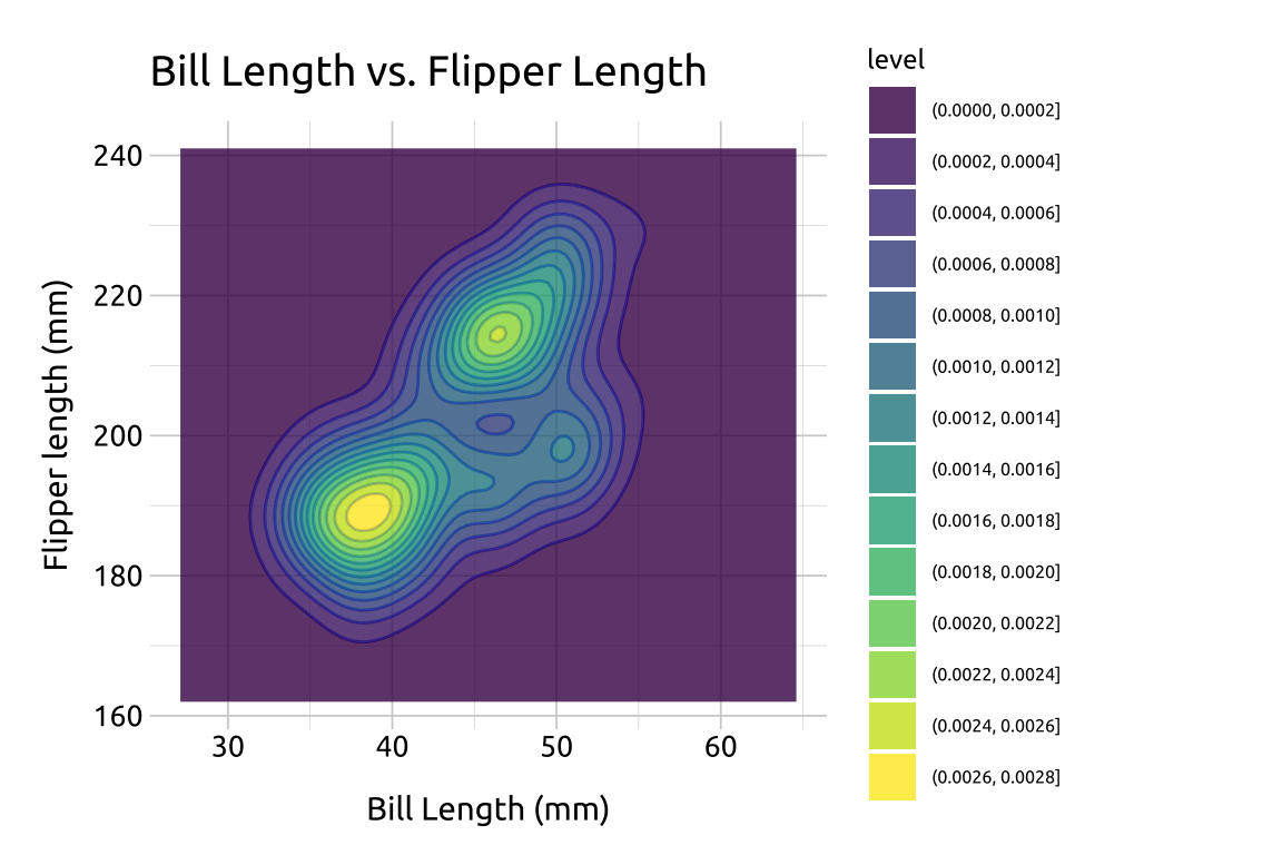
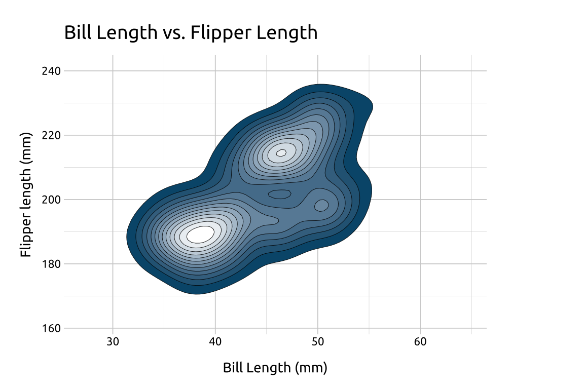
40.5.4 Lines
We can also outline the contours by adding color to the lines using another geom_density_2d() layer:
Set
linewidthto0.30Set
colorto"#ffffff"
show/hide
ggp2_dnsty_2d_fill_lns <- ggp2_dnsty_2d_fill +
  geom_density_2d(
    linewidth = 0.30,
    color = "#ffffff"
  )
ggp2_dnsty_2d_fill_lns +
  labs_dnsty_2d