34 Instance chart
34.1 Description
An instance chart (or instance graph) displays frequencies (or ‘instances’) of different categorical values over time time.
The time dimension is placed on the x and each separate categorical item is placed on the y-axis. The instances are typically represented using the vertical hashes from geom_point() (i.e., shape 124 or the ‘pipe’ "|").
Saturation and color are also used to represent different categorical levels and counts.
34.2 Set up
PACKAGES:
Install packages.
show/hide
install.packages("babynames")
library(babynames)
library(ggplot2)
DATA:

Filter the
babynames::babynamesto only those names in1887, then group bynameandsex, arrange descending by then, and store only the top 6 names intop_bby_nms_1887.Use the names from
top_bby_nms_1887to filterbabynames::babynamesfor names after1897and store inpopular_bby_nms.
show/hide
library(babynames)
top_bby_nms_1887 <- babynames::babynames |>
  dplyr::filter(year == 1887) |>
  dplyr::group_by(name, sex) |>
  dplyr::slice_max(order_by = sex) |>
  dplyr::arrange(desc(n)) |>
  utils::head(n = 6) |>
  dplyr::ungroup()
top_bby_nms_1887
show/hide
popular_bby_nms <- babynames::babynames |>
  dplyr::filter(name %in% top_bby_nms_1887[['name']] &
      year >= 1897)
34.3 Grammar
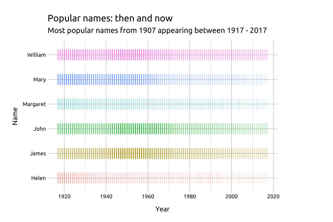
CODE:
Create labels with
labs()Initialize the graph with
ggplot()and providedataMap
yeartox,nametoy, andcolortonameAdd
geom_point(), mapntoalpha, and set theshapeto124andsizeto5
show/hide
labs_inst_pop_nms <- labs(
  title = "Popular names: then and now",
  subtitle = "Most popular names from 1887 appearing between 1897 - 2017",
  x = "Year",
  y = "Name")
ggp2_inst_pop_nms <- ggplot(data = popular_bby_nms,
    mapping = aes(x = year,
                  y = name,
                  color = name)) +
  geom_point(aes(alpha = n),
              shape = 124,
              size = 5)
ggp2_inst_pop_nms +
  labs_inst_pop_nms
GRAPH:
34.4 More info
34.4.1 Saturation with cut_interval()
ggplot2 has two great functions for splitting numerical variables into intervals or widths. We’re going to create two datasets from babynames::babynames that capture the top names in 1900 and and the top names 2000.
show/hide
top_nms_prop_1900 <- babynames::babynames |>
  dplyr::filter(year == 1900) |>
  dplyr::group_by(sex, name) |>
  dplyr::summarise(max_prop = max(prop)) |>
  dplyr::slice_max(n = 2, order_by = max_prop) |>
  dplyr::ungroup()
top_nms_prop_1900
top_nms_prop_2000 <- babynames::babynames |>
  dplyr::filter(year == 2000) |>
  dplyr::group_by(sex, name) |>
  dplyr::summarise(max_prop = max(prop)) |>
  dplyr::slice_max(n = 2, order_by = max_prop) |>
  dplyr::ungroup()
top_nms_prop_2000
These two tibbles tell us something about the top names over a century. The top names in 1900 have much higher proportions than the top names in 2000s.
We’ll get the names from both tibbles and filter
babynames::babynamesto only these eight names between the years 1900 and 2000.We’ll create a
prop_rangevariable, which splits thepropvariable into intervals based on thelengthargument.
show/hide
nms_1900 <- top_nms_prop_1900[["name"]]
nms_2000 <- top_nms_prop_2000[["name"]]

top_nms_1900_2000 <- c(nms_1900, nms_2000)

popular_bby_nms_prop <- babynames::babynames |>
  dplyr::filter(name %in% top_nms_1900_2000 &
                  year >= 1900 &
                    year <= 2000) |>
  dplyr::mutate(
    # proportion range
    prop_range = ggplot2::cut_interval(x = prop,
                                       length = 0.025))
Below we can see the proportion ranges have been built with the interval notation: "(a,b]"
- We can also see the proportion of names changes considerably between the two groups of names.
show/hide
labs_inst_pop_nms_prop <- labs(
  title = "100 years of popular names",
  subtitle = "Most popular names from 1900 and 2000",
  caption = "*based on proportion",
  x = "Year",
  y = "Name",
  color = "Proportion ranges",
  alpha = "Proportion")
ggp2_inst_pop_nms_prop <- ggplot(data = popular_bby_nms_prop,
    mapping = aes(x = year,
                  y = name,
              color = prop_range)) +
  geom_point(aes(alpha = prop),
                shape = 124,
                size = 2.5)
ggp2_inst_pop_nms_prop +
labs_inst_pop_nms_prop 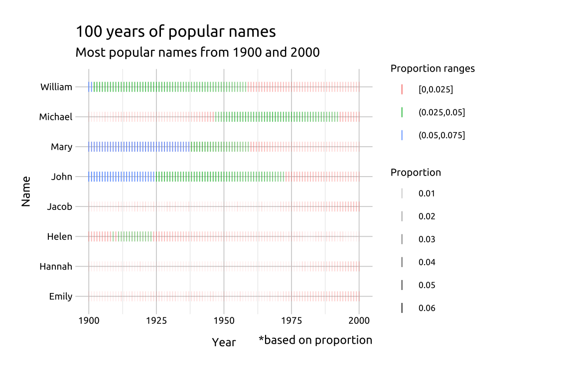
34.4.2 Facets with cut_number()
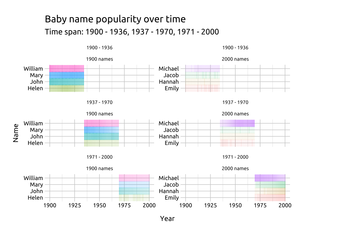
To demonstrate facets, we’ll create two other variables: year_range and group:
year_rangeusesggplot2::cut_number()to create three groups based on theyear, orders the results, and removes the labels. We manually assign the labels to this variable withcase_when()andfactor()groupis a factor variable with two levels:1900 namesand2000 names
show/hide
popular_bby_nms_fct <- popular_bby_nms_prop |>
  dplyr::mutate(
    # year range
    year_range = ggplot2::cut_number(year,
                                       n = 3,
                                  labels = FALSE,
                          ordered_result = TRUE),
  year_range = case_when(
    year_range == 1 ~ "1900 - 1936",
    year_range == 2 ~ "1937 - 1970",
    year_range == 3 ~ "1971 - 2000"),
  year_range = factor(year_range,
    levels = c("1900 - 1936",
               "1937 - 1970",
               "1971 - 2000"),
    ordered = TRUE),
    group = case_when(
      name %in% nms_1900 ~ "1900 names",
      name %in% nms_2000 ~ "2000 names",
      TRUE ~ NA_character_),
    group = factor(group,
      levels = c("1900 names",
                 "2000 names")))
Below we can see the total counts of names in the cross-table of year_range and group
show/hide
popular_bby_nms_fct |>
  dplyr::count(year_range, group) |>
  tidyr::pivot_wider(names_from = group,
    values_from = n)
In the graph, we’ll create labels using the levels from the year_range variable.
- We can also change the
shapeused ingeom_point()to the pipe operator ("|")
show/hide
# create labels from factor levels
st_lbls <- paste0(
              levels(popular_bby_nms_fct$year_range),
            collapse = ", ")

labs_inst_pop_nms_facet <- labs(
  title = "Baby name popularity over time",
  subtitle = paste0("Time span: ", st_lbls),
  x = "Year",
  y = "Name")

ggp2_inst_pop_nms_facet <- ggplot(popular_bby_nms_fct,
  mapping = aes(x = year,
                y = name)) +
  geom_point(aes(alpha = prop, color = name),
                 shape = "|",
                 size = 3,
                 show.legend = FALSE) +
  facet_wrap(year_range ~ group,
             scales = "free_y",
             ncol = 2)
ggp2_inst_pop_nms_facet +
  labs_inst_pop_nms_facet