26 Grouped violin plots
26.1 Description
A ‘violin plot’ is a variation of a density or ridgeline plot, where the distribution is plotted symmetrically, creating a two-sided, smoothed distribution.
26.2 Set up
PACKAGES:
Install packages.
show/hide
install.packages("palmerpenguins")
library(palmerpenguins)
library(ggplot2)
DATA:

Remove missing island from penguins
show/hide
peng_violin <- filter(penguins, !is.na(island))
glimpse(peng_violin)
#> Rows: 344
#> Columns: 8
#> $ species           <fct> Adelie, Adelie, Adelie…
#> $ island            <fct> Torgersen, Torgersen, …
#> $ bill_length_mm    <dbl> 39.1, 39.5, 40.3, NA, …
#> $ bill_depth_mm     <dbl> 18.7, 17.4, 18.0, NA, …
#> $ flipper_length_mm <int> 181, 186, 195, NA, 193…
#> $ body_mass_g       <int> 3750, 3800, 3250, NA, …
#> $ sex               <fct> male, female, female, …
#> $ year              <int> 2007, 2007, 2007, 2007…
26.3 Grammar
CODE:
Create labels with
labs()Initialize the graph with
ggplot()and providedataMap
islandto thex,bill_length_mmto they, andislandtofillSet
alphato2/3Remove the legend with
show.legend = FALSE
show/hide
labs_grp_violin <- labs(
  title = "Adult foraging penguins",
  subtitle = "Palmer Archipelago, Antarctica",
  x = "Island", fill = "Island",
  y = "Bill length (millimeters)")
ggp2_grp_violin <- ggplot(data = peng_violin,
       aes(x = island,
           y = bill_length_mm,
        fill = island)) +
  geom_violin(alpha = 2/3,
      show.legend = FALSE)
ggp2_grp_violin +
  labs_grp_violin
GRAPH:
Violin plots can allow us to compare the ‘center’ and ‘spread’ of continuous variables across categorical groups.
show/hide
labs_grp_violin <- labs(
  title = "Adult foraging penguins",
  subtitle = "Palmer Archipelago, Antarctica",
  x = "Island", fill = "Island",
  y = "Bill length (millimeters)")
ggp2_grp_violin <- ggplot(data = peng_violin,
       aes(x = island,
           y = bill_length_mm,
        fill = island)) +
  geom_violin(alpha = 2/3,
      show.legend = FALSE)
ggp2_grp_violin +
  labs_grp_violin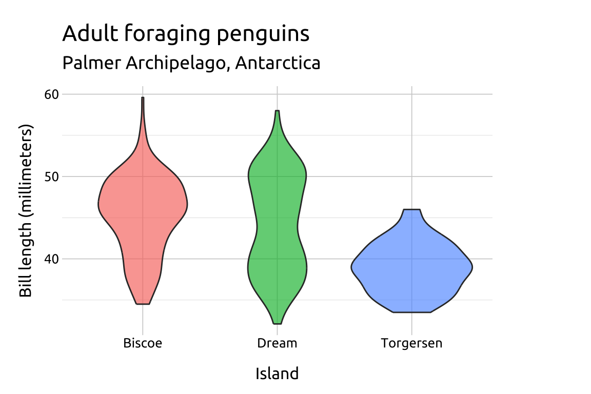
26.4 More info
26.4.1 Quartiles
Change the shape of the line with linetype and linewidth.
We can include lines for the 25th, 50th, and 75th quartiles using the draw_quantiles argument.
show/hide
ggplot(data = peng_violin,
       aes(x = island,
           y = bill_length_mm,
        fill = island)) +
  geom_violin(
      draw_quantiles = c(0.25, 0.5, 0.75),
      alpha = 1/2,
      linewidth = 0.5,
show.legend = FALSE) 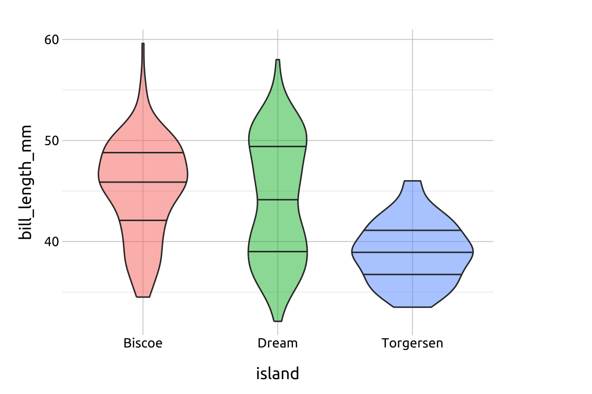
26.4.2 Kernel
The kernel argument let’s us change the “kernel density estimate” used to create the violin shape. The possible kernel density estimates are "gaussian", "epanechnikov", "rectangular", "triangular", "biweight", "cosine", and "optcosine"
show/hide
ggplot(data = peng_violin,
       aes(x = island,
           y = bill_length_mm,
        fill = island)) +
  geom_violin(alpha = 1/2,
      linewidth = 0.5,
      kernel = "rectangular",
show.legend = FALSE) 
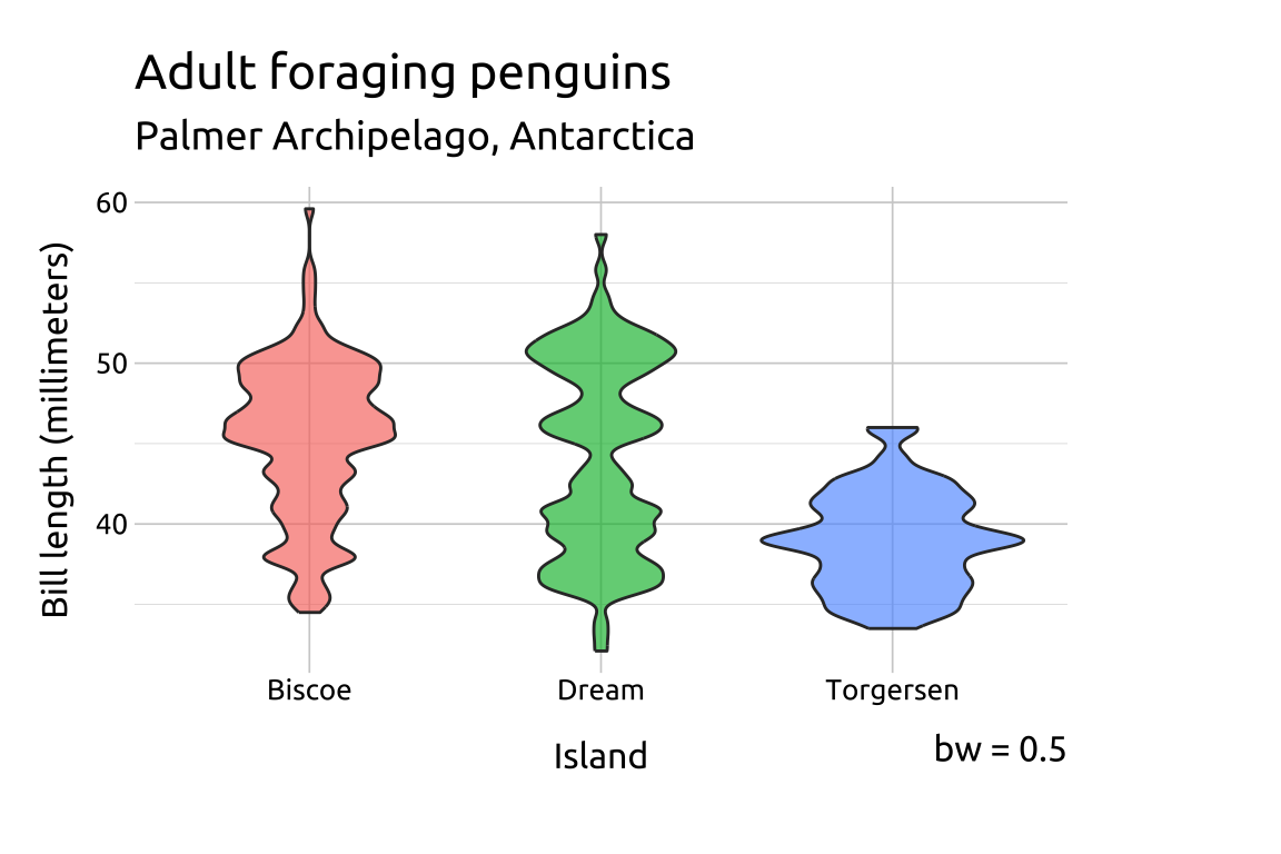
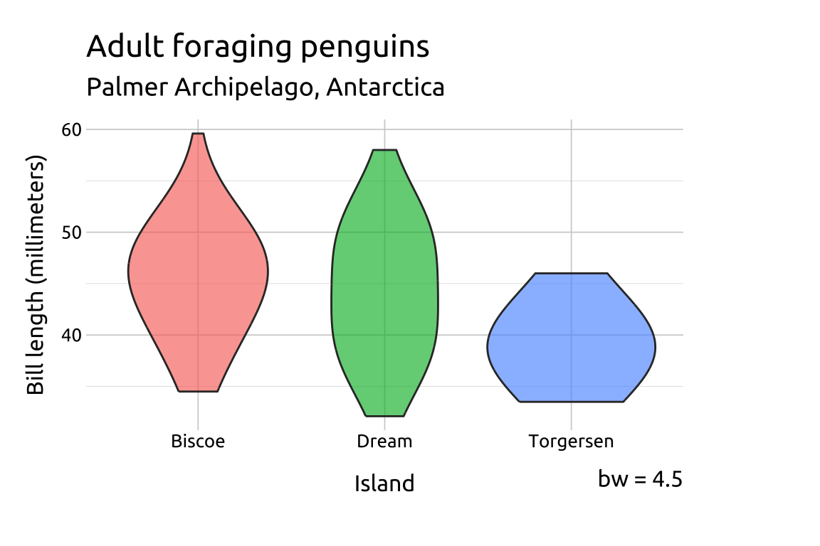
26.4.3 Bandwidth
We can directly adjust the shape of the violin with the bw argument, which is the standard deviation of the smoothing kernel. The trim argument trim(s) the tails of the violins to the range of the data.
show/hide
# bw of 0.5
grp_violin_bw0p5 <- ggplot(data = peng_violin,
       aes(x = island,
           y = bill_length_mm,
        fill = island)) +
  geom_violin(bw = 0.5,
      alpha = 2/3,
      trim = TRUE,
      show.legend = FALSE)
grp_violin_bw0p5 +
    labs_grp_violin +
    labs(caption = "bw = 0.5")
# bw of 4.5
grp_violin_bw4p5 <- ggplot(data = peng_violin,
       aes(x = island,
           y = bill_length_mm,
        fill = island)) +
  geom_violin(bw = 4.5,
      alpha = 2/3,
      trim = TRUE,
      show.legend = FALSE)
grp_violin_bw4p5 +
    labs_grp_violin +
    labs(caption = "bw = 4.5")