3 Frequency polygons
3.1 Description
A frequency polygon is a plot that displays data distributions using points connected by straight lines. It’s similar to a histogram but is more commonly used to compare data across multiple sets. A legend is often included to differentiate between various data sets. Frequency polygons are used to assess symmetry and skewness.
3.2 Set up
PACKAGES:
Install packages.
install.packages("palmerpenguins")
library(palmerpenguins)
library(ggplot2)
library(dplyr) # for data manipulation
DATA:

The penguins data.
penguins <- palmerpenguins::penguins
glimpse(penguins)
#> Rows: 344
#> Columns: 8
#> $ species           <fct> Adelie, Adelie, Adelie…
#> $ island            <fct> Torgersen, Torgersen, …
#> $ bill_length_mm    <dbl> 39.1, 39.5, 40.3, NA, …
#> $ bill_depth_mm     <dbl> 18.7, 17.4, 18.0, NA, …
#> $ flipper_length_mm <int> 181, 186, 195, NA, 193…
#> $ body_mass_g       <int> 3750, 3800, 3250, NA, …
#> $ sex               <fct> male, female, female, …
#> $ year              <int> 2007, 2007, 2007, 2007…
3.3 Grammar
CODE:
Create labels with
labs()Initialize the graph with
ggplot()and providedataMap
flipper_length_mmto thexaxisAdd the
geom_freqpoly()layer
labs_freqpoly <- labs(
title = "Adult foraging penguins",
subtitle = "Distribution of flipper length",
x = "Flipper length (millimeters)")
ggp2_freqpoly <- ggplot(data = penguins,
aes(x = flipper_length_mm)) +
geom_freqpoly()
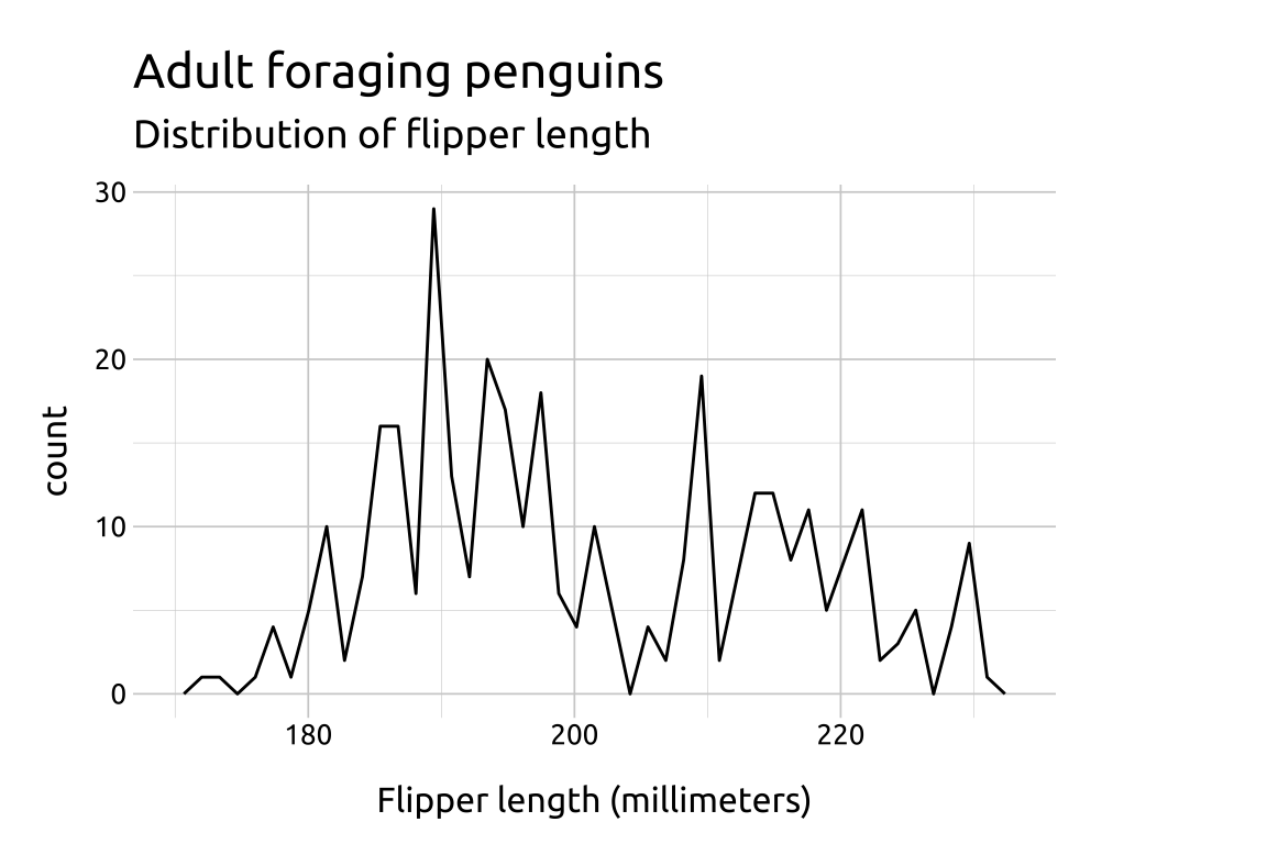
ggp2_freqpoly +
labs_freqpolyGRAPH:

Experiment to see how many bins fit your variable’s distribution.
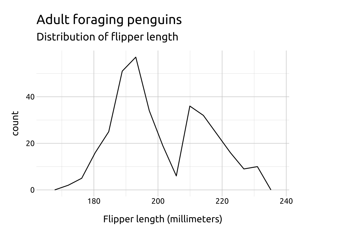
show/hide
ggp2_freqpoly_bins45 <- ggplot(data = penguins,
aes(x = flipper_length_mm)) +
geom_freqpoly(bins = 45)
ggp2_freqpoly_bins45 +
labs_freqpoly
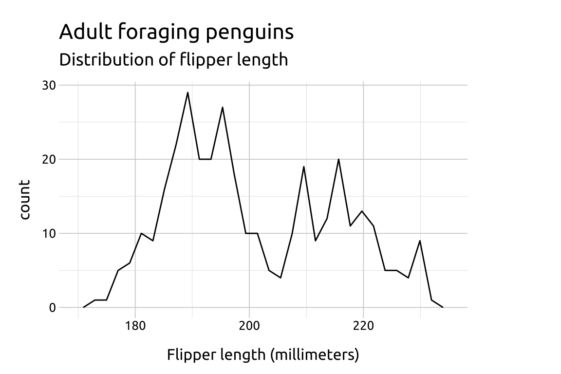
ggp2_freqpoly_bins15 <- ggplot(data = penguins,
aes(x = flipper_length_mm)) +
geom_freqpoly(bins = 15)
ggp2_freqpoly_bins15 +
labs_freqpoly