30 Bump charts
30.1 Description
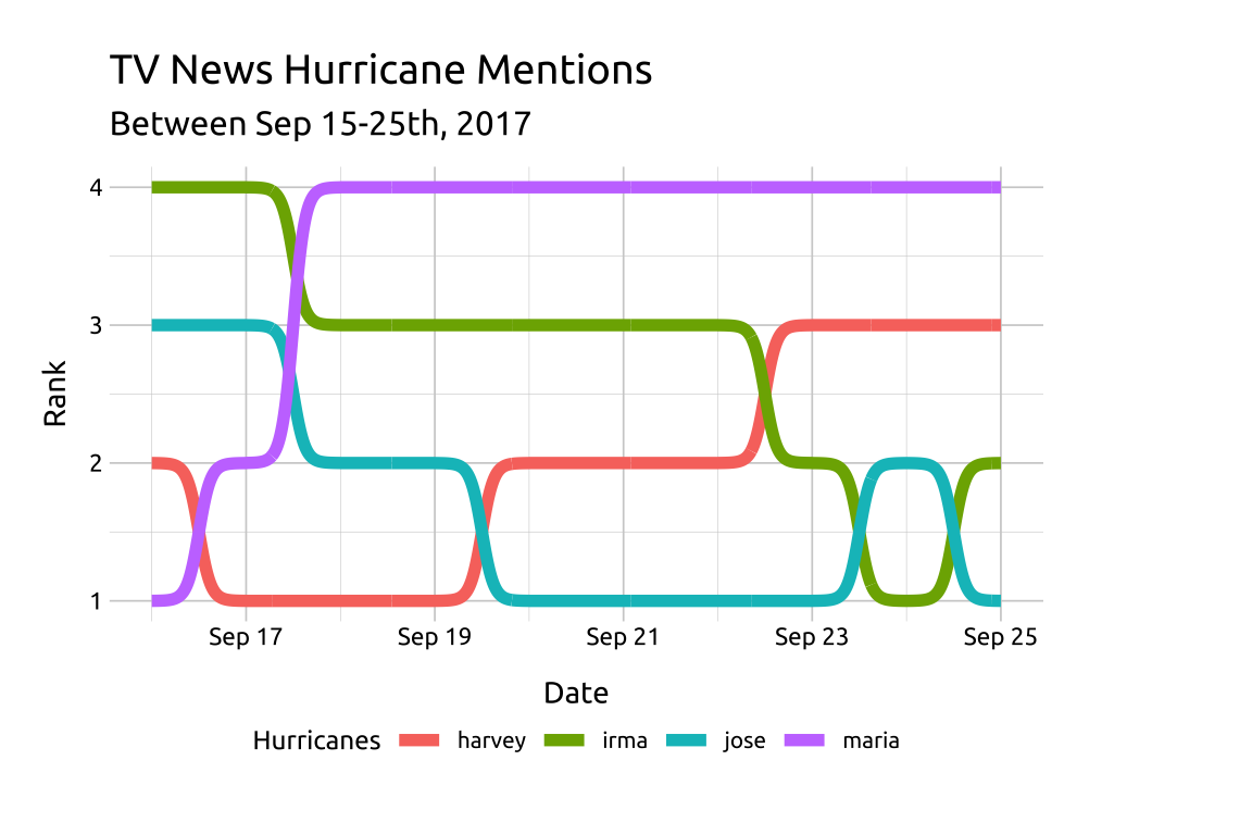
Bump charts show how numerical (ranked) values change over time for different categories (or groups). Differences are represented with connecting lines (along the y axis) that cover the full timescale (along the x axis).
We can build bump charts in ggplot2 with the ggbump package:
30.2 Set up
PACKAGES:
Install packages.
show/hide
# pak::pak("davidsjoberg/ggbump")
library(ggbump)
install.packages("fivethirtyeight")
library(fivethirtyeight)
library(ggplot2)
DATA:

We’ll use the fivethirtyeight::tv_hurricanes data, but slightly restructured and filtered.
show/hide
fivethirtyeight::tv_hurricanes |>
  filter(date > as_date("2017-09-15")) |>
  pivot_longer(cols = -date,
    names_to = 'hurricane',
    values_to = 'value') |>
  group_by(date) |>
  mutate(rank = rank(value,
    ties.method = "random")) |>
  ungroup() -> tidy_hurricanes
glimpse(tidy_hurricanes)
#> Rows: 40
#> Columns: 4
#> $ date      <date> 2017-09-16, 2017-09-16, 2017-…
#> $ hurricane <chr> "harvey", "irma", "maria", "jo…
#> $ value     <dbl> 0.0207, 0.1087, 0.0000, 0.0355…
#> $ rank      <int> 2, 4, 1, 3, 1, 4, 2, 3, 1, 3, …
30.3 Grammar
CODE:
Create labels with
labs()Map date to the
x,rankto they, andhurricanetocolorAdd
ggbump::geom_bump()and setsizeto2Move legend to bottom with
theme(legend.position = "bottom")
show/hide
labs_bump <- labs(title = "TV News Hurricane Mentions",
  subtitle = "Between Sep 15-25th, 2017",
  x = "Date", y = "Rank",
  color = "Hurricanes")
ggp2_bump <- ggplot(tidy_hurricanes,
    aes(x = date,
      y = rank,
      color = hurricane)) +
    ggbump::geom_bump(size = 2) +
    theme(legend.position = "bottom")

ggp2_bump +
  labs_bump
GRAPH: