35 Scatter plots
35.1 Description
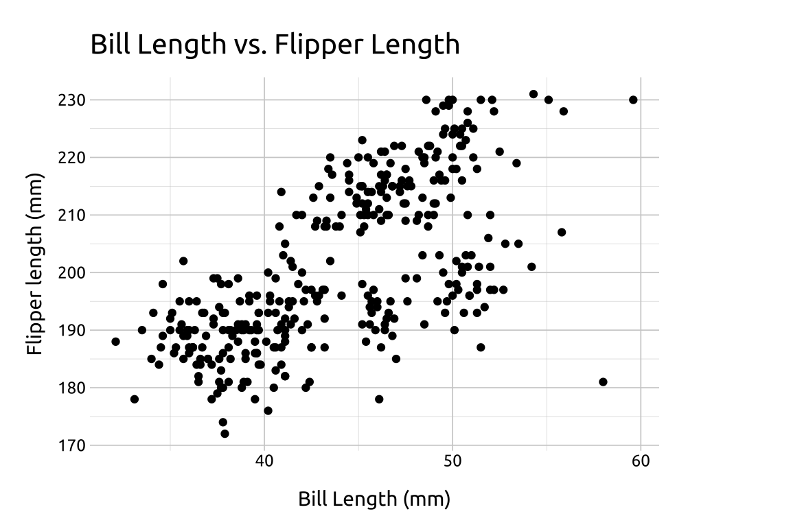
Scatter plots are used to display two continuous variables.
If one of the continuous variables is assumed to affect the other (i.e., outcome vs. predictor), place the outcome on the y axis and the predictor on the x axis.
35.2 Set up
PACKAGES:
Install packages.
show/hide
install.packages("palmerpenguins")
library(palmerpenguins)
library(ggplot2)
DATA:

The penguins data.
show/hide
penguins <- palmerpenguins::penguins
glimpse(penguins)
#> Rows: 344
#> Columns: 8
#> $ species           <fct> Adelie, Adelie, Adelie…
#> $ island            <fct> Torgersen, Torgersen, …
#> $ bill_length_mm    <dbl> 39.1, 39.5, 40.3, NA, …
#> $ bill_depth_mm     <dbl> 18.7, 17.4, 18.0, NA, …
#> $ flipper_length_mm <int> 181, 186, 195, NA, 193…
#> $ body_mass_g       <int> 3750, 3800, 3250, NA, …
#> $ sex               <fct> male, female, female, …
#> $ year              <int> 2007, 2007, 2007, 2007…
35.3 Grammar
CODE:
Create labels with
labs()Initialize the graph with
ggplot()and providedataMap
bill_length_mmto thexaxisMap
flipper_length_mmto theyaxisAdd
geom_point()
show/hide
labs_scatter <- labs(
  title = "Bill Length vs. Flipper Length",
  x = "Bill Length (mm)", y = "Flipper length (mm)")
ggp2_scatter <- penguins |>
  ggplot(
    aes(x = bill_length_mm,
      y = flipper_length_mm)) +
  geom_point()

ggp2_scatter +
  labs_scatter
GRAPH:
If multiple points occupy the same value position, use transparency (alpha) to improve visibility.
