14 Diverging bar graphs
14.1 Description
If you have two proportions that contain positive and negative values, consider using diverging bars with geom_bar().
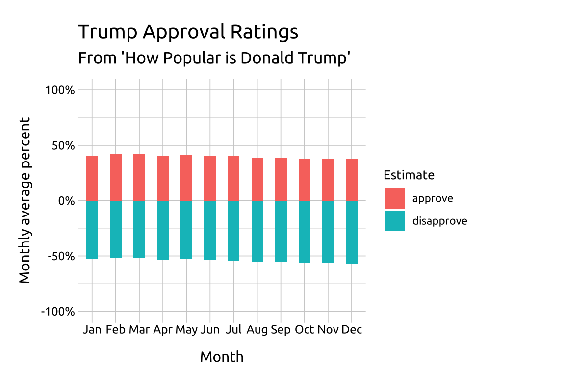
Unlike a standard or stacked bar graphs, diverging bar graphs display positive and negative quantities on both sides of a reference or baseline value (zero in this example). Color, length and position are used to compare the quantities across categorical levels (and within variable values).
14.1.1 Horizontal bars
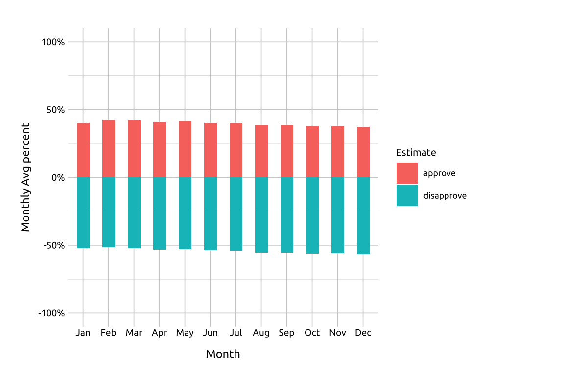
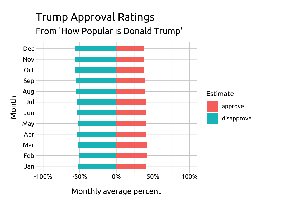
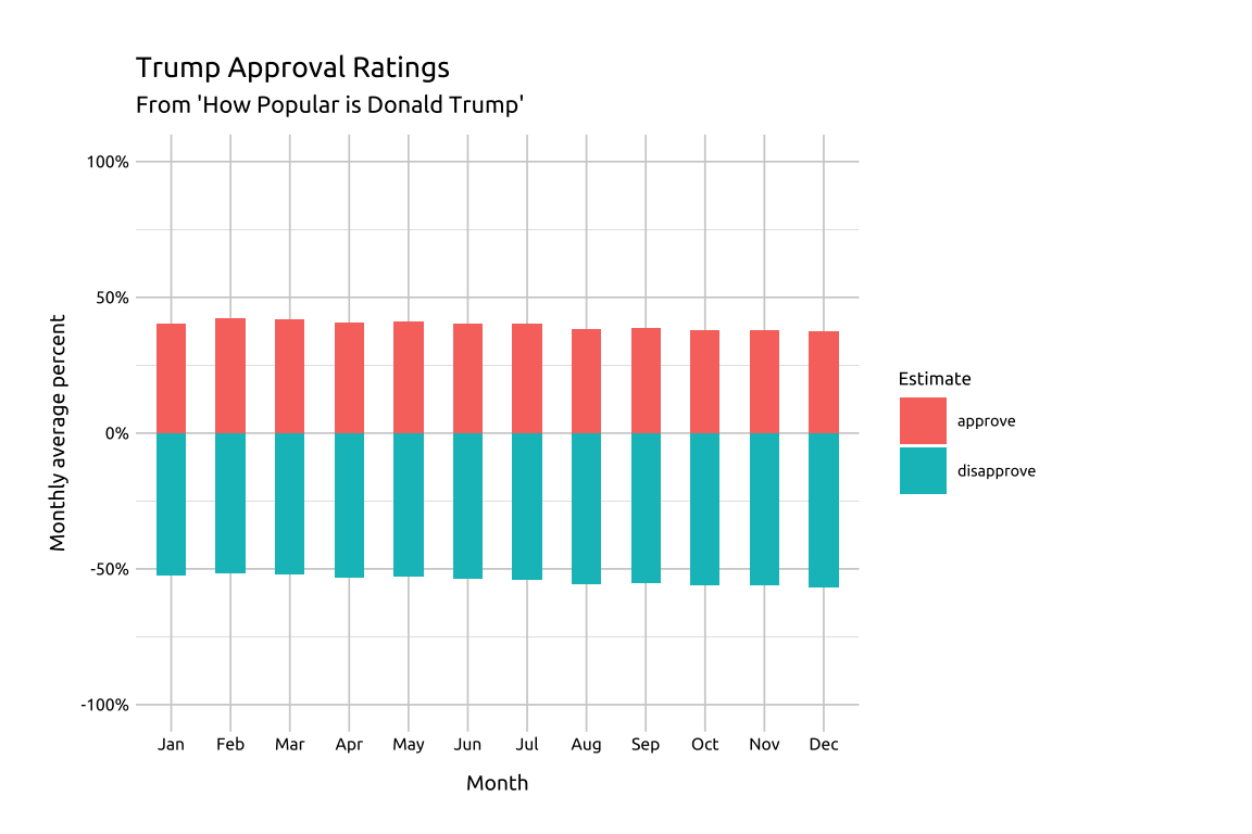
For example, we can use the length of the bar from the reference line to compare disapproval estimates across all months (i.e., comparing red bars to each other).
14.1.2 Vertical bars
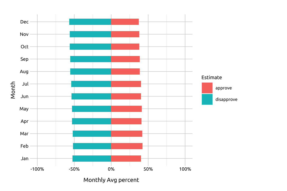
We can also compare approval vs. disapproval for each month (i.e., compare the blue vs. red bars to each other within each month).
14.2 Set up
PACKAGES:
Install packages.
show/hide
install.packages("fivethirtyeight")
library(fivethirtyeight)
library(ggplot2)
DATA:

Create trump_approval_diverg from the trump_approval_trend dataset in the fivethirtyeight package.
show/hide
fivethirtyeight::trump_approval_trend |>
  dplyr::filter(subgroup == "All polls") |>
  dplyr::mutate(
    month = lubridate::month(modeldate,
                label = TRUE, abbr = TRUE),
    approve = approve_estimate*0.01,
    disapprove = disapprove_estimate*0.01,
    disapprove = disapprove * -1) |>
  tidyr::pivot_longer(cols = c(approve, disapprove),
    names_to = "poll", values_to = "values") |>
  dplyr::group_by(month, poll) |>
    dplyr::summarise(
      month_avg = mean(values, na.rm = TRUE)
    ) |>
  dplyr::ungroup() -> trump_approval_diverg
#> `summarise()` has regrouped the output.
#> ℹ Summaries were computed grouped by month and
#>   poll.
#> ℹ Output is grouped by month.
#> ℹ Use `summarise(.groups = "drop_last")` to
#>   silence this message.
#> ℹ Use `summarise(.by = c(month, poll))` for
#>   per-operation grouping (`?dplyr::dplyr_by`)
#>   instead.
glimpse(trump_approval_diverg)
#> Rows: 24
#> Columns: 3
#> $ month     <ord> Jan, Jan, Feb, Feb, Mar, Mar, …
#> $ poll      <chr> "approve", "disapprove", "appr…
#> $ month_avg <dbl> 0.4029758, -0.5234634, 0.42260…
14.3 Grammar
CODE:
Create labels with
labs()Initialize the graph with
ggplot()and providedataMap the
monthto thexandmonth_avgto theyInside
geom_bar()map
polltofilluse
stat = "identity"andwidth = .5
Add
scale_y_continuous()to manually set the limits and format the axis withscales::percent
show/hide
labs_geom_bar_diverg <- labs(
  title = "Trump Approval Ratings",
  subtitle = "From 'How Popular is Donald Trump'",
  x = "Month",
  y = "Monthly average percent",
  fill = "Estimate")
ggp2_bars_diverg <- ggplot(
  data = trump_approval_diverg,
    aes(x = month, y = month_avg)) +
  geom_bar(aes(fill = poll),
    stat = "identity", width = .5) +
  scale_y_continuous(limits = c(-1, 1),
    labels = scales::percent)

ggp2_bars_diverg +
  labs_geom_bar_diverg
GRAPH:
14.4 More info
For vertically arranged bars, we switch the x and y axis variables.
14.4.1 Vertically arranged bars
Create labels with
labs()Map the
month_avgto thexandmonthto theyInside
geom_bar()map
polltofilluse
stat = "identity"andwidth = .5
Add
scale_y_continuous()to manually set the limits and format the axis withscales::percent
show/hide
labs_geom_bar_diverg_vert <- labs(
  title = "Trump Approval Ratings",
  subtitle = "From 'How Popular is Donald Trump'",
  x = "Monthly average percent",
  y = "Month",
  fill = "Estimate")
ggp2_bar_diverg_vert <- ggplot(
  data = trump_approval_diverg,
      aes(x = month_avg, y =  month)) +
  geom_bar(
      aes(fill = poll),
        stat = "identity", width = .5) +
  scale_x_continuous(limits = c(-1, 1),
        labels = scales::percent)
ggp2_bar_diverg_vert +
  labs_geom_bar_diverg_vert