
5 Density plots
5.1 Description
A density plot displays data distribution using a smooth curve instead of bars. It helps compare multiple sets of data and the area under the curve represents the total probability. Instead of dividing the x axis into discrete ‘bins’ to create groupings for the variable’s values, density plots transform the distribution according to a kernel density estimate. Legends are used to explain each curve, and different colors are used to differentiate them.
5.2 Set up
PACKAGES:
Install packages.
show/hide
install.packages("palmerpenguins")
library(palmerpenguins)
library(ggplot2)
DATA:

The penguins data.
show/hide
penguins <- palmerpenguins::penguins
glimpse(penguins)
#> Rows: 344
#> Columns: 8
#> $ species           <fct> Adelie, Adelie, Adelie…
#> $ island            <fct> Torgersen, Torgersen, …
#> $ bill_length_mm    <dbl> 39.1, 39.5, 40.3, NA, …
#> $ bill_depth_mm     <dbl> 18.7, 17.4, 18.0, NA, …
#> $ flipper_length_mm <int> 181, 186, 195, NA, 193…
#> $ body_mass_g       <int> 3750, 3800, 3250, NA, …
#> $ sex               <fct> male, female, female, …
#> $ year              <int> 2007, 2007, 2007, 2007…
5.3 Grammar
CODE:
Create labels with labs()
Initialize the graph with ggplot() and provide data
Map flipper_length_mm to the x axis
Add the geom_density() layer
show/hide
labs_density <- labs(
  title = "Adult foraging penguins",
  subtitle = "Distribution of flipper length",
  x = "Flipper length (millimeters)")
ggp2_density <- ggplot(data = penguins,
        aes(x = flipper_length_mm)) +
      geom_density()

ggp2_density +
  labs_density
GRAPH:
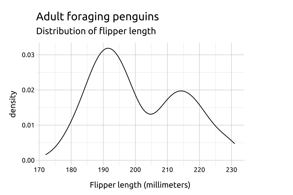
A downside of using density plots is the lack of interpretability of the y axis.