21 Overlapping dot plots
21.1 Description
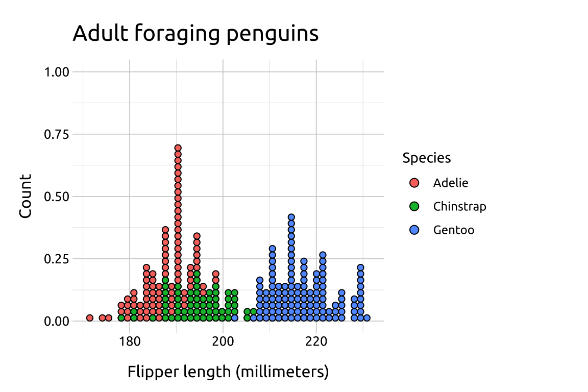
Overlapping dot plots display distributions of a continuous variable across the levels of a categorical variable.
To adjust the dot plot display to look similar to a histogram or frequency polygon, change the method and binposition arguments.
21.2 Set up
PACKAGES:
Install packages.
show/hide
install.packages("palmerpenguins")
library(palmerpenguins)
library(ggplot2)
DATA:
Remove missing sex from penguins
show/hide
peng_dotplot <- dplyr::filter(penguins, !is.na(sex))
dplyr::glimpse(peng_dotplot)
#> Rows: 333
#> Columns: 8
#> $ species           <fct> Adelie, Adelie, Adelie…
#> $ island            <fct> Torgersen, Torgersen, …
#> $ bill_length_mm    <dbl> 39.1, 39.5, 40.3, 36.7…
#> $ bill_depth_mm     <dbl> 18.7, 17.4, 18.0, 19.3…
#> $ flipper_length_mm <int> 181, 186, 195, 193, 19…
#> $ body_mass_g       <int> 3750, 3800, 3250, 3450…
#> $ sex               <fct> male, female, female, …
#> $ year              <int> 2007, 2007, 2007, 2007…
21.3 Grammar
binwidth= When method is “histodot”, this specifies bin width. Defaults to 1/30 of the range of the databinpositions= “all” determines positions of the bins with all the data taken together; this is used for aligning dot stacks across multiple groups.
CODE:
Create labels with
labs()Initialize the graph with
ggplot()and providedataMap
flipper_length_mmtoxMap
speciestofill(insidefactor())Inside
geom_dotplot, setmethodto"histodot",binwidthto1.35, andbinpositionsto"all"
show/hide
labs_ovrlp_dotplot <- labs(
  title = "Adult foraging penguins",
  x = "Flipper length (millimeters)",
  y = "Count",
  fill = "Species")
ggp2_ovrlp_dotplot <- ggplot(data = peng_dotplot,
    aes(x = flipper_length_mm,
        fill = factor(species))) +
  geom_dotplot(
    method = "histodot",
    binwidth = 1.35,
    binpositions = "all")
ggp2_ovrlp_dotplot +
  labs_ovrlp_dotplot
GRAPH: