2 Histograms
2.1 Description
A histogram is a graph that displays numerical data spread over a time frame or interval. Each bar shows the frequency of data points within a specific range. Unlike bar graphs, histograms do not have gaps between the bars, indicating that data covers a continuous interval. The x-axis displays the variable range, while the y-axis represents observation frequency.
Unlike a typical bar graph, histograms can be used to visually assess the ‘normality’ (i.e. are the bars symmetrical, with a single peak in the middle of the x axis? Or do the bars form multiple peaks?) or ‘skewness’ (i.e., is there a long ‘tail’ of bars with decreasing length on either end of the x axis?) of a variable’s distribution.
In ggplot2, histograms can be built using geom_histogram().
2.2 Set up
PACKAGES:
Install packages.
show/hide
install.packages("palmerpenguins")
library(palmerpenguins)
library(ggplot2)
library(dplyr) # for data manipulation
DATA:
The penguins data.
show/hide
penguins <- palmerpenguins::penguins
glimpse(penguins)
#> Rows: 344
#> Columns: 8
#> $ species           <fct> Adelie, Adelie, Adelie…
#> $ island            <fct> Torgersen, Torgersen, …
#> $ bill_length_mm    <dbl> 39.1, 39.5, 40.3, NA, …
#> $ bill_depth_mm     <dbl> 18.7, 17.4, 18.0, NA, …
#> $ flipper_length_mm <int> 181, 186, 195, NA, 193…
#> $ body_mass_g       <int> 3750, 3800, 3250, NA, …
#> $ sex               <fct> male, female, female, …
#> $ year              <int> 2007, 2007, 2007, 2007…
2.3 Grammar
CODE:
Create labels with
labs()Initialize the graph with
ggplot()and providedataAssign
flipper_length_mmto thexAdd the
geom_histogram()Adjust the
binsaccordingly
show/hide
labs_histogram <- labs(
title = "Adult foraging penguins",
subtitle = "Distribution of flipper length",
x = "Flipper length (millimeters)")
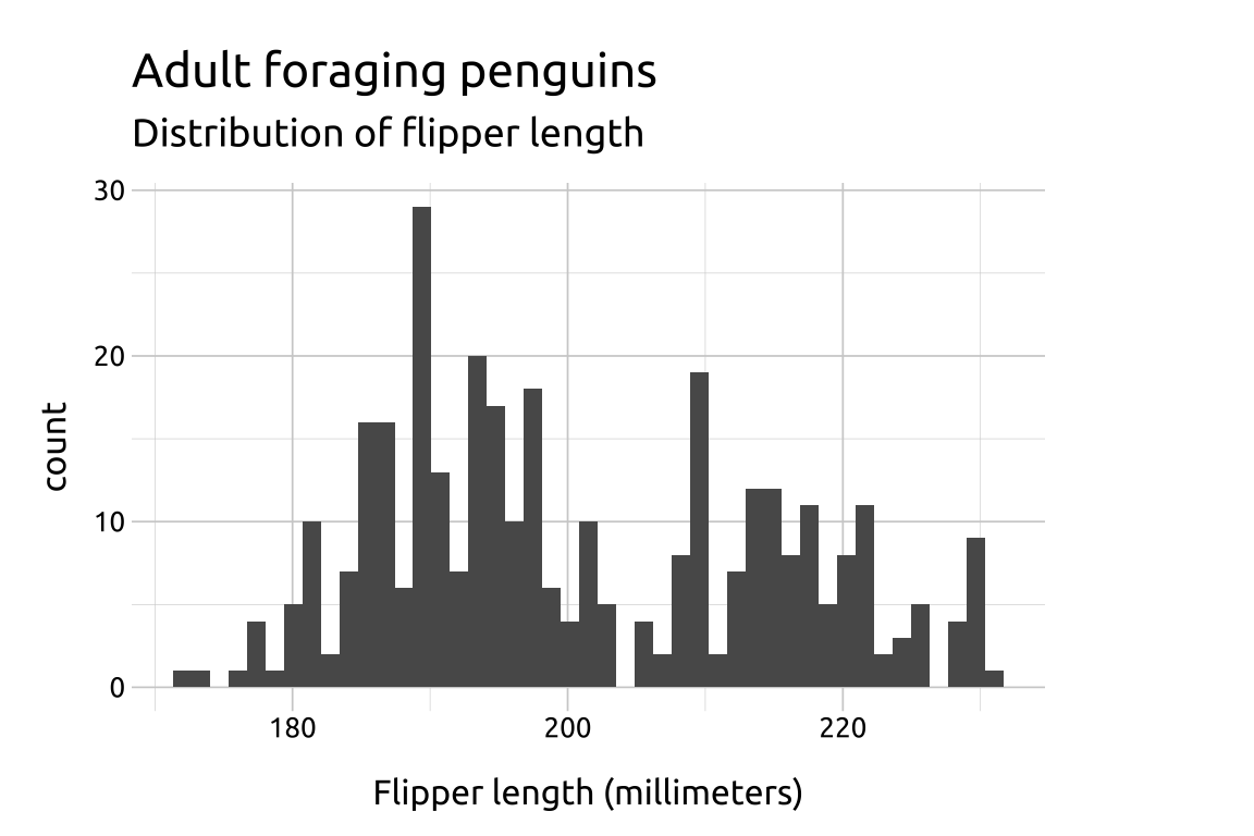
ggp2_hist <- ggplot(data = penguins,
aes(x = flipper_length_mm)) +
geom_histogram()
ggp2_hist +
labs_histogramGRAPH:

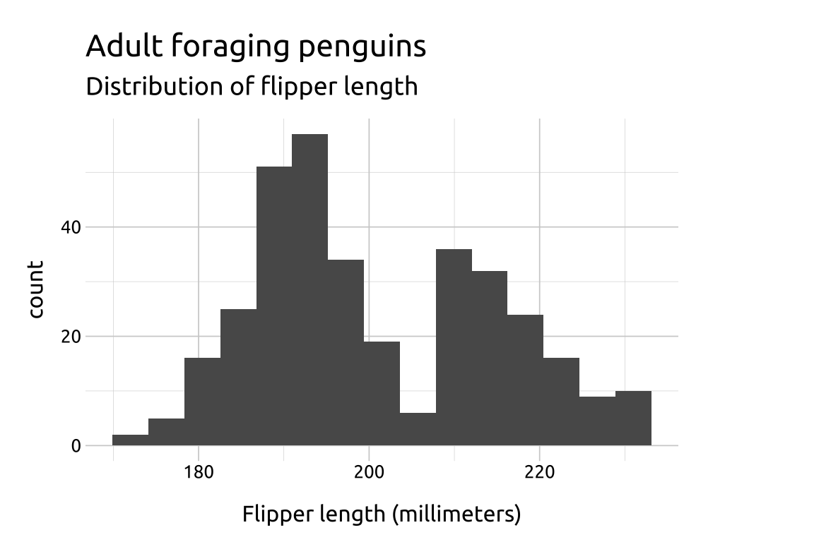
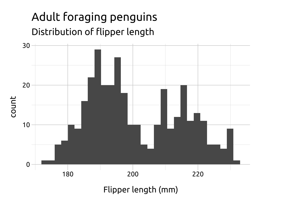
The standard number of bins is 30, but ‘you should always override this value, exploring multiple widths to find the best to illustrate the stories in your data.’
show/hide
ggp2_hist_bins45 <- ggplot(data = penguins,
     aes(x = flipper_length_mm)) +
     geom_histogram(bins = 45)

ggp2_hist_bins45 +
  labs_histogram

ggp2_hist_bins15 <- ggplot(data = penguins,
     aes(x = flipper_length_mm)) +
     geom_histogram(bins = 15)

ggp2_hist_bins15 +
  labs_histogram