13 Cleveland dot plots
13.1 Description
Cleveland dot plots compare numbers with dots on a line and are more efficient than bar graphs. The graph lists the categories on the side and shows the data with dots along a line.
Typically, the graph contains two points representing the numerical value on the y axis, differentiated by color. A line connecting the two points represents the difference between the two categorical levels (the width of the line is the size of the difference).
13.2 Set up
PACKAGES:
Install packages.
show/hide
install.packages("palmerpenguins")
library(palmerpenguins)
library(ggplot2)
DATA:
Remove missing values from sex and flipper_length_mm and group on sex and island to the calculate the median flipper length (med_flip_length_mm).
show/hide
peng_clev_dots <- palmerpenguins::penguins |>
dplyr::filter(!is.na(sex) & !is.na(flipper_length_mm)) |>
dplyr::group_by(sex, island) |>
dplyr::summarise(
med_flip_length_mm = median(flipper_length_mm)
) |>
dplyr::ungroup()
#> `summarise()` has regrouped the output.
#> ℹ Summaries were computed grouped by sex and
#> island.
#> ℹ Output is grouped by sex.
#> ℹ Use `summarise(.groups = "drop_last")` to
#> silence this message.
#> ℹ Use `summarise(.by = c(sex, island))` for
#> per-operation grouping (`?dplyr::dplyr_by`)
#> instead.
glimpse(peng_clev_dots)
#> Rows: 6
#> Columns: 3
#> $ sex <fct> female, female, femal…
#> $ island <fct> Biscoe, Dream, Torger…
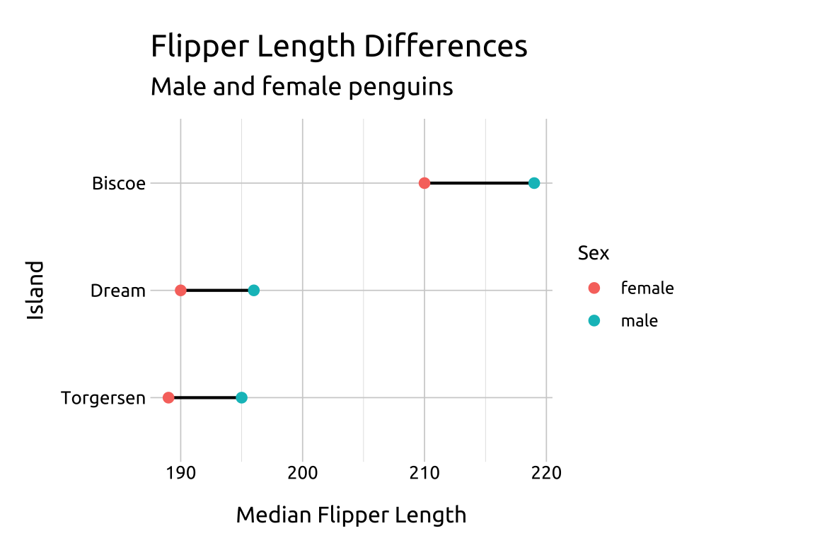
#> $ med_flip_length_mm <dbl> 210, 190, 189, 219, 1…13.3 Grammar
CODE:
Create labels with
labs()Initialize the graph with
ggplot()and providedataMap the
med_flip_length_mmto thexaxis, andislandto theyaxis, but wrapislandinforcats::fct_rev().Add
geom_line(), and mapislandto thegroupaesthetic. Set thelinewidthto0.75Add
geom_point()and mapsextocoloraesthetic. Set thesizeto2.25
show/hide
labs_clev_dots <- labs(
    title = "Flipper Length Differences",
    subtitle = "Male and female penguins",
    x = "Median Flipper Length",
    y = "Island",
    color = "Sex")

ggp2_clev_dots <- ggplot(data = peng_clev_dots,
                mapping = aes(x = med_flip_length_mm,
                              y = fct_rev(island))) +
                geom_line(aes(group = island),
                    linewidth = 0.75) +
                geom_point(aes(color = sex),
                    size = 2.25)

ggp2_clev_dots +
    labs_clev_dots
GRAPH:

13.4 More info
Cleveland dot plots are also helpful when comparing multiple differences on a common scale.
13.4.1 Common scale
SCALE:
Remove missing values from
sex,bill_length_mmandbill_depth_mm, and group onsexandislandto the calculate the median bill length and median bill depth. These variables need to have ‘showtime-ready’ names because they’ll be used in our facets.After un-grouping the data, pivot the new columns into a long (tidy) format with
median_measurecontaining the name of the variable, andmedian_valuecontaining the numbers.Finally, convert
median_measureinto a factor.
show/hide
peng_clev_dots2 <- palmerpenguins::penguins |>
    dplyr::filter(!is.na(sex) &
            !is.na(bill_length_mm) &
                !is.na(bill_depth_mm)) |>
    dplyr::group_by(sex, island) |>
    dplyr::summarise(
        `Median Bill Length` = median(bill_length_mm),
        `Median Bill Depth` = median(bill_depth_mm)) |>
    dplyr::ungroup() |>
    tidyr::pivot_longer(cols = starts_with("Med"),
        names_to = "median_measure",
        values_to = "median_value") |>
    dplyr::mutate(median_measure = factor(median_measure))
#> `summarise()` has regrouped the output.
#> ℹ Summaries were computed grouped by sex and
#>   island.
#> ℹ Output is grouped by sex.
#> ℹ Use `summarise(.groups = "drop_last")` to
#>   silence this message.
#> ℹ Use `summarise(.by = c(sex, island))` for
#>   per-operation grouping (`?dplyr::dplyr_by`)
#>   instead.
glimpse(peng_clev_dots2)
#> Rows: 12
#> Columns: 4
#> $ sex            <fct> female, female, female, f…
#> $ island         <fct> Biscoe, Biscoe, Dream, Dr…
#> $ median_measure <fct> Median Bill Length, Media…
#> $ median_value   <dbl> 44.90, 14.50, 42.50, 17.8…
13.4.2 Scales
scales:
Re-create labels
Initialize the graph with
ggplot()and providedataMap the
median_valueto thexaxis, andislandto theyaxis, but wrapislandinforcats::fct_rev().Add
geom_line(), and mapislandto thegroupaesthetic. Set thelinewidthto0.75Add
geom_point()and mapsextocoloraesthetic. Set thesizeto2.25Add
facet_wrap()and facet bymedian_measure, settingshrinktoTRUEandscalesto"free_x"Move the legend with
theme(legend.position = "top")
show/hide
labs_clev_dots2 <- labs(
    title = "Penguin Measurements Differences",
    subtitle = "Male and female penguins",
    x = "Median Bill Length/Depth (mm)",
    y = "Island",
    color = "Sex")

ggp2_clev_dots2 <- ggplot(data = peng_clev_dots2,
    mapping = aes(x = median_value,
        y = fct_rev(island))) +
    geom_line(aes(group = island),
        linewidth = 0.55) +
    geom_point(aes(color = sex),
        size = 2) +
    facet_wrap(. ~ median_measure,
        shrink = TRUE, nrow = 2) +
    theme(legend.position = "top")

ggp2_clev_dots2 +
    labs_clev_dots2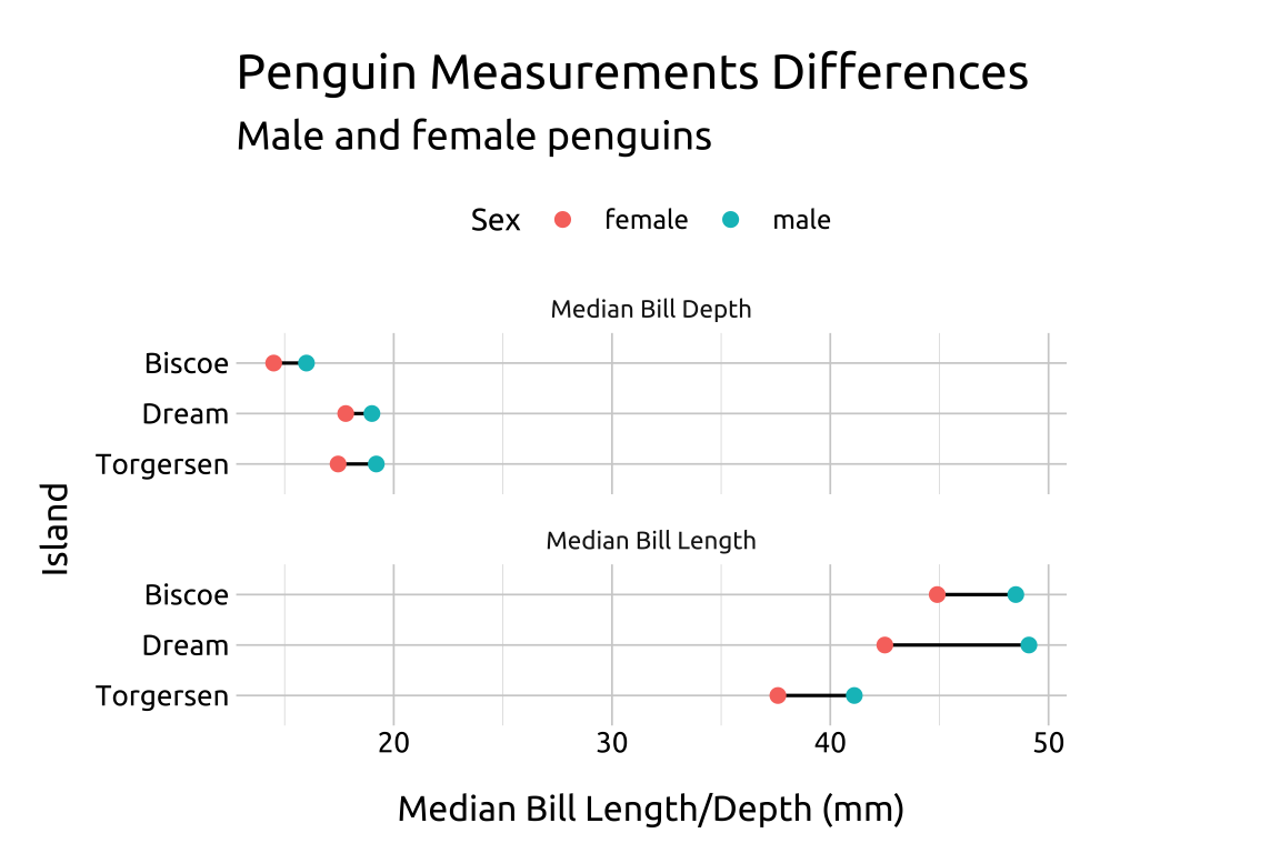
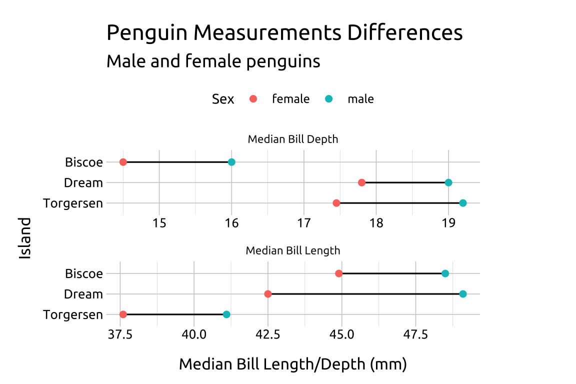
CAUTION when using scales = "free_x": The graph below shows that the median bill length and depth is larger for male penguins on all three islands, but the magnitude of the differences should be interpreted with caution because the length of the lines can’t be directly compared!
show/hide
labs_clev_dots2 <- labs(
    title = "Penguin Measurements Differences",
    subtitle = "Male and female penguins",
    x = "Median Bill Length/Depth (mm)",
    y = "Island",
    color = "Sex")

ggp2_clev_dots2_free_x <- ggplot(data = peng_clev_dots2,
    mapping = aes(x = median_value,
        y = fct_rev(island))) +
    geom_line(aes(group = island),
        linewidth = 0.55) +
    geom_point(aes(color = sex),
        size = 2) +
    facet_wrap(. ~ median_measure,
        shrink = TRUE, nrow = 2,
        scales = "free_x") +
    theme(legend.position = "top")

ggp2_clev_dots2_free_x +
    labs_clev_dots2