9 Summary bar graphs
9.1 Description
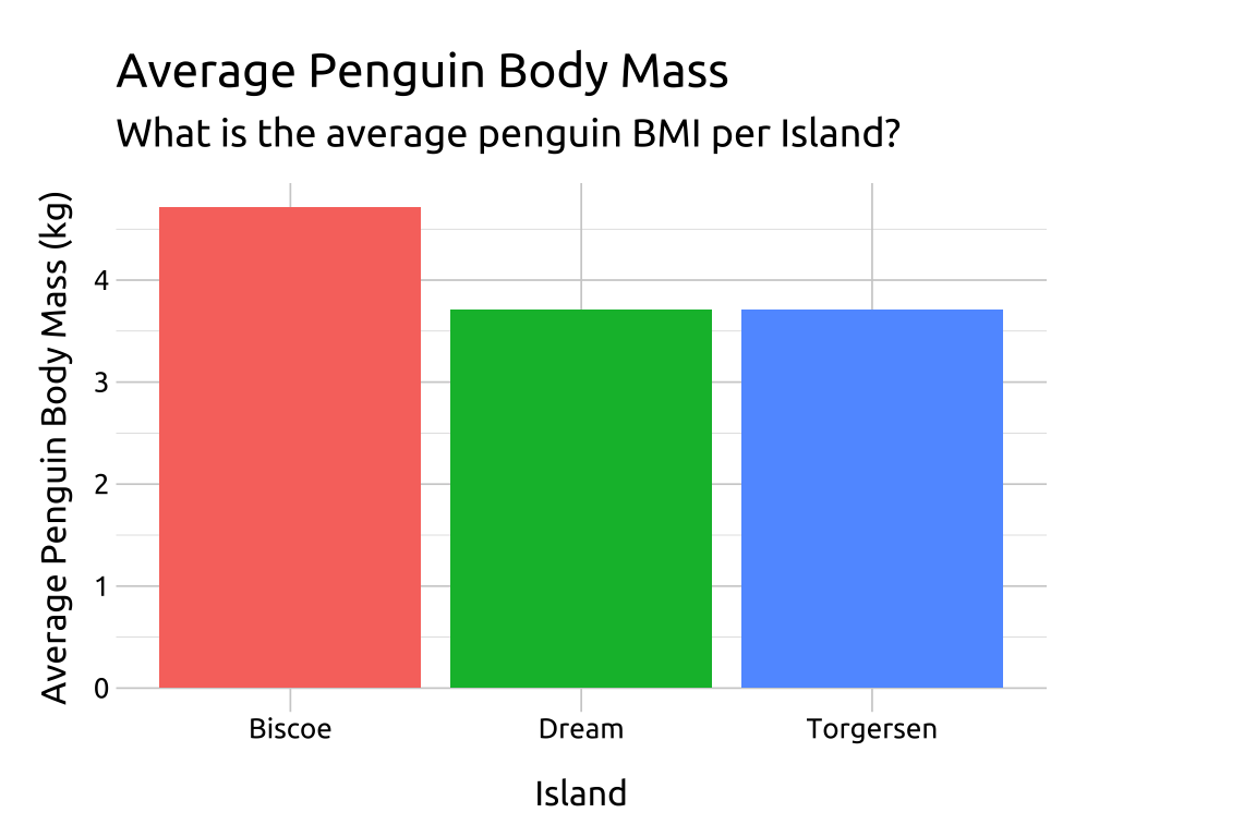
Bar graphs can summarize data by showing a statistic for each category. The x-axis lists the categories, and the y-axis shows the values. They can include error bars to show variation or confidence intervals.
In ggplot2, we can create summary bar graphs with geom_bar().
9.2 Set up
PACKAGES:
Install packages.
show/hide
install.packages("palmerpenguins")
library(palmerpenguins)
library(ggplot2)
DATA:

Remove the missing values from body_mass_g and island in the palmerpenguins::penguins data and convert body mass in grams to kilograms (body_mass_kg).
We’ll also reduce the number of columns in the penguins data for clarity.
show/hide
peng_sum_col <- palmerpenguins::penguins |>
    dplyr::select(body_mass_g, island) |>
    tidyr::drop_na() |>
    # divide the mass value by 1000
    dplyr::mutate(
        body_mass_kg = body_mass_g / 1000
    ) |>
    dplyr::group_by(island) |>
    dplyr::summarise(
      avg_bmi_kg = mean(body_mass_kg)
    ) |>
    dplyr::ungroup()
dplyr::glimpse(peng_sum_col)
#> Rows: 3
#> Columns: 2
#> $ island     <fct> Biscoe, Dream, Torgersen
#> $ avg_bmi_kg <dbl> 4.716018, 3.712903, 3.706373
9.3 Grammar
CODE:
Create labels with
labs()Initialize the graph with
ggplot()and providedataMap
islandtoxandavg_bmi_kgtoyInside the
aes()ofgeom_col(), mapislandtofillOutside the
aes()ofgeom_col(), remove the legend withshow.legend = FALSE
show/hide
labs_sum_col <- labs(
    title = "Average Penguin Body Mass",
    subtitle = "What is the average penguin BMI per Island?",
    x = "Island",
    y = "Average Penguin Body Mass (kg)")
ggp2_sum_col <- ggplot(data = peng_sum_col,
    aes(x = island,
        y = avg_bmi_kg)) +
    geom_col(aes(fill = island),
        show.legend = FALSE)
ggp2_sum_col +
    labs_sum_col
GRAPH:

9.4 More info
Below is more information on geom_bar() vs. geom_col().
9.4.1 Identity vs. Count
- The
geom_bar()geom will also create grouped bar graphs, but we have to switch thestatargument to"identity".
show/hide
ggplot(data = peng_sum_col,
    aes(x = island,
        y = avg_bmi_kg)) +
    geom_bar(aes(fill = island),
        show.legend = FALSE,
        stat = "identity") +
    labs_sum_col
9.4.2 geom_bar() vs. geom_col()
geom_bar()will map a categorical variable to thexoryand display counts for the discrete levels (seestat_count()for more info)geom_col()will map bothxandyaesthetics, and is used when we want to display numerical (quantitative) values across the levels of a categorical variable.geom_col()assumes these values have been created in their own column (seestat_identity()for more info)