UNIVARIATE
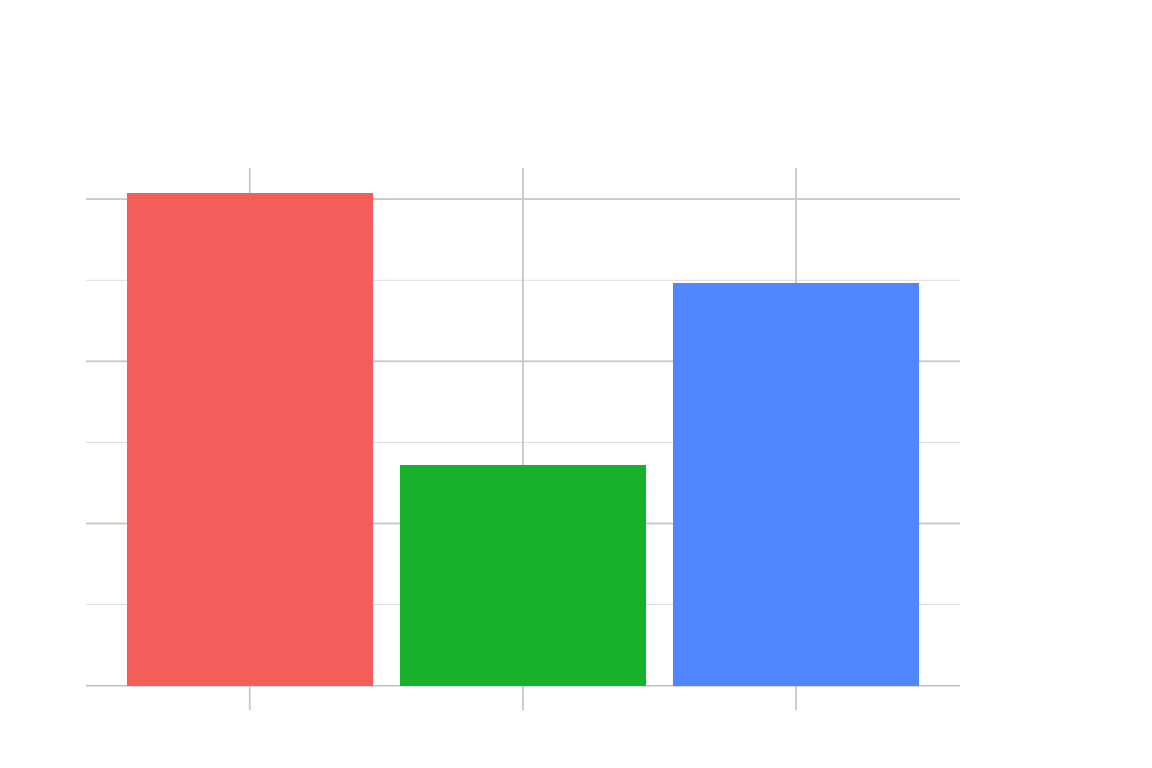
Univariate graphs: These graphs are useful if you have a single column you’re trying to visualize.
Bar graphs
A bar graph displays and compares data in different categories. Each category is represented by a rectangular bar that varies in length or height depending on the quantity it represents. Bar graphs can be either vertical or horizontal, with the vertical axis showing the quantities being measured and the horizontal axis listing the categories. If multiple variables are being compared, bar graphs often include a legend (usually placed to the side of the graph) that explains the colors or patterns used.
Histograms
A Histogram shows how numerical values are spread out over a specific time frame or continuous interval. Each bar shows the frequency of data points within a specific range called bins. In contrast to bar graphs, histograms don’t have gaps between the bars, which indicates that the data covers a continuous interval. The x-axis displays the range of the measured variable, while the y-axis represents the frequency of observations.
Frequency polygons
A frequency polygon displays data distributions. It is similar to a histogram, but it uses points connected by straight lines instead of bars. This method is commonly used to compare data distributions across multiple sets. Frequency is represented by points plotted above the midpoint of each interval on the x-axis, then connected by lines. A legend is often included at the top or side of the plot to differentiate between variables.
Dot-plots
A dot plot shows each data point as a dot on a single line. Dot plots work well for small to moderate datasets because they help us see patterns, clusters, gaps, and outliers. In a dot plot, each dot represents a piece of data, and depending on what we’re measuring, the dots either stack up over categories or spread out along a line.
Density plots
A density plot displays the distribution of data in a smooth and continuous manner. It is similar to a histogram, but instead of bars, it uses a smooth curve to show where values are concentrated over the interval. Density plots are helpful in comparing the distributions of different data sets on the same graph. The area under the curve represents the total probability of the data. These plots often display multiple curves and use different colors to differentiate them. A legend is typically positioned on the side to explain each curve.
Violin plots
Violin plots help us see how data is distributed and how likely a specific value will occur. They are similar to box plots but with a rotated kernel density plot on each side. The plot’s width at different values shows how often that value appears in the data. Broader parts of the violin indicate that the value appears more often. We can use these plots to compare data distribution across categories. They often include a box plot inside the violin to show the median and interquartile range.
Box-plots
Box plots, or box-and-whisker plots, use five values to summarize the data: the minimum, the first quartile (25th percentile), the median, the third quartile (75th percentile), and the maximum. The plot looks like a box with a line in the middle. The line is the median, and the box goes from the first quartile to the third quartile. Lines called whiskers go from the box to the minimum and maximum values. If there are any unusual points, they are shown as dots outside the whiskers. Box plots are helpful if you want to see if there are any unusual points or if you want to compare different groups of data.