12 Waffle charts
12.1 Description
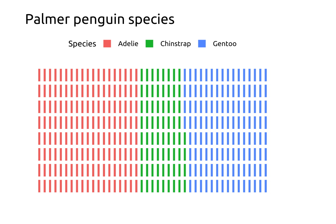
Waffle charts use small squares or icons to show how a whole thing is divided into parts, grouped into categories that fill a grid. They’re useful for visualizing percentages or proportions from a total and can include a legend or labels to explain each category. Waffle chart legends should be positioned on top or bottom and justified horizontally to preserve shape and improve readability.
We’ll build a waffle chart using the ggwaffle package.
12.2 Set up
PACKAGES:
Install packages.
show/hide
library(pak)
library(ggwaffle)
install.packages("palmerpenguins")
library(palmerpenguins)
library(ggplot2)
DATA:

Waffle charts require a special data transformation with ggwaffle::waffle_iron()
Set the group argument in ggwaffle::aes_d() as the categorical variable you want to see the relative counts for:
show/hide
penguins <- palmerpenguins::penguins
penguins <- dplyr::mutate(penguins,
              species = as.character(species))
waffle_peng <- ggwaffle::waffle_iron(penguins,
                      aes_d(group = species))

glimpse(waffle_peng)
#> Rows: 344
#> Columns: 3
#> $ y     <int> 1, 2, 3, 4, 5, 6, 7, 8, 1, 2, 3, 4…
#> $ x     <int> 1, 1, 1, 1, 1, 1, 1, 1, 2, 2, 2, 2…
#> $ group <chr> "Adelie", "Adelie", "Adelie", "Ade…
12.3 Grammar
CODE:
Create labels with
labs()Initialize the graph with
ggplot()and providedataMap the
xandyto thexandyaxesMap
grouptofillAdd
ggwaffle::geom_waffle()Add
ggwaffle::theme_waffle()Move the legend to the top with
theme(legend.position = "top")
show/hide
labs_waffle <- labs(
  title = "Palmer penguin species",
  x = "", y = "", fill = "Species")
ggp2_waffle <- ggplot(data = waffle_peng,
       aes(x = x,
           y = y,
           fill = group)) +
  ggwaffle::geom_waffle() +
  theme(legend.position = "top")
ggp2_waffle +
  labs_waffle +
  ggwaffle::theme_waffle()
GRAPH:
