31 Slope graphs
31.1 Description
Slope graphs show changes in a numeric value (displayed on the y axis) typically over two points in time (along the x axis). The values for each group or unit of measurement are connected by lines, and any differences between the two time points are represented by the slope of the lines (hence the name, ‘slope chart’).
We can build slope graphs in ggplot2 using the geom_line() and geom_point() functions.
31.2 Set up
PACKAGES:
Install packages.
show/hide
install.packages("palmerpenguins")
library(palmerpenguins)
library(ggplot2)
DATA:

We’ll be using the penguins data for this graph, but slightly restructured.
show/hide
peng_slope <- palmerpenguins::penguins |>
dplyr::filter(year < 2009) |>
dplyr::group_by(year, island) |>
dplyr::summarise(across(
.cols = contains("mm"),
.fns = mean,
na.rm = TRUE,
.names = "avg_{.col}")) |>
dplyr::ungroup()
#> `summarise()` has regrouped the output.
#> ℹ Summaries were computed grouped by year and
#> island.
#> ℹ Output is grouped by year.
#> ℹ Use `summarise(.groups = "drop_last")` to
#> silence this message.
#> ℹ Use `summarise(.by = c(year, island))` for
#> per-operation grouping (`?dplyr::dplyr_by`)
#> instead.
glimpse(peng_slope)
#> Rows: 6
#> Columns: 5
#> $ year <int> 2007, 2007, 2007, …
#> $ island <fct> Biscoe, Dream, Tor…
#> $ avg_bill_length_mm <dbl> 45.03864, 44.53913…
#> $ avg_bill_depth_mm <dbl> 15.54091, 18.57391…
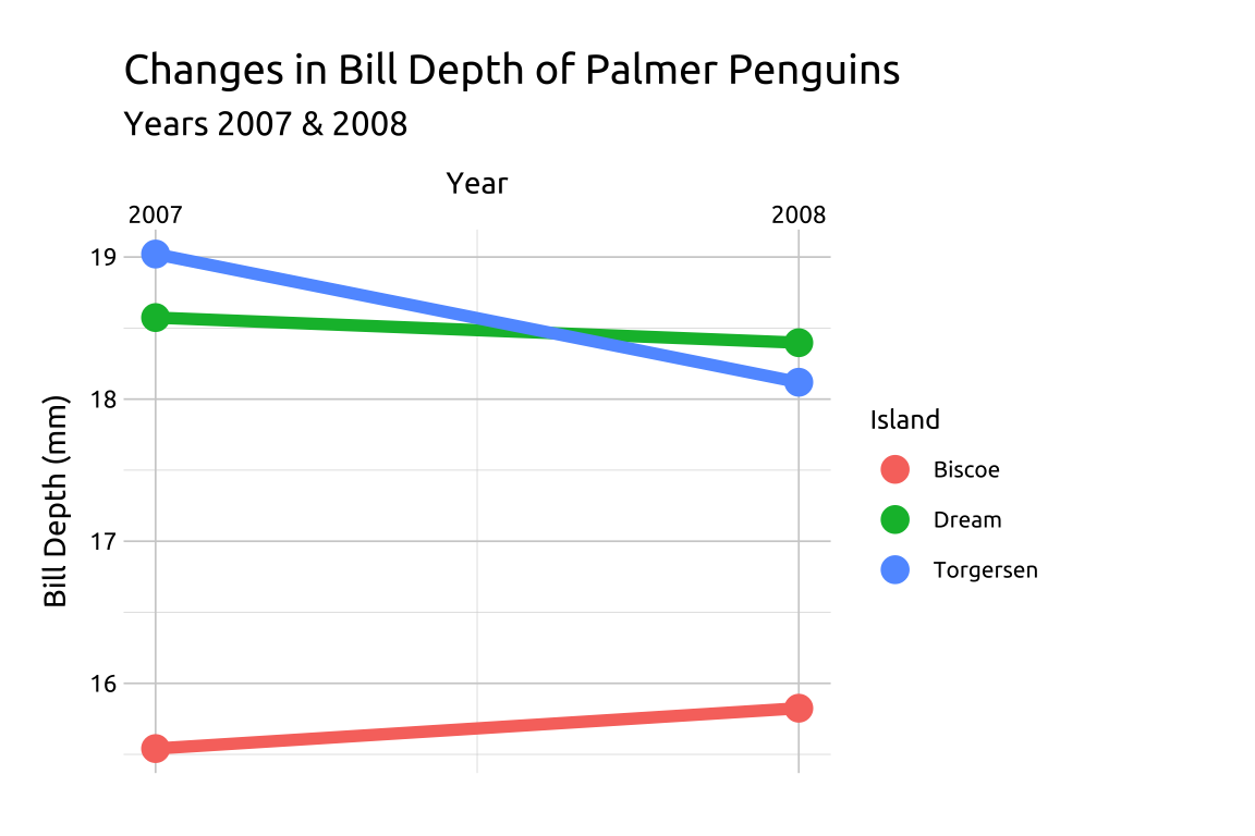
#> $ avg_flipper_length_mm <dbl> 207.5227, 189.8478…31.3 Grammar
CODE:
Create labels with
labs()Initialize the graph with
ggplot()and providedataMap
yearto thex,avg_bill_depth_mmtoy, andislandtogroupAdd a
geom_line()layer, mappingislandtocolor, and setting thesizeto2Add a
geom_point()layer, mappingcolortoisland, and settingsizeto4We’ll adjust the
xaxis withscale_x_continuous(), manually setting thebreaksand moving thepositionto the"top"of the graph
show/hide
labs_slope <- labs(
        title = "Changes in Bill Depth of Palmer Penguins",
        subtitle = "Years 2007 & 2008",
        x = "Year", y = "Bill Depth (mm)",
        color = "Island")

ggp2_slope <- ggplot(data = peng_slope,
    mapping = aes(x = year,
                y = avg_bill_depth_mm,
                group = island)) +
  geom_line(aes(color = island),
                linewidth = 2, show.legend = FALSE) +
  geom_point(aes(color = island),
                size = 4) +
  scale_x_continuous(
                breaks = c(2007, 2008),
                position = "top")

ggp2_slope +
    labs_slope
GRAPH:
31.4 More info
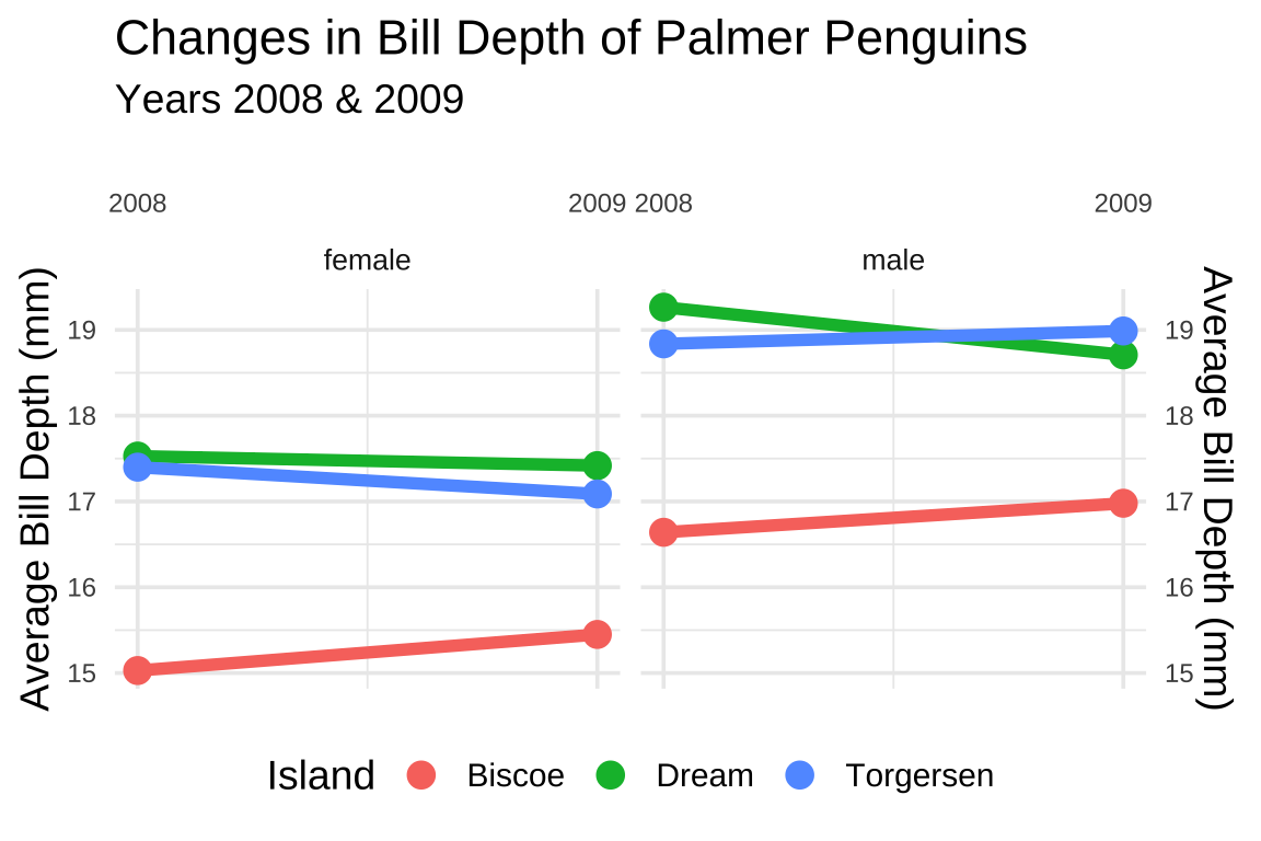
We can also use faceting with slope graphs to add a third categorical variable.
DATA:
We’ll be using the penguins dataset again, but group remove the missing values and group it by year, island, and sex.
show/hide
peng_grp_slope <- palmerpenguins::penguins |>
    dplyr::select(year, sex, island,
                  contains("mm")) |>
    tidyr::drop_na() |>
    dplyr::filter(year != 2007) |>
    dplyr::group_by(year, sex, island) |>
    dplyr::summarise(across(
        .cols = contains("mm"),
        .fns = mean,
            na.rm = TRUE,
        .names = "avg_{.col}")) |>
    dplyr::ungroup()
#> `summarise()` has regrouped the output.
#> ℹ Summaries were computed grouped by year, sex,
#>   and island.
#> ℹ Output is grouped by year and sex.
#> ℹ Use `summarise(.groups = "drop_last")` to
#>   silence this message.
#> ℹ Use `summarise(.by = c(year, sex, island))` for
#>   per-operation grouping (`?dplyr::dplyr_by`)
#>   instead.
glimpse(peng_grp_slope)
#> Rows: 12
#> Columns: 6
#> $ year                  <int> 2008, 2008, 2008, …
#> $ sex                   <fct> female, female, fe…
#> $ island                <fct> Biscoe, Dream, Tor…
#> $ avg_bill_length_mm    <dbl> 42.78387, 41.42353…
#> $ avg_bill_depth_mm     <dbl> 15.02903, 17.52941…
#> $ avg_flipper_length_mm <dbl> 205.3226, 190.9412…
GRAPH:
Create labels with
labs()Initialize the graph with
ggplot()and providedataMap
yearto thex,avg_bill_depth_mmtoy, andislandtogroupAdd a
geom_line()layer, mappingislandtocolor, and setting thesizeto2Add a
geom_point()layer, mappingcolortoisland, and settingsizeto4We’ll adjust the
xaxis withscale_x_continuous(), manually setting thebreaksand moving thepositionto the"top"of the graphWe’ll duplicate the the
yaxis withsec.axis, settingdup_axis()to the samenameof the previousylabel.Finally, we facet the graph by
sex, adjust thesizeof the text, and move the legend to the"bottom"of the graph.
show/hide
labs_grp_slope <- labs(
    title = "Changes in Bill Depth of Palmer Penguins",
    subtitle = "Years 2008 & 2009",
    x = "",
    color = "Island")

ggp2_grp_slope <- ggplot(data = peng_grp_slope,
    mapping = aes(x = year,
        y = avg_bill_depth_mm,
        group = island)) +
    geom_line(aes(color = island),
        linewidth = 2, show.legend = FALSE) +
    geom_point(aes(color = island),
        size = 4) +
    scale_x_continuous(breaks = c(2008, 2009),
        position = "top") +
    scale_y_continuous(name = "Average Bill Depth (mm)",
        sec.axis = dup_axis(name = "Average Bill Depth (mm)")) +
    facet_wrap(. ~ sex,
        ncol = 2) +
    theme_minimal(base_size = 14) +
    theme(
        legend.position = "bottom",
        axis.text.x = element_text(size = 9),
        axis.text.y = element_text(size = 9),
        strip.text = element_text(size = 10))

ggp2_grp_slope +
    labs_grp_slope