28 Line graphs
28.1 Description
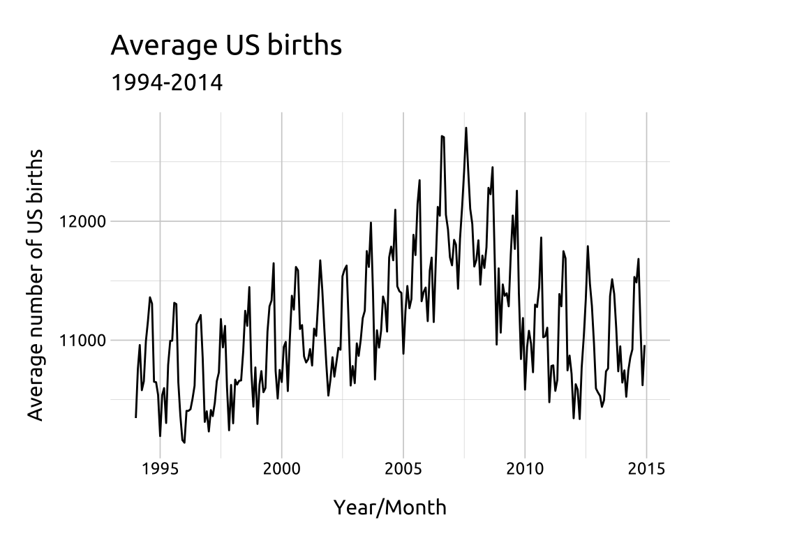
Line graphs display changes of a numeric quantitative variable (on the y axis) over time (on the x axis).
28.2 Set up
PACKAGES:
Install packages.
show/hide
install.packages("fivethirtyeight")
library(fivethirtyeight)
library(ggplot2)
DATA:

We’ll be using the US_births_1994_2003 and US_births_2000_2014 datasets from the fivethirtyeight package.
Remove duplicate dates from
US_births_2000_2014Binding these together (they have identical columns)
Use
yearandmonthto createyr_mnthUse
yearandquarterto createyr_qtrGroup by yr_month to create
avg_births, then un-groupSave as
avg_birth_ym
show/hide
US_births_2004_2014 <-
    filter(fivethirtyeight::US_births_2000_2014, year > 2003)
avg_birth_ym <- US_births_2004_2014 |>
    dplyr::bind_rows(fivethirtyeight::US_births_1994_2003) |>
    dplyr::mutate(
        mon_chr = dplyr::if_else(
            condition = month < 10,
            true = paste0("0", month),
            false = as.character(month)
        ),
        month = lubridate::month(date, label = TRUE),
        yr_mnth = paste0(year, "-", mon_chr),
        yr_mnth = lubridate::ym(yr_mnth),
        yr_qtr = paste0(lubridate::year(date),
            "/0",
            lubridate::quarter(date)),
        yr_qtr = factor(yr_qtr, ordered = TRUE)
    ) |>
    dplyr::group_by(yr_mnth) |>
    dplyr::summarise(avg_births = mean(births, na.rm = TRUE)) |>
    dplyr::ungroup()
dplyr::glimpse(avg_birth_ym)
#> Rows: 252
#> Columns: 2
#> $ yr_mnth    <date> 1994-01-01, 1994-02-01, 1994…
#> $ avg_births <dbl> 10345.32, 10761.68, 10959.23,…
28.3 Grammar
CODE:
Create labels with
labs()Initialize the graph with
ggplot()and providedataMap
yr_mnthtoxandavg_birthstoyAdd
geom_line()
show/hide
labs_line <- labs(title = "Average US births",
                subtitle = "1994-2014",
                y = "Average number of US births",
                x = "Year/Month")
ggp2_line <- ggplot(data = avg_birth_ym,
    mapping = aes(x = yr_mnth, y = avg_births)) +
    geom_line()
ggp2_line +
    labs_line
GRAPH:
